Apple's iPad - The AnandTech Review
by Anand Lal Shimpi, Brian Klug & Vivek Gowri on April 7, 2010 9:39 PM EST- Posted in
- Smartphones
- Mac
- Apple
- iPad
- Mobile
Reading Rainbow
The first time you launch the App Store, it prompts you whether you'd like to install the iBooks application. It's puzzling that iBooks isn't installed by default - perhaps it wasn't finished by the time Apple started flashing EEPROMs for production. Whatever the case, Apple definitely wants you to install their books and reading application immediately upon launch. Until something better comes out, there admittedly isn't any reason you shouldn't.
iBooks is fairly minimalist in its initial presentation, there's no organization or categorization to speak of, just virtual shelves that your "books" sit on. It'd be nice to have some organization here, lest the same kind of icon hell happen with books instead of applications now.
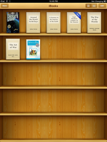
I totally put my real books in bookshelves with their front covers facing out, too
Inside, Apple has crafted a virtual book layout complete with some flashy 3D page turning animations. There's even transparency on the backsides of pages when viewing them in portrait mode.
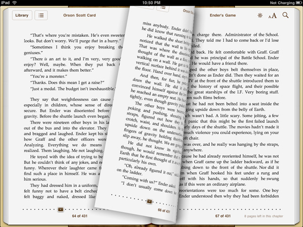
Ooh look at the flashy page turn animations
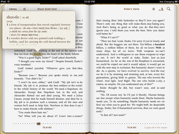
Controls for brightness, text size, and search adorn the top corner, and a slider at the bottom lets you quickly scrub through the book. You can't flick pages quite as fast as you can in a real book, but it's decently fast. Tapping on words in the body of the text brings up the normal copy dialog, but there's also dictionary, bookmark, and search. Bookmarking puts a faux highlighter mark on the selection, and makes a bookmark. Dictionary pops up an OS X dictionary widget-like popover with the word's definition. Search, well, searches.
I regularly ride my space shuttle to Boston, er, what?
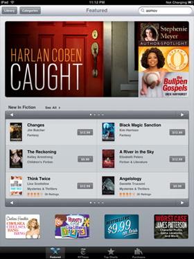
The store itself is relatively limited in scope this far - searching through it for many of the classics I love revealed that they weren't yet included. Free books from Project GutenbergOrganization and appearance is just like the App Store, except with books. That means ratings, categories and featured are all there as well. The reviews themselves are still getting fleshed out; it's a bit unnerving to see one star ratings on timeless classics, but all of that same goodness from the App Store is here in the book store. Nominal price seems to be somewhere around $9.99, though prices are bracketed by the occasional $14.99 or $8.99 book.
 |
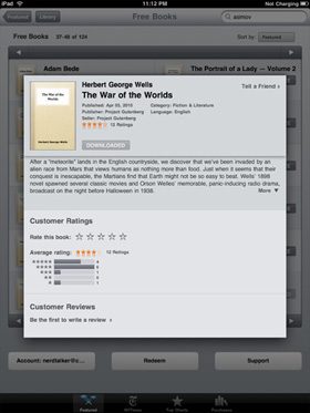 |
Books sync back to iTunes, but you can't open them. In addition, it's apparent that the book store is segmented from the App store somehow, as you cannot buy books in iTunes from the iTunes Store and load them on the iPad. The iBook application fully supports the ePub format for books as well.
Other Reading Apps
If reading through iBooks isn't your thing, there are other ways of consuming print media on the iPad, but for those, you'll have to go install an app.
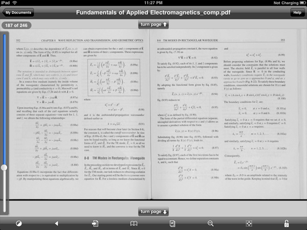
Case in point are PDFs; if left to using the OS' PDF reader, your only options are either browsing online or as email attachments, and both of those get old fast. Though the default reader works, its typical Apple minimalist style leaves out just about everything that makes modern PDF readers, modern. You can view the document; that's it. If you're serious about reading PDFs, one of the best applications for the iPhone was GoodReader, and its developers launched an iPad compatible version day one. Layout is essentially the same as it was on the iPhone version, just larger and more readable.
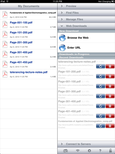
PDFs and Text files can either downloaded from the web or email, or loaded over WiFi, WebDAV, Google Docs, Dropbox or FTP, and are then stored locally. In addition to being noticeably faster than the OS' PDF viewer, there's also an interface complete with bookmarks, search, view, reflow, and even auto scrolling. If you've already got an expansive library of books or notes in PDF form, this is the optimal way to view them for now.

For students, the majority of material is passed down in PDF form; it's nice to finally see a polished document reader for one of the most veteran document formats. In practice, this is the way that iPhone OS' PDF reader should work out of the box.
Of course, there's also the Kindle app which has adopted a similar style to the iBooks app, complete with animated 3D page turns, a grid layout, and the like. It's a great utility if you're already invested in a virtual library of Kindle books. If you haven't seen it by now, there's also the Marvel comic book reader. The iPad's usefulness as a book and print media reader is still evolving, but the primary players are still News.
Media - News
The iPad has become something of a messiah for mainstream print media hoping to finally offer a brave new business model for media consumption. Basically all the major press has their own dedicated newsreader or news-zine application, and this is simultaneously great, and destructive for the platform. On one hand, the iPad is a unique way to consume media tailored to a common device form factor - it's no coincidence that the thing is roughly the size of a magazine. On the other, each of the experiences media venues offer is radically different. One thing is for certain, it's unclear what users will ultimately prefer - tailored experiences delivered through venue-specific applications, or simply getting the same content online.
Of course, there are strings attached in the form of subscriptions. There are two ends of the spectrum here - one offers free media, the other is a subscription or issue based model for all your reading habits. Applications like NPR, Bloomberg, BBC News, NYT, Reuters, USA Today and the Associated Press all offer AD-subsidized or essentially free media consumption. There's the occasional inline or application launch advertisement, but most of it is relatively unobtrusive.
 |
 |
 |
 |
 |
Wall Street Journal, Time, GQ and others instead only offer in-application subscription or purchase. Will people consume media and tolerate the occasional AD, or is subscription the only way to monetize the iPad? The subscription model battle that some media venues are hoping will save their publications will likely be fought partly on the iPad and other converged distribution platforms.
Utility, Entertainment and Social Media
At least thus far, it seems as though a lot of applications have taken a nod from Apple's Mail application design - a quarter width tab at left with information, and a dominant panel for more focus at right. It's obvious that developers used to working on the relatively cramped layout of the iPhone still haven't found the optimal use layout for the iPad's larger screen, but this two panel approach nearly mitigates lack of multitasking for some use scenarios.
The best of example of which is side by side Twitter with web browsing. If any of you are like me, you likely browse with a Twitter client open on one side of the screen and a browser on the other - offering you a glance at what's going on alongside the program in which to view it. This is exactly what TweetBrowser offers, and I think it's the kind of new use scenario that will distinguish the iPad from its smartphone brethren. In time, we'll likely see more efficient use of screen real-estate in other applications, which TweetBrowser does already.
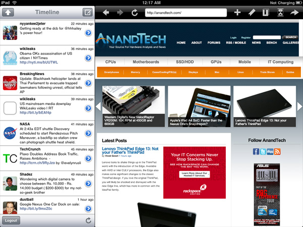
TweetBrowser - Best of all, it's free
Another awesome use of the newfound real-estate is in TweetDeck for iPad. Landscape mode offers a view of all your default tabs and searches, while portrait mode lets uses the vacant space at top to display tweets in detail view, or a browser for links.


108 Comments
View All Comments
zodiacfml - Thursday, April 8, 2010 - link
Another quality review, useful as trying the device myself.I'm not buying Apple products but you touched on features that it should have.
One is the ability to stand on its own to function as a picture frame, movie screen, and reader while someone is eating or something else.
Support for mouse device and keyboard when it can already stand on its own.
Support for uploading media such as video and photos from either flash cards or directly from cameras. it is such a good device to use with cameras.
one more thing, they could get the intel atom cpu once it gets to a smaller process to improve size and energy efficiency.
Spivonious - Thursday, April 8, 2010 - link
Anand, I love your writing and have read the site since the GeoCities days, but please learn the difference between "lay" and "lie".crimson117 - Thursday, April 8, 2010 - link
My biggest pet peeve with the iPhone UI is the lack of an indicator for when an app is visible but busy processing something and not currently accessible.The default Notepad app on the iPhone 3G is a great example - as soon as you tap the icon, the yellow Notepad interface pops right up. However, it actually takes several seconds to finish loading until you can tap to edit a note or tap the (+) sign to start a new note. There's no indicator at all of when the loading is complete - you have to keep tapping periodically until it finally works.
The same is true for resizing a web page using multitouch - there's no indicator that your input has been received but it's going to take a few moments to make it happen.
In Windows 7 when an app is "thinking" and thus you can't interact with it, your mouse pointer becomes a a little circle (aka an hourglass). If an app is ever extremely busy thinking, the app may even gray out to indicate that even Windows can't get it to respond at that time.
The iPhone's lack of this feature just smells of Apple trying to make the device appear on the surface to be more responsive than it really is. Perhaps you'll question whether you tapped correctly, and won't realize that the device is just slower than you expect it to be.
archcommus - Thursday, April 8, 2010 - link
This article, like your others, despite being 22 (!) pages long, is a quick, refreshing read. It feels more like you're talking about your experiences and less like you're writing an article as a journalist (which can make some other long reviews a little boring). Also seemed pretty unbiased and highlighted the good and bad. Another solid article, thanks.Mumrik - Thursday, April 8, 2010 - link
Hehe, this isn't a big deal - it's just amusing:"Although there's no mute button, holding the volume down rocker for 2 seconds mutes the device instantly."
Nope. Sounds to me like it takes about two seconds to mute the device :)
AstroGuardian - Thursday, April 8, 2010 - link
Good one. My thought exactly...leospagnol - Thursday, April 8, 2010 - link
I'm planning to buy one of them when I travel to US next month. THe Eee 1001P is $ 280.00, and the iPad $499.00 at least. I usually read more than I write during classes and I have wifi available during class. I'll probably buy the Eee, but wich do you think suits this task best?Mumrik - Thursday, April 8, 2010 - link
Imagine the iPad lying flat on your desk and then imagine the position you would have to sit in all lecture long if you wanted to be able to write.Then imagine how much of the time you'd have to look down at what you were writing because you didn't have the physical response of a keyboard to make touch typing easy.
Now imagine not being able to multitask.
It would not be a difficult choice for me - Anand said it himself - the iPad is generally not a laptop substitute.
videogames101 - Thursday, April 8, 2010 - link
I love the M3, great episode there.Good to know I can watch it on the iPad, lol.
AstroGuardian - Thursday, April 8, 2010 - link
As far as i remember, this was not mentioned in the review (the overheating problem):http://www.dailytech.com/article.aspx?newsid=18075
Personally i don't think it's worth commenting. It's not just the iPad but all other electronic devices will overheat when put out on the sun. And i wouldn't call it overheating but more like misuse.