Anand's Google Nexus One Review
by Anand Lal Shimpi on April 3, 2010 3:40 AM EST- Posted in
- Smartphones
- Mobile
Notifications: Better than Apple, Worse than Palm
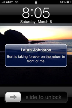
When Apple introduced its notification system on the iPhone, I was pleased. If you’re using your phone and you get a SMS, a little bubble appears on the screen and you get to read/dismiss the SMS:
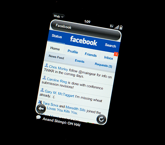
That was three years ago. The iPhone can do a lot more now and the notification system is beginning to show its age. It’s annoying if you’re trying to do something else with your phone and you keep getting notifications. And it doesn’t scale well to getting tons of notifications, you’re just shown the most recent with no indication of what came before it.
Palm improved on Apple’s system by claiming a line or two of screen real estate and displaying notifications at the bottom of the screen. It was far less intrusive than Apple’s method but still gave you the same functionality. If you wanted to see more, just tap the notification bar and you see more of the message. This works for IMs, text messages, etc...
Notifications on the Palm Pre at the Bottom
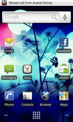
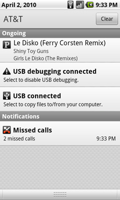
Google takes a similar approach to Palm, although you don’t lose any additional screen real estate. The upper left hand corner of the screen is reserved for notifications. It’s a part of the status bar so there’s no screen resizing at work. If you get a message, missed call, IM, or anything you get a preview in this corner. The entirety of any message is displayed here; if it can’t fit on a single line, the message appears piecemeal.
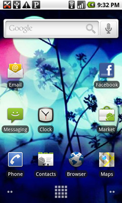
Notifications can build up over time. Here we have a missed call, USB connection message, debug mode message and Pandora running in the background all at the same time:
Kinda crowded, right? Here’s where it gets awkward. To see all of your notifications simply place your finger at the top of your screen and drag down. You’ll reveal all of your notifications in list form:
It feels awkward if you’re used to using any non-Android phone. It’s functional, it gets the job done, but it’s just a strange UI construct. In fact, Android is riddled with such things.


95 Comments
View All Comments
Chloiber - Sunday, April 4, 2010 - link
Sorry for repeating myself, but I really look forward to a test of the HTC Sense UI with either the HTC Desire, Legend (slower though) or Evo. I read several reviews and in every single one they were really impressed by the onscreen keyboard.ol1bit - Sunday, April 4, 2010 - link
I love the android platform. Now my last smart phone was the first Palm ever, so I could be thrilled with anything.The kicker for me was buying my android at Amazon for $49 (3 weeks ago), and now it's only $19!
It's hard for me to grasp how much power is in my hands for $19. Sure I have to have a 2 year contract, but I'd have that anyway.
As far as difference between mine and Goggle's? there's some, but the core functionality is present in both, just like an HP and a Dell computer with their built in thingy's.
Cheers on a great review!
LongTimePCUser - Sunday, April 4, 2010 - link
Today on Amazon the Motorola Droid is $19.99.Amazing. I bought mine about 3 weeks ago at $49. I thik that it is great and a bargin at the price I paid.
They are practically giving it away now. That tells you how profitable their $30/month data plan is.
naalex - Sunday, April 4, 2010 - link
Wow, I've got to say: Super Job! Not only did you review the Nexus One, but you managed to simultaneously review Android, review the iPhone OS, compare the two's strengths and weaknesses, and describe ARM's role in the smartphones and microprocessor business (which I never understood). Long yes, but every page was well worth it.After reading all the hyperbolic tech news coming from Engadget, CNET, and PhoneArena, I was under the mistaken impression that Snapdragon was a clear smartphone platform champion, so I found it rather interesting that Snapdragon's integrated GPU was inferior to the PowerVR solution on the iPhone 3GS. If I'm not mistaken, this is the GPU that is used in the TI chip in the Droid, so does this mean that my Droid may be able to keep up with Nexus Ones/Snapdragons with 3D gaming apps, or will there be too much hardware and OS fragmentation for any app developer to create any optimized 3D gaming app for Android.
This is going to be my go-to resource to provide to people who ask, "What is that strange object pressed to your face that isn't an iPhone? Does it cure cancer like the iPhone?" Trying to explain to my clueless tech friends that there are other viable smartphone options out there is an uphill battle, but one that may go a little easier now.
ExodusC - Sunday, April 4, 2010 - link
Anand, I'll admit, this is the gist of what I expected from your article (I don't mean that in a bad way, mind you--). I own an iPhone 3G, and have for almost a year now. I like it, but I don't particularly love it. I imagine the 3GS would be a more fluid (and therefore more enjoyable) experience. For some reason, tech reviewers tend to not want to get rid of their iPhones for some reason. Even with a device like the Nexus One at their fingertips. I type this from a Motorola Droid right now, and I love it.I agree, I love the fluidity of the iPhone compared to Android devices (why must they be so powerful, but so choppy? That's my biggest complaint), but I love the feature set of Android even more.
I also really want to know, why do you feel Android's pull-down notification menu is awkward? The first time I picked up an Android device and used it (never knowing about the feature), I felt it was very intuitive and a wise design choice.
I completely agree with your general consenus that Android needs some polish, however.
I absolutely love your website, reviews, and attention to detail. Keep up the good work! I just thought I'd share my honest opinion with you. Hopefully you'll have time to respond.
ExodusC - Sunday, April 4, 2010 - link
Excuse my extra "for some reason" in that post. I was a bit distracted while typing up my reply...Anand Lal Shimpi - Thursday, April 8, 2010 - link
It's just an odd construct in my opinion. It's the only place in the entire OS that you pull something down to reveal more notifications. If anything I'd expect a tap to expand sort of deal, but the pulldown seems strange to me.I will say that after using it for a while, it has lost it's weirdness in my opinion :)
Take care,
Anand
DukeN - Monday, April 5, 2010 - link
Love the slide out keyboard - if only this was like the original G1 but with all the new horsepower.The G1 is the first phone that has tempted me away from a blackberry (well...almost) in 5 years.
EazyVG - Monday, April 5, 2010 - link
I have been a WinMo user for past 3-4 years, but I have to agree that Android, not WinMo7, is the replacement for Windows Mobile 6.5, and hence I will be jumping to Android phone (as of today I like the HTC Desire, but want QWERTY) from my current HTC Touch Pro 2.Pitne - Monday, April 5, 2010 - link
wow I cant believe how biased this article is towards apple. Almost every word you used when talking about the Nexus One had a negative connotation. Most of your 'negatives' towards the nexus one are completely false.The notification area for one--this implementation is 100% better than apple or palm and you think its a poor way of handling it? Wtf are you smoking.