Anand's Google Nexus One Review
by Anand Lal Shimpi on April 3, 2010 3:40 AM EST- Posted in
- Smartphones
- Mobile
The Home Bar
The Nexus One has three physical buttons: a power/lock button at the top, volume rocker on the left side and a trackball/button on the face.
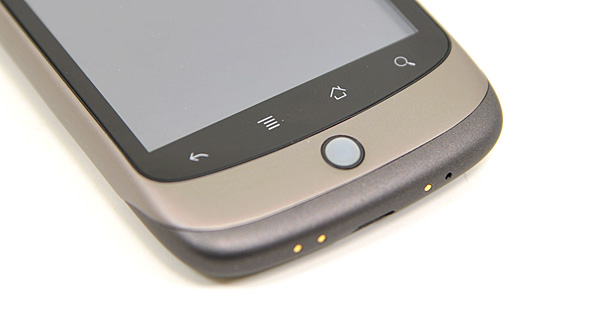
The trackball is mostly useless. The Nexus One has a 3.7” multitouch screen for a reason, and it’s way quicker to use the screen than to use the trackpad for scrolling. There are some limited situations where the trackball can be useful, for example while playing games. The iPhone has no useful physical buttons for gaming, the Nexus One’s trackball is better for moving a character around than a virtual d-pad.
Above the trackball there are four touch buttons with fixed functions: back, menu, home and search. By default all provide haptic feedback when activated. In other words, they vibrate a bit when you touch them. It’s a fine feature but it’s nowhere near the feedback you get from physical buttons if that sort of thing matters to you. The buttons also give you the same feedback regardless of whether or not their operation is permitted in the current mode (e.g. hitting the contextual menu button when no such menu exists).
The back button is useful and works as intended, it goes back a screen. The menu button takes some getting used to. The best way I can describe it is like a right click. You get a contextual menu depending on what app you’re running. At the home screen it lets you pop into Android’s settings, add application shortcuts, change wallpaper, view notifications and search. In the email app the contextual menu lets you refresh your inbox, switch to a different folder, change settings, etc...
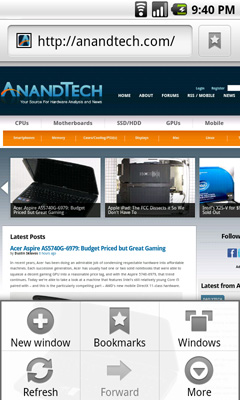
The contextual menu in Android's Browser app
This is where Android’s more PC-side comes out to play. Apple and Palm for the most part try to keep these sorts of menus away from you. Apps are purposefully not very deep and settings are all controlled through the settings screen, not from within an app. Functionality is driven by the UI. Android takes a more application centric approach. Neither is right or wrong, but both approaches have their pros and cons. I’d argue that Apple/Palm’s approach is better suited for something that’s going to be used as a passive device. Something you’re quickly scanning emails or text messages on. Google’s take is more PC-like. Give the users the options they want, where they want them, even at the risk of UI simplicity.
The Apple method runs the risk of limiting functionality, while Google’s risks turning the UI into a cumbersome mess. Neither is there today, but left unchecked that’s where they’d end up.
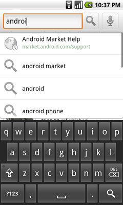
Moving on, the home button works as expected, it takes you to your home screen. The search button is particularly interesting because it is one Android feature that Microsoft copied in Windows Phone 7. Hitting the search button brings up an autocomplete enabled Google search box. Hitting go, launches the web browser (very quickly thanks to Mr. Snapdragon) and displays your search results.
What MS is proposing for WP7 are contextual search results that are formatted for the smartphone. Akin to a search app if you will. Search for GeForce GTX 480 and get a normal listing of websites. Search for dentists and get a smartphone formatted list of dentists in your area. Granted MS’ proposal is just that, a proposal, while Android is shipping today. Enabling similar functionality though shouldn’t be hard for Google. I’d love to be able to search, pull results from the web, but have the results presented as more of an app.
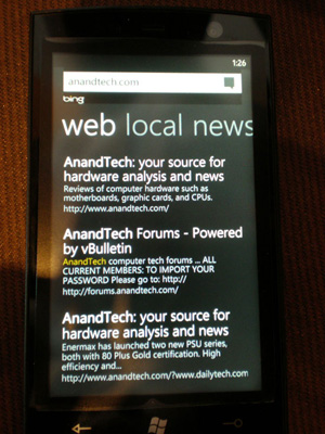
Windows Phone 7 Search
The search function will autocomplete things like address book entries, but it won’t automatically search your email for you. While the iPhone’s search function is more focused on searching your device, Android is more interested in helping you search the web. Google has a search engine, Apple doesn’t, the distinction makes sense.


95 Comments
View All Comments
Chloiber - Sunday, April 4, 2010 - link
Sorry for repeating myself, but I really look forward to a test of the HTC Sense UI with either the HTC Desire, Legend (slower though) or Evo. I read several reviews and in every single one they were really impressed by the onscreen keyboard.ol1bit - Sunday, April 4, 2010 - link
I love the android platform. Now my last smart phone was the first Palm ever, so I could be thrilled with anything.The kicker for me was buying my android at Amazon for $49 (3 weeks ago), and now it's only $19!
It's hard for me to grasp how much power is in my hands for $19. Sure I have to have a 2 year contract, but I'd have that anyway.
As far as difference between mine and Goggle's? there's some, but the core functionality is present in both, just like an HP and a Dell computer with their built in thingy's.
Cheers on a great review!
LongTimePCUser - Sunday, April 4, 2010 - link
Today on Amazon the Motorola Droid is $19.99.Amazing. I bought mine about 3 weeks ago at $49. I thik that it is great and a bargin at the price I paid.
They are practically giving it away now. That tells you how profitable their $30/month data plan is.
naalex - Sunday, April 4, 2010 - link
Wow, I've got to say: Super Job! Not only did you review the Nexus One, but you managed to simultaneously review Android, review the iPhone OS, compare the two's strengths and weaknesses, and describe ARM's role in the smartphones and microprocessor business (which I never understood). Long yes, but every page was well worth it.After reading all the hyperbolic tech news coming from Engadget, CNET, and PhoneArena, I was under the mistaken impression that Snapdragon was a clear smartphone platform champion, so I found it rather interesting that Snapdragon's integrated GPU was inferior to the PowerVR solution on the iPhone 3GS. If I'm not mistaken, this is the GPU that is used in the TI chip in the Droid, so does this mean that my Droid may be able to keep up with Nexus Ones/Snapdragons with 3D gaming apps, or will there be too much hardware and OS fragmentation for any app developer to create any optimized 3D gaming app for Android.
This is going to be my go-to resource to provide to people who ask, "What is that strange object pressed to your face that isn't an iPhone? Does it cure cancer like the iPhone?" Trying to explain to my clueless tech friends that there are other viable smartphone options out there is an uphill battle, but one that may go a little easier now.
ExodusC - Sunday, April 4, 2010 - link
Anand, I'll admit, this is the gist of what I expected from your article (I don't mean that in a bad way, mind you--). I own an iPhone 3G, and have for almost a year now. I like it, but I don't particularly love it. I imagine the 3GS would be a more fluid (and therefore more enjoyable) experience. For some reason, tech reviewers tend to not want to get rid of their iPhones for some reason. Even with a device like the Nexus One at their fingertips. I type this from a Motorola Droid right now, and I love it.I agree, I love the fluidity of the iPhone compared to Android devices (why must they be so powerful, but so choppy? That's my biggest complaint), but I love the feature set of Android even more.
I also really want to know, why do you feel Android's pull-down notification menu is awkward? The first time I picked up an Android device and used it (never knowing about the feature), I felt it was very intuitive and a wise design choice.
I completely agree with your general consenus that Android needs some polish, however.
I absolutely love your website, reviews, and attention to detail. Keep up the good work! I just thought I'd share my honest opinion with you. Hopefully you'll have time to respond.
ExodusC - Sunday, April 4, 2010 - link
Excuse my extra "for some reason" in that post. I was a bit distracted while typing up my reply...Anand Lal Shimpi - Thursday, April 8, 2010 - link
It's just an odd construct in my opinion. It's the only place in the entire OS that you pull something down to reveal more notifications. If anything I'd expect a tap to expand sort of deal, but the pulldown seems strange to me.I will say that after using it for a while, it has lost it's weirdness in my opinion :)
Take care,
Anand
DukeN - Monday, April 5, 2010 - link
Love the slide out keyboard - if only this was like the original G1 but with all the new horsepower.The G1 is the first phone that has tempted me away from a blackberry (well...almost) in 5 years.
EazyVG - Monday, April 5, 2010 - link
I have been a WinMo user for past 3-4 years, but I have to agree that Android, not WinMo7, is the replacement for Windows Mobile 6.5, and hence I will be jumping to Android phone (as of today I like the HTC Desire, but want QWERTY) from my current HTC Touch Pro 2.Pitne - Monday, April 5, 2010 - link
wow I cant believe how biased this article is towards apple. Almost every word you used when talking about the Nexus One had a negative connotation. Most of your 'negatives' towards the nexus one are completely false.The notification area for one--this implementation is 100% better than apple or palm and you think its a poor way of handling it? Wtf are you smoking.