Gateway AMD and Intel Laptops, a Platform Analysis
by Jarred Walton on August 12, 2009 2:00 AM EST- Posted in
- Laptops
Battery Life - AMD vs. Intel
We will start with a recap of our battery life testing. We are using a different format for the graphing than we used previously, so you can look at the other article if you prefer our "normal" graphs. For this chart, equal performance is denoted by the 50% mark in the middle of the chart. A larger bar means better performance, and the numerical results (in minutes) are available for those that prefer raw numbers.
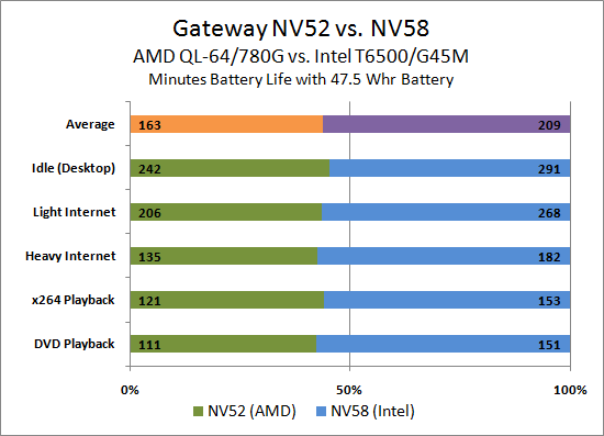
We've already discussed this, but simply put Intel walks away with the battery life crown. On average, the Intel system offers 28% more battery life than AMD, with the closest result at Idle (20%).
We have heard several potential "solutions" for the poor AMD battery life - use one of the Turion X2 Ultra CPUs that have split power planes, for example, which should indeed help matters. However, we are comparing relatively similar offerings; after all, Intel also offers many CPUs that should provide better battery life than the T6500. The P8400 is one example, offering a lower 25W TDP, 50% more L2 cache, and a higher clock speed and FSB.
Undervolting is another suggestion, and one that definitely can improve idle battery life. If you consider the equation:
P = C * F * V2
(Power = Capacitance * Frequency * Voltage Squared)
…reducing the voltage of a chip can greatly improve power requirements. Like overclocking, however, undervolting is not guaranteed, requires the use of additional utilities, and you have to compare undervolted chips to each other. Undervolting an AMD chip might help to match a stock voltage Intel chip, but it's very likely both will be able to achieve lower voltages than what Intel specifies. (We will try to take a closer look at undervolting in the future.) The net result is that we truly don't see AMD closing the gap with Intel until they come out with a built-from-the-ground-up mobile architecture.
Okay, we already knew that the battery life comparison would favor Intel. We'll have a closer look at why this is in a moment when we look at power consumption. First, let's look at the rest of the performance spectrum.
Update
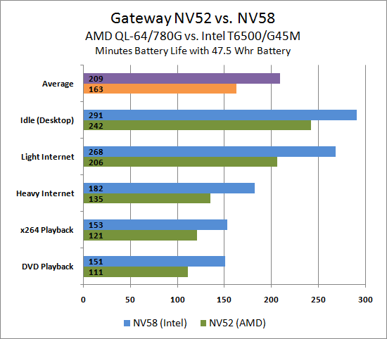
For those that prefer a more traditional presentation, here's a second graph showing the same data as the above chart. Also, the data labels got reversed at some point; the graphs are now both correct - sorry for the confusion.


67 Comments
View All Comments
samspqr - Wednesday, August 12, 2009 - link
(I mean the one on page 5)JarredWalton - Wednesday, August 12, 2009 - link
As mentioned in the text, the graphs on pages 5 though 8 use a different format. I chose the format because I feel it provides a quick way of looking at relative performance. The percent labels aren't particularly meaningful, since the bars are not in actual percentages (though the bar sizes are).Spacecomber - Wednesday, August 12, 2009 - link
Although I found the article interesting, comparing the advantages of intel based laptops to amd based laptops, I have to agree that the choice of how to represent the data in the charts doesn't really work for me. I understand what the notion was, representing the data as a kind of tug of war between the two platforms, but the utility used to create these charts didn't provide the means to make this clear. I'm a strong believer that charts should be intuitively obvious and that you should be able to interpret them without looking at anything other than what is contained in the chart.These charts have an additional problem when it comes to the representation of the gaming data (or any data where the same measurement unit is being used). You can no longer easily compare performance for the same platform across different games (or whatever the instances being measure are). For example, it is not easy to see in these graphs that some games don't have playable framerates, regardless of the platform.
Anyway, while I'm sympathetic with the effort to try something different, I didn't find that it helped me to comprehend the data any better, and it seemed to be more of a hinderance, instead.
JarredWalton - Wednesday, August 12, 2009 - link
The problem is two-fold: I had a bunch of data to represent, and I didn't want a ton of small charts. I debated just putting in a table, but that seemed a poor way of doing things - especially since I can show the number labels and you get the chart plus table effect. The issue is compounded by units that are not easy to chart with each other - i.e. PCMark05 has some scores in single digits, some in the tens, and some in the hundreds. Do I break PCMark05 scores into 16 different charts, or does the "100% Stacked Bar" chart option provide all the necessary detail?I'm inclined to go with the latter as a reasonable compromise between the various options, and let people spend a few more minutes looking at the data to draw conclusions. It's great when a chart can be "intuitively obvious", but there are times when complex data requires a more complex chart. The net result is that I had a choice between more aesthetically pleasing pages and a single summary chart, or I could make dozens of smaller charts and get a cluttered page.
I understand some people won't like the representation, but I've been playing with the data for the past hour and there's really no option that's as succinct. Some graphs (gaming) lend themselves to other options, but the PCMark05 chart and Application Performance charts have to be split up, put in a table, or something else.
FWIW, I'll post alternative charts in a bit for those that really hate the current charts. However, I'm still a firm believer in requiring people to READ the text. I get the impression that many of the comments have only looked at a small portion of the text and are making a lot of assumptions - assumption which are, not surprisingly, incorrect.
Wellsoul2 - Wednesday, August 12, 2009 - link
The Chart is still backwards compared to the first article onbattery life. Idle is 111 minutes and DVD 242 minutes.
It's reversed from last article.
JarredWalton - Wednesday, August 12, 2009 - link
Sorry... not sure how that happened, other than sorting charts in Excel. For some reason, the top spreadsheet cell showed up on the bottom of the chart, and so I resorted. Apparently I missed the numbers at some point. I'll correct the chart shortly....mczak - Wednesday, August 12, 2009 - link
Hmm, what about the raw numbers which should show minutes runtime? Idle has lowest runtime, DVD playback largest. That definitely looks wrong...Wellsoul2 - Wednesday, August 12, 2009 - link
Yes...looks like you reversed the numbers.whatthehey - Wednesday, August 12, 2009 - link
Reading comprehension is a great thing!"We are using a different format for the graphing than we used previously.... For this chart, equal performance is denoted by the 50% mark in the middle of the chart. A larger bar means better performance, and the numerical results (in minutes) are available for those that prefer raw numbers."
Ah, yes, the percentage marks are entirely misleading! Shame on you AnandTech for making people read! (FWIW, I had no issues reading and interpreting the graphs, but then I'm a computer programmer.)
Ben90 - Wednesday, August 12, 2009 - link
" quit looking ahead and pay attention to this paragraph! " You should have added that to the page before, my screen was already down in the chart when i read this :)