Revisiting Linux Part 1: A Look at Ubuntu 8.04
by Ryan Smith on August 26, 2009 12:00 AM EST- Posted in
- Linux
UI & Usability
To put Ubuntu GUI in the context of existing operating systems, I’d lump it in with Windows XP. If you can use Windows XP, then you’re going to be right at home with Ubuntu. The window layouts are similar, the buttons are the same, many of the shortcut key combinations are the same. Whether it’s intentional or not I can’t say, but with the similarities it’s a very easy transition to Ubuntu coming from Windows.
But there are some important differences between Ubuntu and XP, and they start to make themselves apparent almost immediately. The taskbar and its conjoined twin the start menu (the Menu Bar in Ubuntu) have been separated – the taskbar gets the bottom of the screen and the menu bar gets the top. Because the menu bar is always visible by default this makes it look close to Mac OS X, but due in large part to the fact that applications do not share the menu bar like they do in Mac OS X, it’s functionally much more like XP. Joining it up top are the Ubuntu equivalents of the quick launch toolbar, and the system tray. This leaves the taskbar at the bottom, containing running applications along with the controls for Ubuntu’s virtual desktops implementation.
This is something I find works quite well on narrow screens, but is a wash on larger screens and widescreens. By putting the menu bar and the taskbar on different physical bars, it leaves more space for active applications in the taskbar while not forcing the menu bar to be compacted. Depending on how cluttered your complete taskbar may have been under Windows, this can buy you enough space to comfortably fit another couple of active applications, which may not be much but can make all the difference in some situations. The cost of this however is that you lose additional vertical real estate compared to if everything was on one bar. Hiding the bars can get this space back, but it’s been in my experience that most people hate auto-hiding bars, which may very well be why no OS has them auto-hiding by default.
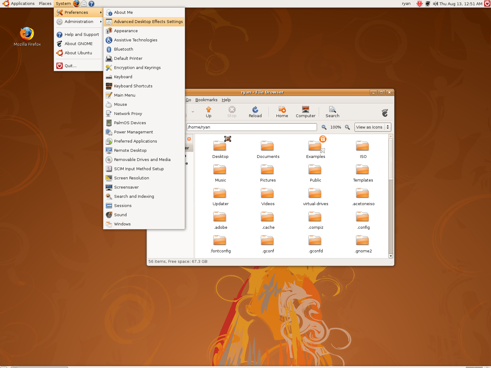
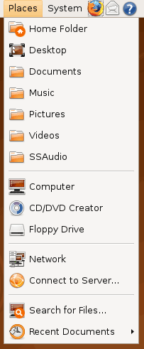
At first glance, the menu bar is just different enough from XP’s start menu to throw some people for the loop. The contents of the start menu have been broken up a bit: Applications is Windows’ All Programs, Places is My Recent Documents, and System is Control Panels. Coming from Windows, the two biggest changes are that most applications are organized by functionality rather than each application getting its own subfolder in the Applications menu, and that what would be found in Control Panels is now split between the Preferences and Administration submenus under System, based on if it adjusts a per-user preference or a system preference (and hence would need administrative access).
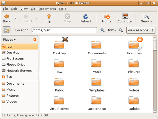
Nautilus, the Ubuntu file manager, really drives home the idea that Ubuntu works like Windows. It takes the “file manager is a web browser” concept just as far Windows ever did, which isn’t necessarily a good thing given how old (not to mention dead) the concept is, making Nautilus feel a bit dated. Beyond that, there’s little that can be said that differentiates it from Windows XP’s Explorer.
Multitasking is also handled in a very XP-like fashion. Beyond the taskbar, alt-tab switches among applications just as it does on Windows (or cmd-tab on Mac OS X). Notably, Ubuntu has copied some of the more interesting quirks of both Windows Vista and Mac OS X. From Windows Vista it inherits the ability to see the contents of a window when alt-tabing, and from Mac OS X it inherits the ability to close an inactive window without needing to focus on it, allowing you to keep focus on whatever you’re working on.
Ubuntu also has one more trick up its sleeve when it comes to multitasking, and that’s virtual desktops. Virtual desktops, or workspaces as they’re called in Ubuntu, allow for the creation of multiple workspaces in a single user session, such that different windows can be in different workspaces, completely hidden when that workspace is not active. It’s been a feature of various *nix operating systems for ages, and Apple added this feature as Spaces in 10.5 Leopard. Windows has no built-in equivalent.
I’ve tried using this method before as Spaces, and again on Ubuntu with their workspaces, and I fully admit I don’t “get it.” The idea of being able to move a window completely out of your way by keeping it in another workspace makes sense, but I have never been able to make it work for me. Ultimately I find that I have to go chase down a window that I need when it’s off in another workspace. I know there are plenty of people out there that can make good use of workspaces, so it may as well just be a personal flaw. It’s a neat concept, but I haven’t been able to make it work for me.
Moving on, one thing I find that Ubuntu does well is that it better bridges the look of the OS with and without eye-candy. Windows Vista does a very poor job of this, and it’s immediately obvious if Aero is running or not. The style choices for Vista clearly were based on Aero, so if for any reason Aero is disabled, you get the 2D-only Vista Basic UI that poorly compensates for the lack of transparency. Ubuntu on the other hand looks nearly identical in static screens, only the lack of subtle window shadows give away when Ubuntu is running without visual effects (Ubuntu’s name for 3D accelerated desktop compositing). Most people will never run Ubuntu with desktop compositing disabled, just as most people will never run Windows Vista with Aero disabled, nevertheless this is one of those subtle design choices that impressed me.
An example of Ubuntu's hardware compositing. Hardware composited on the left, software on the right.
With desktop compositing enabled the experience is similar to that of Windows Vista or Mac OS X. Windows fade out of view, shrink & grow, etc just as they do in the other two. I feel like I should be writing more here, but there’s just not a lot to say; it’s the same desktop compositing abilities everyone else has, including their UI tricks that serve to accelerate user interaction. The one thing in particular that did catch my eye however is that Ubuntu includes a UI feature called Scale that is virtually identical to Mac OS X’s Exposé. As a self-proclaimed Exposé junky I find most welcoming, as this is my preferred way to multitask with a large number of windows. There have been a couple of times, as a result, where I have found my workflow under Ubuntu being smoother than that of Vista, though Mac OS X still surpasses this.
However I’m much less enthusiastic about the icons Ubuntu uses, and there’s one element in particular that nearly drives me insane: executables/binaries don’t even have icons. In Windows executables can be packed with resources such as icons, and in Mac OS X app bundles contain icon files that are used to give the bundle an icon. On Ubuntu however, the executables don’t have their own icons. Ubuntu can assign custom icons to anything, but apparently this is being remembered by file manager, rather than actually attaching an icon. By default, the only thing with custom icons are the Launchers (a type of shortcut) that Ubuntu automatically creates for installed applications. Everything else is either issued a default icon for its type, or certain media types (e.g. images) are thumbnails.
In an ideal world this isn’t an issue because everything is installed to the system and has its own Launcher somewhere in the menu bar, but with software that doesn’t directly install (such as programs distributed in compressed folders) this isn’t something that’s handled automatically. In place of an application specific icon executables have a generic executable icon, which worse yet is shared by more than just executables. As an example of this we have a screenshot of the folder for the demo of Penny Arcade Adventures: Episode 2. Can you figure out which item launches the game?
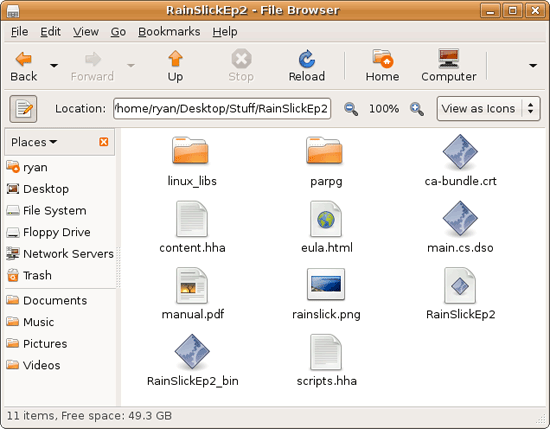
The right answer, the document-like item called RainSlickEp2 (which is actually a shell script) is completely non-obvious. If this were Windows or Mac OS X, there would be an appropriate custom icon over the right item. Meanwhile not only are we lacking a custom icon, but the binary icon is used directly in 3 different places, and as an overlay on top of a document icon in a 4th place. Only 1 item is even an executable binary. And while I had hoped this was an issue just with this game, it extends to everything else; even Firefox’s actual executable lacks an icon. As it turns out, the Linux executable format, ELF, doesn’t have the ability to contain icons.
I hate to harp on this issue, but I am absolutely dumbfounded by it. Usability goes straight down the tubes the moment you need to use non-packaged software because of this – and because the DEB package format is not a Linux-wide standard, there’s a lot of software like that. On a GUI, there needs to be graphical elements to work with.
On the flip side, I find it interesting that Ubuntu has icons in certain places where Windows and Mac OS X do not. Action buttons such as “open” and “close” have icons embedded in them, while the other two OSs have always left these buttons sparser, containing just the text. The ramifications of this are that with icons in your buttons, you don’t necessarily need to be able to read the text to be able to use the OS so long as you understanding the meaning of the icons. It’s easily the most drastic difference between the Ubuntu and Windows/Mac OS X GUIs that I have noticed. But at the same time, I’ll say that it’s so different that even after a year I still don’t know quite what to make of it – it often results in big, silly buttons when something smaller would do. The jury is still out on whether this is a good difference or not.
I would also like to touch on the directory structure of Ubuntu, as it falls under the nebulous umbrella of usability once you have to start traversing it. Because Linux is a spiritual successor to the ancient Unix systems of years past, it has kept the Unix directory structure. This is something I believe to be a poor idea.
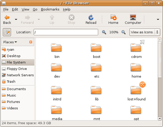
I don’t believe I’ve ever seen a perfect directory structure on an operating system, but there are some that are better than others. As an example of this, here’s a list of some of the more important Linux root directories: bin, boot, dev, etc, home, mnt, opt, sbin, usr, and var. And if this were Windows Vista: Boot, Program Files, Program Data, Users, and Windows.
The problem I have with the Ubuntu directory structure is that the locations of very few things are obvious. Firefox for example is in /usr/lib/Firefox, while on Windows it would be in /Program Files/Firefox. Why /usr/lib/? I have no idea. There’s a logical reason for that placement, but there’s absolutely nothing intuitive about it. Microsoft is no saint here (how many things are in /Windows and /Windows/System32?) but at least the location of user installed programs is completely and utterly obvious: Program Files. And if we’re on Mac OS X it’s even easier, /Applications. This all adheres to a standard, the Filesystem Hierarchy Standard, but that just means the standard is just as confusing.
Thankfully, and to be fair, there’s little reason to be going through the entire contents of the OS partition looking for something, but If you ever need to do so, it can be a frustrating experience. Ubuntu would benefit greatly by using a more intuitive structure, something that I’m convinced is possible given that Apple has pulled this off with Darwin, which also has the *nix directory structure, but avoids it as much as possible. I’d also like to see user data kept in /users like Windows and Mac OS X rather than /home, but Rome wasn’t built in a day… There is much room for improvement here.
Wrapping things up, when I first started with Ubuntu I did not have very high expectations as far as usability was concerned. I expected Ubuntu to be functional, but not necessarily exceptional – GUI design is an ugly and hard job, just how good could it be on a free OS? For all the reasons I like Mac OS X I can’t sing high praises about Ubuntu’s GUI or usability, but it surpassed my initial expectations. Other than the icon issue, there are no glaring flaws in Ubuntu’s GUI or the usability thereof. It’s not a revolutionary or even evolutionary GUI, but it does come off as a very solid facsimile of Windows XP with a few unique quirks and the eye-candy of Vista and Mac OS X thrown in, and that’s something I’m satisfied with. And a satisfactory GUI is not a bad thing, it’s quite an accomplishment given just how difficult GUI design is.
As an aside, I’m not a big fan of the default orange/brown color scheme for Hardy. It can be changed easily enough although I’ve always thought they could do better for a default scheme. I hear 9.10 may finally do away with orange, so we’ll see what we get in Ocotober.


195 Comments
View All Comments
ultraseksy - Tuesday, March 13, 2012 - link
i agree this is a brilliant site with lots of great content which i love thanks<a href="http://www.sendfreetext.info">send free text</a>
<a href="http://www.myplussizelingerie.co.uk">plus size lingerie</a>
<a href="http://www.uktrollbeads.co.uk">uk troll beads</a>
ultraseksy - Tuesday, March 13, 2012 - link
http://www.sendfreetext.info send free texthttp://www.myplussizelingerie.co.uk plus size lingerie
http://www.uktrollbeads.co.uk uk troll beads
juweliefol - Tuesday, April 24, 2012 - link
8.04 is a long LTS release, still there are lots of people are using.http://www.elegantpark.co.uk/wedding-dresses/a-lin...
xinxin - Friday, August 31, 2012 - link
If this article was a private work of the author to provide him an answer on whether he may or may not move to Linux, people should advise him the above mentioned. As for an article intended to be read by thousands it must be pointed out that it's conclusion is a miss lead.It is really nice.http://www.shortweddingdressus.com">http:/...http://www.shortweddingdressus.com
xinxin - Friday, August 31, 2012 - link
Nice website.I wish more works.http://www.shortweddingdressus.com