Gigabyte GM-M8000 Mouse - A GHOST Story
by Gary Key on June 15, 2009 3:00 PM EST- Posted in
- Smartphones
- Mobile
I have to preface our article today with the fact that I tend to gravitate to Logitech mice for all of my needs; well not all of them, but that is another story. At this time, we have a bevy of G5, MX518, and MX510 mice spread throughout the labs. In fact, I use the Logitech MX Revolution on my primary work machine and the G5/MX518 products at home. However, I tried a G9 and just did not like it based on how it felt in my hand, but the hardware capabilities were great. I know others that swear by it or various RAZER models, but I tend to prefer the G5 shape. My kids prefer a couple of products from RAZER for gaming and every day use, but overall we are mainly a Logitech family when it comes to mice.
That said, I used the Gigabyte GM-M8000 for the past two weeks in all our benchmark testing and at home. I have to say, this mouse has grown on me in that time. Does this mean it will replace my Logitech units, maybe, maybe not, so let me explain my fence straddling.
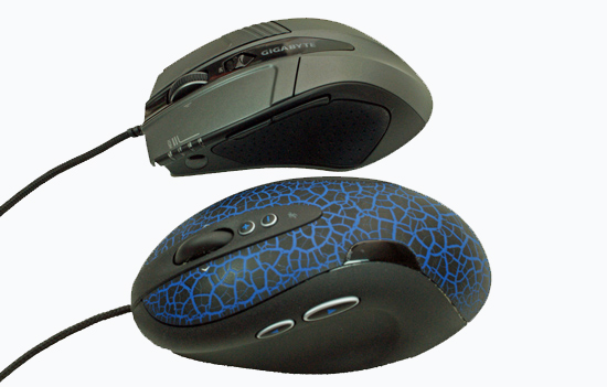
Gigabyte is targeting the Logitech G5 as their primary competition in the gaming market with both priced at $49.99 at most e-tailors. The two mice feature similar dimensions, button placement, and overall weight. First off, the GM-M8000 is also tailored for right hand users only.The Gigabyte leads on specifications with 4000 dpi laser engine compared to 2000 dpi on the Logitech. The Gigabyte ships with a 38-gram weight kit compared to 36 grams on the G5. Gigabyte also allows default dpi on-the-fly adjustments of 800, 1600, 3200, and 4000 compared to 400, 800, and 2000 on the G5. But on the G5, you can also add two additional on-the-fly DPI adjustments utilizing the SetPoint software package. Both feature the ability to customize the dpi sensitivity and utilize those settings via the control buttons.
On the software side, the GM-M8000 offers 30 different functions for each of its three buttons (wheel button offers right/left side scroll options for function control) along with three different profiles. The G5 offers the same button/scroll wheel options but with 21 different functions per button assignment. However, the G5's DPI buttons are fully customizable compared to the fixed function on the Gigabyte mouse.
The GM-M8000 features full Macro capability for the five button assignments compared to Keystroke assignments on the G5. Both mice allow the user to set DPI sensitivity on the X and Y-axis separately along with USB report rates. The one advantage that Logitech has is their game detection and profile setup that will automatically configure the mouse with standard button options for a variety of games or you can tailor basic hardware settings per game.
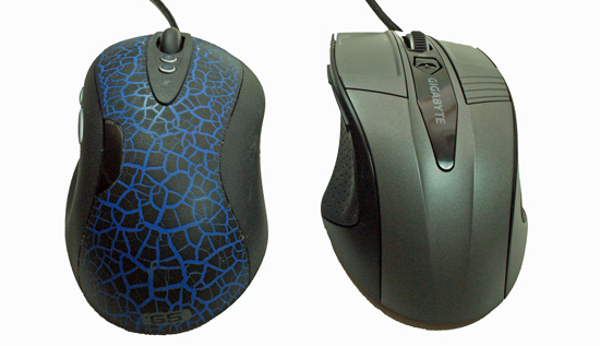
The GM-M8000’s most prominent design feature is its sloped arc and recessed thumb area. The design feels very comfortable for those with average sized or smaller hands. Both sides of the mouse feature a large area molded with a rubber grip that has a nice (almost expensive) tactile feel to it. While the number of buttons first appears to be minimal, the layout design conceals the fact that there are eight available button/wheel choices.
The user can configure the horizontal capable
scroll wheel as three buttons (left, center, right). Two additional configurable buttons are
located on the left side and a single button on the right side. The single button on the right side is not
configurable as it allows the user to switch between the three different mouse
profiles with each profile having its own color; red, green, or blue. The right and left click buttons are not
configurable. < /p>
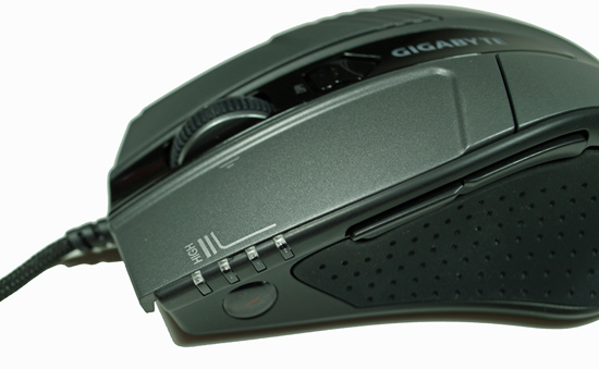
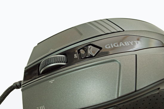
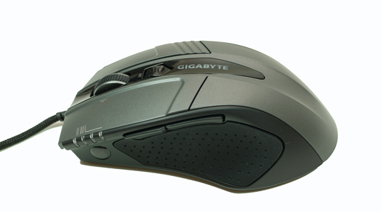
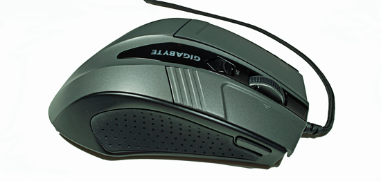
The GM-M8000 features the capability to set dpi sensitivity on the fly as discussed previously. The button utilized for this function is located on top of the mouse in an ideal spot. The indent action required is almost perfect for changing each of the four steppings. The 4-degree LED indicator shows the current sensitivity setting.
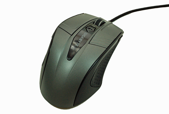
The overall design of the GM-M800 allowed our hands to fit comfortably in most situations and we never experienced any fatigue or pain over long stretches of game play, Lightwave 9.6, or Photoshop CS4 work. However, those with larger hands will find this mouse smallish compared to the G5. I also thought at times the mouse was too small and the reason being is the tapered rear section of the mouse. The G5/MX518 series fits my palm perfectly and allow me to push the mouse without a thought when required. The GM-M8000 required me to use more of claw hold on it, something I eventually became use to and eventually I did not even think about it.
About the only other ergonomic item mentioning is the first side button (number 4) is placed just a little too forward for most hands. We found forward section of the GM-M8000 containing the right and left click buttons is sloped dramatically (seems to be the standard design style now) but its design ensures a relaxing position for the hand. The tactile feedback when clicking the right and left buttons was very good in our opinion. We liked the motion of the scroll wheel on the G5 better but Gigabyte’s range of motion and gating is more than acceptable for most users. Overall, It is obvious that Gigabyte placed a lot of thought into the shape, quality of materials, and overall mechanical operation of the mouse.
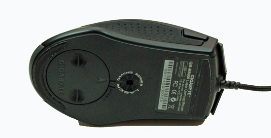
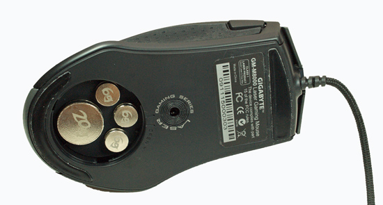
The bottom of the GM-M8000 is ordinary, really, what else would one be expecting besides someone hawking their signature. There are two low-friction Teflon based feet designed to reduce resistance and improve gliding across most surfaces. We found Gigabyte’s feet material allowed the GHOST to glide across our mouse pad or desktop surface just as easy as the Logitech offerings. The user can quickly remove the weight and once removed reveals four slots for the included 38-gram weight kit. We ended up using all 38 grams in testing as we typically like a well grounded mouse. The last area of interest is the sensor opening for the laser sensor. Rated at 4000 dpi, which double that of the G5’s 2000, it proved to be very accurate and flexible in everyday use. We enjoyed the ability customize the dpi as we switched from Call of Duty 4 to Photoshop during testing.


44 Comments
View All Comments
Samus - Tuesday, June 16, 2009 - link
I love my corded OCZ Equalizer. It also cost less than 20 bucks and has been blinking along that lonely mousepad trail for years.cosmotic - Monday, June 15, 2009 - link
Are you serious? It's hideous! Why are they custom painting their driver window? You should not be reinforcing this sort of crap behavior.teohhanhui - Tuesday, June 16, 2009 - link
Logitech does that too...mindless1 - Monday, June 15, 2009 - link
Does that REALLY matter?aeternitas - Monday, June 15, 2009 - link
Some people like their UIs to be standardized. I for one agree. Im getting sick of utilities that think they are unique by giving me a hideous UI.It doesnt effect crucial things, but it DOES matter.
ahmshaegar - Tuesday, June 16, 2009 - link
Even Microsoft doesn't standardize their UI; why should Gigabyte?niva - Tuesday, June 16, 2009 - link
Umm... actually they do, everything in the windows OS has a generic look and feel ranging from explorer to the admin tools. I totally agree with this comment, Asus does the same crap too (example: the asus update utility.) I'm all for allowing apps to be skinned but they should come with a default skin that utilizes the OSs selected look and feel. If you're going to skin something by default at least do a good job at it.MamiyaOtaru - Tuesday, June 16, 2009 - link
They do? Media Player and Office spring to mind immediately as apps that don't match the others.aeternitas - Wednesday, June 17, 2009 - link
WMP and Office are consistent with what they are doing and with the general Vista pioneered UI. When you up a window to open up a file, you dont see a bullshit Win 3.1 menu system pop up. You see a standardized and easily manageable windows from the MS framework.Stop arguing, you're wrong.
ahmshaegar - Tuesday, April 27, 2010 - link
A year later! I'm baaack!And that last comment was highly unnecessary. Boo hoo. But anyway...
Let's dig into your comment. You said something about consistent for what they are doing. Well, okay, but I was under the impression we were talking about consistency with Windows (meaning consistency with Explorer, the Windows file manager.) So I'm not sure what consistency for what they are doing means. You also mention they're consistent with Vista. I'm not aware of Vista making use of Ribbons extensively. And then you bring up Windows 3.1-style dialog boxes. What does that have to do with anything?
"You see a standardized and easily manageable windows from the MS framework." Okay. But if you grew up with Windows 3.1, that would be easily manageable. And Windows 3.1 was standardized, too, to some extent. And since it's a Microsoft product, wouldn't it also be some kind of "MS framework"?
Moving on....
We have Windows Explorer (by that, I mean the file manager.) We have Office. We have WMP. We have many random applications. In general, if you run some random old application, it's going to look like Windows Explorer.
Of course Office is generally internally consistent, and so is WMP. But the point is that Office is not consistent with Windows. Now, I haven't used the latest versions of Office, (can't afford it, so I'm stuck with OpenOffice) but I am aware it uses that Ribbons interface or whatever they call it. I think some other apps use ribbons... Paint? But the point is it's not consistent with Explorer.
So Office is its own program, if you will, and so is this mouse driver. The mouse driver is not consistent with Explorer, and neither is Office. In that sense, they're not consistent.
On the other hand, if you want to change the boundaries of the argument and say that Office is internally consistent with itself, then I guess we'll just have to say this mouse driver is internally consistent with itself.
But let's forget about consistency for a moment. I couldn't care less if all my apps are consistent, because certain specialized apps may require a different UI paradigm for maximum efficiency. If the UI allows me to work better, then I'm all for it. Of course, the tradeoff is a learning curve, but life is full of those. Unfortunately, I can't argue that this UI is better.
Basically, think Media Center. Explorer and other desktop applications are designed for use at a desk, or at least on a computer monitor. The user's eyes are generally no more than half a meter away. Media Center is for use on a TV, so of course the interface is different (and not consistent with the rest of Windows.)
But the argument was merely about consistency, and on that point, we have Office and WMP differing from Explorer (the file manager) for reasons that are debatable, and Media Center differing from Explorer for good reason.
Anyway, I'm aware nobody is ever going to read this comment, but it had to be posted.