BenQ E2200HD and E2400HD - 1080P FullHD LCDs
by Jarred Walton on November 4, 2008 5:00 AM EST- Posted in
- Displays
Brightness and Contrast Ratio
For the brightness (luminance), contrast, and color accuracy tests, we depend on a hardware colorimeter and software to help calibrate the displays. We use a Monaco Optix XR (DTP-94) colorimeter and Monaco Optix XR Pro software, and we also test with ColorEyes Display Pro. Results in nearly every case have been better with Monaco Optix XR Pro, so we only report the ColorEyes Display Pro results on the monitor evaluation pages. We'll start with a look at the range of brightness and contrast at the default LCD settings while changing just the brightness level. (In some cases, it will be necessary to reduce the color levels if you want to achieve a more reasonable brightness setting of 100-120 nits.)
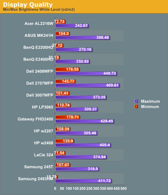
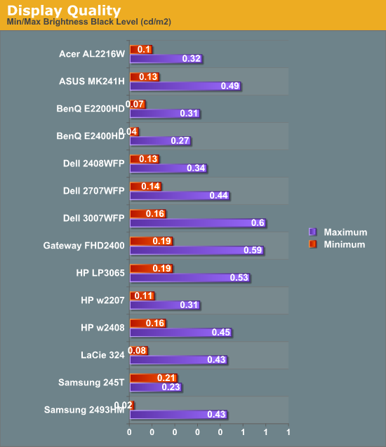
The two BenQ LCDs have a maximum brightness level of 250-270 nits, which is more than sufficient and is actually brighter than what most users prefer to use in an office environment. If you want to reach the advertised 300 nits brightness setting, you will need to adjust contrast and/or color levels as well. Minimum brightness at default settings is 30-50 nits, so there's typically no need to fiddle with color levels.
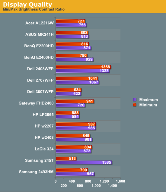
More important than the luminosity is the contrast ratio that is achievable at the various brightness settings. Depending on setting, we measured a contrast ratio of 780~930 with these LCDs. While higher scores are better, in reality anything above 700 is more than sufficient for most users. The Dell 2408WFP tops our charts, but this is mostly a victory of marketing numbers. Also, we wouldn't worry about any advertised dynamic contrast ratio numbers -- at least not if you want consistent colors.
Color Gamut
We've already shown color gamut for the LCDs, but here's a chart showing how the LCDs stack up against each other. We use Gamutvision, a utility developed by Imatest LLC to calculate color gamut. We compare the color profiles of the LCDs to the Adobe RGB 1998 color profile and report the results as a percentage.
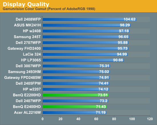
So far, color gamut has generally fallen into one of two categories: either +/-95% or +/-75%. The BenQ E2200HD and E2400HD target the budget market, so it's not too surprising that color gamut is lower than many competing models. However, it's important to keep things in perspective: these results may seem very low, but if you are using the standard sRGB profile (Windows' default) these LCDs look fine. It's only in applications like Adobe Photoshop with its improved color space that you begin to notice a difference between the displays.
Power Requirements
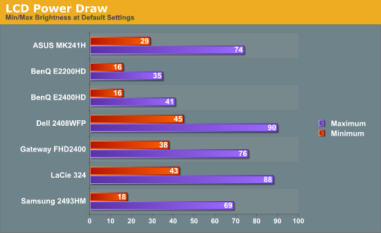
We also look at power requirements, but we've changed our testing procedure somewhat since previous article. Minimum power requirements are going to depend largely on how dim the backlight is at the minimum setting, so a display that only puts out 16 nits at minimum brightness should logically use less power than one that puts out 50 nits. Since very few people will run an LCD at less than 100 nits, we tested at that level, as well as our standard 200 nits that we use for calibration, and finally at maximum brightness setting using default color and contrast settings. Since we changed testing procedures, we don't have equivalent information for any other LCDs yet, so we included a chart showing min/max power draw as well (our previous power test). We will report the new results in a table, along with brightness and contrast ratio information at the various settings.
| Power, Brightness, and Contrast Levels | ||
| BenQ E2200HD | BenQ E2200HD | |
| Maximum Power Draw | 36W | 41W |
| Maximum White | 270.16 | 250.92 |
| Maximum Black | 0.31 | 0.27 |
| Maximum Contrast | 871 | 929 |
| Calibrated Power Draw | 29W (66%) | 34W (73%) |
| Calibrated White | 199.3 | 199.23 |
| Calibrated Black | 0.23 | 0.22 |
| Calibrated Contrast | 867 | 906 |
| Print Power Draw | 20W (20%) | 24W (30%) |
| Print White | 100.03 | 99.34 |
| Print Black | 0.11 | 0.11 |
| Print Contrast | 909 | 903 |
Looking at just the two BenQ LCDs, it's no surprise that the larger E2400HD consumes slightly more power. Perhaps more interesting is that many old 20" CRTs could draw 100W or more and only attain a brightness level of ~120 nits. That's one more reason we prefer LCDs (along with a lot less strain on our backs when moving displays around). Even at maximum brightness, the BenQ displays both use less power than the other LCDs we've tested, but those displays may have been brighter so we can't make any definite conclusions about "greenness".


33 Comments
View All Comments
10e - Tuesday, November 4, 2008 - link
Keep in mind, that if you set 1:1 pixel mapping on your video card whether ATI or nVidia, both of these monitors will display 1:1 with black borders. 1680x1050 works perfectly as do other resolutions. To me this is the only reason you need 1:1 pixel mapping, and if the monitor supports it, it's not a big issue if it is not explicitly stated in the menus.A PS3 is a good benchmark here, and if the monitor was set to 1:1 you would get a full screen XMB/dashboard, and most games, running at 720p would display a tiny image with large black borders elsewhere. This is why proper aspect ratio scaling is important.
Additionally, for the seldomly used 480p resolution, the monitor can simply be set to stretch to full screen so that this content is displayed at proper aspect ratio.
I would say 1:1 pixel mapping in all cases is more useful for 16:10 monitors as opposed to 16:9.
wicko - Tuesday, November 4, 2008 - link
One problem I've had with TN panels is that under certain conditions in a game I've noticed a strange artifacting appear. It is most obvious under Source engine games, like Lost Coast, HL2, CS:S, but also noticeable in other games and even in movies. In the game, to reproduce it all you have to do is look at the sky and move the mouse around at varying speeds, and pay attention to the clouds. I noticed this magenta colouring appear in the silhouette of the cloud in the position it used to be, and then it will quickly disappear. Sometimes its other colours, it depends on whats being displayed. I've noticed this in movies (in the latest Bourne movie with the fight where he pistol whips the guy in the end) and in games. I think it was really bad in Quake 4, the part where you're launched into the air in a pod, and fog is rushing past, you can see a strange discolouring going on. Not sure what this is called, I haven't been able to find any info about this. I've noticed it with 3 different monitors with TN panels (a year or two ago) and since I've bought an LG panel with 5ms response time (not sure which panel) I haven't been able to reproduce it. Can anyone tell me what that artifacting is called, and do these new BenQ monitors have the same issue?JarredWalton - Tuesday, November 4, 2008 - link
It may have simply been an issue where the transitions between colors ended up with some image persistence that looked weird. You can see in the lag/response time images that there's an afterimage on moving objects, which ends up being half way between what was there last frame and what will be there in the next frame. It's likely that in some instances the half way point looks magenta.Some people call this "smearing", others "ghosting", or "motion blur". I call it image persistence I guess.
wicko - Tuesday, November 4, 2008 - link
I think this is a little different. I've seen ghosting before, and I was under the impression that low response time monitors don't have that issue. You only see this situation occur with certain colours, otherwise its completely unnoticeable.JonnyDough - Wednesday, November 5, 2008 - link
Whatever you choose to call it, in my experience 5ms or < = none of it. On 8ms monitors it is still noticeable. My advice when buying a monitor is to shoot for integrated no speakers, HDMI, 1080P, matte finish on the screen and bezel, and at a 2ms response time. Also, anything under 21.5" is a waste of time in my opinion. A 19" or 20" monitor will suit many people just fine. I use Samsung Monitors and I think they're fantastic. I have the 204B and the 215tw, both of which have served me well with only one dead pixel in 4 yrs. I got the 20" for gaming with a 2ms response time, and the 22" (8ms response time) because it has component jacks. The only downsides are that I bought them as HDCP and HDMI were just coming into fruition, and that the 215tw has some worthless speakers which not only contribute to a rise in the cost of the product, but the weight and size of it too.wicko - Wednesday, November 5, 2008 - link
Like i said, I've only seen this occur with 2ms panels. 2 of them were samsung (I can't remember what the models were) and another was the Viewsonic Vx922 (although there was considerably less of that happening to the VX922, a much higher end panel than the samsungs). On the LG, a 5ms panel, I haven't noticed this problem, which leads me to believe that its *not* ghosting. I've seen ghosting before. The whole screen kind of slides around, and its more obvious in darker areas. However, this only happens with certain colors, as far as I could tell, and they were all light colours.MadMan007 - Wednesday, November 5, 2008 - link
The ms ratings of monitors is pretty often bs anyway. The overdrive required to get the fast speeds you mentioned can be done well or poorly, it sounds like the ones that had the problem were done poorly.Gizmonty - Tuesday, November 4, 2008 - link
I bought an E2400HD about a month ago (in Australia) and it came with a DVI cable as well as a VGA cable. I've been very happy with it.Slash3 - Tuesday, November 4, 2008 - link
Regarding the lack of 1:1 mapping, it can still come in quite handy for people who sometimes play older games, which commonly supported resolutions no higher than 1280x1024. With 1:1 mapping, this would result in a very close vertical fit, as intended (albeit with the unavoidable black bars on the left and right). Having to stretch the image to what amounts to 28 pixels in each direction (up and down) will result in reduced image quality with no perceived gain in size. This won't affect all users, but it is certainly a feature which separates the quality displays from the budget models.For 1280x720 content, scaling to fit is the obvious solution, as the aspect ratio is unchanged. That said, it's always nice to have the option. Sometimes, the pixels should only go where they're intended to be.
JarredWalton - Tuesday, November 4, 2008 - link
Agreed... which is why I list it, but at the same time it's not quite as critical as getting the AR correct with stretching (at least if the user asks for it). 1:1 is just a nice extra, which is becoming less necessary as time goes by. If it's there, though, bonus points. :)