Acer AL2216W: a worthwhile compromise?
by Jarred Walton on March 10, 2007 3:00 PM EST- Posted in
- Displays
Printing Results
Brightness and Contrast Ratio
Using the standard calibration procedures works well if you only plan on using your computer with online data. In fact, you can generally set what ever brightness and contrast levels you want and then let the calibration software adjust the color profile as appropriate (although depending on the display certain settings will produce more or less accurate colors). However, many image professionals also have a need to match colors between their computer displays and their printers, and what works well for computing purposes often isn't the best suited for doing print related work. To help people who work in such areas match their computer colors to their paper colors better, some standards were established. Generally speaking for print work the standard is a gamma of 2.2 (some people recommend 1.8, but we'll use 2.2), a black point of 0.60 cd/m2, and a white point of 100 cd/m2.
Finding the appropriate settings to reach these levels can be a time-consuming process. Numerous iterations through the calibration process are required in order to end up with the desired white point, and on some LCDs it might not even be possible to reach a satisfactory result. We were unable to get both an accurate white point and an accurate black point according to printing requirements (our black levels always ended up darker than they were supposed to be) but eventually we did manage to get the desired 100 cd/m2 white point on all of the tested displays. This required adjusting the individual color levels on most of the displays (the Dell 3007WFP doesn't give this option). Here are the settings we ended up using for these monitors:
Dropping just the brightness on the Gateway FPD2485W and Dell 2407WFP did not reach the required white point, in the case of the former not by a long shot. We also found that dropping the brightness level to zero and then further reducing the color levels did not generate desirable results. We were most successful when we set the color levels to a moderate value and then tweaked the brightness and color levels as necessary to get the desired result. Here's how the brightness and contrast ratios changed with these tweaks.
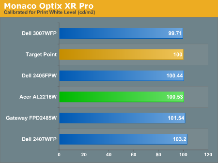
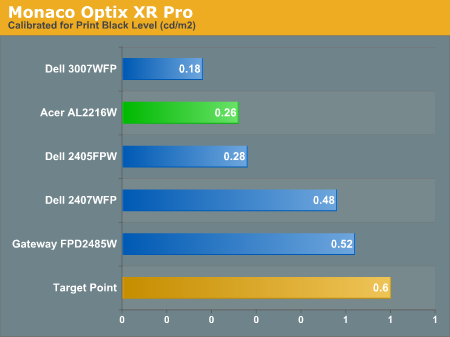
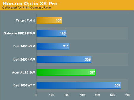
We were not attempting to get 100% accuracy on the white point, but further tuning of the various displays would have likely made it possible to get closer to 100 cd/m2. The primary goal was to merely get the white point down to close to 100 cd/m2 if possible. The target black point on the other hand is much more difficult to achieve once we have reached the target white point. Due to the reduced brightness level, contrast ratios are lower, but that is expected with print material. For reference, we have included the target values in the above graphs, so the greater the deviance of the display from the targeted value, the less suitable for display becomes for print work. Having calibrated the displays for printing, let's see how they actually fare.
Color Accuracy
Given the importance of accurate colors for printing work, we have adjusted the Delta E scale appropriately. A Delta E of less than 1.0 is definitely the goal here, and 1.0 to 2.0 is merely acceptable. Scores above 2.0 basically mean that the display is not fit for printing professionals.
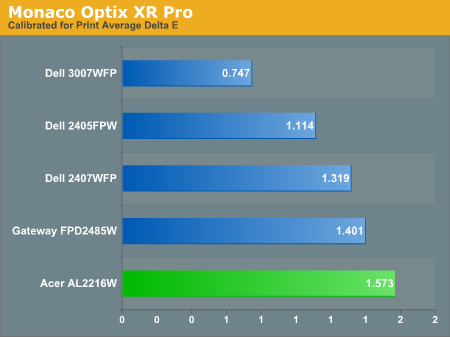
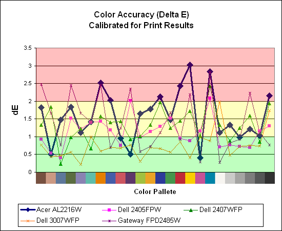
Again the Acer AL2216W is the lowest score in this grouping, but we were somewhat surprised with the results we were able to achieve with all of these monitors. With default brightness levels seemingly increasing with every display generation, we weren't sure we'd be able to come anywhere near the desired colors at such a low white point.
The Acer and Gateway displays took the most time to properly calibrate, as it was necessary to spend a lot more effort tweaking the individual colors. Given how bright the Gateway FPD2485W is by default, we were happy to find that customizing the color levels allowed us to reach a more or less acceptable level. While the Acer and Gateway still place at the bottom of the pack in terms of printing color accuracy, they're at least somewhat close to the 1.0 threshold. The Dell 3007WFP is clearly the best out of these displays for printing work, with a very low average Delta E and only two individual scores (pure white and pure black) that were above 1.0 (and still below 2.0).
Brightness and Contrast Ratio
Using the standard calibration procedures works well if you only plan on using your computer with online data. In fact, you can generally set what ever brightness and contrast levels you want and then let the calibration software adjust the color profile as appropriate (although depending on the display certain settings will produce more or less accurate colors). However, many image professionals also have a need to match colors between their computer displays and their printers, and what works well for computing purposes often isn't the best suited for doing print related work. To help people who work in such areas match their computer colors to their paper colors better, some standards were established. Generally speaking for print work the standard is a gamma of 2.2 (some people recommend 1.8, but we'll use 2.2), a black point of 0.60 cd/m2, and a white point of 100 cd/m2.
Finding the appropriate settings to reach these levels can be a time-consuming process. Numerous iterations through the calibration process are required in order to end up with the desired white point, and on some LCDs it might not even be possible to reach a satisfactory result. We were unable to get both an accurate white point and an accurate black point according to printing requirements (our black levels always ended up darker than they were supposed to be) but eventually we did manage to get the desired 100 cd/m2 white point on all of the tested displays. This required adjusting the individual color levels on most of the displays (the Dell 3007WFP doesn't give this option). Here are the settings we ended up using for these monitors:
| Calibrated for Print Settings Gamma 2.2, White 100 cd/m2, Black 0.60 cd/m2 |
|||||
| Acer AL2216W | Gateway FPD2485W | Dell 2405FPW | Dell 2407WFP | Dell 3007WFP | |
| Brightness | 80 | 100 | 50 | 100 | 25 |
| Contrast | 80 | 100 | N/A | N/A | N/A |
| Red | 40 | 32 | 7 | 49 | N/A |
| Green | 39 | 32 | 10 | 50 | N/A |
| Blue | 39 | 32 | 11 | 46 | N/A |
Dropping just the brightness on the Gateway FPD2485W and Dell 2407WFP did not reach the required white point, in the case of the former not by a long shot. We also found that dropping the brightness level to zero and then further reducing the color levels did not generate desirable results. We were most successful when we set the color levels to a moderate value and then tweaked the brightness and color levels as necessary to get the desired result. Here's how the brightness and contrast ratios changed with these tweaks.
We were not attempting to get 100% accuracy on the white point, but further tuning of the various displays would have likely made it possible to get closer to 100 cd/m2. The primary goal was to merely get the white point down to close to 100 cd/m2 if possible. The target black point on the other hand is much more difficult to achieve once we have reached the target white point. Due to the reduced brightness level, contrast ratios are lower, but that is expected with print material. For reference, we have included the target values in the above graphs, so the greater the deviance of the display from the targeted value, the less suitable for display becomes for print work. Having calibrated the displays for printing, let's see how they actually fare.
Color Accuracy
Given the importance of accurate colors for printing work, we have adjusted the Delta E scale appropriately. A Delta E of less than 1.0 is definitely the goal here, and 1.0 to 2.0 is merely acceptable. Scores above 2.0 basically mean that the display is not fit for printing professionals.
Again the Acer AL2216W is the lowest score in this grouping, but we were somewhat surprised with the results we were able to achieve with all of these monitors. With default brightness levels seemingly increasing with every display generation, we weren't sure we'd be able to come anywhere near the desired colors at such a low white point.
The Acer and Gateway displays took the most time to properly calibrate, as it was necessary to spend a lot more effort tweaking the individual colors. Given how bright the Gateway FPD2485W is by default, we were happy to find that customizing the color levels allowed us to reach a more or less acceptable level. While the Acer and Gateway still place at the bottom of the pack in terms of printing color accuracy, they're at least somewhat close to the 1.0 threshold. The Dell 3007WFP is clearly the best out of these displays for printing work, with a very low average Delta E and only two individual scores (pure white and pure black) that were above 1.0 (and still below 2.0).


32 Comments
View All Comments
kmmatney - Saturday, March 10, 2007 - link
I have the display and am happy with it. While I could easily nitpick away at various details, it's a great LCD at the $300 price point. However if I was buying a 22" TN display now, I'd go for the Dell 22" model. It has a much nicer stand, and looks better overall.rqle - Saturday, March 10, 2007 - link
Excellent setup on the viewing angle!