Gateway FPD2485W: 24" LCD Beauty or Beast?
by Jarred Walton on February 22, 2007 10:00 AM EST- Posted in
- Displays
Brightness and Contrast Comparisons
As this is our first display review in quite some time, we don't have a large backlog of results with which to compare new displays. Given that many people are familiar with Dell's older 2405FPW we decided to provide results from our 18 month old Dell LCD for comparison. While we have heard of users that are experiencing backlight fade or other problems on older displays, our 2405FPW continues to perform admirably. We'll start by looking at brightness levels and contrast ratios.
For testing, we used a Monaco Optix XR (DTP-94) colorimeter on the hardware side. For software, we used Monaco Optix XR Pro. The software and hardware is relatively easy to use and helps users to fine tune their displays. We did find that the instructions tend to be a bit aggressive in terms of setting the contrast ratio, however, as we achieved better results by setting the Gateway LCD to a 60% contrast ratio instead of the 100% that was recommended.
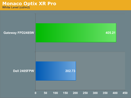
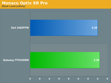
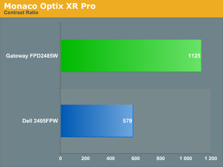
Theoretically, you want your whites to be brighter and your blacks to be darker, and we have sorted the charts appropriately. Dividing the white point by the black point gives you the effective contrast ratio, with higher scores being better. The problem is, darker blacks are good but brighter whites are only good up to a certain point. Anything above 400 cd/m 2 is far too bright in our opinion. As you can see, the black levels of both the Gateway and Dell LCD are equal, so the Gateway LCD achieves better contrast ratios mostly by offering brighter whites. If you work in a well lit office environment, the Gateway system might be the better choice, but most users will likely end up running either LCD at similar brightness levels.
As this is our first display review in quite some time, we don't have a large backlog of results with which to compare new displays. Given that many people are familiar with Dell's older 2405FPW we decided to provide results from our 18 month old Dell LCD for comparison. While we have heard of users that are experiencing backlight fade or other problems on older displays, our 2405FPW continues to perform admirably. We'll start by looking at brightness levels and contrast ratios.
For testing, we used a Monaco Optix XR (DTP-94) colorimeter on the hardware side. For software, we used Monaco Optix XR Pro. The software and hardware is relatively easy to use and helps users to fine tune their displays. We did find that the instructions tend to be a bit aggressive in terms of setting the contrast ratio, however, as we achieved better results by setting the Gateway LCD to a 60% contrast ratio instead of the 100% that was recommended.
Theoretically, you want your whites to be brighter and your blacks to be darker, and we have sorted the charts appropriately. Dividing the white point by the black point gives you the effective contrast ratio, with higher scores being better. The problem is, darker blacks are good but brighter whites are only good up to a certain point. Anything above 400 cd/m 2 is far too bright in our opinion. As you can see, the black levels of both the Gateway and Dell LCD are equal, so the Gateway LCD achieves better contrast ratios mostly by offering brighter whites. If you work in a well lit office environment, the Gateway system might be the better choice, but most users will likely end up running either LCD at similar brightness levels.


77 Comments
View All Comments
Aquila76 - Thursday, February 22, 2007 - link
Chizow,Did you run the gradient test from xtknight's website (linked above)? I'm curious to see how yours fares. I handpicked a Dec '06 model from Best Buy, but it still borked that thing badly no matter what bright/cont/R/G/B etc. I had it set to. I got most of my settings from the thread over at , but none seemed to eliminate the transition issues / color accuracy for me. :(
chizow - Thursday, February 22, 2007 - link
Ok, I applied the color profile Jarred provided (thanks again!) and colors do look much better, a lot more like the 2407WFP out of the box. Ran the gradient tests in full and windowed mode. In windowed, there is no significant banding or gradients although there is some faint gradient lines and banding on the straight color strips at the transition between the corresponding 1st and 2nd blocks. Seem to be uniform vertically through the pattern although they're unnoticeable on the magenta strips.In full screen mode, the banding is more obvious but again, its limited to the lower dark areas and don't extend past the 3rd block. After the 3rd block, the transitions are flawless. I wish I ran these before I calibrated the settings to see if its my panel or the calibrated settings.
Unfortunately, it looks like these settings will only apply under WinXP.
Jarred did you change the OSD/EzTune settings at all? Also, if you're really bored, would you mind calibrating the panel using EzTune or the OSD? Lol, well was worth a shot at least. Thanks again for the help and review.
Aquila76 - Thursday, February 22, 2007 - link
Heh, somehow clipped the last phrase off....from the thread over at HardForums.
Aquila76 - Thursday, February 22, 2007 - link
WTF? I used a BRACKET H BRACKET and it hides the text?
Aquila76 - Thursday, February 22, 2007 - link
Sorry for all the quotes of myself.The first one should have ended with:
...the thread over at HardForums.
chizow - Thursday, February 22, 2007 - link
I haven't run any extensive tests, but I'll check out Xtknights later when I get home. The few tests I have run were just html-based static images, and I can honestly say I saw very little gradient issues on the 2 panels I had (DEC annd current JAN). Banding was another issue though and pretty severe depending on content, source resolution/quality, and colors etc. I'll have to look over the definitions to make sure they're not mutually exclusive, so I'll have to get back to you on that one.JarredWalton - Thursday, February 22, 2007 - link
Beware the open-bracket H close-bracket abbreviation used for a certain other site! :DWe use brackets for our pseudo-HTML, and that one just happens to correspond to turning on white text. It comes up now and then, but thankfully you figured it out before the thread was very long. LOL We had a thread a year or two back where about 20 people responded trying to figure out WTF happened to the text. I think a guy had posted a comment where he used {H} five or ten times, which only served to make things more difficult to "fix".
Aquila76 - Thursday, February 22, 2007 - link
Eeks. I'll have to keep that in mind! Another cool test on xtknight's site (www.lcdresource.com) is a Dark Grayscale test. It's in the same section as the gradient. Mine just showed all black unless I cranked the brightness up to eyeball-melting. Granted, this is difficult for any LCD to display properly due to the issue of backlighting.I think what really pushed me over the edge on this monitor is that the last few bands of the grayscale showed up on my HP L1706 at work and the gradient shows flawlessly on it. A ~$700 display beaten handily by a ~$150 display hurt much more than my wallet. That was the final deciding factor on my returning the Gateway. I don't know how they managed to screw up this panel so badly. AFAIK, the Dell and Samsung 24" (same panels) had this resolved before the Gateway was released.
JarredWalton - Thursday, February 22, 2007 - link
I believe my sample is an earlier run from around November, but I didn't notice any issues with PSU buzzing. Could be that the color banding was a result of the early run - I don't know for sure. As for settings, I set contrast to 60% and ended up with brightness at 61%. The color profile will of course vary somewhat from panel to panel, so I'm not sure how helpful providing my particular profile will be, but if you want to give it a look, here you go:http://images.anandtech.com/reviews/monitor/2007/g...">FPD2485W Calibrated Profile
Caveat Emptor! :)
chizow - Thursday, February 22, 2007 - link
Wow that was fast! thanks :) A lot of 2485W owners will be happy. I think a lot of people got the brightness/contrast settings similar to yours, but color accuracy is a whole different monster, like whack-a-mole almost. Solve one color problem only to make one much worst. For me, its like tuning a guitar. I know what doesn't sound right, I just don't know how to fix it. :) That profile should help a ton though, thanks again!