Gateway FPD2485W: 24" LCD Beauty or Beast?
by Jarred Walton on February 22, 2007 10:00 AM EST- Posted in
- Displays
Features - OSD
One of the more interesting aspects of this LCD is its On-Screen Display (OSD). Depending on how you intend to use the LCD, you may find yourself accessing the OSD infrequently or on a regular basis. If you use multiple inputs, you will use the OSD to select among the various connected devices. We definitely get the impression that Gateway was trying to make a "cool" OSD. Rather than having actual buttons, the right black border hides touch sensitive areas that light up when you press the menu option.
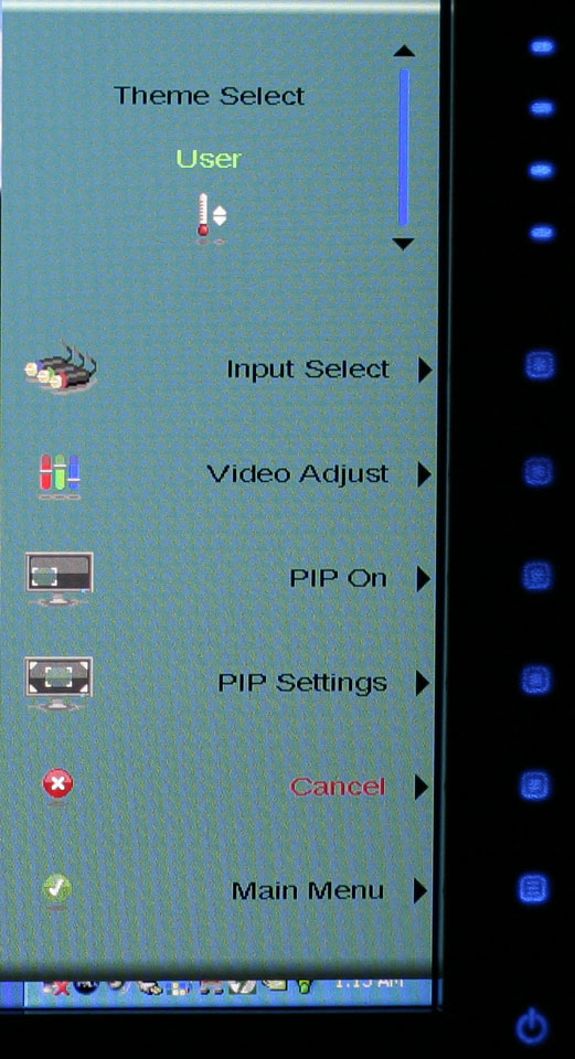
The initial press of the menu button brings up several quick access options to get you to the most commonly used areas. At the top is a "scrollable" area where you can select among several different color themes: movie, web, picture, game, warm, cool, and user. These options basically adjust the brightness, contrast, and color levels to preset values, with the exception of "user" which is for user-defined adjustments. The next four options provide quick access to input selection, picture in picture settings, and video adjustments. The bottom option takes you to the main menu, which is necessary in order to reach a few other areas.
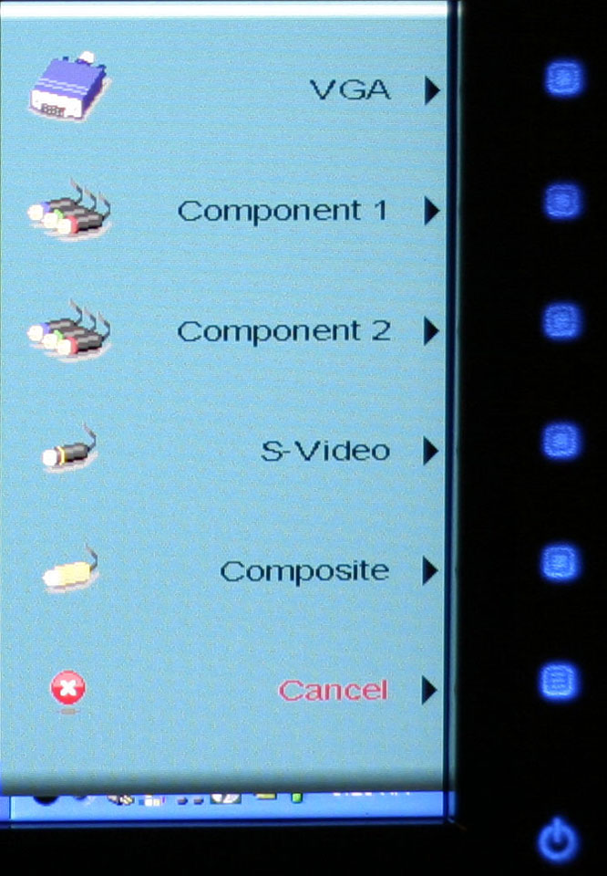
Choosing among the six available inputs is pretty simple. After exiting the Input Select option, you choose the appropriate input and you're done. The currently active input is not listed, which is why there are only five inputs shown - we used the DVI input for most of our testing. It's a bit odd that they don't simply put the sixth input in place of the Cancel option, however, so that all of the menu items would always be in the same position.
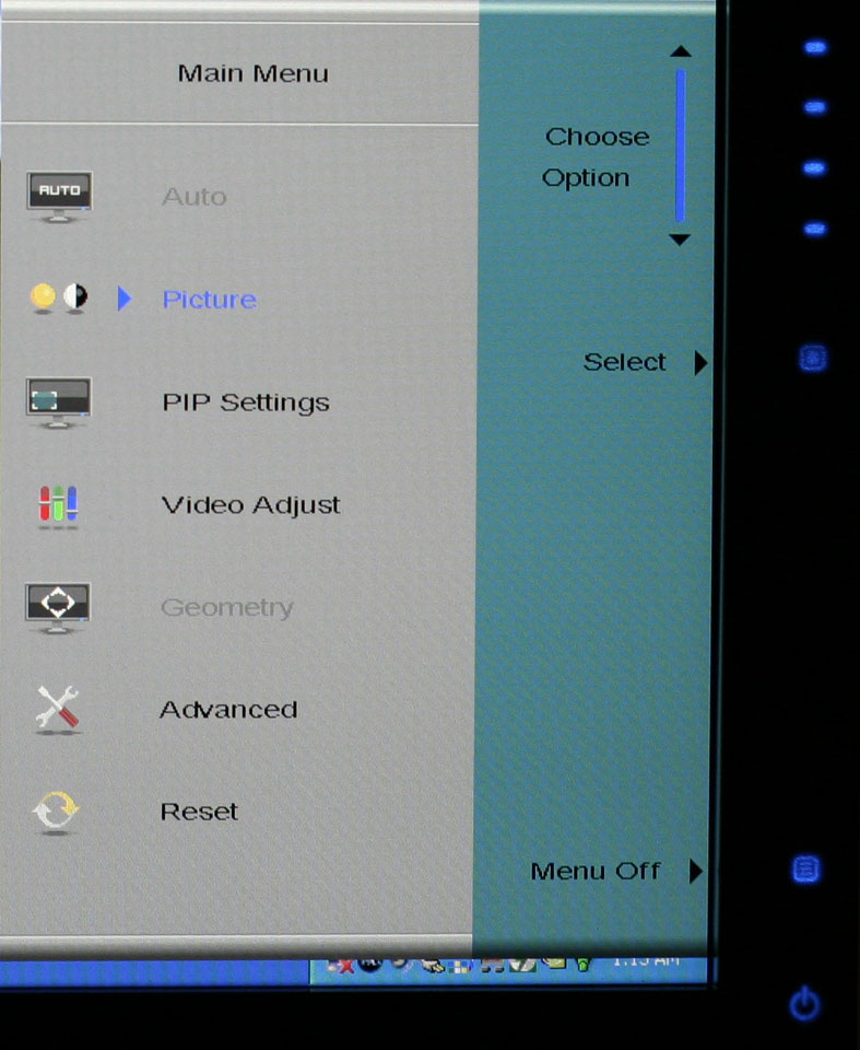
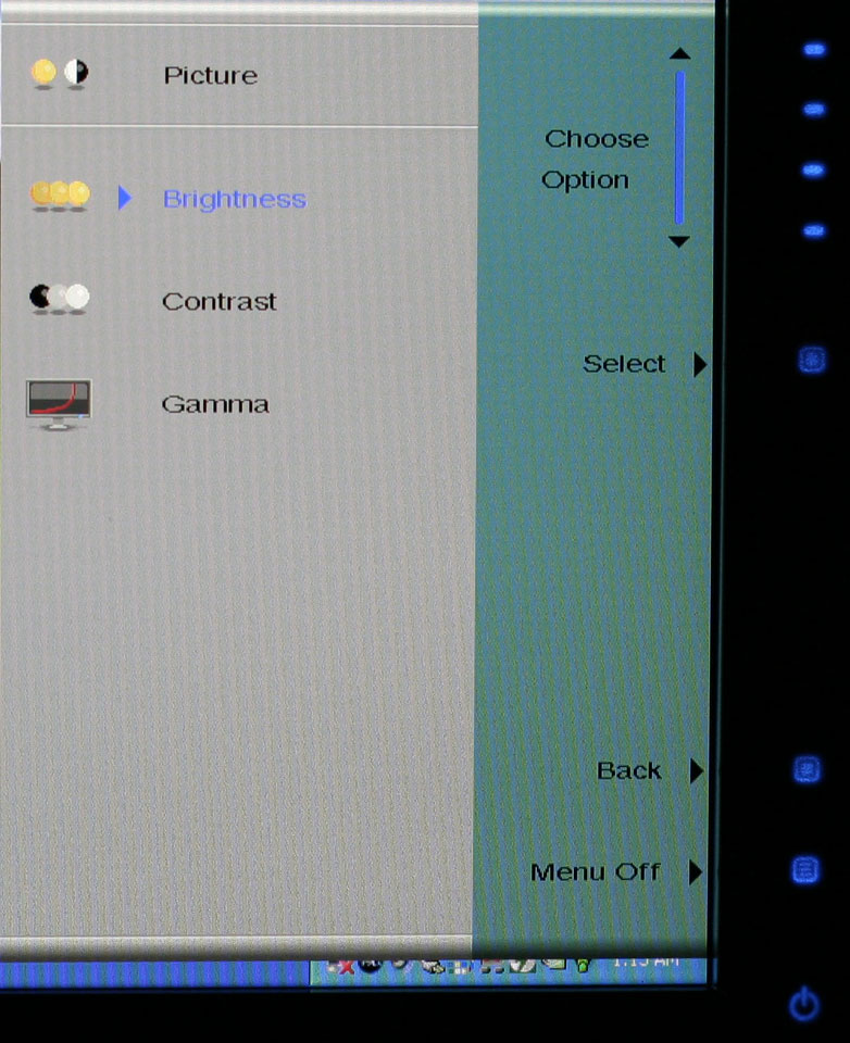
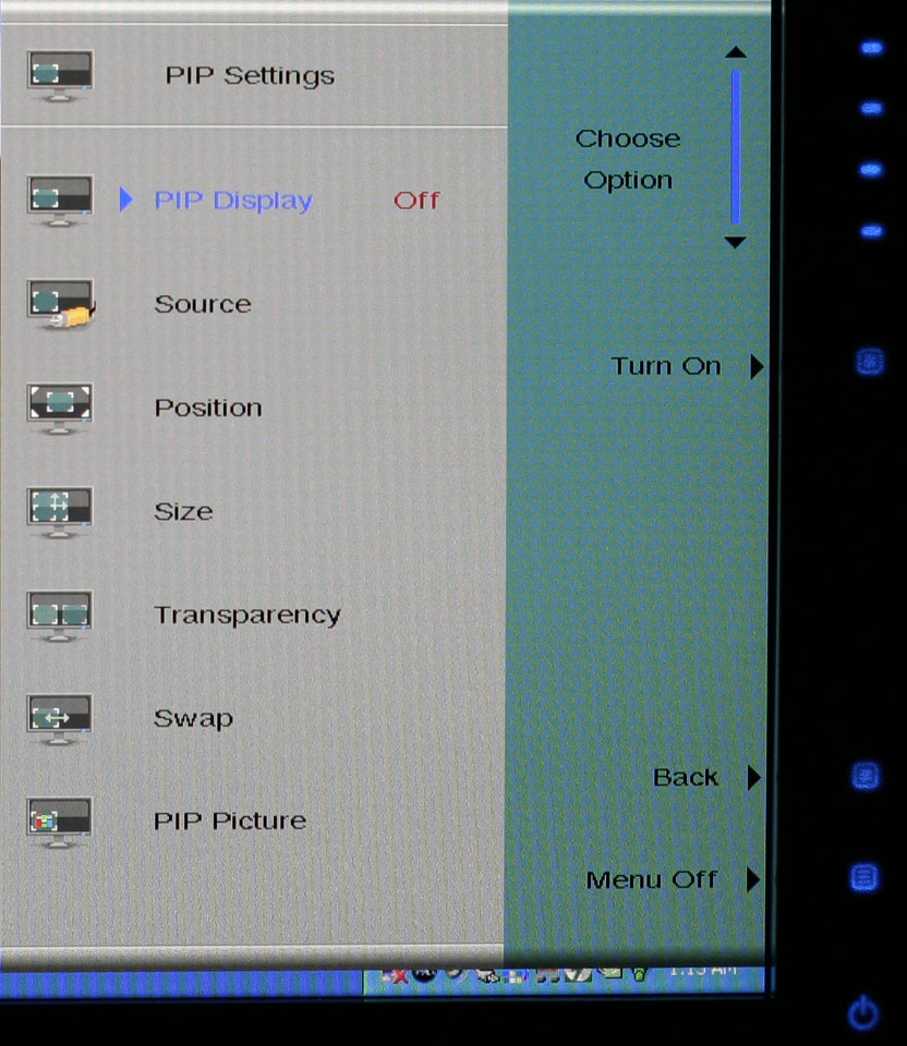
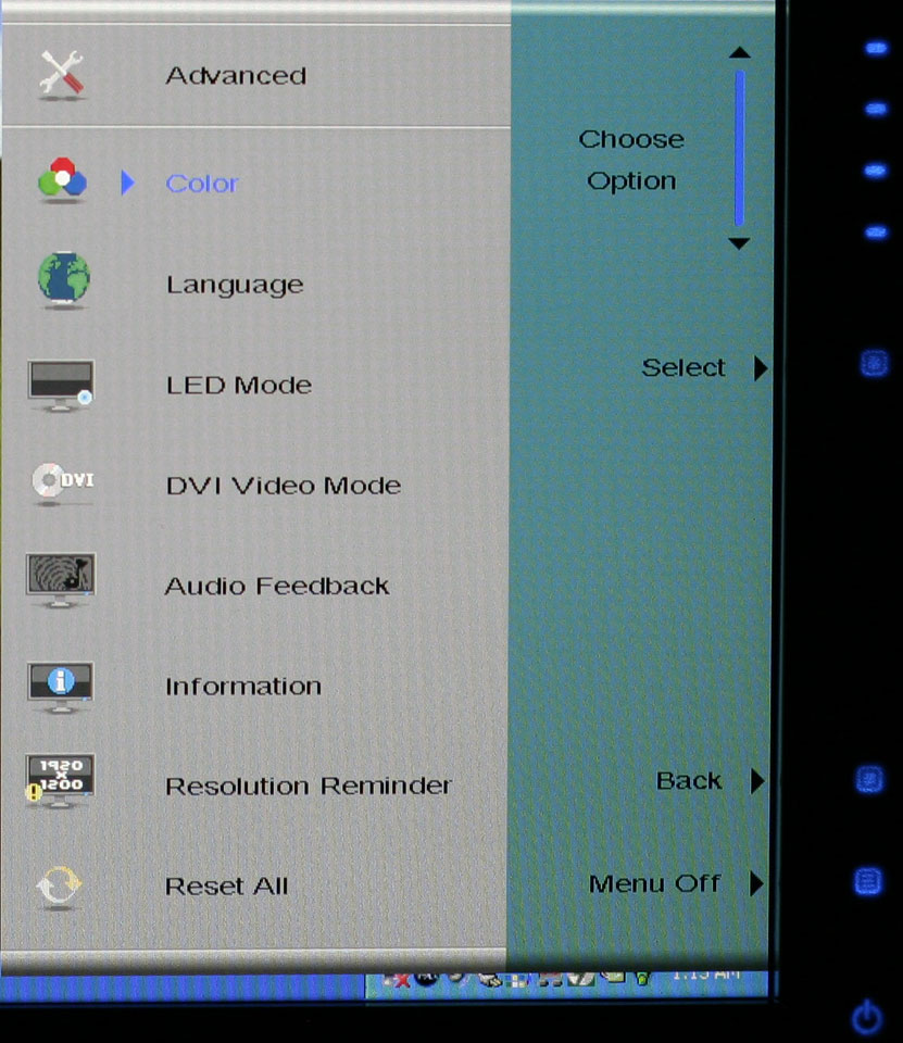
Outside of the initial menu and input selector, the way the On-Screen Display functions changes - somewhat counter-intuitively, we might add. The remaining menus move the various options into a gray area on the left side of the OSD, and the top "scroll" buttons are now used to move up and down among the options. These buttons aren't particularly sensitive, so sometimes you will tap a button and get no result while other times you will push it once and the selection will jump twice. Above you can see the images of the Picture, PIP, and Advanced menus; the various submenus are self-explanatory and we didn't bother capturing screenshots taking pictures.
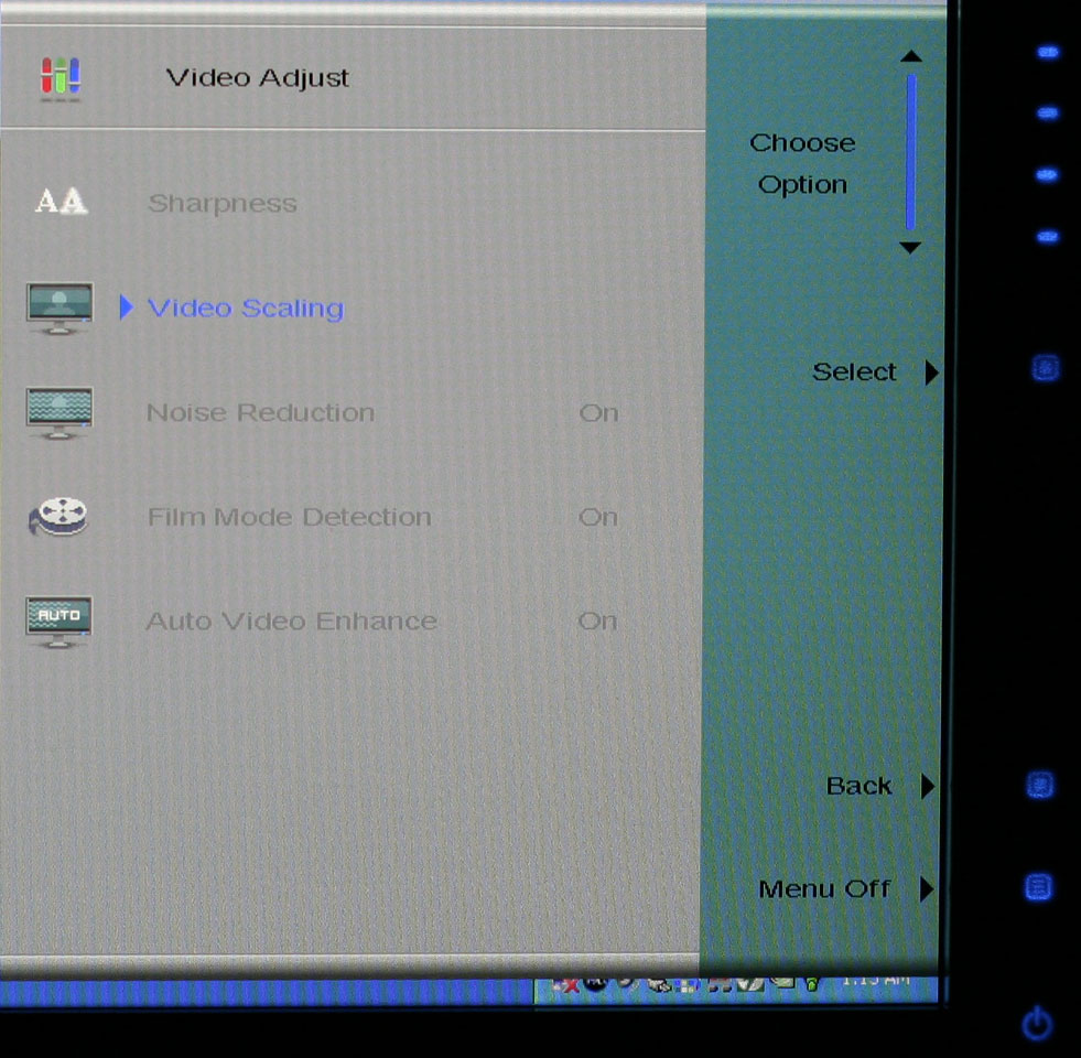
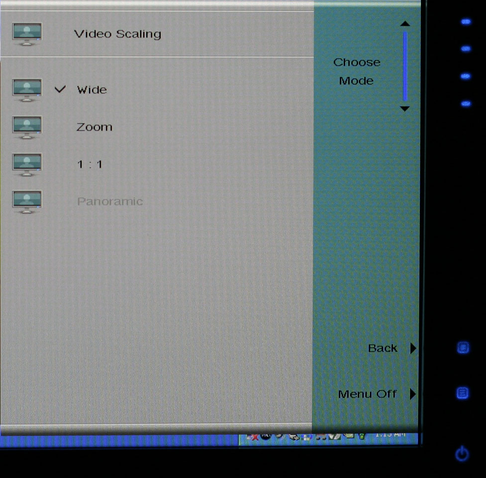
The final two OSD menus contain items related to adjustment of signal properties. If you are using a digital connection, several of the items are grayed out - Sharpness, Noise Reduction, Film Mode, and Video Enhance all deal with improving the quality of analog signals. Video Scaling allows you to customize how non-native resolutions are handled, including the option of displaying the content at a one-to-one ratio (unscaled). The Panoramic function is a nonlinear stretch that is only available with analog connections.
The OSD certainly provides all of the options we like to see, but navigating through the various menus is not quite as straightforward as we would like. This is due in part to the less sensitive "scroll" buttons at the top of the menu - or at least they didn't seem to be quite as responsive as the other menu buttons. If you find yourself frequently accessing the OSD menus, it can be a little irritating at times, and it seems like things could have been made easier by turning the "scroll" area into a couple more buttons and eliminating the need to move up and down among the various options. Still, the OSD does provide a good set of adjustments, and while it could have been streamlined it works well enough to get the job done.
One of the more interesting aspects of this LCD is its On-Screen Display (OSD). Depending on how you intend to use the LCD, you may find yourself accessing the OSD infrequently or on a regular basis. If you use multiple inputs, you will use the OSD to select among the various connected devices. We definitely get the impression that Gateway was trying to make a "cool" OSD. Rather than having actual buttons, the right black border hides touch sensitive areas that light up when you press the menu option.
 |
 |
| Click to enlarge | |
The initial press of the menu button brings up several quick access options to get you to the most commonly used areas. At the top is a "scrollable" area where you can select among several different color themes: movie, web, picture, game, warm, cool, and user. These options basically adjust the brightness, contrast, and color levels to preset values, with the exception of "user" which is for user-defined adjustments. The next four options provide quick access to input selection, picture in picture settings, and video adjustments. The bottom option takes you to the main menu, which is necessary in order to reach a few other areas.
 |
| Click to enlarge |
Choosing among the six available inputs is pretty simple. After exiting the Input Select option, you choose the appropriate input and you're done. The currently active input is not listed, which is why there are only five inputs shown - we used the DVI input for most of our testing. It's a bit odd that they don't simply put the sixth input in place of the Cancel option, however, so that all of the menu items would always be in the same position.
 |
 |
 |
| Click to enlarge | ||
Outside of the initial menu and input selector, the way the On-Screen Display functions changes - somewhat counter-intuitively, we might add. The remaining menus move the various options into a gray area on the left side of the OSD, and the top "scroll" buttons are now used to move up and down among the options. These buttons aren't particularly sensitive, so sometimes you will tap a button and get no result while other times you will push it once and the selection will jump twice. Above you can see the images of the Picture, PIP, and Advanced menus; the various submenus are self-explanatory and we didn't bother capturing screenshots taking pictures.
 |
 |
| Click to enlarge | |
The final two OSD menus contain items related to adjustment of signal properties. If you are using a digital connection, several of the items are grayed out - Sharpness, Noise Reduction, Film Mode, and Video Enhance all deal with improving the quality of analog signals. Video Scaling allows you to customize how non-native resolutions are handled, including the option of displaying the content at a one-to-one ratio (unscaled). The Panoramic function is a nonlinear stretch that is only available with analog connections.
The OSD certainly provides all of the options we like to see, but navigating through the various menus is not quite as straightforward as we would like. This is due in part to the less sensitive "scroll" buttons at the top of the menu - or at least they didn't seem to be quite as responsive as the other menu buttons. If you find yourself frequently accessing the OSD menus, it can be a little irritating at times, and it seems like things could have been made easier by turning the "scroll" area into a couple more buttons and eliminating the need to move up and down among the various options. Still, the OSD does provide a good set of adjustments, and while it could have been streamlined it works well enough to get the job done.


77 Comments
View All Comments
Aquila76 - Thursday, February 22, 2007 - link
Chizow,Did you run the gradient test from xtknight's website (linked above)? I'm curious to see how yours fares. I handpicked a Dec '06 model from Best Buy, but it still borked that thing badly no matter what bright/cont/R/G/B etc. I had it set to. I got most of my settings from the thread over at , but none seemed to eliminate the transition issues / color accuracy for me. :(
chizow - Thursday, February 22, 2007 - link
Ok, I applied the color profile Jarred provided (thanks again!) and colors do look much better, a lot more like the 2407WFP out of the box. Ran the gradient tests in full and windowed mode. In windowed, there is no significant banding or gradients although there is some faint gradient lines and banding on the straight color strips at the transition between the corresponding 1st and 2nd blocks. Seem to be uniform vertically through the pattern although they're unnoticeable on the magenta strips.In full screen mode, the banding is more obvious but again, its limited to the lower dark areas and don't extend past the 3rd block. After the 3rd block, the transitions are flawless. I wish I ran these before I calibrated the settings to see if its my panel or the calibrated settings.
Unfortunately, it looks like these settings will only apply under WinXP.
Jarred did you change the OSD/EzTune settings at all? Also, if you're really bored, would you mind calibrating the panel using EzTune or the OSD? Lol, well was worth a shot at least. Thanks again for the help and review.
Aquila76 - Thursday, February 22, 2007 - link
Heh, somehow clipped the last phrase off....from the thread over at HardForums.
Aquila76 - Thursday, February 22, 2007 - link
WTF? I used a BRACKET H BRACKET and it hides the text?
Aquila76 - Thursday, February 22, 2007 - link
Sorry for all the quotes of myself.The first one should have ended with:
...the thread over at HardForums.
chizow - Thursday, February 22, 2007 - link
I haven't run any extensive tests, but I'll check out Xtknights later when I get home. The few tests I have run were just html-based static images, and I can honestly say I saw very little gradient issues on the 2 panels I had (DEC annd current JAN). Banding was another issue though and pretty severe depending on content, source resolution/quality, and colors etc. I'll have to look over the definitions to make sure they're not mutually exclusive, so I'll have to get back to you on that one.JarredWalton - Thursday, February 22, 2007 - link
Beware the open-bracket H close-bracket abbreviation used for a certain other site! :DWe use brackets for our pseudo-HTML, and that one just happens to correspond to turning on white text. It comes up now and then, but thankfully you figured it out before the thread was very long. LOL We had a thread a year or two back where about 20 people responded trying to figure out WTF happened to the text. I think a guy had posted a comment where he used {H} five or ten times, which only served to make things more difficult to "fix".
Aquila76 - Thursday, February 22, 2007 - link
Eeks. I'll have to keep that in mind! Another cool test on xtknight's site (www.lcdresource.com) is a Dark Grayscale test. It's in the same section as the gradient. Mine just showed all black unless I cranked the brightness up to eyeball-melting. Granted, this is difficult for any LCD to display properly due to the issue of backlighting.I think what really pushed me over the edge on this monitor is that the last few bands of the grayscale showed up on my HP L1706 at work and the gradient shows flawlessly on it. A ~$700 display beaten handily by a ~$150 display hurt much more than my wallet. That was the final deciding factor on my returning the Gateway. I don't know how they managed to screw up this panel so badly. AFAIK, the Dell and Samsung 24" (same panels) had this resolved before the Gateway was released.
JarredWalton - Thursday, February 22, 2007 - link
I believe my sample is an earlier run from around November, but I didn't notice any issues with PSU buzzing. Could be that the color banding was a result of the early run - I don't know for sure. As for settings, I set contrast to 60% and ended up with brightness at 61%. The color profile will of course vary somewhat from panel to panel, so I'm not sure how helpful providing my particular profile will be, but if you want to give it a look, here you go:http://images.anandtech.com/reviews/monitor/2007/g...">FPD2485W Calibrated Profile
Caveat Emptor! :)
chizow - Thursday, February 22, 2007 - link
Wow that was fast! thanks :) A lot of 2485W owners will be happy. I think a lot of people got the brightness/contrast settings similar to yours, but color accuracy is a whole different monster, like whack-a-mole almost. Solve one color problem only to make one much worst. For me, its like tuning a guitar. I know what doesn't sound right, I just don't know how to fix it. :) That profile should help a ton though, thanks again!