ASUS P5NSLI: Core 2 Duo and SLI on a Budget
by Gary Key on August 22, 2006 5:30 AM EST- Posted in
- Motherboards
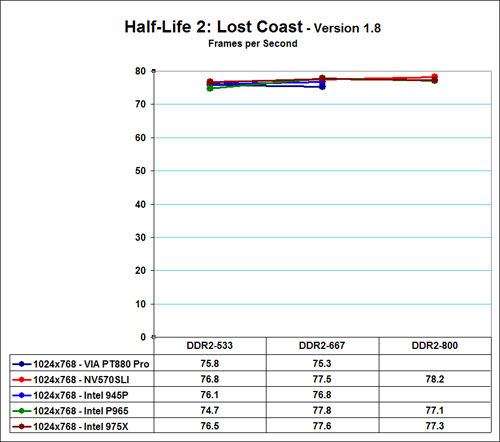
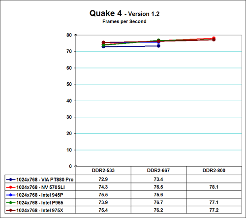
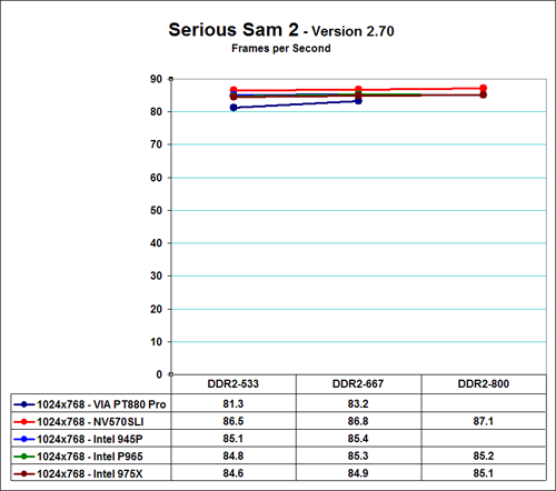
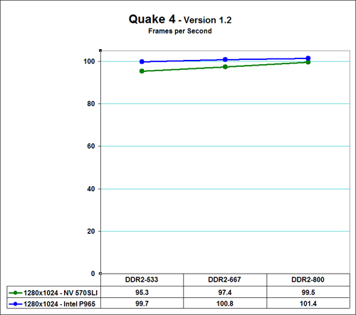
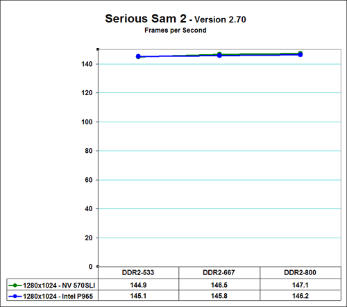
Gaming Performance - E6300/7600GS
While Sandra and Super Pi provide useful information on how memory performs without the influence of other components, our first round of real world tests has shown there is not a noticeable difference in performance between DDR2-533 and DDR2-800 except with the NVIDIA 570SLI chipset. However, our next set of real-world benchmarks consists of gaming benchmarks. Due to the amount of information and the relative closeness of the scores we are not utilizing zero based charts as the line graphs would stack on each other. Although the data chart tells the story we felt like there should be some separation in the line graphs to accurately depict the information. Zero-based graphs are available by clicking on the charts below if you would like to see the bigger picture.
We are utilizing Half Life 2 and Quake 4 in our testing because they are sensitive to memory bandwidth changes. We added Serious Sam 2 to our benchmark mix because it is typically very GPU dependent and we will see the effects of our memory/GPU choices on these games. We tested at both 1024x768 (E6300) and 1280x1024 (E6700) resolutions at High Quality settings with 4x anti-aliasing and 8x antistrophic filtering enabled at 1280x1024.
Our two memory sensitive games show a pattern with the ASUS P5NSLI motherboard performing extremely well at all memory settings with a constant scaling in performance even in the GPU limited Serious Sam 2. The 570SLI results in gaming are almost opposite of our synthetic and application benchmarks. It appears the old adage that NVIDIA hardware runs best on NVIDIA hardware is true in this case. This is a very small sampling of games at this time and the GPU choice does not match what most buyers of this board would run. However, we find this result interesting from a viewpoint that memory bandwidth is extremely important for the 570SLI to operate at an optimum level.
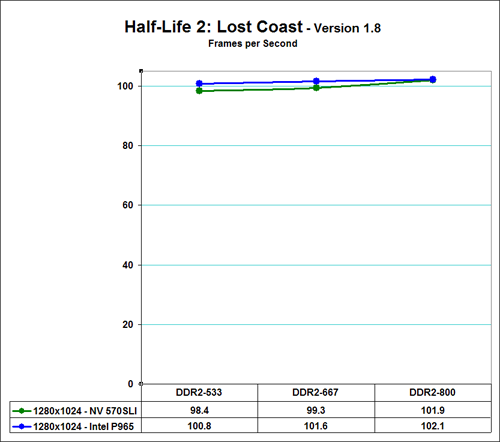
Gaming Performance - E6700/7950GX2
We see the performance of the Intel P965 leading the NVIDIA 570SLI in our memory sensitive games once we introduce our E6700 processor and 7950GX2 video card. These results are more in alignment with the synthetic benchmark results where the P965 had the highest Unbuffered memory scores along with the lowest latencies overall. While the 570SLI scales well, the P965 chipset's superior bandwidth just outperforms the 570SLI in this situation. The result in Serious Sam 2 shows the 570SLI performing better in a GPU limited situation where NVIDIA typically shines. Once again we see the 570SLI scaling well as we improve bandwidth.
While Sandra and Super Pi provide useful information on how memory performs without the influence of other components, our first round of real world tests has shown there is not a noticeable difference in performance between DDR2-533 and DDR2-800 except with the NVIDIA 570SLI chipset. However, our next set of real-world benchmarks consists of gaming benchmarks. Due to the amount of information and the relative closeness of the scores we are not utilizing zero based charts as the line graphs would stack on each other. Although the data chart tells the story we felt like there should be some separation in the line graphs to accurately depict the information. Zero-based graphs are available by clicking on the charts below if you would like to see the bigger picture.
We are utilizing Half Life 2 and Quake 4 in our testing because they are sensitive to memory bandwidth changes. We added Serious Sam 2 to our benchmark mix because it is typically very GPU dependent and we will see the effects of our memory/GPU choices on these games. We tested at both 1024x768 (E6300) and 1280x1024 (E6700) resolutions at High Quality settings with 4x anti-aliasing and 8x antistrophic filtering enabled at 1280x1024.
 |
 |
 |
| Click for Zero-based Graph |
Our two memory sensitive games show a pattern with the ASUS P5NSLI motherboard performing extremely well at all memory settings with a constant scaling in performance even in the GPU limited Serious Sam 2. The 570SLI results in gaming are almost opposite of our synthetic and application benchmarks. It appears the old adage that NVIDIA hardware runs best on NVIDIA hardware is true in this case. This is a very small sampling of games at this time and the GPU choice does not match what most buyers of this board would run. However, we find this result interesting from a viewpoint that memory bandwidth is extremely important for the 570SLI to operate at an optimum level.
Gaming Performance - E6700/7950GX2
 |
 |
 |
| Click for Zero-based Graph |
We see the performance of the Intel P965 leading the NVIDIA 570SLI in our memory sensitive games once we introduce our E6700 processor and 7950GX2 video card. These results are more in alignment with the synthetic benchmark results where the P965 had the highest Unbuffered memory scores along with the lowest latencies overall. While the 570SLI scales well, the P965 chipset's superior bandwidth just outperforms the 570SLI in this situation. The result in Serious Sam 2 shows the 570SLI performing better in a GPU limited situation where NVIDIA typically shines. Once again we see the 570SLI scaling well as we improve bandwidth.


27 Comments
View All Comments
Gary Key - Tuesday, August 22, 2006 - link
That is due to the fact they are using a different chipset than the AM2 family although the marketing language is the same.
scott967 - Tuesday, August 22, 2006 - link
I'm trying to understand the chart on memory which compares different chipsets. The Via PT580 falls apart on Sandra standard going from 533 to 667 memory. Is this correct?scott s.
.
Gary Key - Tuesday, August 22, 2006 - link
That is correct. ASRock and VIA have figured out the issue, just waiting on a fix that hopefully is bios related and nothing else.
Spacecomber - Tuesday, August 22, 2006 - link
This came up before with another article, but perhaps it needs to be said again, I wish that Anandtech would stop using charts showing comparitive FPS that don't show a full FPS axis that starts with zero.I understand that you are trying to highlight the small differences that are being measured and that if you have a chart that uses a proper axis, starting at zero, these differenes are harder to see. However a chart with an axis starting with zero is still a better representation of the results than using a distorted graph to draw out the differences.
Essentially, all you have graphed are the differences between the different results, and if this is what you want to do that is fine. Just relabel the graph and change the axis to show this. Call it something like "Increase in FPS with Memory Speeds Faster than DDR2-663" and then have an axis that runs from 0 to 5 FPS, since that should about cover all your results.
Obviously, such a graph would not be very appealing or interesting, but it would be in better keeping with your data. And, the fact that it doesn't seem to be a very informative graph is precisely my point. Trying to dress these charts up, which really are only charts of the small differences between your results, as if they also provide a relative comparison of the different FPS with different motherboards and different memory timings, simply confounds things. You would do better to pick one or the other to represent, but not mash both together as you are doing now.
It is bad enough that these statistics are posted in such a manner that pays little heed to the kinds of variations that are involved. Magnifying tiny differences in order to make them seen more significant only compounds the problem. Without these distorted graphs a reader might more correctly conclude that the differences in the frame rates, comparing these two different motherboards while using memory running at different speeds, are essentially insignificant. And, drawing out speculative conclusions, based on the perception of any differences, is most likely just much ado about nothing.
hibachirat - Wednesday, August 23, 2006 - link
I don't mind those. But the red and green lines are to close for my red-green color blindness. I can almost tell them apart...but would be nice it the green was brightened and/or the red darkened just a bit.Gary Key - Tuesday, August 22, 2006 - link
Zero based graphs are available by clicking on the orginal image. :)Gary Key - Tuesday, August 22, 2006 - link
Our full review will not utilize these charts. Instead of separating the information and showing pages and pages of the data we felt like this was the best way to collectively show it all at once. We end up with either a graph that has the majority of data points stacked into a single line path or the other evil of not having a zero based graph. We are still working on an updated engine so hopefully this issue disappears quickly or we go back to the bar charts.
Personally, it really bothers me not to have a zero base graph. I will work on another alternative today and update the article if it works. Thanks for the comments and we do agree with you.
JarredWalton - Tuesday, August 22, 2006 - link
We have added a zero-based graphs as pop-ups if you want to see those results. The number tables at the bottom of the charts are intended to help you see that the scores really aren't that far apart, but now you can see the true relative difference.shecknoscopy - Tuesday, August 22, 2006 - link
Well, I've never been that discouraged with their axis labeling, but I could see how someone unfamiliar with the world of statistics could be misled by purported performance differences that are actually within the measurement error.Personally, if I were the one reporting these data, I'd use <b>both</b> methods. Plot the data as you currently do - so as to highlight subtle differences, and <b>also</b> place them on a full graph (where y ranges between 0 and the maximum observed value) in an inset. That way you get a nice zoom-in on the "interesting stuff," and a smaller zoom-out to illustrate that the differences are typically minor, compared to the absolute values.
I'll also point out that, if you <i>really</i> want to get persnippity about their stats reporting, you should demand that they repeat their tests several times, and report each datum with an error bar. :)
Of course, most of my suggestions for improvement involve the word "bar."
-sheq
Renoir - Tuesday, August 22, 2006 - link
I feel it's important to put a lot of these results in perspective with regards to their level of significance. For me personally when looking at results I find the thing that I find most useful is percentages. Lately it seems that a lot of system variables (memory timings/frequency, cpu cache etc) often result in differences of less than 10% in most cases which to me isn't that significant when just getting 1 higher speed bin on your cpu would get you that and probably for less money than say buying the very best ram. I guess I'm saying that when I see graphs that are zoomed in to highlight minor differences I find myself thinking "ok I see why they've done that but it would be nice to be given a percentage so that I can make a quick and dirty evaluation of whether the difference is significant or not". Just some random thoughts :-)