The First Look
While Vista has numerous new features Microsoft is hoping will entice users to upgrade, the most immediate and visible change is the new Aero interface that will be the preferred look for Vista. Since Microsoft is making a big deal of it both for reasons of eye-candy (whether we like to admit to it or not, eye-candy sells) and productivity allowed by using GPU-acceleration, this is where we will start our look.
One disadvantage of Microsoft's long cycle time between releasing XP and Vista is that their main competition in the consumer space, Apple, has had the chance to release several OS revisions in between the releases of XP and Vista, and will likely release one more before Vista ships. Given this lead, it shouldn't come as a shock that certain elements of Aero/Vista end up looking like Mac OS X, and while Microsoft isn't going to admit to it any time soon, we're not going to ignore it. Mac OS X implemented several good ideas both in terms of eye-candy and usability/productivity, so we're certainly not going to complain if Microsoft has borrowed some of these ideas for Aero. However, we expect that they'll try to improve on the design of Aero over Mac OS X as well.
In general, Microsoft has ditched the traditional Windows blue for a white color that wouldn't be out of place in Mac OS X. As with colors in XP, this is all user-configurable, and several different template colors are included, but the resemblance is none the less uncanny. The entire interface is more or less streamlined, with more curves, and the semi-transparent windows are immediately visible. To some extent, it can be argued that transparent windows are helpful for productivity reasons by letting the user see through the window to whatever is below, but since this only applies to the borders, it's more along the lines of functional eye-candy. At any rate, we're a bit skewed towards eye-candy around here (Mac usage has shot up immensely since Anand started covering that market, with at least 3 of our editors admitting to their Mac addiction), so we don't really have any complaints about it. Aero is an aesthetically pleasing UI that doesn't decrease usability.
With that said, the eye-candy covering every window can only distract for a moment; we need to talk about some of the interface changes Microsoft has made to Vista in general. Vista is the biggest change in Microsoft's human-computer interaction (HCI) guidelines since Windows 95 launched, replacing several methods with new designs. The menu toolbar is gone in many applications, including Explorer itself, and frankly it's very disorienting at first. The "classic menus" as Microsoft calls them can be enabled for those who miss them, and indeed we did enable them shortly after we installed Vista, but as they'll ultimately be removed entirely in some future Windows version now that they've been deprecated, users will need to get used to the new system at some point. After spending the better part of a week forcing ourselves to use Vista with the classic menus turned off, we can get around about as well as we could with the classic menus in the first place, though there's a fair bit of keyboard shortcut usage thrown in. For a glimpse into the direction Microsoft wants to take us, the Beta 2 version of Microsoft Office 2007 implements a navigation system Microsoft calls "ribbons". These large, tabbed, icon filled menu+toolbar replacements are designed to make it easier for a user to find what he or she needs in an application chock full of options.
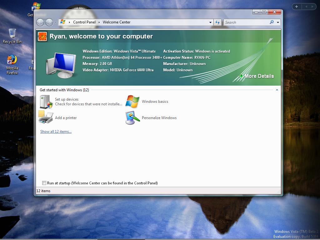
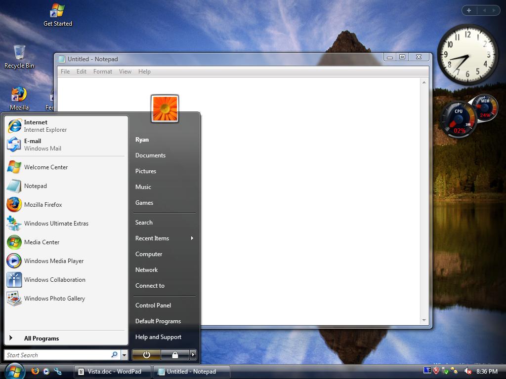
Other, less immediate HCI changes include using Explorer to browse folders, where Microsoft has moved even farther away from using the old hierarchical sidebar in favor of a more abstracted system based on virtual folders. Search is also much more pervasive in Vista, as there's a search bar in nearly every Explorer window and in many other Microsoft applications too; it has a very strong resemblance to how Apple implemented Spotlight on Mac OS X. Last but not least, one no longer needs to "start" Windows to shut it down; Microsoft is keeping the start menu, but has replaced the Start button with a Windows icon.
While Vista has numerous new features Microsoft is hoping will entice users to upgrade, the most immediate and visible change is the new Aero interface that will be the preferred look for Vista. Since Microsoft is making a big deal of it both for reasons of eye-candy (whether we like to admit to it or not, eye-candy sells) and productivity allowed by using GPU-acceleration, this is where we will start our look.
 |
| Click to enlarge |
One disadvantage of Microsoft's long cycle time between releasing XP and Vista is that their main competition in the consumer space, Apple, has had the chance to release several OS revisions in between the releases of XP and Vista, and will likely release one more before Vista ships. Given this lead, it shouldn't come as a shock that certain elements of Aero/Vista end up looking like Mac OS X, and while Microsoft isn't going to admit to it any time soon, we're not going to ignore it. Mac OS X implemented several good ideas both in terms of eye-candy and usability/productivity, so we're certainly not going to complain if Microsoft has borrowed some of these ideas for Aero. However, we expect that they'll try to improve on the design of Aero over Mac OS X as well.
In general, Microsoft has ditched the traditional Windows blue for a white color that wouldn't be out of place in Mac OS X. As with colors in XP, this is all user-configurable, and several different template colors are included, but the resemblance is none the less uncanny. The entire interface is more or less streamlined, with more curves, and the semi-transparent windows are immediately visible. To some extent, it can be argued that transparent windows are helpful for productivity reasons by letting the user see through the window to whatever is below, but since this only applies to the borders, it's more along the lines of functional eye-candy. At any rate, we're a bit skewed towards eye-candy around here (Mac usage has shot up immensely since Anand started covering that market, with at least 3 of our editors admitting to their Mac addiction), so we don't really have any complaints about it. Aero is an aesthetically pleasing UI that doesn't decrease usability.
 |
| Click to enlarge |
With that said, the eye-candy covering every window can only distract for a moment; we need to talk about some of the interface changes Microsoft has made to Vista in general. Vista is the biggest change in Microsoft's human-computer interaction (HCI) guidelines since Windows 95 launched, replacing several methods with new designs. The menu toolbar is gone in many applications, including Explorer itself, and frankly it's very disorienting at first. The "classic menus" as Microsoft calls them can be enabled for those who miss them, and indeed we did enable them shortly after we installed Vista, but as they'll ultimately be removed entirely in some future Windows version now that they've been deprecated, users will need to get used to the new system at some point. After spending the better part of a week forcing ourselves to use Vista with the classic menus turned off, we can get around about as well as we could with the classic menus in the first place, though there's a fair bit of keyboard shortcut usage thrown in. For a glimpse into the direction Microsoft wants to take us, the Beta 2 version of Microsoft Office 2007 implements a navigation system Microsoft calls "ribbons". These large, tabbed, icon filled menu+toolbar replacements are designed to make it easier for a user to find what he or she needs in an application chock full of options.
Other, less immediate HCI changes include using Explorer to browse folders, where Microsoft has moved even farther away from using the old hierarchical sidebar in favor of a more abstracted system based on virtual folders. Search is also much more pervasive in Vista, as there's a search bar in nearly every Explorer window and in many other Microsoft applications too; it has a very strong resemblance to how Apple implemented Spotlight on Mac OS X. Last but not least, one no longer needs to "start" Windows to shut it down; Microsoft is keeping the start menu, but has replaced the Start button with a Windows icon.


75 Comments
View All Comments
rqle - Friday, June 16, 2006 - link
dont really need bad memory module, overclock the memory just a tad bit to give errors while keeping the cpu clock constant or known stable clock.JarredWalton - Friday, June 16, 2006 - link
That still only works if the memory fails. Plenty of DIMMs can handle moderate overclocks. Anyway, it's not a huge deal I don't think - something that can sometimes prove useful if you're experiencing instabilities and think the RAM is the cause, but even then I've had DIMMs fail MemTest86 when it turned out the be a motherboard issue... or simply bad timings in the BIOS.PrinceGaz - Saturday, June 17, 2006 - link
Erm, no. Just overclock and/or use tighter-timings on a known good module beyond the point at which it is 100% stable. It might still seem okay in general usage but Memtest86 will spot problems with it. Now see if Vista's memory tester also spots problems with it. Pretty straightforward to test.xFlankerx - Friday, June 16, 2006 - link
I love how I was browsing the website, and I just refresh the page, and there's a brand new article there...simply amazing.xFlankerx - Friday, June 16, 2006 - link
Masterful piece of work though. Excellent Job.