The LG G4 Review
by Joshua Ho on July 30, 2015 10:00 AM EST- Posted in
- Smartphones
- Qualcomm
- LG
- Mobile
- Snapdragon 808
- LG G4
Software: LG UX 4.0
Software is ultimately one of the most important aspects of a smartphone. In the case of iOS and most mobile OSes, the experience is essentially fixed for everyone. However, with Android OEMs often create their own frameworks within the OS to enable various features that are missing from the base OS. OEMs also tend to change the look and feel of many core user applications and many key Android UI elements. As a result, it is often necessary to evaluate UI on a per-device basis rather than with a single catch-all OS review due to the potential for some enormous design variance.
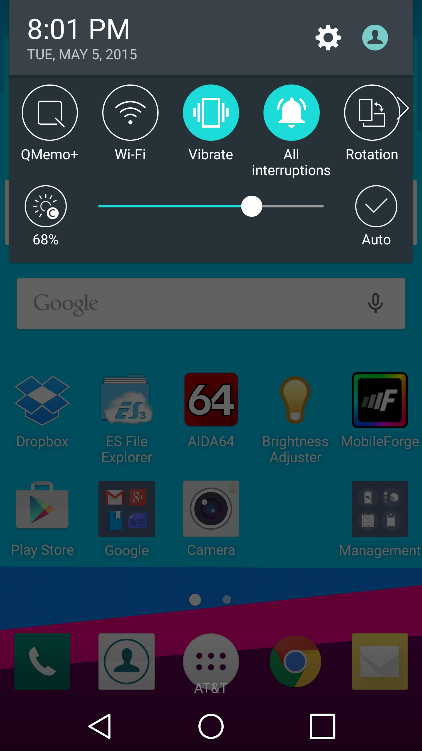
When it comes to LG’s UX 4.0, LG definitely goes with an experience that is extensively customized that differentiates itself from stock Android. Almost every stock application has been replaced by LG’s take on Android. The color scheme of the UI is somewhat inconsistent, as aspects of the UI like the weather clock and quick settings toggles tend to be strongly saturated while other aspects of the UI like the notification shade and most of the iconography tends to be rather muted in comparison due to the use of pastel colors. I’m actually not sure whether this is the result of the high-gamut display or deliberate color choices, but the use of neon colors in general definitely draws a lot of attention when it’s used.
Outside of this though, I honestly don't have too much to object to on this front. LG still isn’t really following all of Material Design, although I suspect there’s at least some debate over whether the level of focus on animation in Lollipop has become distracting. At any rate, this isn’t a huge deal but I suspect it would give a better sense of flow and continuity within the UI if LG implemented more animations to fit Material Design, such as sliding in a “card” when adding a calendar event rather than just having the new screen appear from thin air.
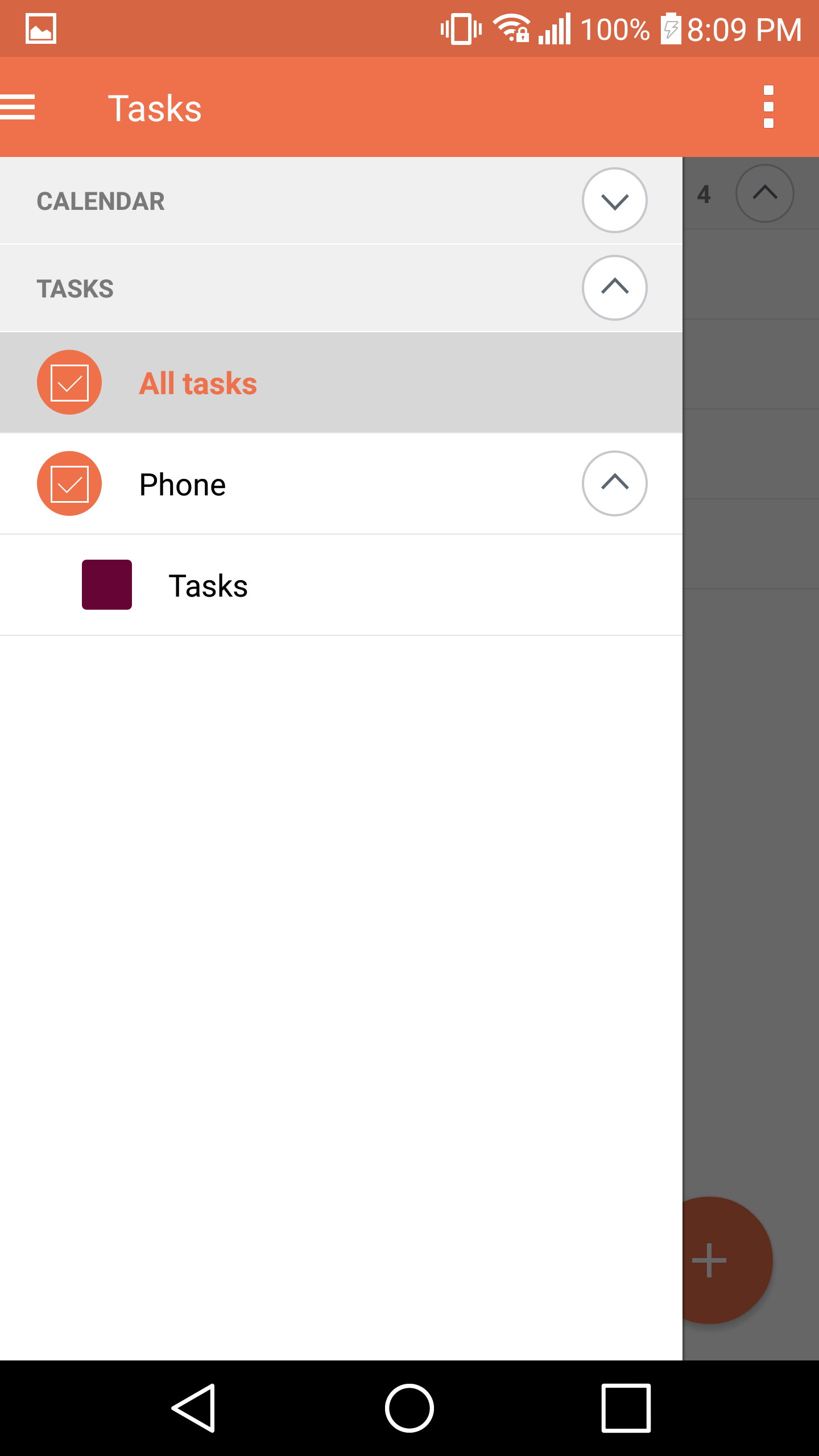
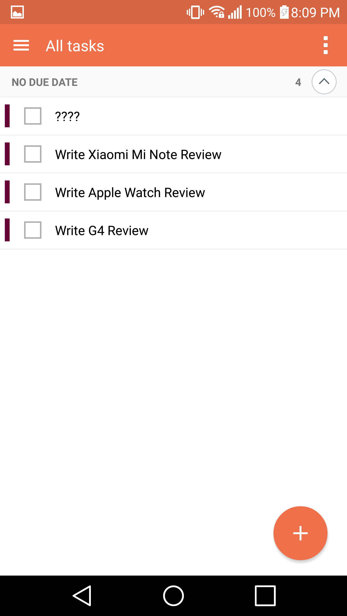
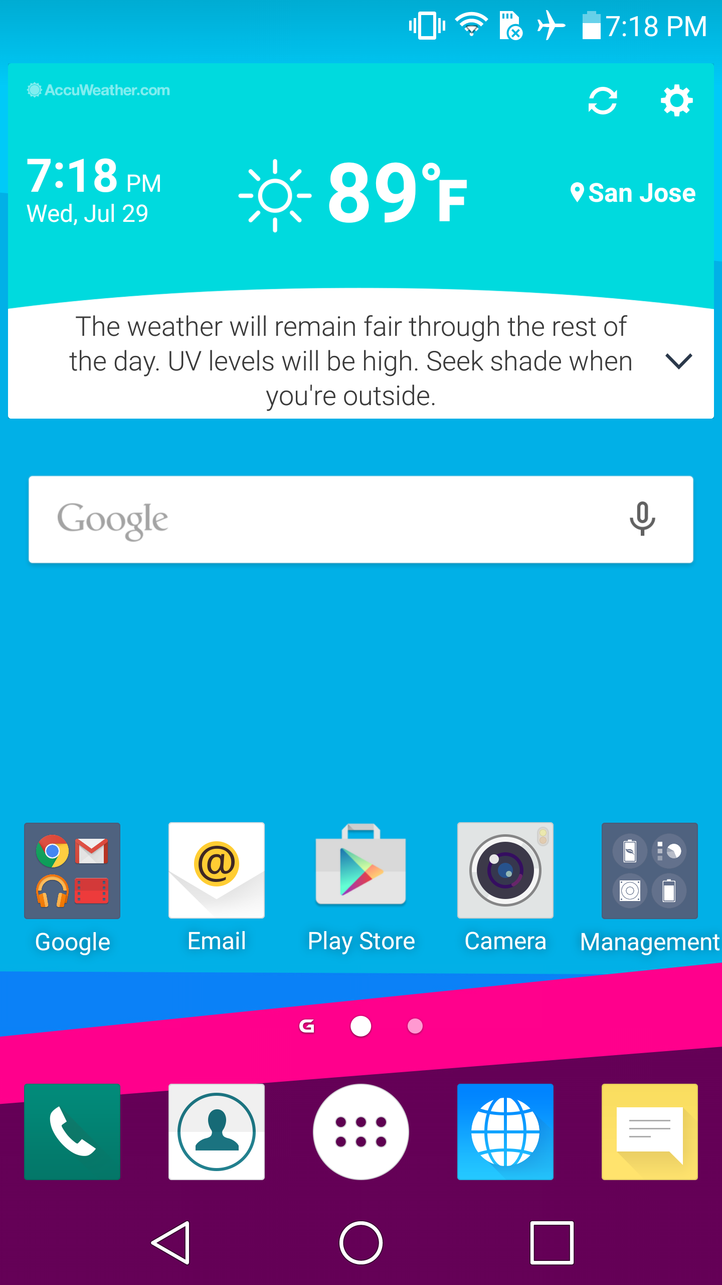
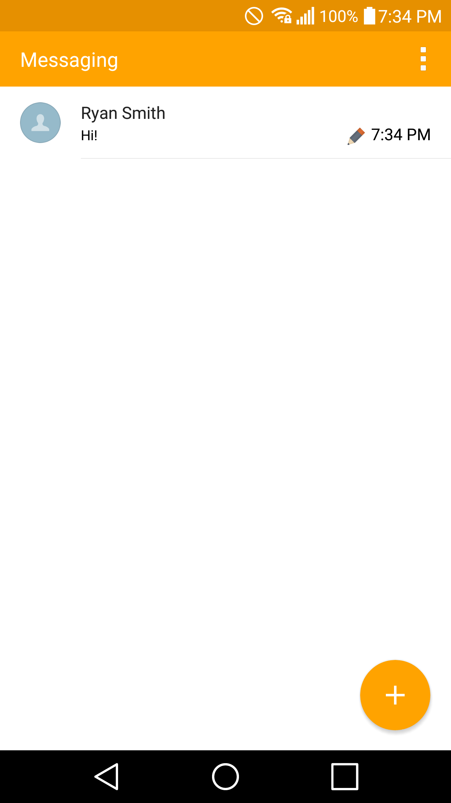
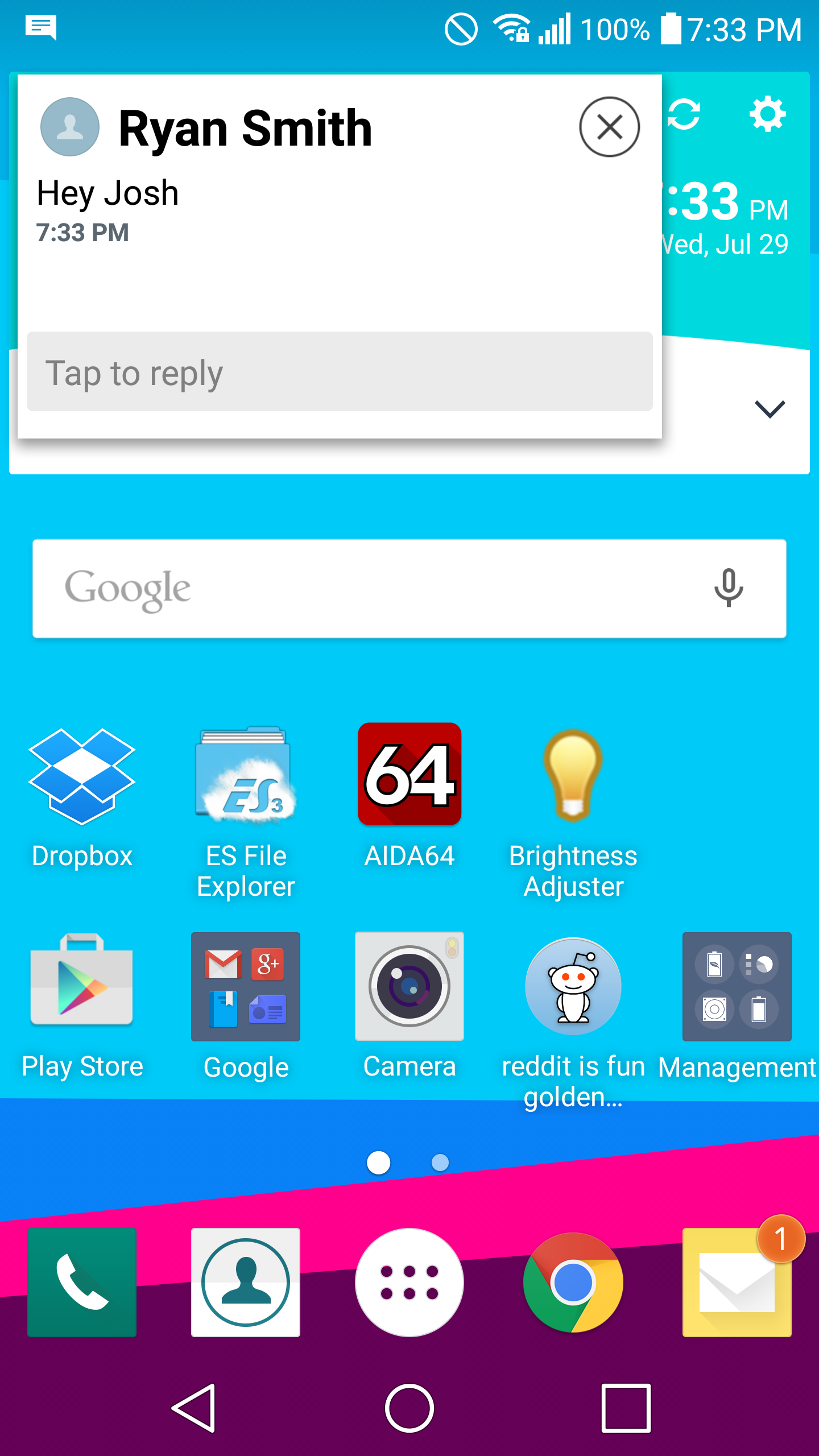
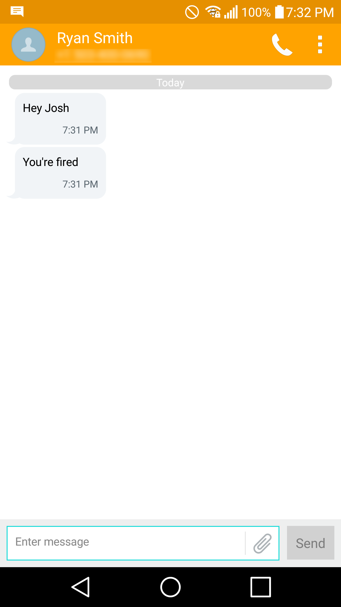
If you look past the animation style, LG has done a surprisingly good job with the UI. Most applications mostly look the part of a modern Material Design. Most applications like the calendar, tasks, and notes (QMemo+) place the action overflow button on the far right of the top navigation bar, then a floating action button (FAB) with appropriate drop shadows on the bottom right. Sidebar menus are marked with the standard icon that we’re all familiar with on Android and open with a swipe in correctly instead of requiring a precise tap of the icon like TouchWiz on the Galaxy S6. Meanwhile there are some applications that behave strangely by default like the settings app, but changing the view to list view instead of tab view resolves these problems for the most part. The messaging experience is also surprisingly awesome, as you get popups to quickly reply to SMS/MMS when you aren't in the messaging app.
Ultimately LG really deserves some credit for implementing smart functionality in an intuitive manner throughout their skin, and these are things that arguably couldn't be accomplished within the constraints of a "pure AOSP" build.
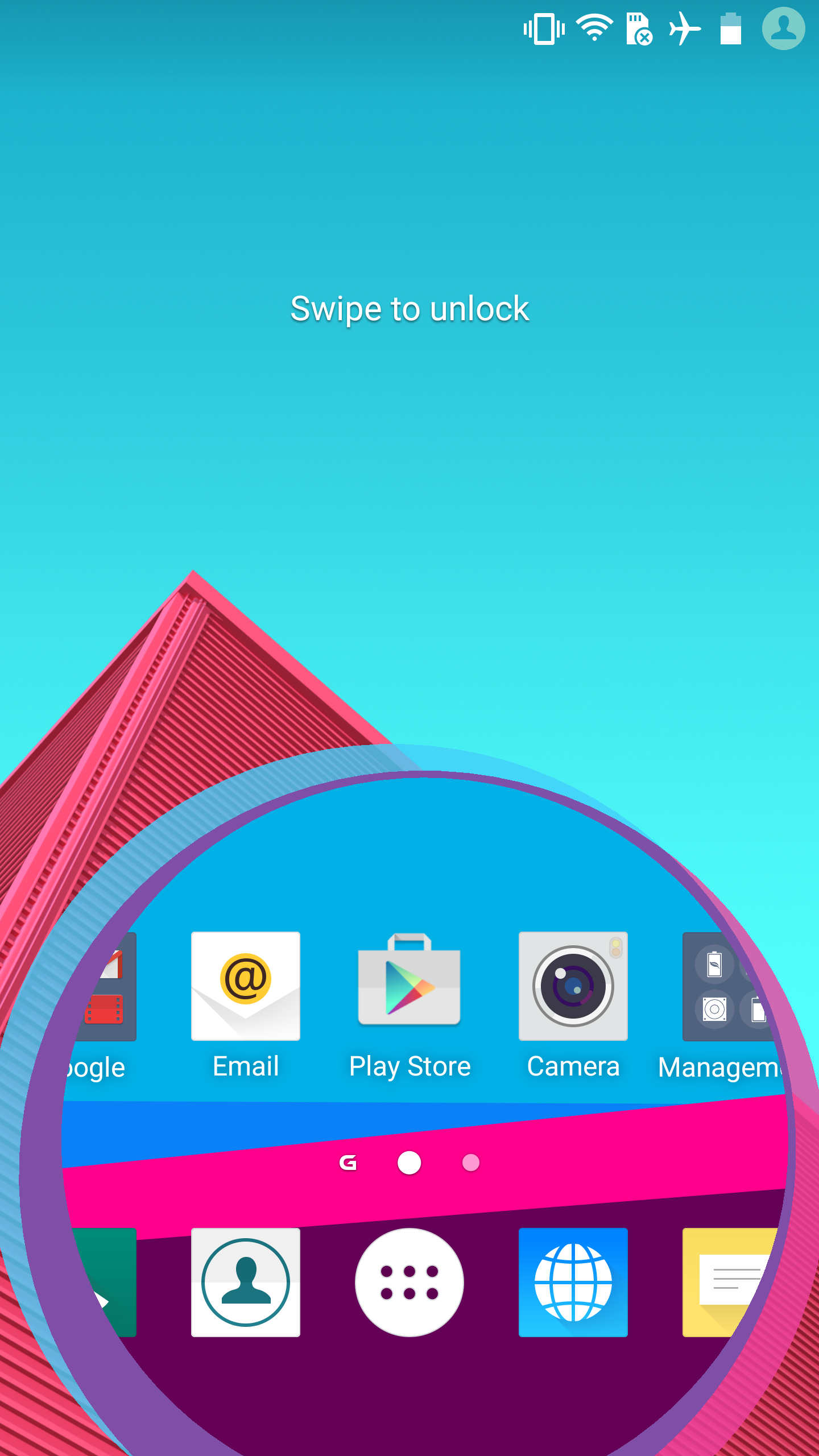
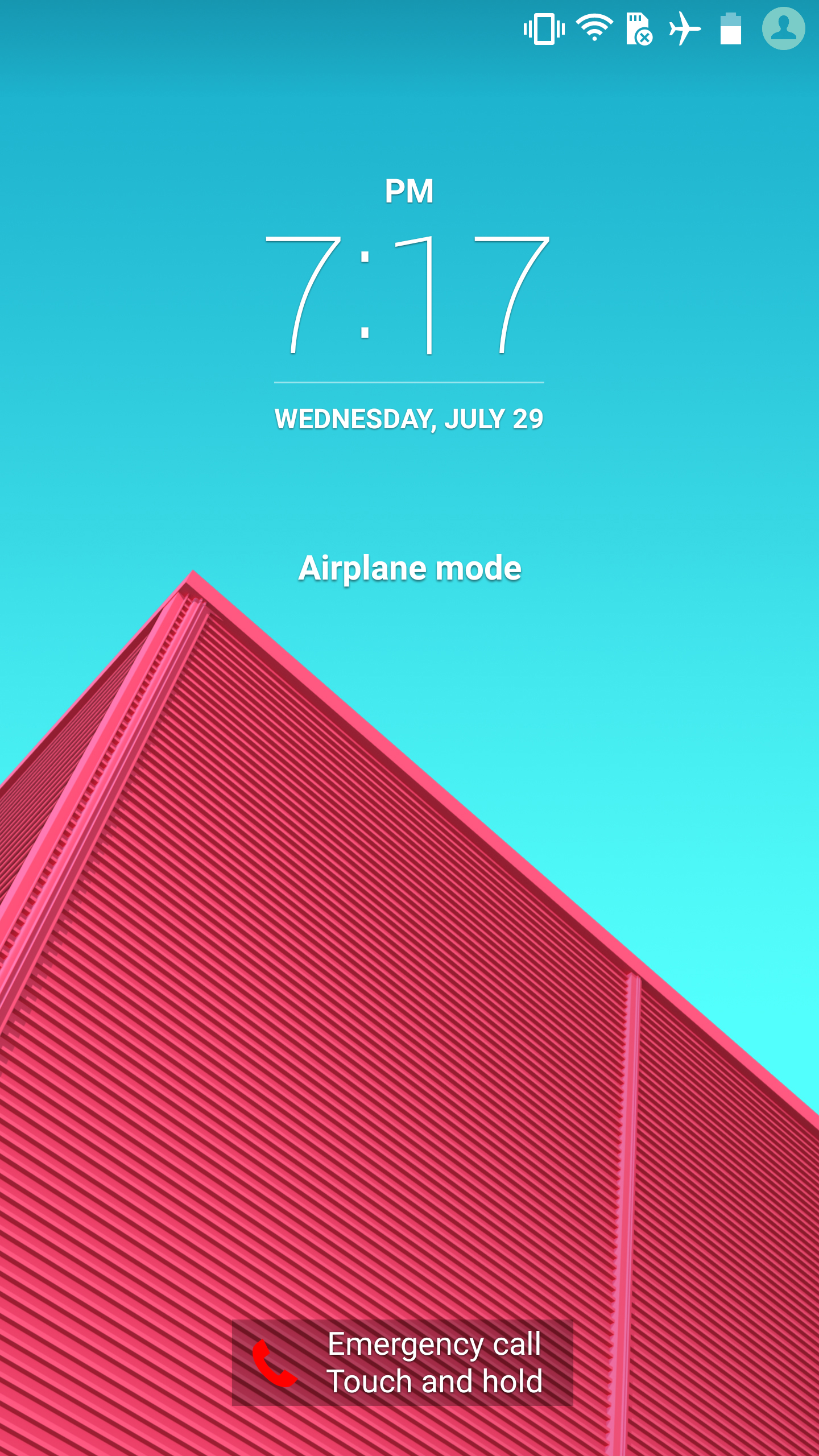
Of course, there are some other issues with design consistency. The lock screen is one notable departure from the rest of the mostly-MD UI, as the default swipe lock screen has some really ostentatious animation no matter what you set. Admittedly, this is a pretty minor issue and goes away completely if you set any sort of security with no timeout, so I’m not too hung up on this. There’s also no fingerprint authentication option here, which is a big disappointing as I’ve always felt that a combined fingerprint scanner and power button on the G4 would’ve been a great user experience given the rear-mounted buttons.
Iconography is also a big inconsistent even if it’s all relatively tasteful, with some icons using drop shadows and pastel colors with a square background, while others have a single fixed color, no shadowing, and a round background. The final aspect where I saw some noticeable design inconsistency is the power menu, which looks like it came from MIUI or iOS rather than Android due to the use of a background Gaussian blur with rounded, white icons that lack depth.
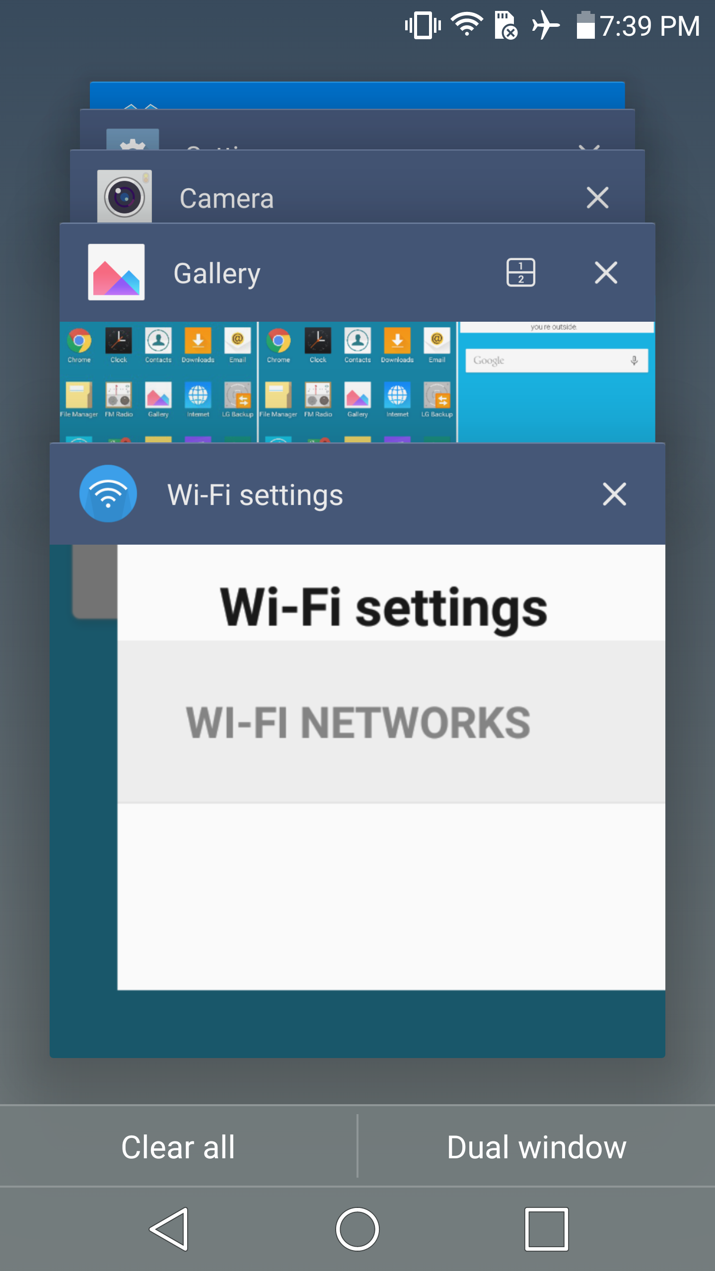
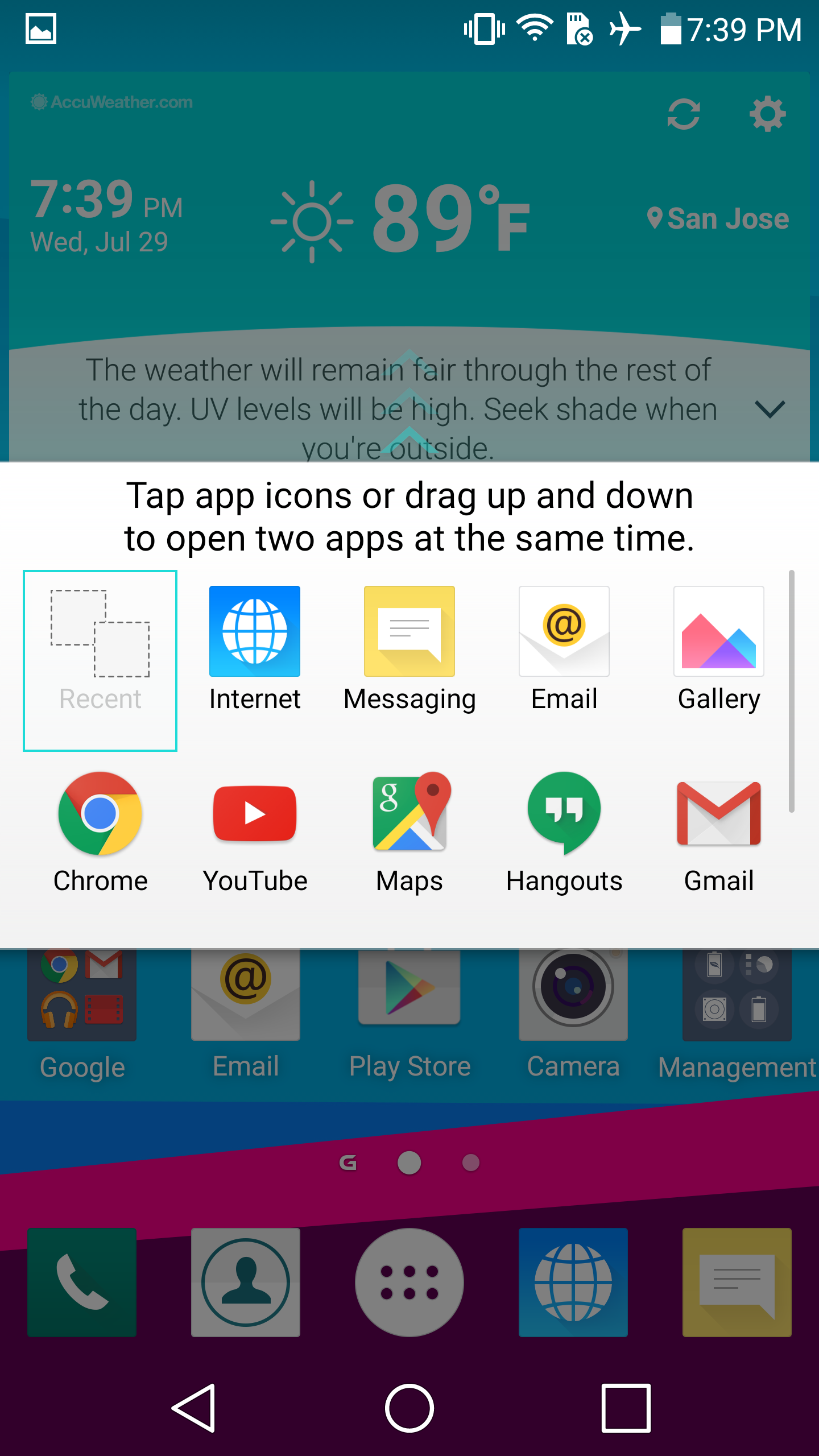
Outside of these basic questions of design, LG has also added some surprisingly useful functionality with working Dual Window functionality. LG has implemented a UI that requires manually selecting both applications that will be used in Dual Window mode, and the list of applications that work with this mode is noticeably lower than what Samsung supports with MultiWindow so the functionality and user experience isn’t as good here. I still think native windowed application support is a must for Android on tablets, but this is something that only Google can do. There are also QSlide apps which are essentially floating window applications, but for some reason activating QSlide within a supported application is an option buried within the action overflow button instead of some sort of gesture or immediate action button. Key applications for a good out of the box experience are also done acceptably well.
Going beyond design consistency concerns, performance is solid on the LG G4. For the most part, navigation through the UI is fluent and basically free of lag. However, compared to the Galaxy S6 I noticed more dropped frames in third party applications when dealing with CPU-heavy listviews like the Play Store. I suspect that this is mostly due to differences in governor behavior and software optimization rather than throttling though, as die temperatures never approach anything notable when just going through light applications like the Play Store or scrolling through a webpage.
Overall, LG’s software experience is decent, but there is still progress to be made. There is some need for more cohesive design and overall polish, but otherwise I doubt that anyone will really have major problems with LG’s UI. I didn’t notice any real usability issues in general, and I suspect neither will the average user. I noticed an option in the developer settings for enabling and disabling OEM bootloader unlock, so enthusiasts should be able to unlock the bootloader on at least a few variants although with US carriers it’s always hard to gauge whether this is possible due to their requirements. The real concern isn’t so much that the experience is poor, but that there are some notable feature omissions like a fingerprint scanner and Google Now activation regardless of screen state. If you don’t find these omissions to be glaring, the G4’s software experience should be acceptable.


84 Comments
View All Comments
hans_ober - Thursday, July 30, 2015 - link
Throttling compared to S810?JoshHo - Thursday, July 30, 2015 - link
Definitely less. S808 spends more time at higher frequencies than S810 even after 20 minutes.hans_ober - Thursday, July 30, 2015 - link
Thought I'd see a AT deepdive (a whole page :) ) on S808 vs S810.. especially what S808 loses compared to S810 (memory, GPU, CPU ) and throttling, perf vs time.JoshHo - Thursday, July 30, 2015 - link
I definitely hope to do that at some point.hans_ober - Thursday, July 30, 2015 - link
Thanks a ton!LoganPowell - Friday, November 27, 2015 - link
The L3 G4 is really good, however the Moto X Pure Edition is rated slightly higher (see http://www.consumerrunner.com/top-10-best-phones/ for example), so I would consider that one instead if I were you.ThisIsChrisKim - Thursday, July 30, 2015 - link
Looking forward to it :)niva - Thursday, July 30, 2015 - link
I was also expecting to see some sort of a technical comparison here related to the SD 808 vs. the SD 810. I for one also think the 1440 screen is overkill, especially in a sub 6" device using the SD 808.On the final page you went on to say the G4 and the S6 have a camera somewhat comparable to the iPhone 6+... and there you totally lost me. This is one of the things Anandtech can do without in the reviews, the iFanboyism.
BMNify - Friday, July 31, 2015 - link
@niva: Quit trolling Android fanboy, Anandtech and Josh are not ifanboy, they are stating the truth here, you can critic Apple for less ram or restrictive ecosystem but the latest iphone camera is amongst the best, only high-end Lumia phones can challenge or best Apple in this regard.bleached - Sunday, August 2, 2015 - link
Apple isnt rate in the top 5 best smartphone cameras (they haven't tested the G4) and Lumia isn't even close. This is from a camera specific website.