Lenovo Yoga 3 Pro Review: Refreshed With Faster Core M
by Brett Howse on March 13, 2015 8:00 AM ESTDesign and Chassis
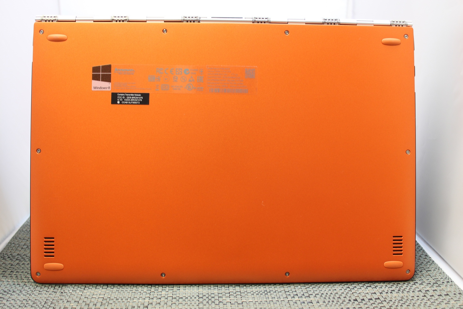
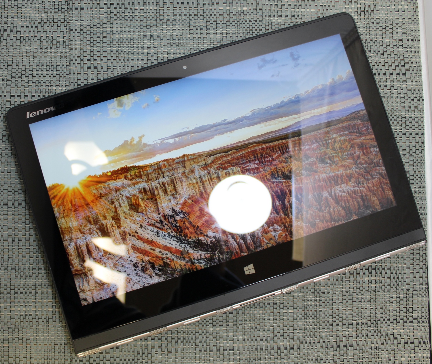
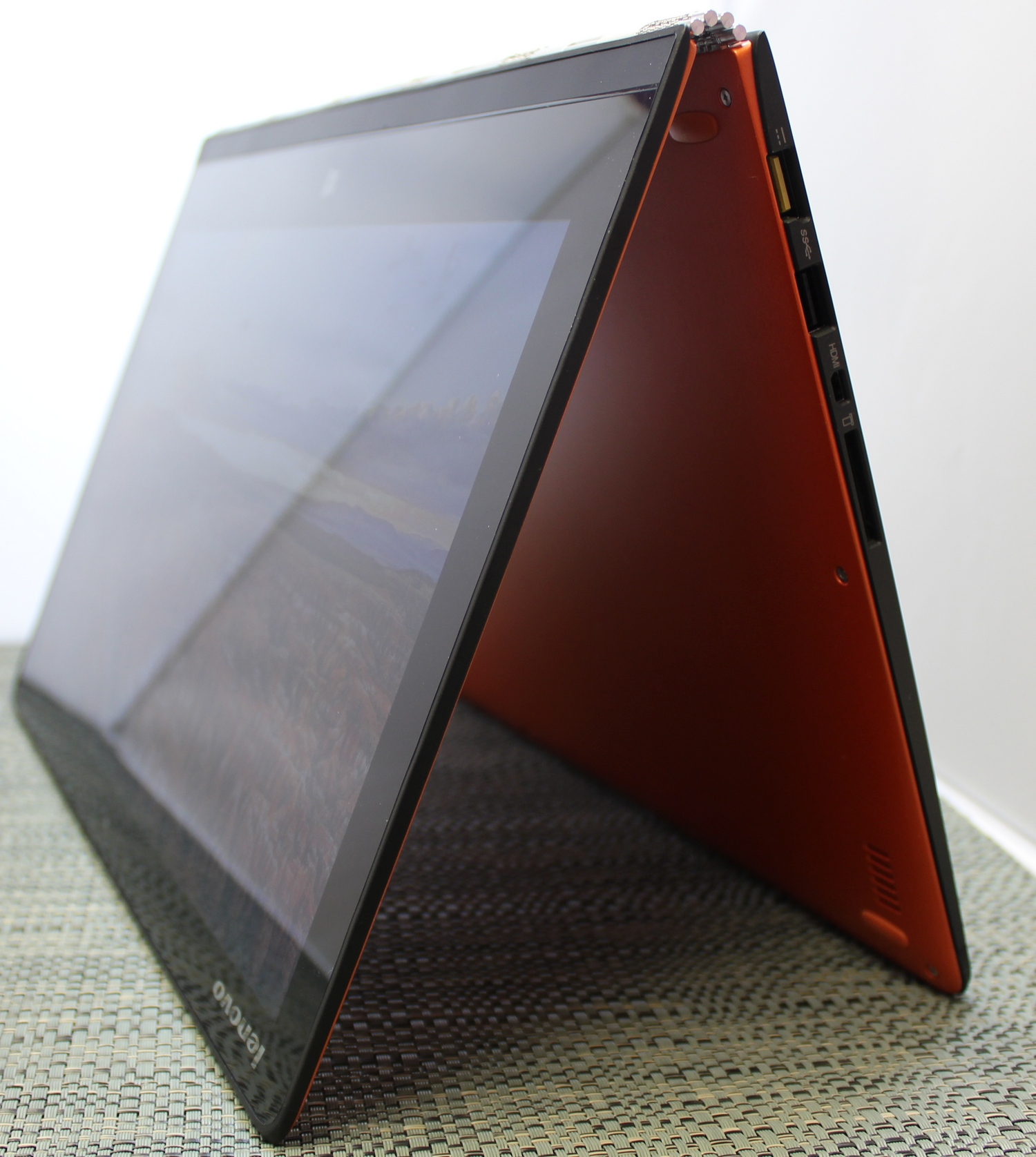
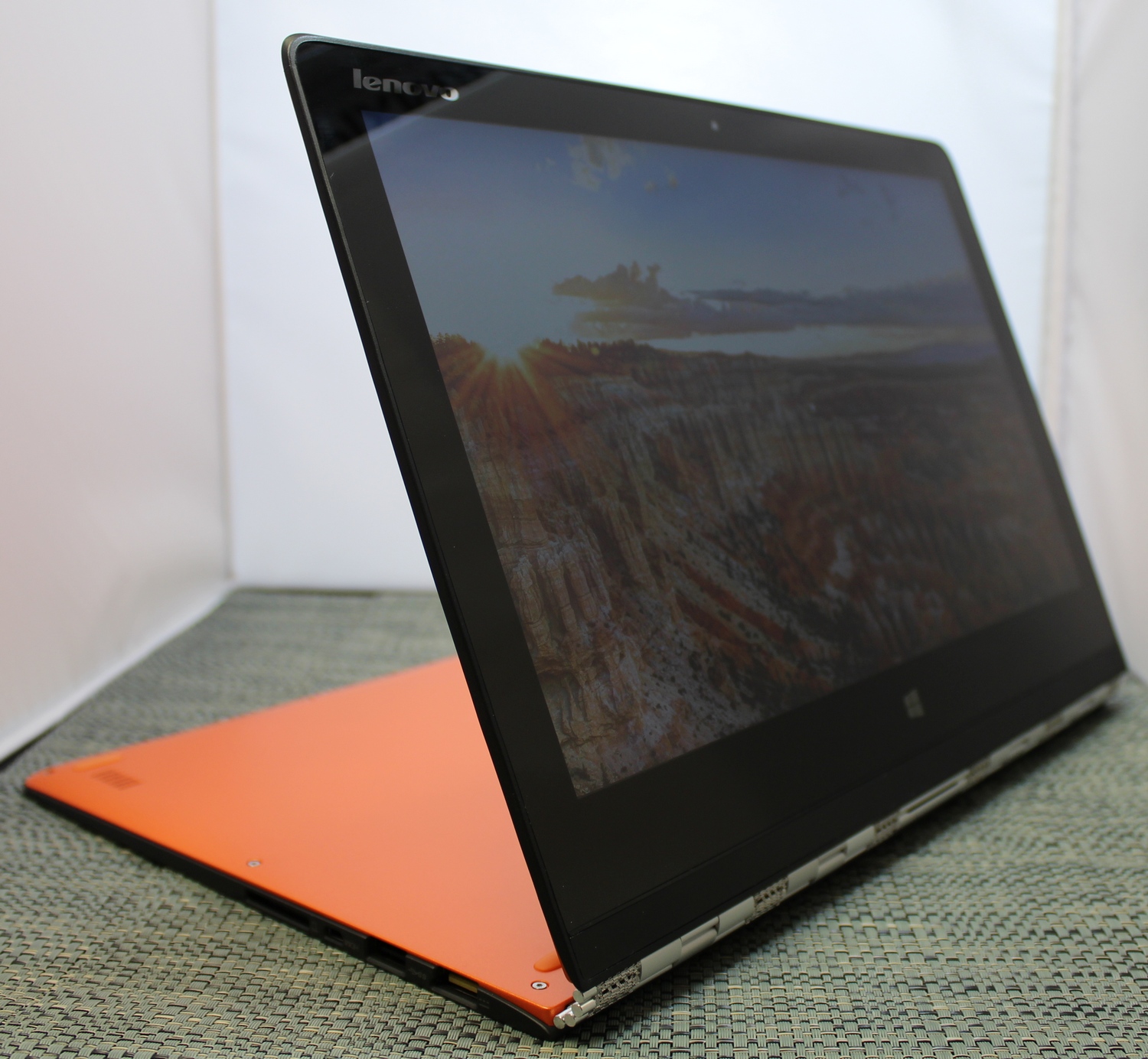
The Yoga 3 Pro’s design is certainly striking, especially in the Clementine Orange version which was shipped to us for review. It is incredibly thin, coming in at just 12.8 mm, or 0.5 inches. It is very light as well, with the Yoga 3 Pro tipping the scales at 1.19 kg, or 2.62 lbs. The most striking feature of all is the watchband hinge, which consists of 885 pieces of aluminum and steel. It is functional too, with the new hinge allowing the Yoga 3 Pro to be opened 180° and sit completely flat, as well as continue to open all the way to 360° to use the Yoga 3 Pro as a tablet. The hinge has a good amount of stiffness in the travel, and stays exactly where you open it to. The hinge also has six focus points, as compared to just two on the outgoing model.

The exterior of the Yoga 3 Pro is in colored plastic, with three colors available for purchase. The orange on the review unit has an almost metallic paint job to it, with some subtle sparkles in the coating. The exterior is clean and simple, with the only notable features being the chrome Lenovo text on the top, the watchband hinge at the back, and a couple of speaker grilles on the bottom.
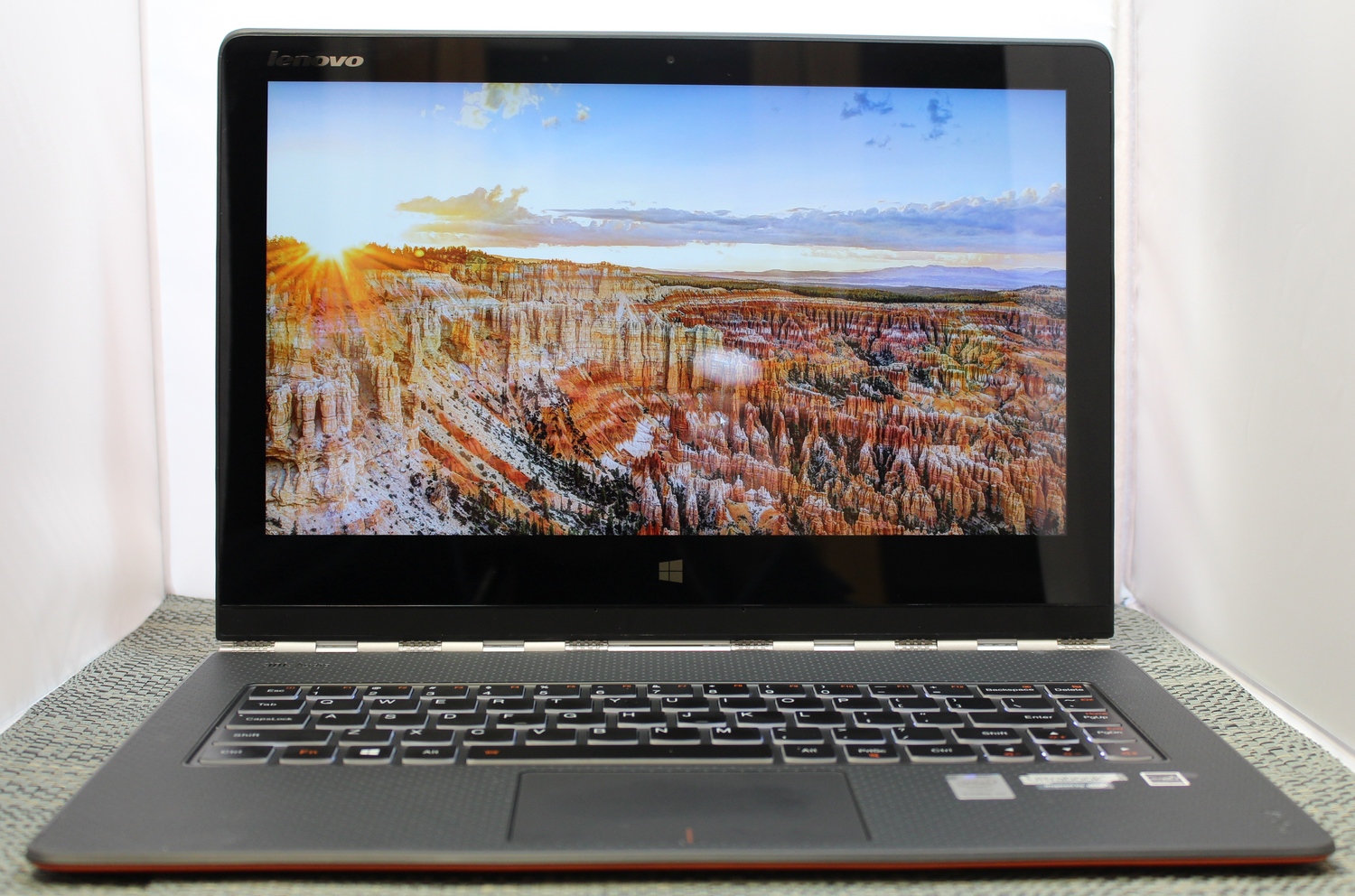
Once opened up, you get a glimpse of the 13.3 inch display, which is covered in Corning Gorilla Glass. When in one of the touch modes, this will be your primary interface for the device, and where as the Dell XPS 13 has removed the display bezels, the Yoga 3 Pro keeps them. For a touch device, this seems to work better, especially when trying to initiate one of Windows 8’s edge gestures. With the tiny bezel on the XPS 13 this could be slightly more difficult, but on the Yoga 3 Pro, there was no trouble there at all. The one issue found with the touch interface is that the Start button on the display seemed miss some of the attempts to invoke it. Lenovo has let me know that they are working on a fix for the sensitivity of the Windows button on the display.
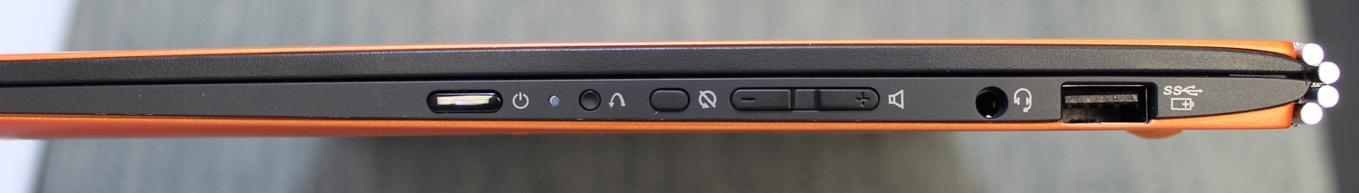
The left side of the device features a SD card slot, mini HDMI port, and a USB 3.0 port. The power port is also on the left side, and Lenovo has created a new form factor for the port, which allows it to double as a USB 2.0 port as well when the power cord is not plugged in. It is a nice bonus, when most Ultrabooks only come with two USB ports. The right side features another USB 3.0 port with Sleep Charging, headset jack, volume rocker, display lock, Novo (Recovery) button, and a new location for the power button. Lenovo found that the placement of the power button on the Yoga 2 Pro could cause people to accidently push it, so they have moved it into the middle of the device to correct this.

The keyboard deck has been updated as well, and is now covered in a soft, dimpled coating, which makes the device quite comfortable to type on, as well as gives it a sturdy base for Stand mode. The backlit keyboard is also slightly different, with Lenovo going from six rows of keys, to just five. The sixth row on the Yoga 2 Pro was the function keys, as well as various Fn functions such as display brightness, volume, and others.
While the core typing experience is very much the same as the outgoing model, the removal of some of the keys has compressed a lot of the functions onto other keys. The volume up and down is now Fn + Left/Right, and brightness is Fn + up/down. I appreciated the dedicated Home and End keys on the Yoga 2 Pro, but they are now doubled with the Page Up/Down keys. When looking at the deck of the Yoga 3 Pro, there is quite a gap between the top of the keyboard, and the top of the deck, which I can only assume Lenovo has done to improve the ergonomics when holding the device like a tablet. The keys are very much centered now, so holding the top or bottom of the device means you only feel the soft dimpled texture of the keyboard deck.
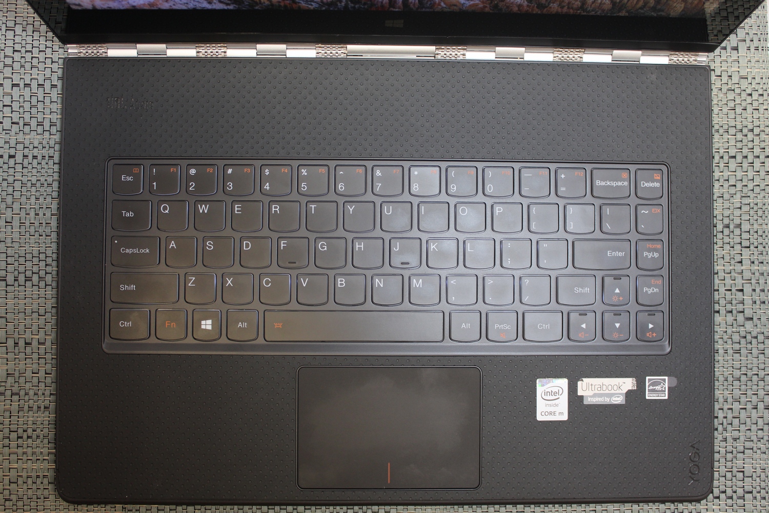
The trackpad is also very much the same as the Yoga 2 Pro, with a Synaptics clickpad being made available. It is quite smooth, and easy to use. I did find the two-finger scrolling to be a bit odd in modern Windows. The Start Screen, for instance, would not scroll with two-finger scrolling, but the selected tile would change. It is different behaviour, which is the only reason I mention it. The Synaptics software does have quite a few more options than the Microsoft Precision Touchpad drivers, which anyone who likes three and four finger gestures will appreciate.
One cannot discuss the design of the Yoga family without discussing the convertible nature of the device. The Yoga 3 Pro can be switched into four modes by simply folding the display into different orientations. The normal mode is laptop mode of course, and here the Yoga 3 Pro performs very well, and unlike convertibles with detachable displays, keeps the traditional balance of a laptop with the processor and battery in the keyboard section.
Next up is Tablet mode. The Yoga 3 Pro is generally too big for use as a tablet, but it does work in this orientation. They slightly smaller keyboard is appreciated for this model year, since you are less likely to be holding the device where the keys are. The keyboard is of course deactivated in this mode, so it is only a comfort issue.
Tent mode has the laptop folded like an inverted V. The footprint of the device is incredibly small in this mode, and it is very sturdy as well. With the back of the laptop acting as a kickstand, touch inputs on the screen are free of bounce from the display pushing against the hinge. If you have somewhere sturdy to set the Yoga 3 Pro, and you need to use it like a tablet, this is the mode to use.
The final mode is the one that I tend to use more than the others (except laptop mode of course). Stand Mode is fantastic for any sort of media consumption, and in this mode I find the Yoga 3 Pro easily outperforms most tablets. The display holds itself up, unlike a tablet, and with the keyboard underneath as a base it is very sturdy on uneven surfaces, such as watching a movie in bed.
On a recent trip to Anaheim, I brought the Yoga 3 Pro to see how it would perform on an airplane. The Tent Mode and Stand Mode were excellent for watching movies, or playing games. The smaller footprint made it easy to use on a tiny airplane tray, and with the display at the front, reclining seat backs were never an issue. For those that travel a lot, this would be a good device to consider.
The Yoga 3 Pro keeps the tradition of the Yoga’s design intact, but refines it further. The new model is thinner, and lighter, and features a very nice looking, yet functional, watchband hinge. The new keyboard deck material is quite nice to use, and the smaller keyboard makes the Yoga 3 Pro a bit better to use as a tablet. Overall the design is a nice iteration of an already solid concept.


113 Comments
View All Comments
KZ0 - Friday, March 13, 2015 - link
Why did they have to break the keyboard! So close to perfect, but the keyboard is important!fokka - Friday, March 13, 2015 - link
the yoga line is nice and the yoga 3 pro could be one killer machine, but when i have to press key combos for simple things as adjusting brightness, or to skip a track this would be just a big step back in usability for me.like the author, i'm also not a fan of the rgbw-display, especially when sharp makes a display of the same resolution which is just so much nicer.
and the third point would be the middling battery life. i would give up the 1800p screen in a heartbeat if it meant i could get the same battery life as the 1080p xps 13.
i'm still not the biggest fan of core m, even with a little fan helping out.
i guess for me that means the time isn't quite here yet for the super-slim 12mm for factor and in this generation and probably the next i'd still be more inclined to go with a 15-17mm thick device, simply to have something a bit more future proof in the cpu and especially gpu department.
if more manufacturers could now offer 16:10, or even 15:10 screens on their future devices, that would be much appreciated.
fokka - Friday, March 13, 2015 - link
oh sorry, now i posted the whole shebang, when i only wanted to share my sentiments about the keyboard... edit option, anyone?wintermute000 - Saturday, March 14, 2015 - link
someone in lenovo has obviously gotten hold of some kind of focus group testing or user survey that says most 'normals' don't use the F keys, and gone ahead and loaded the shotgun (pointed at their feet). Observe the X1 carbon (though maybe the latest variant went back to the F keys?), yep thinkpad users don't use F keys... not.....My company recently got a laptop refresh where we were given the choice of T440s or X1s. The first wave of people went X1s en masse and there was a seriously high return rate after people realised how much of a PITA the new, no-F-key layout was.
MrSpadge - Sunday, March 15, 2015 - link
I agree, this is ridiculous especially for a "Pro" version. And they still have so much space left at the top of the current keyboard.Wwhat - Sunday, March 15, 2015 - link
It seems the new paradigm to remove stuff and reduce user convenience, samsung did it with their new phones, apple did it with their new single-port laptop, and you see more and more devices being released with pointlessly reduced functionality.But as for 'pro', I'm not sure any 'pro' would get lenovo after the spy-ware fiasco.
I know lenovo is not an option for me after that.
Gigaplex - Monday, March 16, 2015 - link
"Pro" use in the Enterprise would just use a corporate image, rather than using whatever Lenovo installed.Wwhat - Saturday, March 21, 2015 - link
Fair point, but seeing we hear more and more about things embedded in firmware and BIOS I'm not sure I'd trust it either way. Especially the BIOS would only require a cooperation of lenovo to 'enhance' their system.It's the nature of the nastiness they were exposed as bundling, it was too complex and devious to brush off. In my opinion at least. And it ruined any trust I have.
miahshodan - Tuesday, March 17, 2015 - link
I don't mind the function keys as much as having keys in the wrong place. For instance the right shift key should be directly below the enter key and the forward slash / should be below the '. things like that kill typing speed.Wwhat - Tuesday, March 24, 2015 - link
Odd view, the shift key isn't too bad if you type with ten fingers since it is where it suppose to be except the right part missing, and people can probably adapt to that.As for the forward slash, that is always below the middle between ; and ' on standard keyboards, check wikipedia to see. And it's actually the ctrl key which isn't where you expect it.