Core i7 Giveaway Winner, AT on Kindle, Site Redesign Preview and More
by Anand Lal Shimpi on November 13, 2009 12:00 AM EST- Posted in
- CPUs
We have a winner to our Core i7 giveaway from last week: Gregory Peng from California (user name Possum). Congratulations Gregory! I've just sent you an email to confirm your details, drop me a response and I'll get this out to you.
Below are the specs of the iBuypower system that Gregory won:
| iBuypower Core i7 System | |
| Case | Chimera Inferno |
| CPU | Intel Core i7 870 |
| CPU Cooler | Asetek Liquid Cooler |
| Motherboard | ASUS P7P55D-LE |
| Memory | 4GB DDR3-1600 |
| Video Card | ATI Radeon HD 4890 1GB |
| HDD | Intel 80GB SSD, 1TB |
| Optical | LG Blu-ray Reader |
| PSU | NZXT 800W |
| Media | 12-in-1 Card Reader |
| OS | Windows Vista Home Premium 64-bit |
| KB & Mouse | iBuypower Keyboard & Mouse |
| Monitor | ASUS 23.6" Widescreen LCD Monitor |
We're already working on gathering hardware for the next giveaway, so this won't be your only opportunity to win. Thanks again to Intel and iBuypower for sending in the hardware for this giveaway and thanks to all of you for entering.
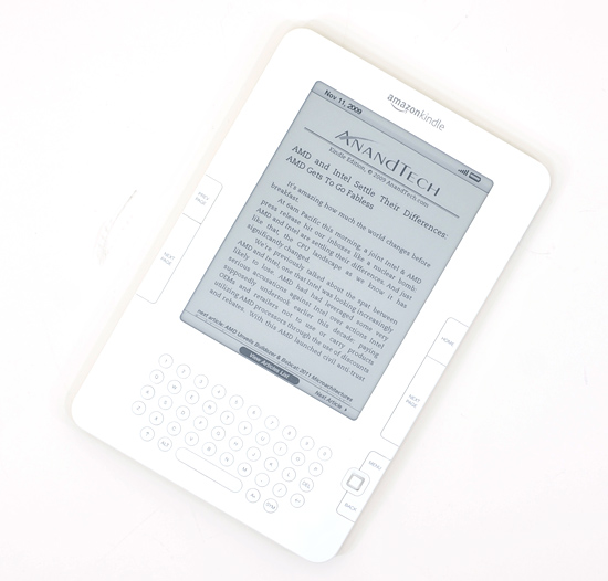
Next on the Agenda: AnandTech is now Available on Amazon Kindle Devices
I'm a Kindle 2 owner and I have to admit, it's sort of exciting seeing AnandTech on the device. Our 10 most recent articles are available for reading (subscription required) on the Kindle through Amazon's Kindle Store. If you've got a Kindle, check it out.
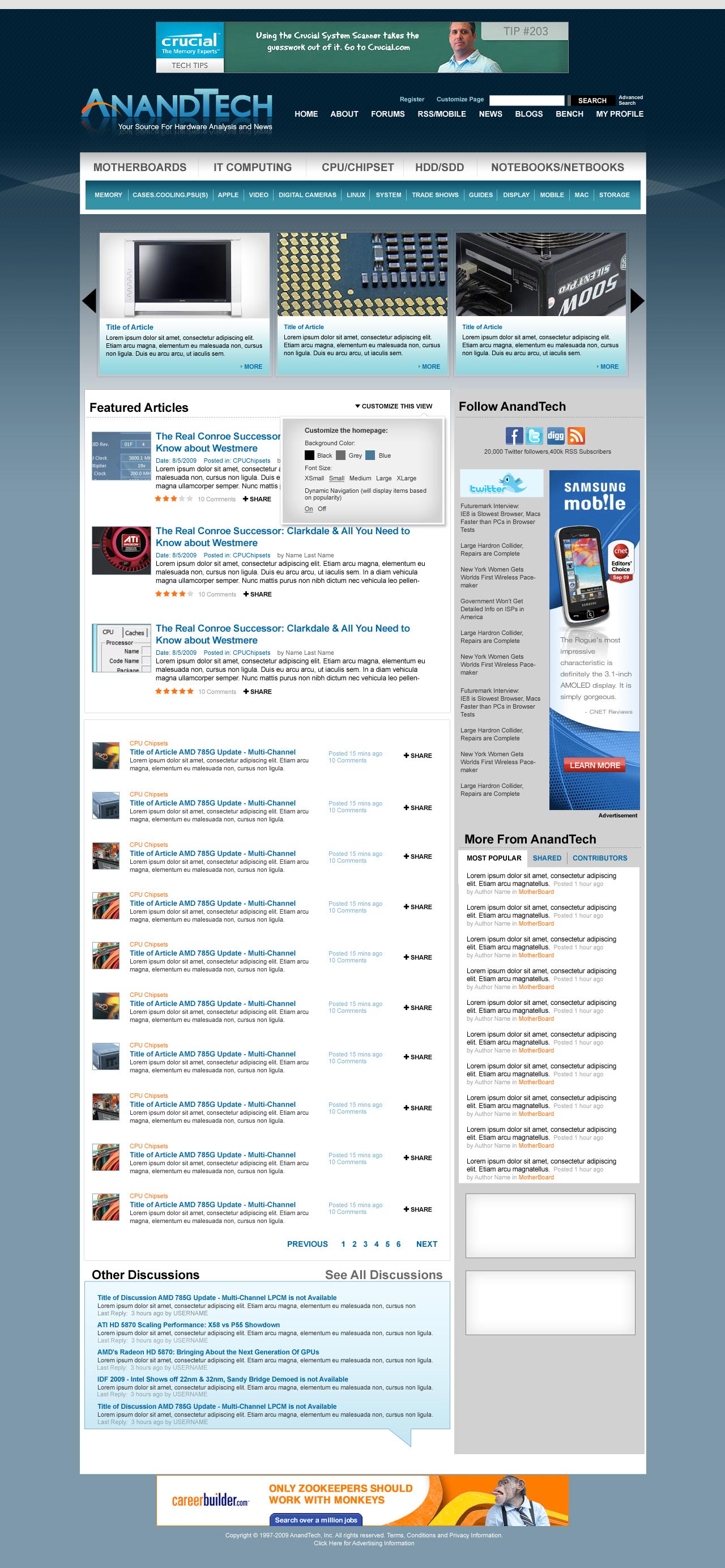
The AnandTech Redesign
I mentioned this a while ago, but we're finally at a point where we can give you guys an idea of what's coming. Have a look at the new AnandTech and be sure to leave your feedback in the comments section. We haven't implemented it in HTML so there's still room to tweak.
Not all of the ad placements are in (something I want to get your input on shortly) and there's going to be a ton of customization options offered as well. So keep those two in mind. The main carousel up top with three big article images will actually automatically rotate through a set number of articles so you'll be able to get a good idea of the past several articles on the main site without any scrolling.
Our main goal here was to make the site look and feel a lot more modern, as well as bring its functionality where it should be for 2010. There's a lot of cool stuff coming with more giveaways, more content and more categories of Bench next year. Here it is, constructive criticism is always appreciated :)
Coming Soon: A Call for Writers
It's a bit premature but I just wanted to give you all a heads up that we'll be looking for some new writers in the near future. If you've ever wanted the chance to get into the industry, it may be time to start polishing off your writing skills. Get those writing samples ready folks!
More details soon...
Anand Goes to India?
From 12/1 - 12/15 I will be traveling to India for the first time in 10 years. If you're an AnandTech reader in/around Mumbai, Delhi or Jaipur let me know. If we can get enough folks together we might do a reader meetup :)


97 Comments
View All Comments
v12v12 - Monday, November 23, 2009 - link
The new lay out seems nice but I inherently have a problem with this whole "modernization" non-sense. I say non-sense b/c WHO defines "modern," and what about "modern" means it ought to be that way or mimic what *others* attempt to define it as? When I hear or see "modern" it typically reeks of flash, java and a whole host of other overly complex and unnecessary code aka more things to go wrong, or not load properly, or the worse—compatibility issues... I don't wanna be a downer/pessimist, but please, if you're going to update the site; learn from the racing industry: Form FOLLOWS function. Flash, and all kinds of animations and little window popups = problems and added weight that doesn't aid to getting the info we desire ASAP.Also a note... the post-options for a new/reply post are horrible, (strike through) no, THE WORST! They never, ever work properly! How many times do we have to say it; FIX THE B/I/U/etc functions. Someone's always retorting "well, her her, it works fer me..." Great for YOU, but for a majority they DO NOT WORK. I'm trying to use these features (right now) and they are NOT working, and haven't ever worked starting from IE6 --> FFox2, 3...
Again "modern" doesn't mean flash and trash etc... "modern" means; light weight + powerful AND... EFFICIENT! Not like todays' cars; heavier than the past and certainly slower per amount of power applied...
Shadowmaster625 - Friday, November 20, 2009 - link
Make sure you can fit more than 10 comments per page. I'm sure intel pays by the click, but this is just rediculous. You need less retarded ways to generate revenue. Just put up more ads. Those are easy enough to block.laptopbattery - Thursday, November 19, 2009 - link
Early morning time, the mist is dim.Curved river bank, willow obviously elegant like smoke. Far does not see the mountain, nearly does not see the ship, http://www.laptopbatteryclub.comonly">http://www.laptopbatteryclub.comonly a little selects the lights, embellishes in the faintly recognizable mist.KingKuei - Thursday, November 19, 2009 - link
1) Congrats to Greg for winning the ibuypower system. Sounds fantastic.2) Let me throw in my vote for the current AT logo on it's original blue colored background. I simply do not like the new proposed logo.
3) PLEASE, please, pleeeaaassseee make the site more mobile friendly. Although AT loads relatively quickly on my iPhone 3GS over Wi-Fi, all of the elements on the mainpage take much longer to load over 3G or on my original iPhone. I'm hoping you will do something to optimize the site for mobile users.
datarez - Thursday, November 19, 2009 - link
With the new design one thing I'd hope it would have is more information above 'the fold'. The new look still only has the main 3 plus the headline of the first in the list viewable on a 1xxx pixel height screen. Seems like the section names and logo are oversized.Just my opinion, still love the content.
TerminusAvid - Tuesday, November 17, 2009 - link
Excellent work guys, the new design looks great and the layout looks simple and easy to navigate! The color combination works perfectly in my opinion. I realize others have already mentioned this but it would be great if it was possible to physically widen the site a bit (given all the empty space on left/right sides). Granted I'm running a 24" LCD but still it seems like you would be able to fit far more information into a wider format? What ever the site ends up looking like I'll continue to read on a daily basis!freezervv - Monday, November 16, 2009 - link
Congrats to "Mr. i7" Gregory Peng! Enjoy. ;)As far as a website redesign goes, I'll try to keep the points concise. ("You" encompasses AnandTech, not just Anand)
== 'Don't insult your readers.'
I stopped reading Ars, after five or so years, in part because of their recent redesign. You've always chosen and constructed your graphics carefully (even if you get flak for your slide order), so please don't go image-crazy with unrelated stock photography.
== 'Cater to your readers.'
Yes, I am aware you would like to bring in more/new/different readers in addition to keeping your legacies. Who wouldn't? Just remember that your (new) formatting speaks as loudly as your writing.
For example, "What does an auto-rotating image carousel say?" Imho, it says "I do not know what I'm looking for, nor how to navigate categories, and pretty pictures distract me." Does this sound like your userbase? (AMD article comments-aside?)
== 'Spheres and wheels both roll. In different ways.'
When you read a site frequently (yay, ad revenue!), you learn how to navigate it and develop your own rhythm. Indeed, you usually have multiple rhythms for the different sites (and UIs) you visit.
*Nothing* annoys readers during a site re-design more than having to learn a new rhythm without an observable benefit. Even if the change is simply the Powerpoint-effect (design reflects tools) of your chosen technologies, an "Introduction to New AnandTech" article with an explanation might be nice. It's a technology site! We'd love to read that this widget is the way it is because of this errata in the interface between X and Y.
Good luck!
Possum - Tuesday, November 17, 2009 - link
I'm looking forward to putting this system through its paces and seeing how far it can overclock with the liquid cooling (without going too far though, according to the P55 sockets warning). My own Q6600 overclocked to 3.4 GHz with a 4870 512 MB is struggling on a few scenes in the new Call of Duty game, so hopefully the Core i7 with the 4890 1 GB will smooth that out.I'm also excited to try out the Intel SSD to drastically reduce the hard drive bottleneck effect.
A GIGANTIC THANK YOU goes to Anand and the Anandtech staff for running this contest and to Intel and iBuypower for their generosity in providing such impressive hardware.
-Greg
BarneyBadass - Monday, November 16, 2009 - link
Is a selectable database where the reader can select the motherboard, the CPU(s) you've tested with; the Video Card(s) in that configuration you've tested with and on and on and on... cooling systems etc....Have the database have the prices (at time of build) and pros / cons about the build and other good stuff..
This seems to be what is really missing on all these review sites (no this isn't a negative)... all to many times I've wanted to see card x; with cpu y; on board z; psu whatever; HDD / SSD / Optical drive ...... kind of like a Chinese menu and see how that system compares to some other system from the selection.
Utter'n that... until I can actually play with the site to see how it really behaves.... I won't know if it's soup yet or not :) (Soup's a good thing... better'n dish water anyway! )
---Barney
Guspaz - Monday, November 16, 2009 - link
Say it ain't so, Anand! If the pictures of the new layout are to believed, it harkens the death of the classic AnandTech logo!As far as I can tell, the current logo has been with us for at least a decade (http://web.archive.org/web/19991129032934/http:/an...">http://web.archive.org/web/19991129032934/http:/an..., possibly longer.
I don't like the new logo. It looks amateurish, like something you'd get from cooltext.com or a similar generator. All detail (and character) is removed from the orange swoosh, the angle change and steeper curve removes the stylized application, and the reflection reminds me of Mac OS circa 2001.
Please, keep the current classic logo :(