Windows 10 Build 10547 Brings Some Nice Changes For Insiders
by Brett Howse on September 18, 2015 11:00 PM EST- Posted in
- Operating Systems
- Microsoft
- Windows 10

It’s Friday and Gabe Aul has unleashed another new build of Windows 10 to people in the Windows Insider Program’s fast ring. Unlike the last build which was mostly just some cosmetic changes, build 10547 looks to fix a few of the complaints that I had with Windows 10 in our review.
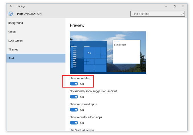
One thing that bothered me was that the Start Menu would not allow you to create groups more than three “medium” tiles wide, and with this update, users can select “Show more tiles” in the personalization settings which allows a fourth column of tiles. It’s nice for the desktop, but this should be very beneficial to tablet mode which I felt was wasting a lot of space with just the three column width. Having four columns also allows for two wide or large tiles to be on the same row, which is a much better solution than having to plug holes with smaller tiles even if you don’t really want them. Hopefully the wording changes on the setting, since Show more tiles is not really what the setting is doing, and it is of course a fall back to the Windows 8.1 setting with the same name which actually did allow you to put more tiles on the Start Screen.
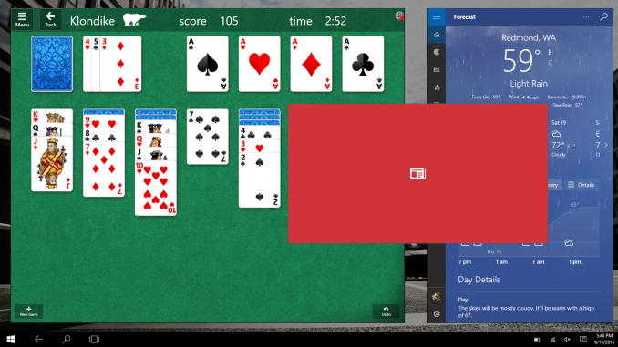
Tablet mode also gets some tweaks. I felt that Windows 10 actually lost a step compared to Windows 8.1 in just touch usage. Microsoft appears to be trying to bring back some of the good tablet features that Windows 8 had. A small change which should actually be a nice change is that when you have two apps snapped in tablet mode, you can now snap another app over one of those, just like in Windows 8.1. Microsoft has a graphic that shows the app teeter from side to side to show you which side it is going to replace. It’s a small change, but welcome. Windows 8.1 was pretty solid as a tablet operating system so it’s great to see Windows 10 adding some of those features back.
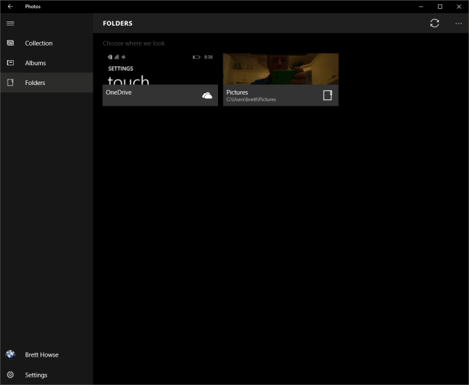
The core apps are also being updated constantly, and we’ve seen some good changes to things like Mail getting an option to disable conversation view, and the photos app keeps getting iterated to make it a better experience. It has been updated again to make it more obvious which photos are on your PC and which are in the cloud. Other core apps like Xbox app are getting updated, and the Xbox app is gaining a Beta program too much like the Xbox itself has.
The Start Menu has gotten some fixes, and with this build the 512 app limit in the Start Menu has been increased to 2048 apps. While there should not really be a limit here, 2048 should be enough for pretty much anyone as far as installed apps.
Cortana, which before required a Microsoft Account, is now usable with a local account. I’ll have to test to see exactly what this means. In the original version of Windows 10, enabling Cortana with a local account would force the system to switch the account login to a Microsoft Account. It’s not clear from the release notes if you can just log in to Cortana with a Microsoft Account now instead of switching the login, or if it is actually usable with just a local account.
There are, as usual, a few known issues as well including Store Apps may not update automatically, so please check out the known issues before installing in case one of them will directly affect you.
Source: Windows Blog


71 Comments
View All Comments
lmcd - Monday, September 21, 2015 - link
Yeah, I miss hot corners as well. Funny enough, more so in desktop mode than tablet mode. The Charms menu was totally underrated, and some of its functionality should be more present in the notifications pane.The bigger thing I want though is more tablet friendliness in Edge. Right now, the Downloads menu and other menus are completely unusable without a mouse or other pointing device.
kmmatney - Monday, September 21, 2015 - link
The problem I had is the charms bar always popped up when I didn't want it to, and sometimes wouldn't pop up when I needed it. In Windows 10, I mainly hate having to go between several places whenever i want to change a setting - you still need the old control panel just as much as the "touch-friendly" windows screen. Overall I like the under-the-hood efficiency in Windows 10, but I don't think I'll ever like the UI as much as Windows 7. I still prefer ClassicShell for my start menu, although I'm giving the Windows 10 start menu an honest try.imaheadcase - Saturday, September 19, 2015 - link
Am i the only one that HATES the little sliders for on and off? Its to "mobile phone" looking to me. The design is not very user friendly. I had a friend text me wanting to know if when it showed "on" means it is on in that position, or does she slide it over to turn it on. lolimaheadcase - Saturday, September 19, 2015 - link
What i mean is, why don't they go back to how it used to be with Check boxes. Then you know instantly at first glance. The way it is now you try to read like a book left to right. Very annoying.I will look for a UI skin that changes it if i can.
bug77 - Saturday, September 19, 2015 - link
No you're not. Those controls tell you they should be dragged, instead of pressed. Big usability fail.damianrobertjones - Saturday, September 19, 2015 - link
Pointless. It's not like we're constantly changing those settings.Oxford Guy - Saturday, September 19, 2015 - link
The 1983 Apple Lisa was designed with clickable boxes. Now we're in 2015 and MS is too stupid to figure out something that Apple's UI people discovered 32 years ago.That's progress for you.
Gigaplex - Saturday, September 19, 2015 - link
They intentionally moved away from check boxes because they didn't work as well as a slider in their usability studies for touch input. Considering both Apple and Google do the same thing with sliders on their touch devices, they're not exactly breaking new ground here.kmmatney - Monday, September 21, 2015 - link
I would just like (for desktop users) all the setting in one window. I'm constantly going back and forth (or at least was while settings things up) between the touch settings window, and the Control panel.Fiernaq - Monday, September 21, 2015 - link
Agreed. Checkboxes are a much more intuitive way to identify state. The reason physical toggle switches work is because both the On and Off indicators are always visible and it's also easy to see which way the toggle is pointing. When you drop to nearly flat shapes with only color as an indicator it becomes virtually impossible to guarantee everyone will understand at first glance which direction the toggle is pointing let alone which direction they need to point it to achieve their desired state. At least Apple's toggles aren't quite flat - the little circle with drop shadow more clearly represents the toggle itself. Unfortunately, even on Apple they only show one indicator at a time and it's up to you to figure out if that indicator means that's what the toggle is currently set to or if moving the toggle over to that side will set it to that state.This stuff should be common sense. I just don't understand how people can mess it up so badly and still get paid for their work.