The Apple Watch Review
by Joshua Ho & Brandon Chester on July 20, 2015 8:00 AM EST- Posted in
- Wearables
- Apple
- Mobile
- Apple Watch
Design
With a new form factor comes the need to deeply analyze design, and in the case of a smartwatch it really becomes more important than ever before. Like clothing, watches are deeply personal in a way that smartphones weren’t. The most immediate aspect of the Apple Watch is the size. I’ve used the Moto 360 before, and while I didn’t think it was too big for me, people with smaller wrists can look rather ridiculous wearing the Moto 360 or many other smartwatches. Even in the 42mm variant, the Apple Watch is surprisingly small for a smartwatch. The 38mm variant is definitely sized for people with smaller wrists.
Outside of height and width, the thickness of the watch is definitely a bit more than what one might expect from a regular watch, but it isn’t really all that noticeable due to the rounded curves of the casing. When looking at the display, the display’s cover glass also blends seamlessly into the metal case of the watch, which really looks impressive indoors, although the illusion is somewhat lost in strong sunlight as it becomes obvious where the display ends and the bezel begins. This really helps with analog watchfaces, but in practice I found I was never really bothered by rectangular watch displays. If anything, I’ve found round watch display to lack information density; round watch displays just aren’t pragmatic for general purpose computing.
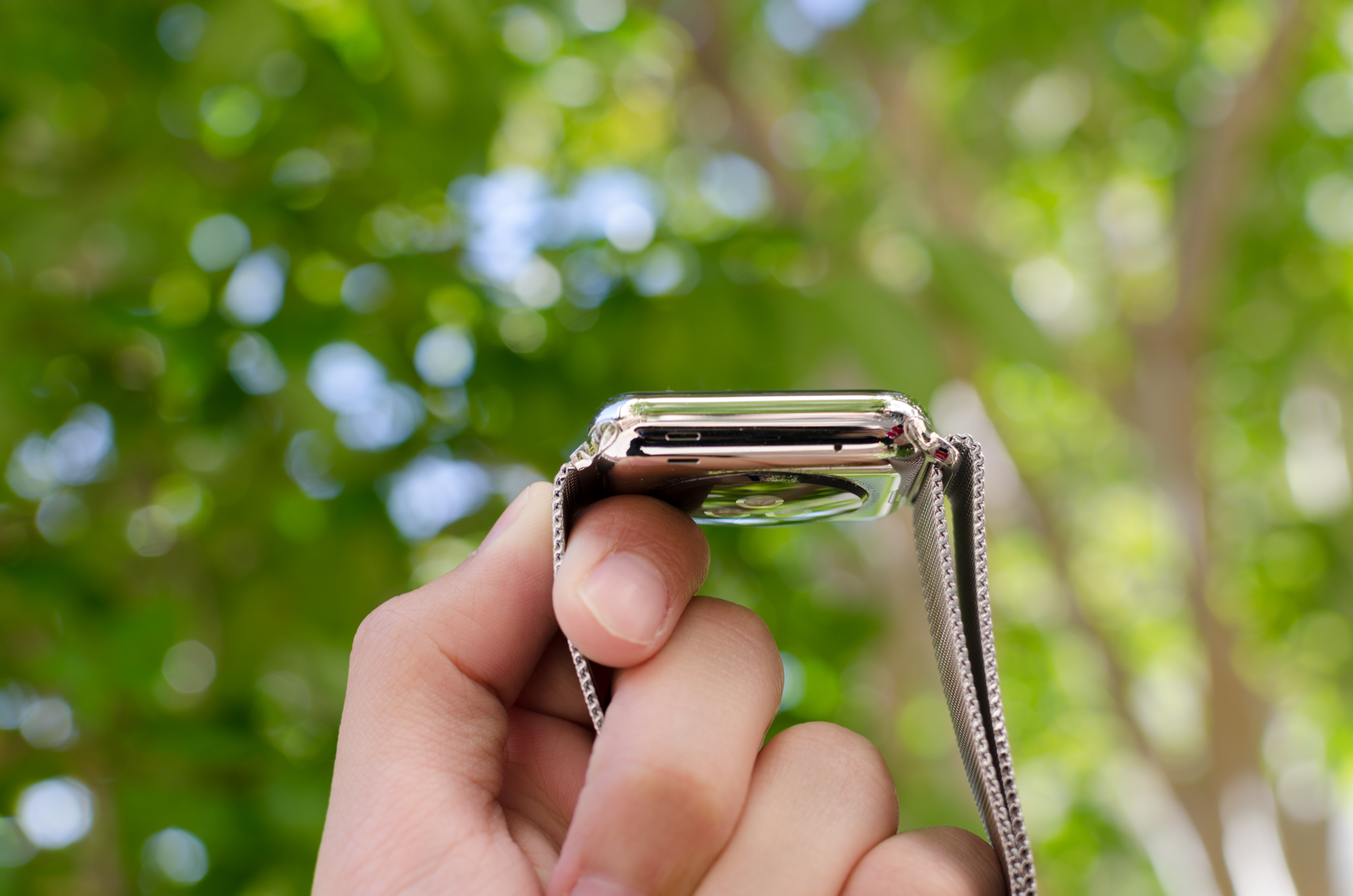
In order to really give a sense of what the watch looks and feels like when it’s on the wrist, I’m going to start by assuming that most people will wear this watch on their left hand. This places the side button and digital crown on the right. If you read nothing else in this entire article, you should know that the digital crown is probably the best solution I’ve seen to the smartwatch input problem yet. The digital crown manages to have just the right amount of friction to the knob so input feels deliberate without being difficult. The notches that surround the crown really help with gripping the crown and improve the precision of input with the digital crown. Both the digital crown and side button have a solid, clicky action, but it’s probably not a surprise at this point given that Apple seems to consistently nail down details like button feel on their iPads and iPhones.

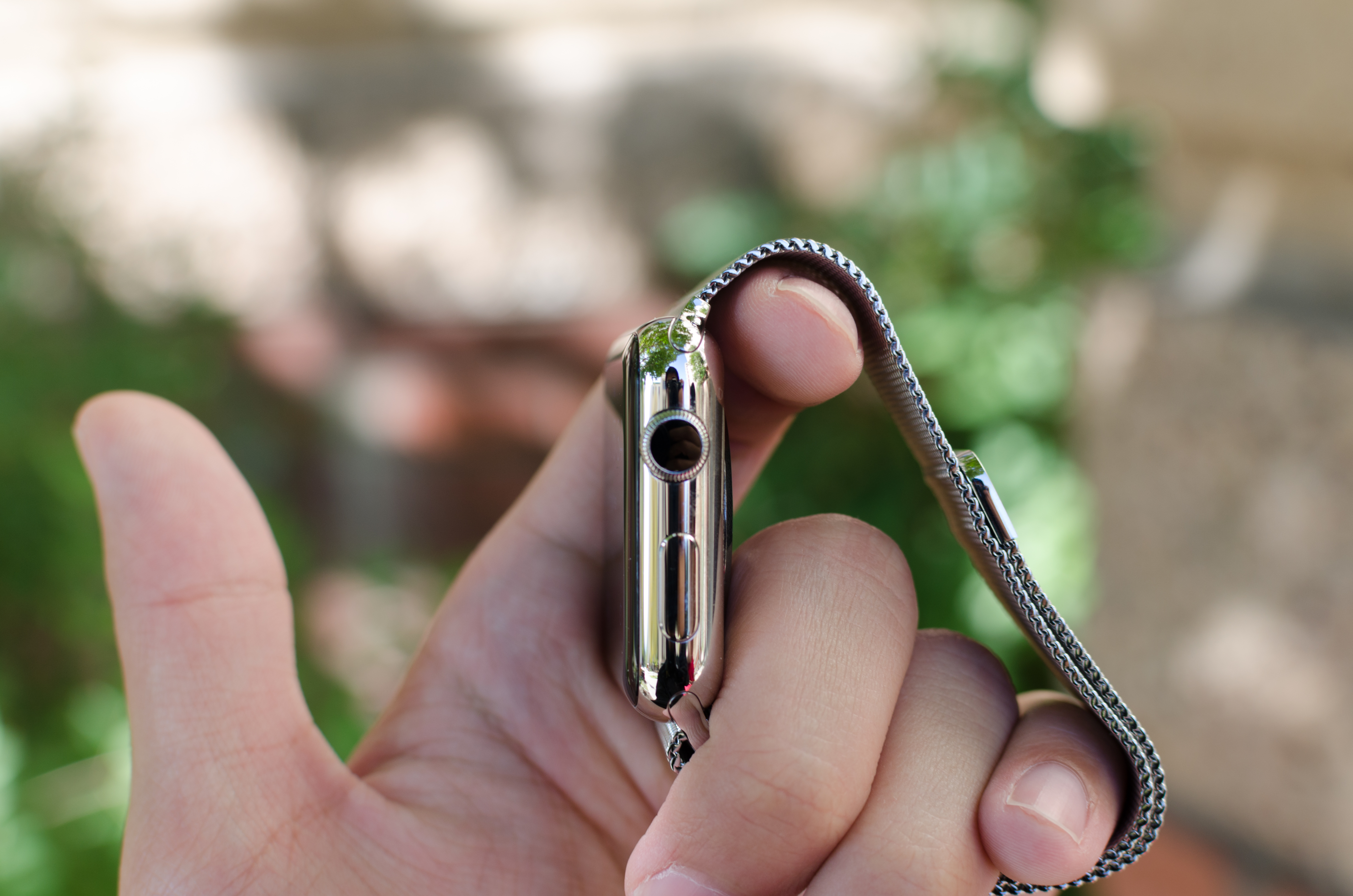
On the left side of the watch, the only notable interruptions are the speaker and microphone holes. As far as I can tell there’s only a single microphone hole, but it seems that Apple has some form of noise cancellation as background noise is generally well-muffled.
The top and bottom of the watch are just the attachment points for the bands of the watch, but from a design perspective this is probably one of the most crucial. The interchangeable bands work incredibly well because of just how easy it is to attach and detach bands. Attaching a band is as simple as matching with the slot and sliding it in, although it is possible to get it wrong by putting a band in upside-down. The fit and finish of both the Milanese loop and sport band that I received were both essentially perfect here, and the Milanese loop band has a glossy finish on the side that helps the band to blend in with the casing of the watch.
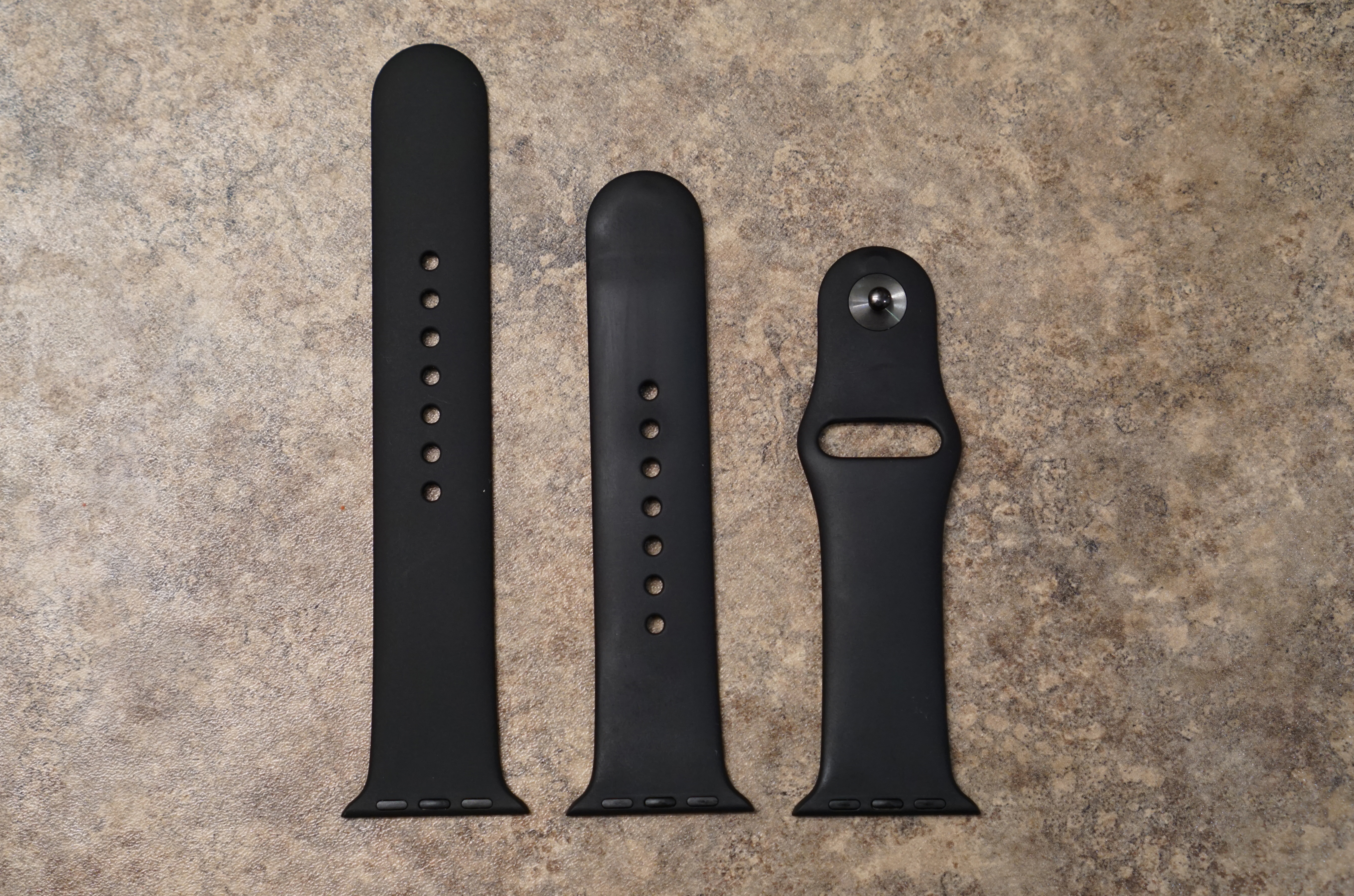
The bands themselves are probably the most important aspect of the Apple Watch's design. While Apple definitely hopes that users will be purchasing bands in addition to the one that comes with their watch, it's a safe bet that most users will be using the fluoroelastomer bands that ship with the Apple Watch Sport and the entry level Apple Watch and Apple Watch Edition models. Because the fluoroelastomer band ships with the Sport version of the watch and has to fit every wrist size the fluoroelastomer band actually is more like one and a half bands. Included in the package is the section of the strap with the metal pin, and two pieces of different lengths with holes in them. The longer one is meant for users with larger wrists, and the smaller one for users with smaller wrists.
As for the band itself, the feel of it can be difficult to describe. When they were first revealed, my initial thought was that they would have a somewhat firm and rubbery feel. It turns out that the bands are very flexible, and also very soft. The best description I could give is that it feels similar to the soft touch back of the black Nexus 5 and Nexus 9, but much smoother and very resistant to smudges. Water also tends to roll right off of it which makes it very well suited to fitness activities. Since it's not infinitely adjustable there's always a small mismatch between the size of the band and the size of your wrist, but there's not much that can be done to solve that with a pin and tuck design.
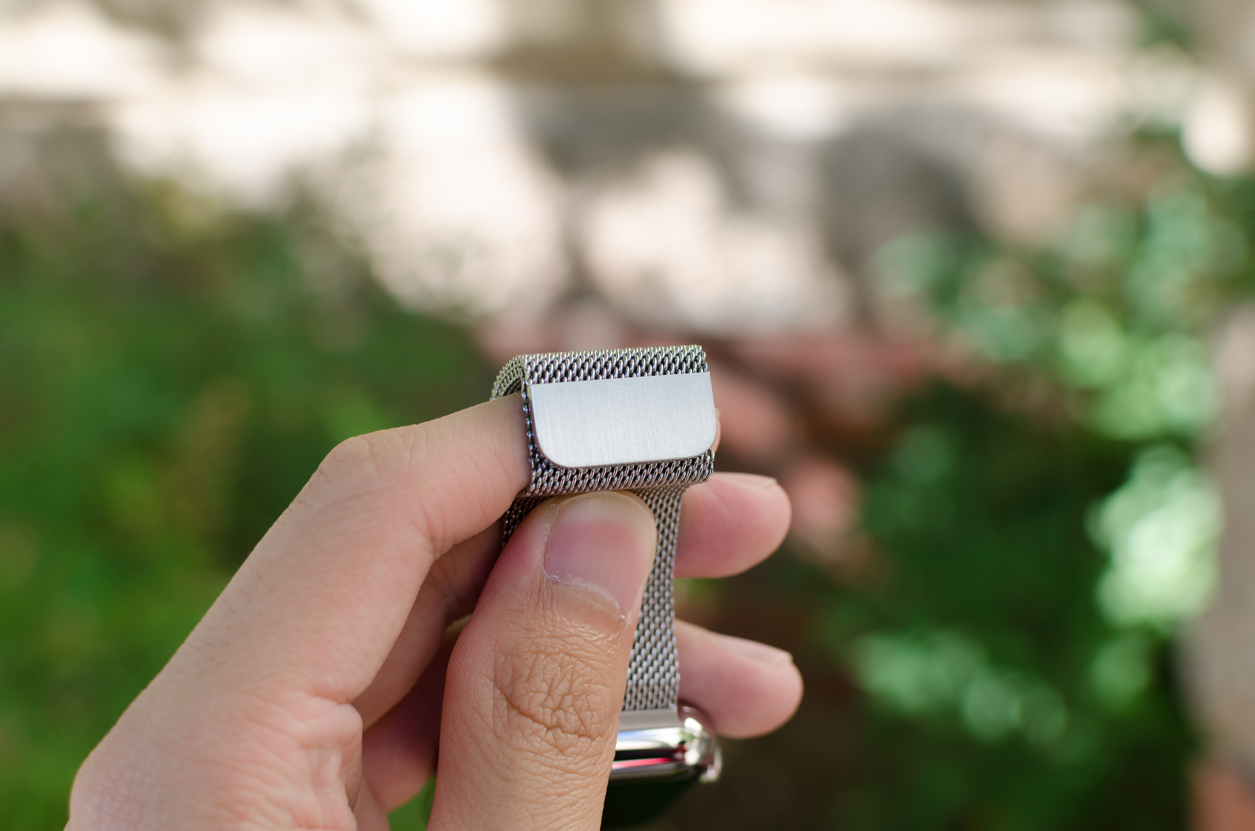
In the case of the Milanese loop, the infinitely adjustable design has basically solved the teething issues I have with wearing most watches. The band manages to deal with the issues I’ve always had with wristbands that always seemed to be either too tight or too loose. The fabric-like pattern of the metal links also helps to distribute pressure while allowing for ventilation, so I don’t feel the need to constantly take off the watch due to trapped sweat or some similar issue. It’s also easy to clean the metal bands if they get dirty, although I suspect the leather bands will be rather difficult to deal with in this regard. There is some potential to pinch hairs, but in my experience this is pretty unlikely and I can count on one hand the number of times I’ve noticed this problem in the past few months. As a result, this is probably the only watch I’ve ever worn that is consistently comfortable regardless of weather conditions. Independent of how good the wearable is from a digital logic/software standpoint, I’ve noticed that these aspects of the design are far, far more crucial than anyone seems to notice. In the case of Apple Watch, the bands are pretty much as good as it gets.
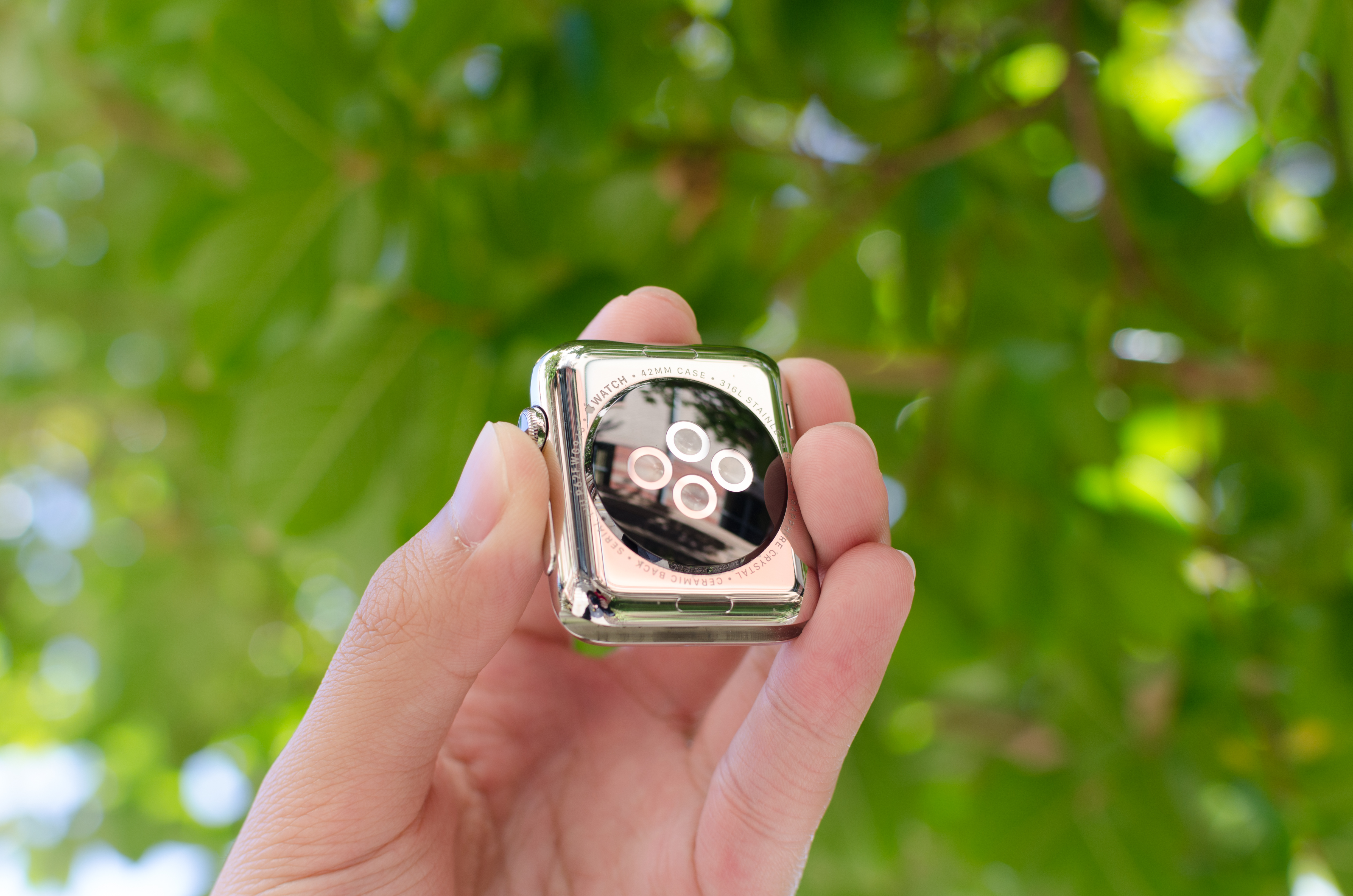
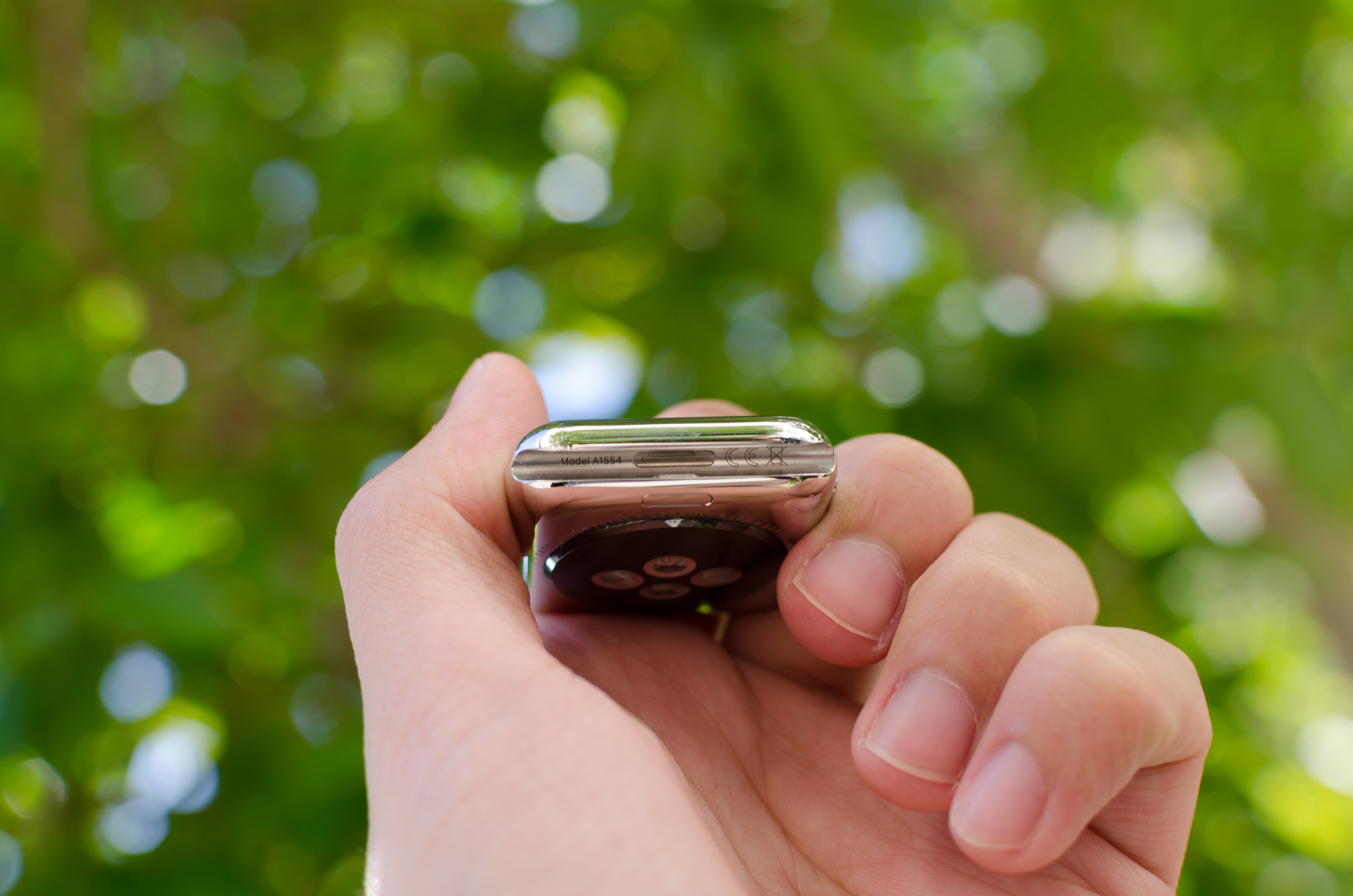
Moving past the bands, the back of the watch is somewhat unremarkable. There’s a rounded crystal that houses the heart rate LEDs and sensors, and serves as an attachment point for the MagSafe wireless charger. In practice, the only notable issue here is that the crystal seems to act as a pressure point when wearing the Watch, but it’s likely that this is done to ensure proper contact for the heart rate monitor.
Overall, Apple has pretty much nailed the design of the watch. The controls are well-executed and placed in a pragmatic position, in a way that I haven’t really seen anyone else achieve yet. The only real objection I have to the design is that the stainless steel casing seems to be a magnet for small scratches. They’re tough to see in most conditions, but with strong lighting it becomes pretty obvious that it’s pretty easy to scratch the watch casing. I suspect the only solution here is to regularly buff out scratches from the casing like most any stainless steel watch. As for the Apple Watch Sport, the 7000 series aluminum seems to hold up to daily use without any sign of scratches or chips on the casing of the watch. At 25g and 30g for the 38mm and 42mm respectively it's also lighter than the 40g and 50g masses of the stainless steel models. Since the Sport edition uses Ion-X glass like the iPhone 6 instead of the Sapphire crystal of the normal Apple Watch and Apple Watch Edition, the display cover glass is much more susceptible to scratching. While I haven't encountered any scratches at this point, the sapphire glass editions will undoubtedly better stand the test of time.


270 Comments
View All Comments
name99 - Monday, July 20, 2015 - link
Regarding ARMv7k, check out the following story:http://arstechnica.com/apple/2011/09/support-for-q...
Note the date --- Sept 2011. Further evidence that Apple plans these things a LONG time in advance,
(Relative to which, it is interesting to note that over the past month there has been a flurry of activity by Apple people on working LLVM targeting M-class processors. Maybe Apple are planning more IoT peripherals in a few years, or maybe they want to stick a small MPU in every Beats headset for some reason?
Or maybe they are moving from whatever they use today for PMU and sensor fusion on iOS/Watch to an M-class core?)
hlovatt - Monday, July 20, 2015 - link
First, thanks for a great review. Excellent to have such detail.I don't wear a watch so won't be getting one. However I know 4 owners who are all very happy. They all previously owned smart watches, Garmin, Pebble, Fitbiz, etc. and universally prefer the Apple Watch. The tap thing sounds like a gimmick, but just try it - it's really well done.
Gripe: If you hate Apple so much that you can't be rational just leave Anandtech. There are plenty of places were you can have a mutual we hate Apple session. You are spoiling the site for others who want to discuss tech. If you prefer some other product just buy it, don't sling insults at others that disagree with you. Get real the reviewers said they wouldn't recommend the 1st gen device and you go off saying they have sold out etc. Totally unfair to them.
name99 - Monday, July 20, 2015 - link
While investigating the CPU details in interesting (and thanks!!! for doing this) I think it's important to appreciate that the CPU is probably the least important thing about aWatch performance as it matters to the average person.There are IMHO three primary performance problems with aWatch today:
(a) There is far too little caching (in a very generic sense) so that third party apps (and some interactions with Apple apps) require communicating with iPhone. Much of this will disappear with WatchOS2; some of it may be an inevitable fact of life regarding how BT LE works and, in particular, the minimum possible latency when one side wants to talk to the other. But it's also possible that this latency could be reduced in future versions of BT by changing the rendezvous algorithm?
(b) The touch screen controller (I assume to save power) only seems to take initial sensor reading at around twice a second. The result is that the first time you touch the screen to scroll, there is an obvious halting until the system sort of "gets it" and starts smoothly scrolling. This is obviously a touch screen issue because using the digital crown (when that is feasible, so for vertical rather than horizontal scrolling) acts immediately and smoothly. The fix, presumably, is to ramp up the rate at which the touch screen controller does its initial sensing, but who knows what the power implications of that are.
(c) The heart rate sensor is on "full-time" (which means, I don't know, sensing once every 10 seconds?) when you are in the Workout app, but otherwise runs at a really low rate (once every ten minutes?) At least the way I use my aWatch, I'd prefer a higher rate.
I'm guessing that Apple was overly cautious about battery life in WatchOS1, and now that most people understand what to expect, and have about 40% battery at the end of the day, they can afford to bump up the sampling rates for all these different things (touch screen, heart rate, maybe even BT LE) and if that moves the battery life down to 20% battery at the end of the day, that's a pretty good tradeoff.
But nowhere in any of this is CPU performance actually an issue. I can't think of anywhere where CPU or GPU performance affect the experience.
name99 - Monday, July 20, 2015 - link
A few comments about fitness:The primary thing using the Workout app does, as far as I can tell, is switch to ongoing (rather than coarse) monitoring of heart rate and position, which is useful but not essential. However it DOES also give you a nice display of whatever you consider important. My Pebble used to kinda sorta track steps and thus calories, but the fact that the watch tracks and displays heart rate on the Workout app screen is actually really useful. With the Pebble I'd kinda slack off when doing a run or step climbing being that's only natural, but when your heart rate is displayed you have more incentive to keep pushing.
The workout app is also nice if you're trying to hit your calorie burn goal every day. If you get to say 10pm or so and are 150 calories short, you can set a calorie goal (rather than say a time goal or a distance goal) and then just start stepping while watching TV or whatever.
Two useful facts to know (which I don;t think you mention). You can launch Workout (or any app) through "Hey Siri launch workout" rather than navigating to the app screen. (It's also useful to know that Hey Siri as a way to start speech ONLY works when the screen is lit up. If you don't know this, it's maddening at first as half the time it seems to work and half the time it doesn't.
Also double-clicking the digital crown toggles between the most recent app and the watch face. I use it a lot to toggle between watch and workout.
Finally most readers are probably young and think the stand up stuff is dumb or pointless. It really isn't, at least for older people. I've got to the stage where, when I stand up I can feel a kind of stiffness in the muscles, you know that old person sigh when you get up. And I've found that since getting the watch and heeding the stand notices, that has pretty much disappeared --- it really does help older muscles to not get locked into no motion for two or more hours.
(Also if you find the standing irritating, it's worth noting that the watch wants you to stand for a full minute, with some motion. At first I just used to stand then pretty much immediately sit down. That's not good enough and it won;t give you credit for that. But if you stand and pace for a minute or so, it will always give a little ding and reward you with credit for the stand.)
The one thing I wish (there is so much we can all want them to add to WatchOS2 and then WatchOS3) is a data broadcast mechanism. In particular, if the workout data could be displayed simultaneously on a phone (placed near a TV or on a step machine control panel) that would be much more comfortable than having to flick the wrist every minute or so to check one's heartbeat. Oh well, in time...
navysandsquid - Monday, July 20, 2015 - link
I've never seen such a butthurt bunch of people. Almost every review on the internet give the apple watch a favorable review. Maybe you guys should stop letting you hate consume you. Anandtech has done one of the most indepth review of the apple watch. Which they do with most products. If you don't like apple products don't read the reviews. Your pathetic for even comments such ignorant things like "Watch under 9 days of battery life is unacceptable" Like please name a watch device with this much capability that runs longer then a couple days. oh wait you cant. I've had the watch for about 2 months and this review is spot on weather you like apple or not. Anandtech is a good review site. So just look in the mirror and say "Why do I hate them so much" Let me answer that for you. You don't like paying for what you get. Wait let me rephrase that. you do like paying for what you get your just to cheap to pay for quality. so p1ss of and buy yours self a Samsung smart watch for 149$ and let it collect dust lol I'm donename99 - Monday, July 20, 2015 - link
"Glances are well-executed and a useful feature, but I don’t really get the point of integrating heart rate monitoring into a glance or similar cases of app information"The authors appear unaware that you can customize glances. Go to the Watch app on iPhone and look around. You can both hide glances you find unimportant, and rearrange those that you want to use. Once you've done this, you can basically prioritize so that the most important stuff is in complications, while second tier stuff lives in glances, and third tier stuff requires an app launch.
name99 - Monday, July 20, 2015 - link
"Moving on to the saturation test, we can see that Apple has put a huge amount of effort into calibrating these displays, which is somewhat surprising given that one might expect wearables to not be all that critical when it comes to color accuracy."A persistent (and STILL not fixed) problem with the Apple ecosystem is that the faces of contacts display slightly differently on OSX vs iOS. There are outright bugs in the system (.psd photoshop files get incorrectly cropped on iOS, and different gamma is applied on OSX and iOS) but these may be fixed with the new Contacts framework of iOS9/OSX 10.11.
Point is --- your eye is actually remarkable sensitive to these apparently very slight deviations, at least when it comes to faces. So it makes sense for Apple to line up their hardware so that when they (at LONG FREAKING LAST!) get their software act together, the face photos do look identical across the line.
(And BTW how long will we have to keep typing in triples like iOS10/OSX 10.12/WatchOS3? At some point, and I think we're reaching that point, it's time to just refer to AppleOS 2015 followed by AppleOS 2016 followed by ...)
aryonoco - Monday, July 20, 2015 - link
I am not an Apple hater, and I am very curious in the Apple Watch and the whole wearables category. However I agree with those who say that this review was below Anandtech's standards. Overly wordy, with too little information. I don't think I have ever said this about an Anandtech review before, but after reading this, I really don't think I learned a single thing that I didn't know going into the review.whiteiphoneproblems - Monday, July 20, 2015 - link
Without wanting to "pile on," I agree that this review could have been 1/3 the length, and 3x as helpful. I usually look to AT for the "best" review of any mobile device, but I would not say that is the case with this particular review. Most other Apple Watch reviews I've read have been more useful. (I think it comes down to editing.)nrencoret - Monday, July 20, 2015 - link
+1 on that. I think you nailed the fact that Anandtech's succes is after reading an article, you always come out at the end a bit (or a lot in some cases) smarter. This review breaks the trend.