Windows 10 Technical Preview First Impressions: The Return Of The Desktop
by Brett Howse on November 13, 2014 8:00 AM EST- Posted in
- Software
- Microsoft
- Windows 10
I’ve said this before, and I will reiterate it now. Windows 8, in general, is not perceived in a positive light. Not necessarily because of the lack of features, or even due to the touch first interface, but because from the start people did not buy into the paradigm. We can argue over why that was, and the specifics are likely different for every individual. But a big part of that was that Windows, which has had a familiar interface since Windows 95, had changed dramatically in look, feel, and general use. The traditional mouse and keyboard PC and notebook is a big part of the Windows user base, and especially at the beginning, Windows 8 did not cater to that crowd. While there were certainly improvements to the desktop, it was not enough to overcome the negative feelings of many users in regards to being productive on their PC. I say this as a fan of Windows 8.1, and I say this despite the positive review from this site. Windows 8 was an OS that worked, but had a steep learning curve that many people did not want to bother learning.
One of the biggest issues facing Windows 8 was just how much people liked Windows 7. Windows 7 was seen as the savior to Vista, and fixed many of its issues. But a lot of the initial problems with Vista were due to a major change in the driver model as well as the security model, which caused a lot of compatibility issues with older programs which expected administrator rights, as well as many hardware devices needed driver updates. With Windows 7, all of those changes were in the rear view mirror, allowing 7 to be a tweak of the overall UI and functionality rather than a rebuild of the OS from the ground up. With Windows 8, the move to touch first caused another dramatic upheaval. This time, rather than incompatible programs and hardware, we got a new Start Screen, a new runtime in WinRT, and a new app model with the Windows Store. For reasons that will never be made clear, the familiar start button was even removed, with the designers relying on hidden functions such as the hot corners to navigate around the OS with a mouse and keyboard. Luckily this change was reversed for Windows 8.1, with the start button returning, even if it still opened the Start Screen. With the Windows 8.1 Update, the system was made much more usable for a mouse and keyboard with the return of the menu bar to close apps, rather than dragging them down off the screen, and several other changes as well which brought the balance back somewhat to cover both touch interfaces as well as the mouse and keyboard.
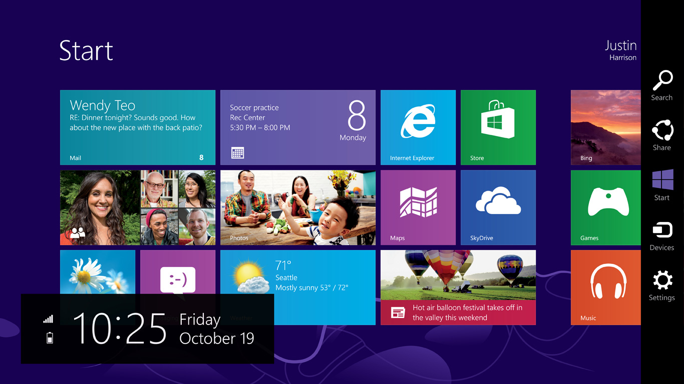 Windows 8 at launch in October 2012
With Windows 8, Microsoft tried out an operating system which would work with a single interface across a breadth of hardware, from small form factor tablets, up to 30” monitor desktops. While they certainly succeeded in creating an interface that worked across all of those platforms, it was not ideally suited to any of them. With the tablet mode, the new Start Screen worked very well, and the charms menu and app switcher were fairly easy to use. But many of the settings and programs would be on the desktop, where touch only worked sparingly. Some desktop applications, such as Office, were created with a touch mode to increase the size of the onscreen elements, but overall the experience was subpar. Similarly, on the desktop, the touch interfaces were not ideal, and the hot corners certainly had issues especially on multi-monitor systems.
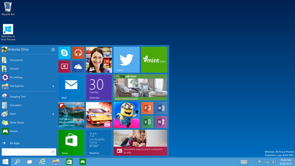
Windows 10 Technical Preview at launch
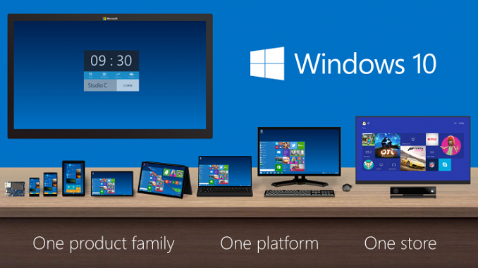
But now we come to Windows 10. Windows 10 is ditching the “One Interface to Rule them All” mentality, and moving to a more user friendly model of a single store across all platforms, and multiple interfaces to the same OS depending on the current usage model. We have not seen all of this in practice as of yet in the Technical Preview, but Microsoft has demonstrated their solution to this change in input mode with a feature they are calling Continuum.
The goal is that those that are on a keyboard and mouse based system will have the traditional start menu and desktop, with apps in windows, but if you are on a touch based device, or if you go on a 2-in-1 from keyboard to touch, the system will switch to the Windows 8 style start screen with full screen apps.
One of the keys to having this experience is an app model that allows a developer to target this different user interface paradigms. Microsoft’s solution to this is Universal Apps.


198 Comments
View All Comments
Pork@III - Thursday, November 13, 2014 - link
Now back and aero interface and become ... well. For excellent results, however, it is necessary to hide the "Metro" even aside. It is still more harm than help.metayoshi - Thursday, November 13, 2014 - link
With regards to the Share feature on desktop, does the Windows Photo Viewer also have a share button? That would definitely be useful for sharing to Facebook or Twitter (or Instagram, if they ever implement a Windows app) instead of having to share from the Windows Explorer every time.Brett Howse - Thursday, November 13, 2014 - link
The "Photos" app supports this. I would think it unlikely they would add the Share contract in to the old one but at this rate - who knows.Chloiber - Thursday, November 13, 2014 - link
As a person who works in a small start up that uses a lot of Microsoft hardware and software, the new business features sound awesome. We are getting to a point where we need management systems but many existing ones are simply too expensive for only a handful of people and require (again) hardware, software and someone probably needs to invest several days or weeks to set things up correctly. So this really comes in handy and I'm looking forward to it!Regarding the server OSes, I think they did many things right with Windows Server 2012 R2, but there are still some things (usability wise) that need improvements.
Taurus229 - Thursday, November 13, 2014 - link
I still say that Windows 7 is much more user friendly. Just look at where Microsoft has placed the shutdown, restart button. Common sense says that Microsoft did not put much thought into that change! Microsoft still has to make it as user friendly as Windows 7 to achieve acceptance.Chloiber - Thursday, November 13, 2014 - link
I have to agree on this one. I always used my keyboard with Windows 7 to shutdown/restart/standby my machines. Win -> ArrowRight -> (ArrowUp/Down) -> Enter. It was terrible in Windows 8 / Windows Server 2012 and got a bit better in 8.1 / 2012 R2. In Windows 10 it's basically the same as in 8.1...inighthawki - Thursday, November 13, 2014 - link
Or, you know, make it customizable? Let the user drag and drop components onto their start menu however they see fit. Isn't that the entire goal - start is personal?lilmoe - Thursday, November 13, 2014 - link
I love the way windows snap right and left now. When you snap a window to the left, re-size it, and try to snap another to the right, the new window will snap filling all the space made available by re-sizing the first window. Cool.This is great when you're trying to snap 2 windows only. However (and I did write to Microsoft about it), when you're trying to snap 3 or more windows (columns of windows), it would be nice if the third window automatically snapped in the vacant space made by resizing any of the previous ones. Would be awesome, especially when you're trying to display several windows together since screens are really wide nowadays.
crabperson - Thursday, November 13, 2014 - link
I never understood why the app switcher mechanism in Windows 8 wasn't fused with the classic taskbar. It seems like there's a 'touch' taskbar you can pull up using a gesture, and a separate taskbar for windows on the desktop. It makes even less sense now that apps show up on both in 8.1, yet the Desktop is still an app on the touch version.Couldn't you just swipe from whatever side of the screen the taskbar is on to see the app previews (or even the existing aero previews), and keep swiping to pull the app to the foreground, whether its a fullscreen touch app or a standard application window? Then the charms and menu gestures can be moved to whatever sides of the screen that are free, for the 5% of people that move the taskbar around.
stephenbrooks - Sunday, November 16, 2014 - link
Glad I'm not the only one who wondered why they weren't more unified.While we're unifying things, why not have an option for the Win8-style Start screen to *be* your desktop? It basically replaces "putting a load of application shortcuts on your desktop" anyway.