The iPhone 6 Review
by Joshua Ho, Brandon Chester, Chris Heinonen & Ryan Smith on September 30, 2014 8:01 AM EST- Posted in
- Smartphones
- Apple
- Mobile
- iPhone 6
Display
As the primary mode of interaction with the phone, the display is one of the most important areas of evaluation. Of course, the methods of evaluation can be hotly debated. There is a great deal of subjectivity in this area in terms of what someone prefers. However, for the sake of color calibration our tests follow world-wide standards instead of personal preference one way or another. This means that we use the sRGB gamut and 2.2 gamma, which most content is adapted to. While AdobeRGB and other gamuts exist, these are for limited use cases and only applicable to operating systems that are aware of multiple gamuts and can dynamically switch between them depending upon the metadata of the content. In order to accurately test for how well a display conforms to these standards, we use SpectraCal’s CalMAN 5 along with a spectrophotometer for accurate color readings.
For those that are unfamiliar with the display of the iPhone 6 and Apple’s key marketing points on this new model, the improvements are mostly centered on higher resolution, contrast, and better viewing angles. In terms of higher resolution the iPhone 6 moves from the 1136x640 pixels of the iPhone 5/5s generation to 1334x750 pixels. However, this doesn’t improve the pixel density, which remains at 326 pixels per inch.
In practice, I definitely continue to notice the difference in resolution when using the iPhone 6 as opposed to the higher pixel density iPhone 6 Plus and the various Android smartphones with 450+ PPI displays. I definitely don’t find the resolution to be a problem though, as these issues only become significant to me below 300 PPI. I do think that around 450 to 500 PPI is the right place to be when balancing pixel density and power, but Apple’s choice should pay off in the form of better power consumption especially because LED backlights rapidly lose efficiency near the highest current region.
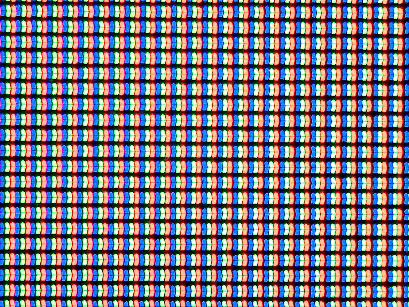

The other issue at hand is that of viewing angles. While Apple is one of the first to really talk about dual domain pixels, this technique is rather commonly used to improve viewing angles. The result is that a pair of pixels will appear to be a chevron, and overall the pixels appear to be squiggly in nature. While this doesn’t really change the readability of the display at extreme angles, colors like white no longer have noticeable red/yellow/blue shifts depending upon the angle that the display is shifted at.
This is definitely noticeable in everyday use, as the iPhone 5s could only avoid color shifting at certain angles instead of every angle. As I predicted in the launch article though, the one caveat seems to be that black has a noticeable shift towards purple in certain angles. There's also a noticeable hatching on close examination, but this doesn't affect image quality. This is definitely better than what I see on AMOLED though, as while AMOLED has much better brightness stability the color shifting is far more obvious and significant.
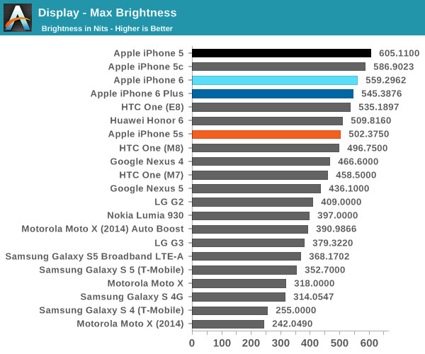
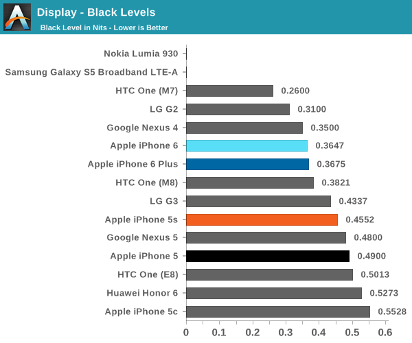
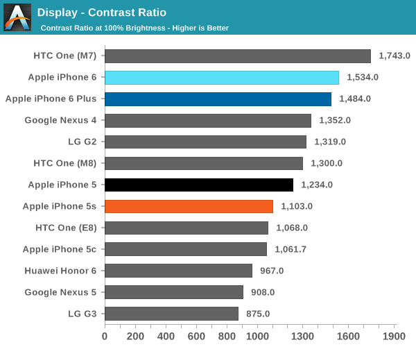
Now that we’ve covered the other two, we can talk about contrast. For this test, we measure brightness of 100% white and black at maximum display brightness, and look at the ratio. While we’re looking into getting patterns that can’t be defeated by dynamic contrast/backlight this should give an idea of best case contrast. In this case, peak brightness is on the high side at 560 nits, with relatively low black brightness at about a third of a nit. The result is one of the best contrast ratios I’ve ever seen. While the HTC One (M7) has a 1743:1 contrast ratio in our tests, some testing I’ve done indicates that the true contrast ratio is realistically around that of the One (M8). I’m not quite sure how this was done, but Apple stated that a new deposition process was used for the liquid crystals. This, along with changes to the liquid crystals themselves, could be responsible for the improved contrast.
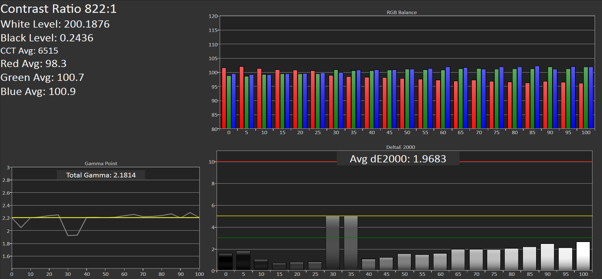
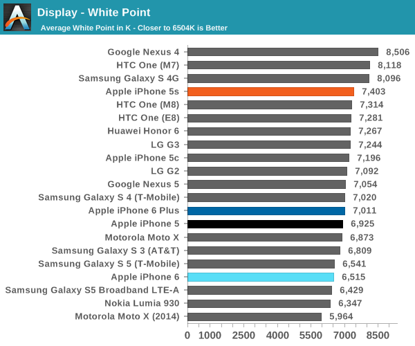
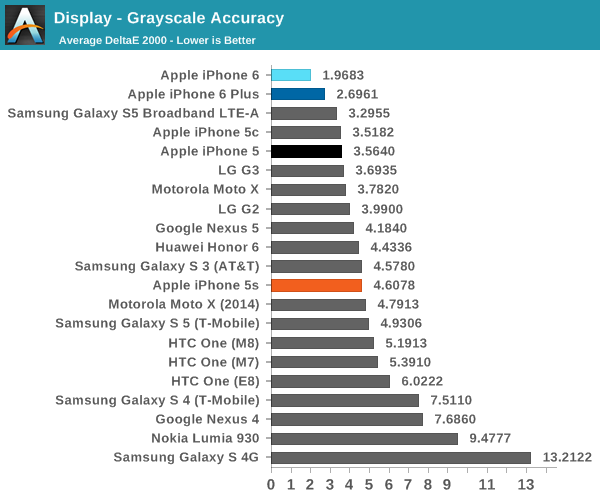
The next part to talk about is grayscale, which is an area where Apple seemed to prefer bluer color balances. I don’t really have much to pick at here, because the level of calibration here is incredible. While there is a noticeable trend of overshooting red at the low end and undershooting red at the high end, this is nitpicking at best. At any rate, this is essentially perfect.
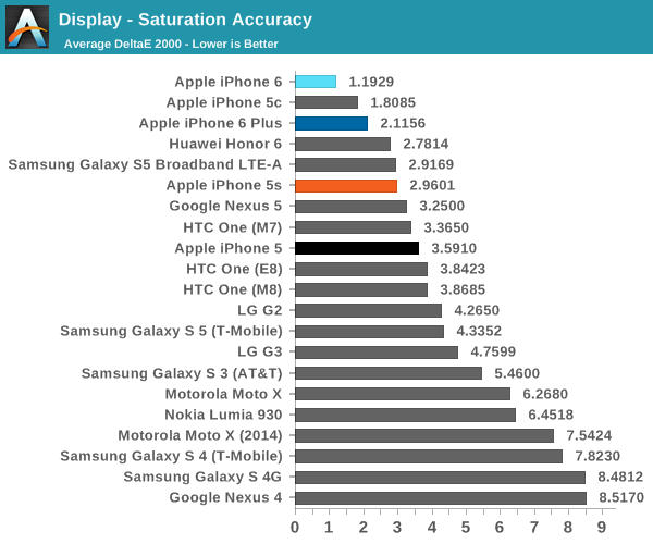
Our next test is the saturation sweep, which tests each primary and secondary color for accuracy in hue and luminance. While it’s true that humans can be relatively insensitive to differences in saturation, it is all too common to see OEMs artificially compress saturations to have vivid colors and be able to claim that they have an accurate display because it matches the sRGB gamut. In this test, the iPhone 6 sets a new record. I really don’t have any objections here because a dE2000 value of 1.19 is a deviation that is almost impossible to notice.
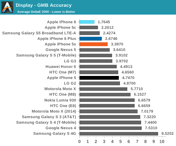
The final test is the Gretag MacBeth ColorChecker, which tests various hues and is usually one of the hardest tests to perform well in. In this regard, the iPhone 6 once again sets a new record for accuracy. This display is effectively calibrated to sRGB, and one would be hard pressed to find a significant deviation when compared to a reference monitor.
Overall, it’s hard to find any criticism for this display. I would normally be incredibly suspicious to see these numbers on a smartphone, but the fact that there’s a hot pixel in the center of the display suggests to me that this was not a cherry-picked unit. The fact that I find this level of calibration to be suspicious speaks volumes about how good this display is. While contrast isn't AMOLED levels of black, there are no purple smearing effects, noticeable uneven luminance near black, or any other idiosyncrasies.


531 Comments
View All Comments
thrasher32 - Tuesday, October 14, 2014 - link
That must be some really good crack there chiefGerryS - Wednesday, October 1, 2014 - link
Absolutely. If it can't be built into the price of the product, there's no incentive to innovate, at all.perpetualdark - Friday, October 3, 2014 - link
Not true, you innovate to stay in the game, not to increase your price point. Part of the "innovation" of the android flagships has been their ability to increase technology, form, and function while reducing or maintaining costs. Both the M8 and the S5 were selling for $99 on contract within a month of launch (by Verizon). Apple might have sold a lot of phones in this launch, but that was mostly due to the fact that there hasn't been an "innovation" in several years, and very little reason to buy an Apple product for at least 2 generations. Just keep watching to see how sales hold up after the initial storm is passed. In a few months when you can buy an S5 or M8 for $99 on contract, or an iPhone for $299, which do you think will sell better? And in 6 months, both companies will have the next gen of flagship out, with superior specs across the board and will launch at the same price as Apple, because the iphone 6 will STILL be $299.bigstrudel - Tuesday, September 30, 2014 - link
Samsung uses Off-the-shelf SoC's for every flagship device outside of Korea. Nothing impressive about that.techconc - Thursday, October 2, 2014 - link
@danbob999 - Samsung's SoC designs are basically equivalent to Apple's early A4 and A5 work. They essentially just use off the shelf reference designs and put them together to meet their own specifications. Yes, there is some work involved with doing that, but to date, this hasn't been a competitive advantage for Samsung like it has for Apple. In fact, Samsung ends up using Qualcomm chips for a very large percentage for their devices. Likewise, putting them in the same league as what Apple, Qualcomm or even nVidia is doing isn't quite right. They're not in the same league design wise.Samsung attempts to add layers of customization (Touchwiz, etc.) on top of Android, but it just feels like a clumsy layer on top and ends up dropping performance and resources for the device overall. Such customizations are no substitute for writing your own OS and controlling the entire technology stack. That's why a Samsung phone will always feel clumsy as compared to an iPhone. Samsung would have to to the Tizen route to attempt to compete on that level.
Chaser - Wednesday, October 1, 2014 - link
Now this is amusing. The OS hasn't changed since it launch except for, wait for it: pull down notifications! Amazing. But seriously its the same floating blobs that sit in rows on a screen. Designed for teenagers and grandparents in mind.techconc - Thursday, October 2, 2014 - link
@Chaser - Thanks for sharing your ...wait for it... ignorance on OS design and what's actually changed over the years. It should suffice to say that you clearly don't know what you're talking about.shm224 - Thursday, October 2, 2014 - link
@techconc : Sure, would you mind giving us some examples of such "changes" in iOS?techconc - Monday, October 6, 2014 - link
@shm224 - LOL! Not interested in doing a commercial for Apple and the listing surely wouldn't fit in a forum post. Google is your friend... If you're really interested, you can start with something like the Wikipedia entry for iOS and of course consult the release notes for each iOS release on Apple's developer site.michael2k - Thursday, October 2, 2014 - link
What? It gained an app store, popup notifications, printing, multitasking, search, pull down notifications, pull up settings, folders, multiple homescreens, enhanced notifications (reply, dismiss, widgets), and file sharing.