Scaling Windows - The DPI Arms Race
by Brett Howse on April 15, 2014 2:00 PM EST- Posted in
- Operating Systems
- Windows
- Microsoft
- Windows 8.1
- High DPI
Where It All Falls Apart
As with many things in Windows, the operating system is too trusting of developers. Of course not all developers fall into this trap, but many applications in Windows (including many written by Microsoft) don’t follow the best practices on how to deal with High DPI displays. Let’s take a look at one example – VLC player.
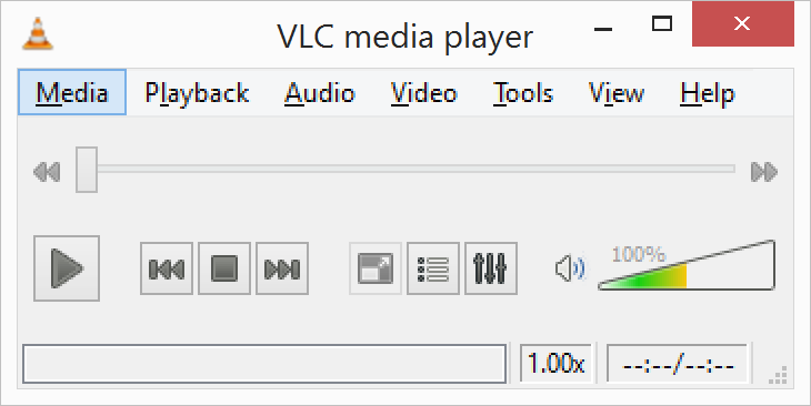
VLC 1.0 is what is referred to as a DPI-unaware application. The application was created to render at 96 DPI and it just expects the display to match. This makes the application undersized on a High DPI display, but thanks to DPI Virtualization Windows can automatically scale the application up to match the DPI settings of the display. This does introduce some blurriness to the appearance, but all menu controls and fonts are the correct size for the screen as seen here:
Looking at that image, it’s clearly upscaled but it’s also completely usable. So what’s the issue? VLC is a media player. With DPI Virtualization, media being played back through the application is also rendered at 96 DPI, and then scaled up off screen. This produces a video that appears blurry to the end user, which is not what VLC wants. To correct this issue, the VLC developers changed the application to declare it as System DPI-aware. This disables Windows’ scaling of the application, and Windows expects the application to scale itself. However, in the case of VLC player it doesn’t actually do any scaling at all as you can see in these screen shots of VLC 1.1.1 and the most current version 2.1.3:
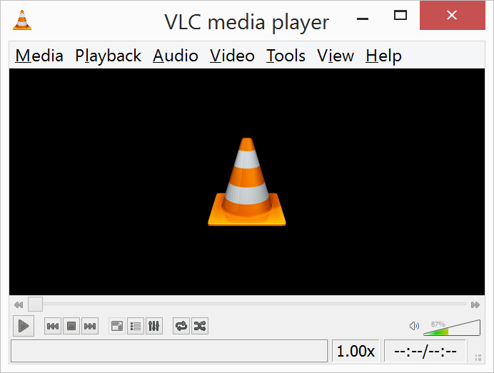
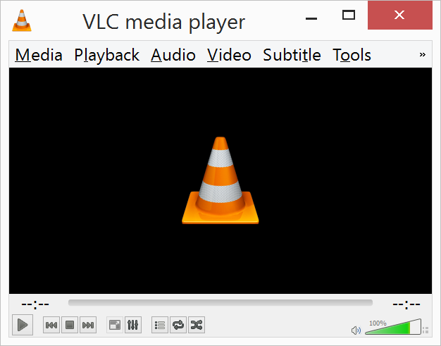
Here, any of the UI elements that are handled by the operating system are scaled to the correct DPI settings, but the rest of the application is not scaled at all, which results in an application with unequal proportions. I’m not picking on VLC player here – it is just one of many applications that do exactly the same thing. It’s a great example to show the progression of when a coding choice was made to enable the flag and view the results of the change, as older versions of the software are still readily available. Also in VLC’s favor is the fact that their UI elements are somewhat oversized to start with. This could easily have been a design decision that their application was already usable at High DPI, so it’s not worth scaling the UI at this time.
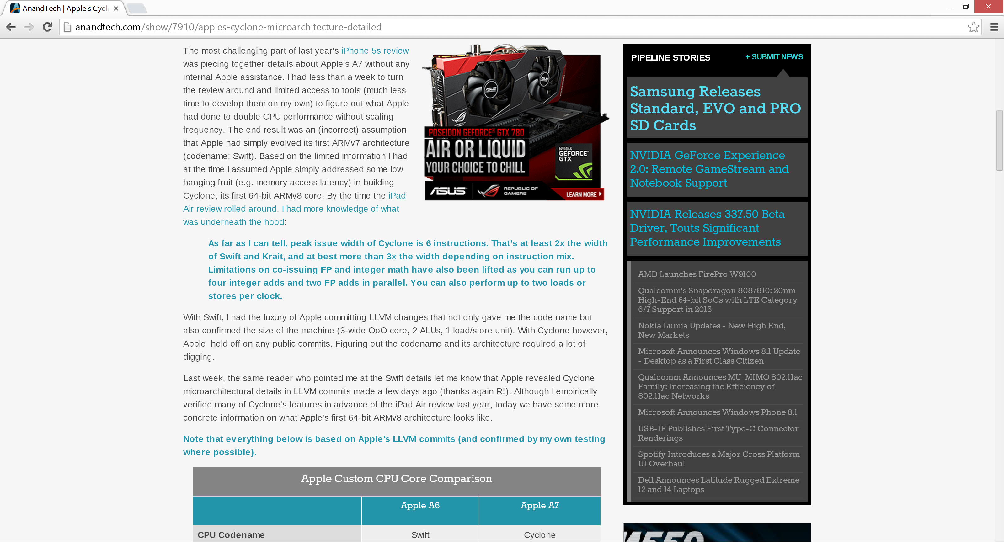
Let’s look at another application which has long been called out for having issues when Windows is run on a High DPI system – Google Chrome. The oddest thing about Chrome not scaling well is that Chrome does actually support High DPI. Chrome OS, Mac OS X, and obviously the Android versions of Chrome all scale well. But on Windows? There are issues. Here’s a screenshot of Google Chrome taken on my Lenovo Yoga 2 Pro at 3200x1800 with Windows scaling set at 200% (the default setting from the factory):
To see the issues, you’ll likely have to open the full resolution version of that screenshot. At first glance all seems pretty nicely scaled with Chrome – the “chrome” of the browser is not tiny, tabs appear to be the correct size – but look at the actual text on the webpage.

With the cropped image, you can instantly see that the font that Chrome is using is not scaling very well. Text in Chrome on a High DPI system is very poor, and defeats the purpose of using a high resolution screen since you actually lose fidelity rather than gain it.
Chrome, unlike many other apps, does have some workarounds to this issue; unfortunately it’s not something the average computer user would ever be able to figure out. First, you have to open chrome://flags setting page and then enable HiDPI Support Windows. Next, you have to right click the Chrome icon on your desktop, choose properties, and then the configuration tab. Here you need to check the box that says “Disable display scaling on High DPI settings” and apply.
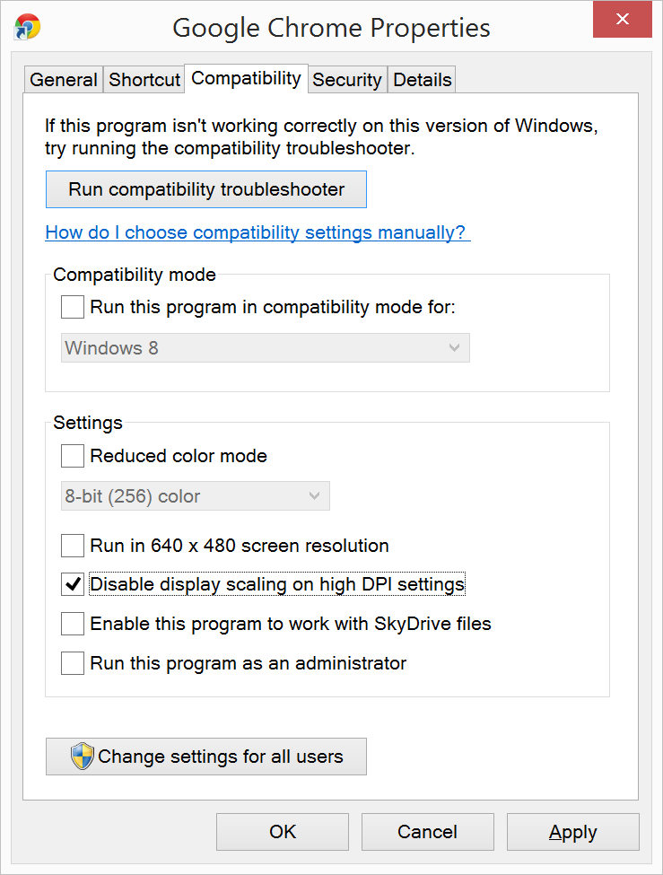
What this checkbox does is actually disable the DPI Virtualization on a per-application basis. Chrome will now use XP style scaling. If you don’t check this box, Chrome will disregard the flag in its own settings, and continue to render text very poorly. The only reason I can think of for Chrome to not use the newer DPI awareness API and instead use the old XP style DPI setting request would be because Chrome is still supported on XP. It’s a strange decision though because running a High DPI system on Windows XP is not a great experience. It’s unfortunate for Chrome users because most of them will never know just how poor of an experience they are getting on newer systems. However, with these changes in place, Chrome now renders correctly.

Next, let’s compare Chrome to an application which does follow best practices – Internet Explorer 11. IE11 correctly queries the operating system for the current DPI setting. When it receives the response, it rescales the UI elements as necessary, and then uses its Zoom feature to enlarge the actual web page. The result is a web page that looks exactly as it should.

IE11 also uses the queried DPI level of the operating system to set the default zoom level, so if you are a heavy keyboard user and you like to use Ctrl+0 to get back to 100% zoom, fear not. This still works, but the default zoom will be a higher number than 100% depending on the scaling factor chosen. Here’s another screenshot of IE11 with the resolution set to 3200x1800 and the DPI set at 96 DPI.
 At first glance, it looks hilariously bad, but in fact it is doing exactly what it is supposed to. IE has queried the operating system for the DPI level (now set at 96) and scaled correctly to that level. Not all of Microsoft’s applications do this, but most are not as high profile as Internet Explorer.


 Facebook
 Twitter
 RSS
RSS


114 Comments
View All Comments
Brett Howse - Tuesday, April 15, 2014 - link
You should do the math - 1280x1024 @ 17" is 96 DPI (called out in the article) and 1600x1200 @ 21" is also exactly 96 DPI.So not high DPI. Even going down a couple inches on screen size isn't going to change the DPI much.
MonkeyPaw - Tuesday, April 15, 2014 - link
Interestingly enough, I had an Acer "Centrino" laptop circa 2004 that I believe had a 14" screen at 1280x1024. I remember needing to use 125% scaling. It was my first high DPI experience.solraun - Tuesday, April 15, 2014 - link
Great article! Thank you for calling out Adobe. But you are right, they are probably working overtime for a solution.One important point though:
The resolution dictates how much detail any screen can display. The screen size determines how far away you want to be.
Actual dpi is unimportant.
The bigger the screen, the further away you will want to use it. The actual field of view, or angle, that the screen represents in for your eye stays the same. Sit in front of your monitor, then take out your smart phone and place it in the distance you would normally use it, but in front of the monitor. It will mostly match the outlines of the monitor.
So for me, if I am using 1080p on my 24'' screen or 1080p on my 5'' smartphone: it is the same number of pixels per degree of my view.
Similarly, I just bought a 4k 24'' screen, and while many people say 4k makes only sense on bigger displays, I disagree. I would have to sit further away from a 30'' monitor, and I don't have the space.
I
bountygiver - Tuesday, April 15, 2014 - link
that's why windows 8.1 has a feature that solve this.It queries the dpi and screen size and calculate the viewing distance and decide how it scales.
And I love how it scales real time when you move the apps across different monitors.
Taracta - Tuesday, April 15, 2014 - link
Adobe, with postscript and PDF (especially PDF which was meant to scale from the 10s of DPI on monitors to thousands of DPI on printing presses) in their portfolio that were meant to scale with DPI and their applications don't scale properly! RIDICULOUSNESS!bengildenstein - Tuesday, April 15, 2014 - link
What? We're now giving Apple sole credit for the trend to improve mobile screen resolutions? Utterly preposterous.The DPI race did not "begin" with the iPhone 4. Screen resolutions (and by direct implication PPI/DPIs -- given a fixed screen area) have been steadily increasing over time, with Android devices showing a far smoother increase curve than the single iPhone "retina" release. Additionally the increase in resolution requires a larger industry of components to support them. And smartphone resolutions continue to increase while the iPhone screen remains stagnant at a sub-HD resolution.
I'm not arguing whether Apple is influential. But I think it's high-time that we stop crediting them with creating innovations that have already happened and were trending at the time of their release.
Taracta - Tuesday, April 15, 2014 - link
Apple deserve the credit for the increase in DPI and screen resolutions. Without Apple you would not have had the Android device push ever higher DPI and laptops with now 4K screens. The only thing that was happening was the defaulting of resolutions to 1080p because of HDTV but DPI was actually going down as you were just getting bigger and bigger 1080p monitors. Actually 1080p was a regression from the 1920X1200 monitors that had existed before!So yes, Apple deserve the credit for starting the trend of increasing DPI and resolution.
evonitzer - Tuesday, April 15, 2014 - link
In the phone space, not exactly. The OG iPhone, 3G, and 3GS were all 320x480 devices (165ppi). Meanwhile, Android phones had bumped their way up to 480x800 and 480x854 (265ppi @ 3.7"). The 3GS was released in June 2009, and 4-5 months later the OG Droid came out with a higher resolution. Then in June 2010 Apple released the iPhone 4, which further bumped up the resolution to 'retina', or 330 ppi. I'm not sure when the first 720P Android phone came out, but roughly 16 months later, Android phones matched the 330ppi and have kept going up.So I dunno. Perhaps the Android manufacturers would have stagnated without Apple countering them in 2010, but I would suggest that Android phones were pressuring Apple to improve and so they did. Push and pull from good competition. Who deserves the credit?
Brett Howse - Tuesday, April 15, 2014 - link
It's all about marketing. The "Retina" branding of the screens worked with consumers.You could say the same about the Touch ID. Not the first phone with a fingerprint sensor, but certainly the first one that average consumers would know about.
In tech, it's rarely about who gets to market first, but more about who resonates with consumers with a product and in these two cases I'd argue Apple did that.
They are not always the product innovators, but sometimes they are the ones that get average people to know enough to ask about an innovation.
hackbod - Wednesday, April 16, 2014 - link
If you think us having high density displays in mobile today owes *anything* to Apple, you are delusional. This would have happened without Apple lifting a finger, it was *already* happening without them, and was actually happening long before the iPhone came out.Android devices were clearly increasing screen densities first, and in the Android world as soon as that happened, the platform had the full extensive density support it has today that allows seamless scaling down and up in density, to 320dpi and beyond, without changes to applications (once they were tweaked to be compatible with the implementation in Android 1.6, which was even a bit before the Droid). Nobody needed to push this along: screen resolution has *always* been one of those marketing numbers manufacturers use to convince people that their hardware is better, and in fact for the densities we are talking about here this is one of the more useful numbers because its impact is clearly visible right on the screen. The fact that they continue to push screen densities up to 480dpi and beyond pretty clearly shows that nobody needed Apple to make up a word and act like they were the Big Innovator in order to spur things on.
But this was all happening well before Android or the iPhone. This increase in screen density actually happened well before that, in the Palm device world, with the introduction double density (160dpi) screens on Palm devices and support in that platform for scaling based on density. In fact this experience with how important it is to handle multiple densities on mobile devices had a big impact on the design of Android, planning for this from the start and thus having better intrinsic support for it.
If you are actually familiar at all with the development of the mobile market, I think it is pretty clear that this increase in density is actually some intrinsic aspect to this market compared to what happened in desktops. There are probably a lot of reasons for this; for example, mobile screens can't really grow in size so increases in screen pixels need to be done as density increases rather than screen size increases, and these screens are starting at a much lower resolution so the simple 2x jump in density is a lot easier (keep in mind that 2x screen density means 4x the pixels to render, and when you are talking about desktop screens starting from their current resolutions that actually pushes you up in to resolutions that are pretty expensive to drive).
Thinking that Apple had anything to do with pushing this part of the industry just shows a severe lack of knowledge about the history of the mobile market.