Scaling Windows - The DPI Arms Race
by Brett Howse on April 15, 2014 2:00 PM EST- Posted in
- Operating Systems
- Windows
- Microsoft
- Windows 8.1
- High DPI
For several years now, mobile device manufacturers have been in a race to push the pixel density of mobile devices higher and higher. The race began with the iPhone 4 “Retina” display – an at the time impressive 330 pixels per inch (PPI) 960x640 3.5” display. Keen to trump the Retina moniker, makers of Android devices soon churned out devices with displays with PPIs of 440 and higher, with the current push to 2560x1440 displays in 5.5” or smaller sizes which yield an amazing 500+ PPI. Next up was a similar race in the tablet space, with 1280x800 soon giving way to 2560x1600 displays, but this time in a 7” to 10” form factor.
All the while, the lowly PC and Mac chugged along with displays that could hardly be called impressive. The standard LCD display of just a few years ago would hover somewhere around 96 PPI, and it was often lower. A 17” LCD with a resolution of 1280x1024 wasn’t an accident – it was exactly 96 PPI, which is what the PC and Mac would render at by default. High resolution laptops would barely squeak past the 120 PPI range. These lower densities – though decent for the longer view distances of desktop monitors – have until recently not been improved on, highlighting the gap in progress between the two devices categories.
Further complicating matters, desktops and mobile devices have always differed in how they use resolution when it is increased. On a mobile device, higher resolution has been used to increase image quality, while higher resolution displays on a desktop were released as part of physically larger displays and used to increase the amount of work you can do. Mobile devices have had one big advantage: they are backed by new operating systems that are built for higher resolution out of the box, and there is no back catalog of legacy applications to deal with. Phones and tablets can easily deal with high resolution displays, but for the PC and Mac, things are not so simple.
In 2012, Apple launched the 15.4” Retina MacBook Pro. At the time it was far and away the highest PPI laptop available. It took a lot of work for Apple to ensure a high resolution display was usable because for really the first time, increased resolution on a computer was used to improve image quality rather than simply to increase screen real estate. How they achieved this was nicely explained by Anand back in 2012. However, OS X wasn’t perfect; certain applications didn’t behave as well as they should have, which resulted in some applications having blurry text or other UI issues. Still, Apple was able to make the Retina display work, and for the applications that were Retina aware, the result was a fantastic experience. If developers updated their applications, their clients could enjoy the high resolution clarity that had already taken over the mobile space.
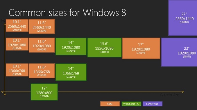
But what about Windows? Windows Vista, and then Windows 7, both had support for higher DPI (Dots Per Inch) settings; even lowly Windows XP had some support for DPI scaling. The main issue was that there was no market force pushing for High DPI (in the operating system and APIs, it’s referenced as DPI as opposed to the PPI of a display) like there was with the Retina MacBook Pro. OEMs were happy to sell consumers low cost, low resolution 1366x768 TN panels for years. If people don’t demand better, most OEMs are unlikely to provide them better than the basics in such a low margin industry.
| High Resolution Laptops | ||||||
| Brand | Model | Screen Size | Screen Resolution | Pixels per inch | ||
| Acer | Aspire S7 | 13.3" | 2560x1440 | 221 | ||
| ASUS | Zenbook UX301LA | 13.3" | 2560x1440 | 221 | ||
| Dell | XPS 11 | 11.6" | 2560x1440 | 253 | ||
| Dell | XPS 15 | 15.6" | 3200x1800 | 235 | ||
| HP | Spectre 13t-3000 | 13.3" | 2560x1440 | 221 | ||
| Lenovo | Yoga 2 Pro | 13.3" | 3200x1800 | 276 | ||
| Lenovo | X1 Carbon | 14" | 2560x1440 | 210 | ||
| Panasonic | Toughpad 4k | 20" | 3840x2560 | 231 | ||
| Razer | Blade | 14" | 3200x1800 | 262 | ||
| Samsung | ATIV Book 9 | 13.3" | 3200x1800 | 276 | ||
| Toshiba | KIRAbook | 13.3" | 2560x1440 | 221 | ||
What changed was a combination of High DPI tablets and the Retina MacBook Pro putting pressure on the PC industry to offer something better. It has taken a long time, but finally quality displays are something that are important enough to consumers for every single major OEM to now offer at least one, if not multiple, devices with High DPI.


 Facebook
 Twitter
 RSS
RSS


114 Comments
View All Comments
weebnuts - Wednesday, April 16, 2014 - link
Thanks for the Google Chrome tip, it used to scale fine until a month or so ago, they must have changed things in the new versions when the new windows 8.1 update was released.Icehawk - Wednesday, April 16, 2014 - link
I just ran into this issue this week when I added a Dell 27" to my family of older 19x12 16:10 monitors - aside from the aspect ratio change in order to use the new Dell as my main monitor I need scaling or the text is too small - now my old monitors are cartoonishly large. Was hoping to skip W8 but will try W8.1U1 and see if it works better with the different DPI levels and doesn't drive me insane with Metro, ahem, I mean Modern.kgh00007 - Wednesday, April 16, 2014 - link
Cheers for the tip on Chrome, it looks way better now on Win 8.1 on my 40" 1080p TV!fokka - Wednesday, April 16, 2014 - link
i'm really thankful for the article shedding more light at this topic, maybe this will bring more developers to update their programs to feature better hidpi-skaling.vlad0 - Thursday, April 17, 2014 - link
Great talk on DPI @ build2014http://channel9.msdn.com/Events/Build/2014/2-535
liffie420 - Thursday, April 17, 2014 - link
This is not really a comment on the article itself but something that the screen shots bring up dealing with web pages. This does not apply to all pages however, but with most people using a widescreen display (we are talking at least %95 at this point) regardless of actual resolution why is it that we page developers can not manage to scale the page elements to wide screen?? Having done a very small amount of hand coding html back in the day (16ish years ago) I know you want to aim for the LCD to be sure your pages load correctly on all browsers and across connection types. But why is it you can't fill the sides os your browser window with the actual site. Im in the newest chrome browser with a 22" lcd at 1080P yet the site itself only falls in the middle leaving a couple inches of screen empty. Yes you can F11 in most browsers and full screen but that still rarely fixes the issue. Just a pet peeve of mine is all.dorekk - Saturday, June 21, 2014 - link
Because very wide lines of text are extremely awkward to read, so it's much better to make the text area of a website look roughly like a portrait-oriented piece of paper.Androidtech - Thursday, April 17, 2014 - link
I find it rather perplexing that a mobile operating system like Android is more capable at scaling resolutions than something as old as windows. I thought things are supposed to get better with age and experience. Oh well at least this summer we will have some new code for websites to scale properly !caywen - Friday, April 18, 2014 - link
In actuality, IE11 on Windows 8.1 isn't clear of these problems when doing multi-monitor. I have a Yoga 2 Pro connected to a 24" 1080p display. IE11 looks beautiful on the Y2P display, but when moved to the 24" display, the whole UI becomes enormous. The title bars are almost 1" thick! Clearly, Microsoft still have a few hurdles.Other windows, when dragged between displays, instantly snap to their "normal" size on that display, but the effect is strange.
I think what they ought to do is:
- Support high-DPI virtualization where applications can advertise that they support, say, 200 or 300dpi. The author can then write their app specifically to that. Windows could then do the same DPI virtualization, but the scaling would then be much sharper (and almost always downwards).
- Draw *only* from the virtual buffer to each display. That way, there would be no snapping effect - just the app always being the right size even when between displays.
- Create a virtual buffer at the highest DPI of all the connected monitors and have 96dpi apps draw scaled-up into that buffer. The difference would be that text draw calls would draw at the native size rather than at 96dpi. At least the text in these apps would be razor sharp, if not the icons and other things.
AnnonymousCoward - Saturday, April 19, 2014 - link
The name "retina display" doesn't even make sense, because a retina senses light. Apple just went with "[some word associated with vision] display".