Microsoft Announces Windows 8.1 Update - Desktop as a First Class Citizen
by Brett Howse on April 3, 2014 9:00 AM EST- Posted in
- Software
- Operating Systems
- Microsoft
- Windows 8
- BUILD
- Windows 8.1
Microsoft’s day 1 keynote for the BUILD developer conference detailed an update to Windows coming on the next scheduled patch Tuesday called 8.1 Update. Notice it’s not called Update 1, which means there may or may not be more of these updates later in the year. Hopefully there’s more.
Windows 8 launched about 18 months ago. With that launch, Windows was put on a rapid release cycle, which resulted in Windows 8.1 a mere 12 months later. When Windows 8 launched, “touch first” was the talking point used during the reveal. Windows 8 was likely the biggest ever change to Windows, and was a pretty big gamble on Microsoft’s part. For the project head of Windows 8, it didn’t work out with Steven Sinofsky leaving the company only a couple of weeks after the launch event. As a product launch, it certainly didn’t halt the decline in PC sales that were already beginning.
Much has been said of Windows 8 since its launch, some of it good, some of it bad. Most of the bad focused on how Microsoft forced a touch interface and mobile app system onto a market that was, especially at the time, dominated by non-touch PCs and devices. A lot of the criticism was valid, and was likely exaggerated due to there being no way to re-enable any legacy mode. In the history of Windows, there has always been a way to go back to the old version’s look and feel, but keep the new functionality. In the case of Windows 8, this didn’t happen, and many people don’t appreciate that.
To add extra fuel to the fire, even the touch first interface (called Modern by this point) wasn’t finished. Many settings and functionality could only be accessed by the desktop control panel which was decidedly non-touch. Even though Windows 8 was actually quite a good touch based operating system, it wasn’t finished. The design decisions of the touch based system were all based on edge gestures, but there were no obvious way to know that.
Windows 8.1 addressed a lot of the complaints. The Start Button was back – even if its functionality was not the same. The Start button could be configured to launch into the All Apps mode rather than the Start Screen of Windows 8. You could choose to boot directly to the desktop. And on the touch side, some of the gestures were changed, and many more of the PC settings could be configured from the Modern interface. As a bonus (or not – depending on who you are) everything was synced with SkyDrive, and SkyDrive was installed on both x86 and ARM versions for file sync with the cloud. The built in apps were much better, the store was overhauled, and more people were happy.
If Windows 8 was touch first, then 8.1 Update is most definitely keyboard/mouse first. Almost every single feature added in the Update is geared towards making the Desktop environment a first class citizen again, and it’s wonderful – and I say that as someone who uses and enjoys Windows 8 and 8.1 every day.
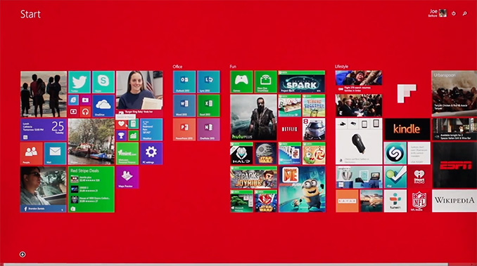
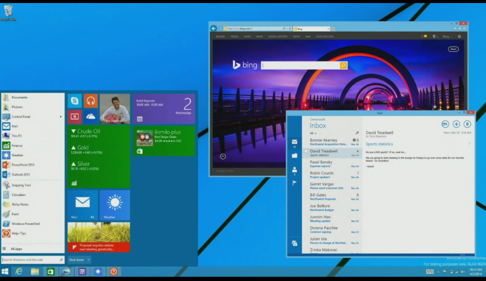
Traditional PCs – desktops and laptops – will now boot to the desktop by default. PC makers building tablets or types of hybrid machines with touchscreens can now set a flag to identify the device as a Slate, which will make them boot to the Start Screen. The Modern interface is now aware of how it’s being used. If you are using touch, it acts just like 8.1, but if you are using a keyboard and mouse, there are now context boxes on the right click menus. Moving the mouse to the top of the screen reveals the traditional minimize and close options. The task bar is now available on the Start Screen. Hidden functions like Search and the Power button are now available right on the Start Screen by your login ID.
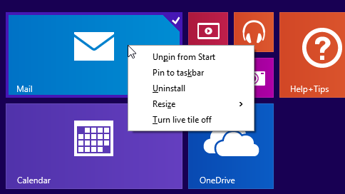

And speaking of the task bar, as in interim step until further Desktop/Modern integration happens is the ability to pin Modern apps to the taskbar. They still open the full screen or snapped Modern app, but it’s an easy way to multitask with desktop and modern apps. Microsoft also demonstrated further integration coming in a future update. Whether that is an 8.1 Update 2 or Windows 9 wasn’t specified, but it brings Modern apps to the desktop in a window. I think this will really increase the usefulness of Modern apps. Full screen on a 10” tablet is fine, but when a desktop is equipped with 22” to 32” monitors, there’s a LOT of wasted real estate by running these apps in full screen, or even split screen mode. This is a huge change from the original vision of Windows 8, and if anything can make Modern apps more useful, this is it.
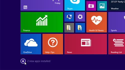
Also with apps, one of the biggest issues with Windows 8 was that any app you installed dumped at least one tile onto the Start Screen. For Modern apps, this was mostly useful, since the tiles were usually live, but with desktop apps like Office, you could easily get 10-20 new tiles on your Start Screen which was a huge pain. So for Windows 8.1, they removed the auto-created tile on the Start Screen, and put it on the All Apps screen. This solved one issue, but certainly created a new one because once you installed an app, you had no idea where it was. For 8.1 Update, they are adding a text notification at the bottom of the screen to let you know that you’ve got new apps there waiting to be used. I think this is an improvement, but the obvious solution is to add an option in the store to pin the app to the start screen automatically.
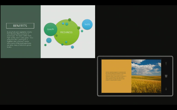
And the final piece with the app situation is Universal Apps. At long last, common code can be used to develop for phones, tablets, laptops, and desktops. Visual Studio will now build one application, which can have both Windows 8/RT and Windows Phone binaries. This also enables the store to allow one app purchase to be installed on both platforms without having to re-purchase the app as you do now. The keynote demonstration was the Modern version of Office, coded to WinRT, and running on both the desktop and phone with the same code base. Even better, with the update developers can now target Desktop apps (due to the windowed mode), Tablet apps, Phone apps, and even Xbox One apps, all with common code. This is a big win for developers, and I’m sure Microsoft is hoping it draws more developers to WinRT, which in turn will be a big win for consumers.
Another notable change to Windows 8.1 Update is a new build which enables Windows on low end PCs. Windows has been shrunk, and the memory usage has been reduced, enabling the installation of Windows on devices with 1 GB of RAM, and 16 GB of storage. Previous to this, it’s been difficult for hardware partners to be price competitive with Chrome OS devices and Android tablets because the Bill of Materials would be higher. This is coupled with a new licensing change, where Windows (Windows x86, RT, and Windows Phone) is now available free to OEMs for all devices with a screen size of less than 9”. Although I would never buy a tablet with 16 GB of storage, Microsoft should now be able to be price competitive with Android and Chromebooks.
There are also some additional features for Businesses. Mobile Device Management (MDM) is now extended, and IE 11 now has a compatibility mode which can be enabled for intranet sites which require IE 8 functionality. This feature alone should allow companies that were stuck on XP a new way to get off of the aging OS, assuming they are not stuck with web apps that require IE 6 or lower.
This was an interesting keynote. Windows 8 was all about touch, and this keynote was all about restoring functionality to Windows that people have grown accustomed to over the years. The demos of both Modern apps running in a window with a start menu, and Office as a universal app were certainly a clear indication that the Steven Sinofsky days are over. Windows is changing again. No longer will it be “touch first” but instead be any input method you prefer. And I don’t mean to imply that they are taking away any touch functionality either – both are now equally supported which is how it needs to be.


149 Comments
View All Comments
Mr Perfect - Thursday, April 3, 2014 - link
What is this 8.1 Update still missing? It looks like they've now put back all the features they stripped out.inighthawki - Thursday, April 3, 2014 - link
Ojectively, a start menu, and subjectively, a visual style that doesn't make my eyes bleed from ugliness.Mr Perfect - Thursday, April 3, 2014 - link
This update returns the start menu, is there anything else that's still missing?I agree with you on the theme by the way. It's flat, sharp and somehow reminds me of the 256 color days, what with everything being one solid color.
phoenix_rizzen - Thursday, April 3, 2014 - link
Windows 8.1 Update 1 doesn't include the Start Menu or windowed Metro apps. That's coming in Update 2 (or 8.2 or 9.0 or whatever they call it). They demonstrated it this week, but it won't be available for awhile yet.inighthawki - Thursday, April 3, 2014 - link
Truthfully my biggest complaint about the visual style is it's absolute lack of any contrast around anything. The outline around windows, for example, is just a single pixel line that is a darker shade of the theme color, and inactive windows are quite possibly the worst shade of light gray (not even the theme color) they could have chosen. The min/max buttons are ugly little flat solid black icons. Couple this with the non-configurable title bar text color and you have an ugly theme that is incompatible with any kind of dark color as the theme color.Thankfully deviantart has a number of decently nice visual styles to choose from to make the OS bearable to look at.
valnar - Friday, April 4, 2014 - link
MidiMapper is gone from Windows 8. New printer driver system screws up some printers. There are a bunch of under the hood "improvements" that were bad.Exodite - Thursday, April 3, 2014 - link
True, nested application menus sorted alphabetically as opposed to by gaudy non-scannable icons.Killing the travesty that is charms.
The ability to completely disable Metro and everything assosciated with it.
Real boot options that don't require blundering through 8 levels of submenus because it's deemed "advanced".
Getting rid of the C64-style flat interface, being very unintuitive and ugly.
The short of it is that, aside from a couple of minor under-the-hood changes that largely doesn't impact me as a desktop user, everything that's different in W8 from W7 is a direct downgrade. Often a significant one.
Now, that obviously goes for me personally so I'll appreciate being spared from any discussion over how these new UI changes and features are *actually* good and how I *just have to learn how to use them*.
Wolfpup - Thursday, April 3, 2014 - link
How is it "entirely superior"? I find 8 mostly superior to 7 for desktop use. Explorer has a lot of nice tweaks that make 7 feel a bit archaic.Exodite - Thursday, April 3, 2014 - link
I'm sure that's true - for you.I'm arguing from my personal preferences and usage, obviously, and in that case W8 is a strict downgrade in every possible way.
I wouldn't be so vocal about it if I didn't find outright terrible, it's like someone dug up my personal vision of hell and implemented it as a operating system interface.
piiman - Saturday, April 12, 2014 - link
" it's like someone dug up my personal vision of hell and implemented it as a operating system interface."LOL Good one!