The Nexus 7 (2013) Review
by Anand Lal Shimpi on August 22, 2013 6:00 PM EST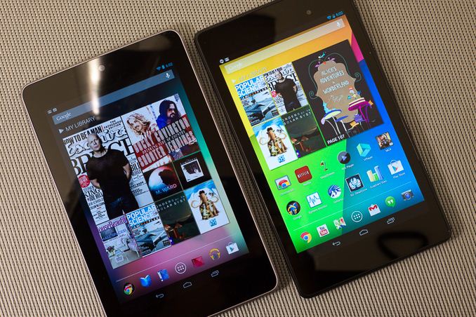
Truth be told, Google has made (or at least directed the making of) some of the best tablets on the market today. The original Nexus 7 was groundbreaking in that it offered a totally usable platform, married to the latest version of Android, for $199. The Nexus 10 gave us a very quick, ultra high resolution 10-inch tablet for $100 less than the flagship iPad (and with more storage). Both were easily recommendable due to their value, but this year Google is stepping out of the shadow of value and into one of excellence. It starts with the new Nexus 7.
Based on the success of the original Nexus 7, Google went back to ASUS for the second version. In the 12 months since the release of the Nexus 7, the world has changed quite a bit. Expectations for value tablets had been reset by the original Nexus 7 as well as Amazon's lineup of Kindle Fires. Simply showing up with another good value likely wouldn't do anything to further the brand (or market). I get the distinct impression that Google isn't big on not changing the world.
| Nexus 7 Tablet Specification Comparison | ||||
| ASUS Nexus 7 (2012) | ASUS Nexus 7 (2013) | |||
| Dimensions | 198.5 x 120 x 10.45mm | 200 x 114 x 8.65mm | ||
| Chassis | Plastic + Rubber back | Plastic + Soft Touch back | ||
| Display | 7-inch 1280x800 IPS | 7.02-inch 1920x1200 IPS | ||
| Weight | 340 g | 290 grams (WiFi), 299 grams (LTE) | ||
| Processor | 1.3 GHz NVIDIA Tegra 3 (T30L - 4 x Cortex A9) | 1.5 GHz Qualcomm Snapdragon S4 Pro (APQ8064-1AA) | ||
| Memory | 1 GB | 2 GB DDR3L | ||
| Storage | 8 GB / 16 GB | 16 GB / 32 GB | ||
| Battery | 16 Whr | 15.01 Whr | ||
| WiFi/Connectivity | 802.11b/g/n, BT, NFC | 802.11a/b/g/n, BT 4.0, NFC | ||
| Camera | 1.2MP Front Facing |
5.0 MP Rear Facing w/AF 1.2MP Front Facing |
||
| Wireless Charging | – | Yes (Qi Compatible) | ||
| Pricing | $199/$249 |
$229/$269 (WiFi 16/32 GB) $349 (LTE) |
||
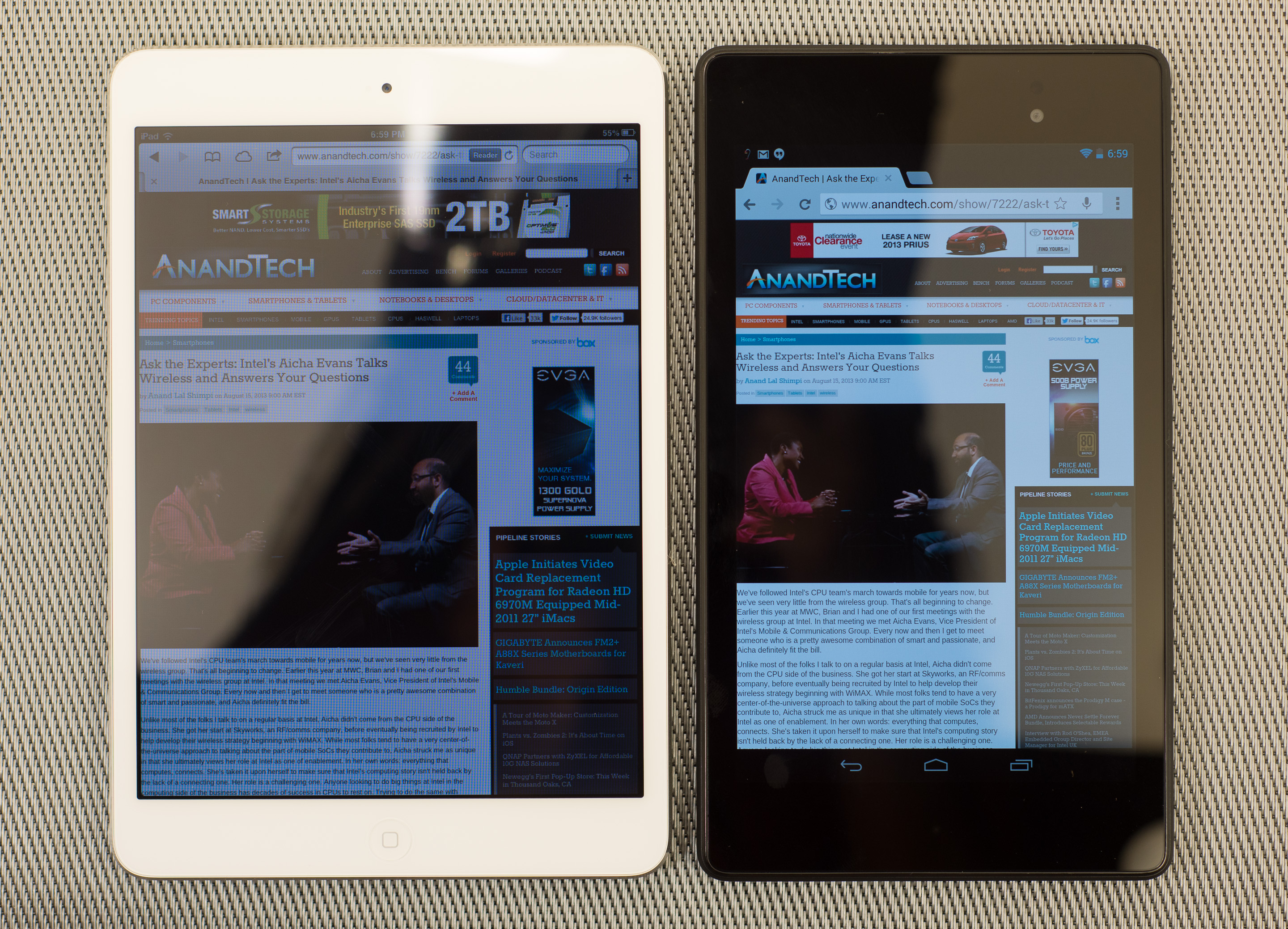
The result is the new Nexus 7. Identical only in name, manufacturer and screen size, the 2013 Nexus 7 is a downright Apple way to rev a product. Google made it thinner, lighter, faster and better in almost every way.

2013 Nexus 7 (left) vs. 2012 Nexus 7 (right)
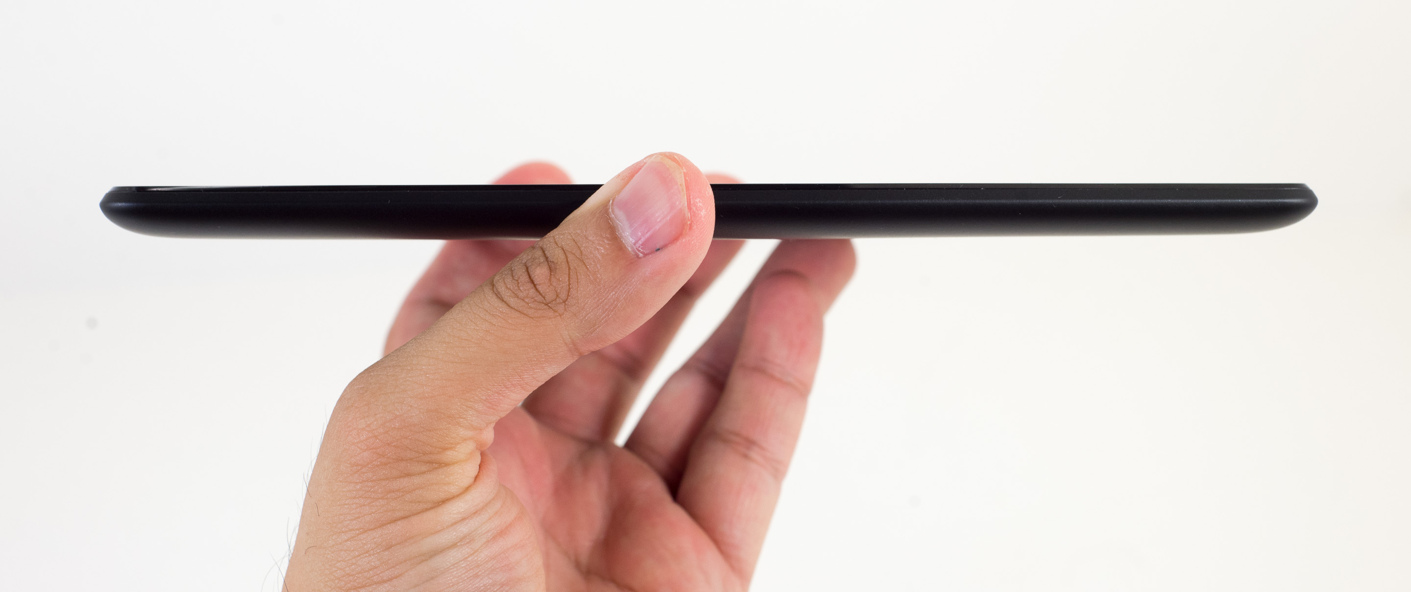
The original Nexus 7 was rather thick but it got away with it since the overall footprint of the tablet was so small. The new Nexus 7 truly feels like a slate. It's the type of thing I expect to see carried around on the Enterprise.
I don't miss the rubber imitation leather from the original Nexus 7, it's replaced by a soft touch plastic back. You definitely don't get the premium aluminum feel of the iPad mini, but the device doesn't feel cheap either. The new Nexus 7 is still nice enough that I'm nervous about scratching or scuffing the back.
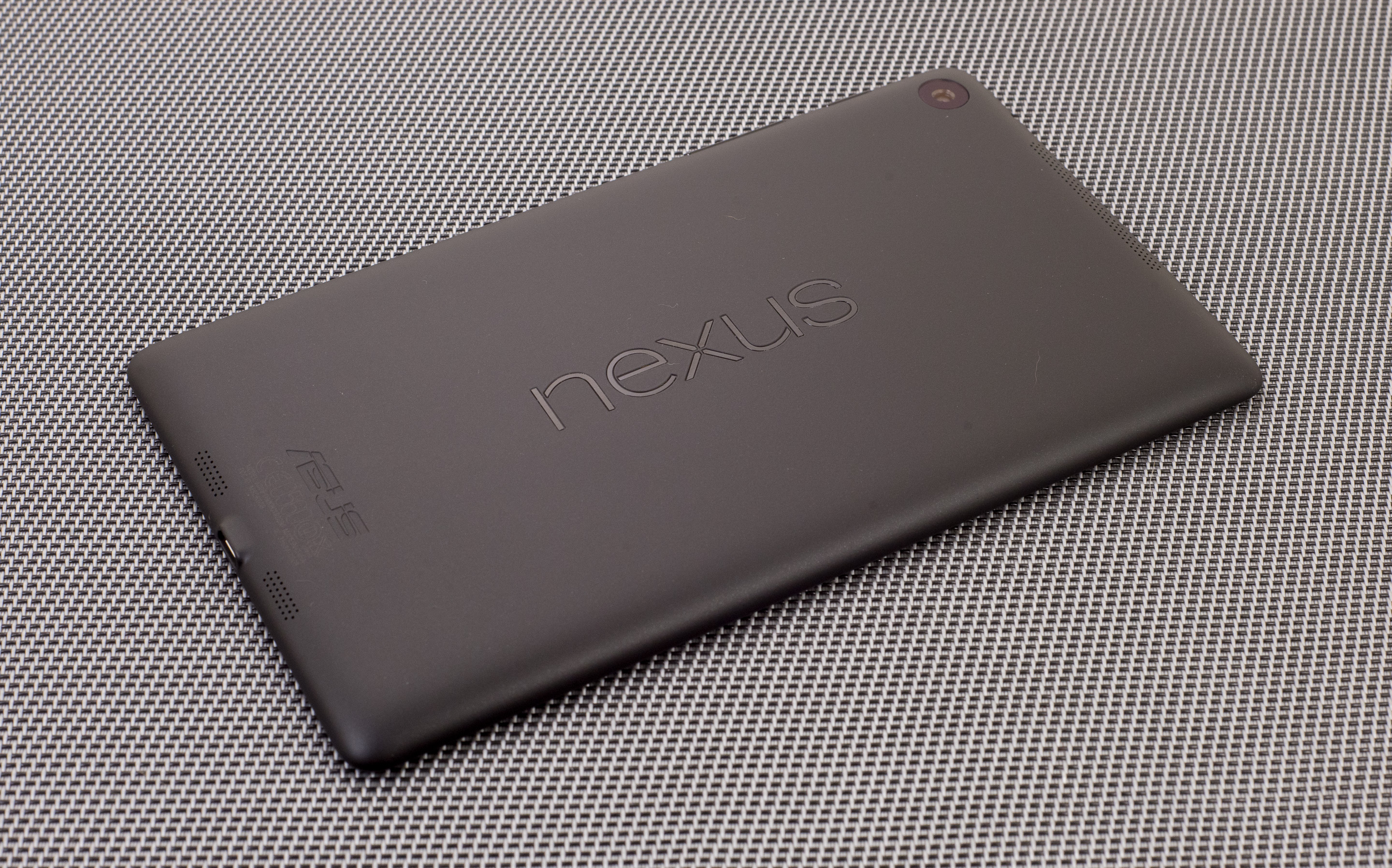
Both ASUS and Nexus logos are prominently featured on the back. ASUS continues to amaze me by just how far it's come as a company, and the new Nexus 7 is hands down its most impressive tablet creation yet. From a build quality standpoint I really have no complaints about the Nexus 7. While the MeMO Pad HD7 has some creaks and flex in the chassis, the new Nexus 7 feels like a solid slab of soft plastic and glass. It's nice.
Unlike the original Nexus 7, the new model features stereo speakers on back of the tablet. It's an easy feature to take for granted but going back to the old mono design sounds worse.
I agree with Brian that the power/lock and volume buttons are the only real sore spot on the physical execution. They aren't particularly well defined and feel a bit mushy. Even writing this paragraph feels like I'm nit picking though, the build here is really good.

The only other complaint I'd levy against the new Nexus 7 is that the design doesn't particularly stand out as being unique. The iPad has its aluminum, the Moto X has its wood, but the Nexus 7 falls victim to the fact that ultimately it's tough to make these ultra mobile devices stand out. You need a large glass surface and you need a back. Black also tends to be one of the easier colors to sell (get too creative and you end up with inventory problems). It's not a huge deal to me personally, but as mobile devices can often be fashion statements I don't know that the new Nexus 7 has all that much curb appeal.


The Display
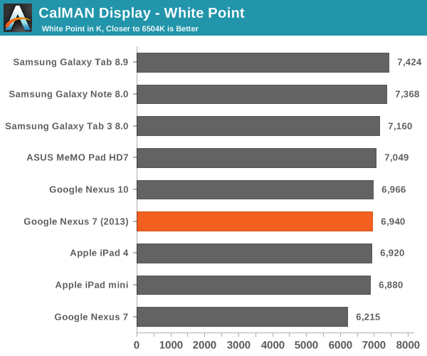
What the Nexus 7 lacks in pizazz, it completely makes up for once you power on the display. The 7-inch 1920 x 1200 display produces colors that are not only vibrant but, for the first time ever in a Nexus device, accurate as well. Google really worked on color accuracy this time, with a two step calibration process - once at a high level by the panel maker and once again per device during final manufacturing. The result is just awesome:

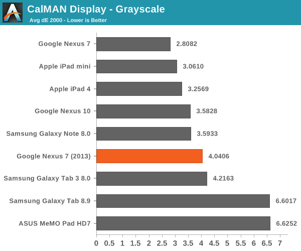
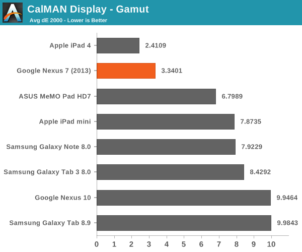
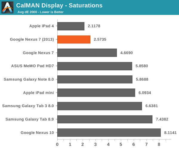
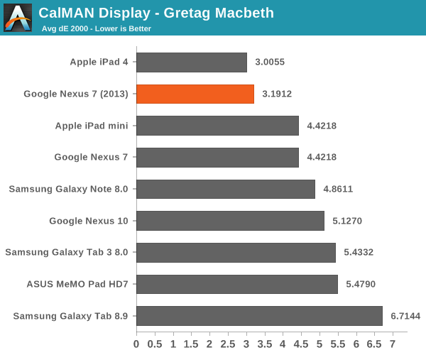
The Nexus 7 display is not only visually appealing but stacks up incredibly well in our CalMAN display tests. Although it loses to the iPad 4, the Nexus 7 gets indiscernibly close in many cases and blows the non-Retina iPad mini out of the water. I won't even bother comparing it to everything else in the Android space, they don't hold a candle to it.
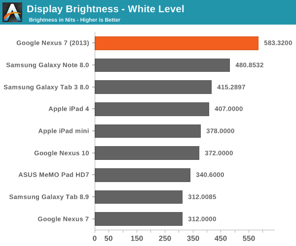
The new panel is also incredibly bright. I typically view 500 nits as the threshold for outdoor usability, and the new Nexus 7 definitely exceeds that threshold. The tablet will drink away all of your battery life if you leave it at this brightness setting indefinitely, but if you need to actually use your tablet outdoors for a while the Nexus 7 works.
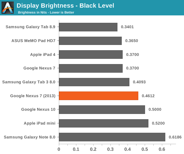
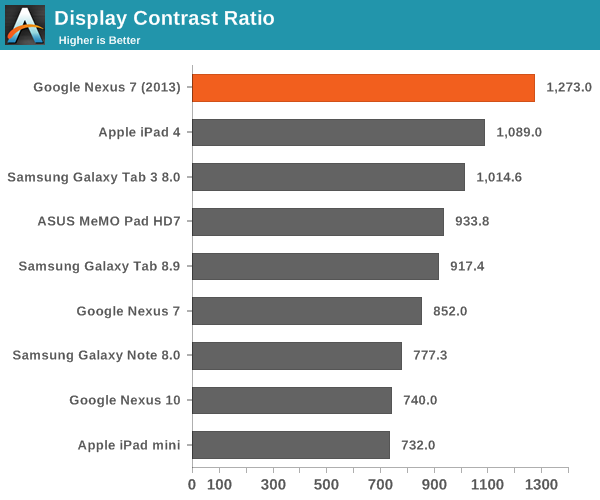
Black levels are a bit higher than on the original Nexus 7, but the resulting peak contrast ratio is still excellent:
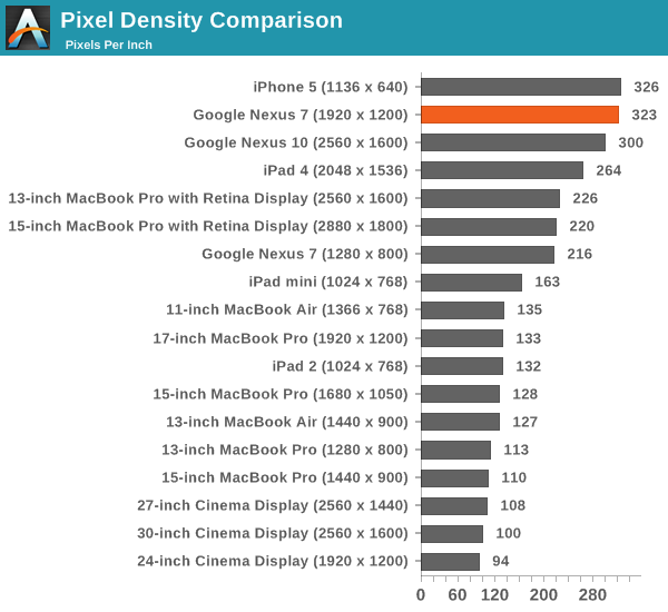
Pixel density shoots through the roof with the new Nexus 7 display as well. Brian was quick to point out that a major advantage of the Android platform is in its flexible resolution handling. The 1920 x 1200 panel presents itself as a 960 x 600 panel to web pages in Chrome, while other apps can use every last pixel for unique content (e.g. games).
The beauty of not having to double the original Nexus 7's resolution but instead settling on an in-between option like 1920 x 1200 is that Google could get away with a performance mainstream SoC instead of something ridiculously high-end.
The display looks great when viewing everything from photos and movies to web pages and eBooks. My only complaint about the Nexus 7's display is its size. A 7-inch tablet is almost pocketable (in fact I did carry it around in my pocket for a day), but the screen can feel a little cramped.


202 Comments
View All Comments
jl0329 - Wednesday, October 9, 2013 - link
Your idiocy made my laugh out loud. You are truly clueless, aren't you?bznotins - Thursday, August 22, 2013 - link
Is this new version polarized? The 2012 Nexus 7 was on the horizontal axis, precluding from me using it in that orientation as a nav device with my (also polarized) sunglasses on. Looks like a great tablet though.OzedStarfish - Thursday, August 22, 2013 - link
Yes it is, for my unit it is almost entirely blocked when in landscape unfortunately.amdwilliam1985 - Thursday, August 22, 2013 - link
Good read, this is one of the very few article that actually praises on the new Nexus 7's battery life :)max1001 - Thursday, August 22, 2013 - link
I was expecting Gold since the review was all praises. lol.ikjadoon - Thursday, August 22, 2013 - link
If Anandtech compared this to all other 7" Android tablets, it'd be a gold. But, he might be taking the bigger picture: for myself, 7" is just too small, as well.It's portable, though, and for some people, that's more important.
Impulses - Friday, August 23, 2013 - link
I'd prefer 8.9"... But until there's a Nexus 8 I'd rather deal with the size than any of the shortcomings on other current tablets.max1001 - Friday, August 23, 2013 - link
I think it's better to have both. I have a 7" and a 9". Nexus 7 easily fit in my coat inner pocket and I can bring it with me everywhere. It's also a lot easier to handle on the subway. I can grip it by the side with 1 hand and not worry about dropping it. I user the 9" to watch Netflix and web browse when I am at home.mmarafie - Thursday, August 22, 2013 - link
I remember the old days when anandtech was the best tech site for reading awesome, detailed, and unbiased reviews. It seems those days are long gone, the more I read the reviews here (especially by Anand) the more I realize the site has become basically an advertising and marketing place for Apple. There are so many tell-tale signs in this review and others where its quite obvious..DukeN - Thursday, August 22, 2013 - link
Agreed.I automatically ignore Apple/iOS mentions and figure out my own comparisons to the rest.
Anand, perhaps this can be a feature for you.