Three Months with Microsoft's Office 365
by Vivek Gowri on January 31, 2013 11:59 PM EST- Posted in
- Microsoft
- Cloud Computing
- Office 2013
- SkyDrive
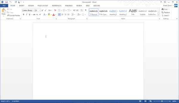
Generally, Office 2013 works pretty similar to Office 2010, with an interface heavily reliant on the ribbons. Now, I’ve always been a fan of the ribbons, which I thought were a good idea in Office 2007 but really came into their own with Office 2010. It’s been six years since they debuted, so anyone that is still complaining about Ribbon UI should really get over it, especially now that Windows Explorer uses it as well.
The aesthetic has been updated to match the Metro visual style that forms the basis of the Windows 8 and Windows Phone 8 UIs. This visual style has left me a bit cold in Windows 8 Desktop - I like the UI chrome in Windows 7, I feel it gives the interface some three-dimensionality and offers more natural interactions. But in Office, the chromeless aesthetic is awesome. I think it works really, really well in Word and PowerPoint especially, where the starkness and simplicity of the UI (particularly in the hidden command or hidden Ribbon modes) gives you a very blank slate to work from. It’s clean and pure in a very fundamental sense, with no visual distractions at all in the UI.
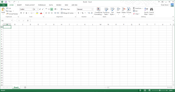
I’ll also note that the refreshed interface has little to no effect on Excel, which has looked and felt exactly the same since I first used it in Office 97 as a five year old. It’s like the Porsche 911 - no matter what changes under the hood, externally it has looked the same for decades it seems like. Not that it’s a bad thing, since I love the 911 and love-hate Excel, but it’s worth mentioning nonetheless.
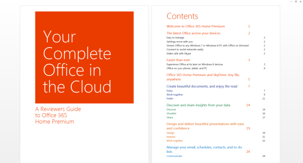
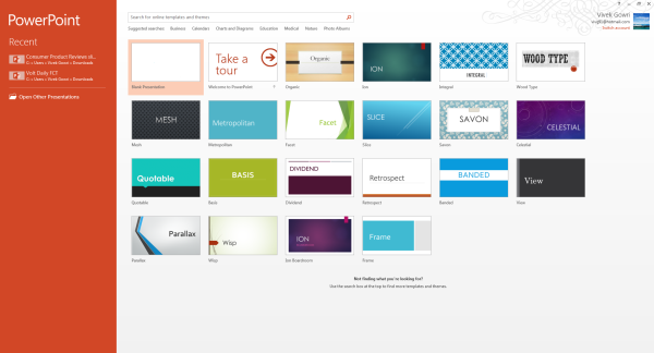
Generally, it seems like the Office 2013 has a much stronger focus on the visual style of the content being created than I’ve noticed in previous editions of Office. There’s much more aesthetic polish, with rich templates that aren’t worthless like they have been in many previous editions of Office, nicely styled titles and headers, and many more document design capabilities. Until you use it, it’s really difficult to overstate how much cleaner documents that come out of Office 2013 look. It’s now much easier to create content that are visually pleasing - documents and presentations that just look good and are easy to read without needing to spend a ton of time on formatting.
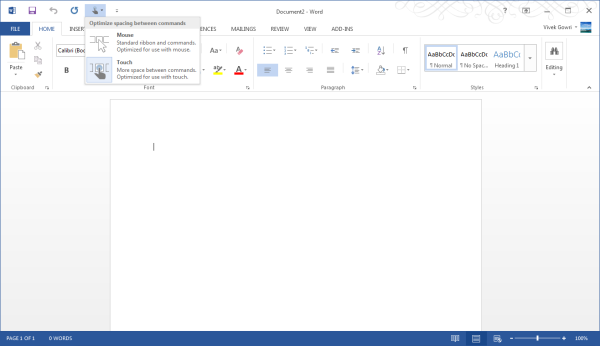
Microsoft is including two input modes: mouse (Office as we know and love it) and touch, which expands the size and spacing between menu options for a more finger-friendly interface without dumbing it down. Look closely at the below screenshot versus the one at the top of the page to get an idea of what I'm talking about. It’s decent to use, but obviously, creating content using the touchscreen keyboard is an outright pain, so this is more for navigation, minor editing, and formatting changes. You will obviously get more out of any office suite with a traditional keyboard and mouse setup, but the new Office at least has a more touch-centric UI as an option.




113 Comments
View All Comments
guidryp - Friday, February 1, 2013 - link
Totally disagree.Monochrome icons all look the same on first glance. You need to waste more time deciphering them.
The flat featureless crap was windows in the early 1990's.
It is also totally ridiculous that you like Aero more, but you are willing to give it up and defend flat monochrome because Microsoft is pushing that fashion.
Talk about sheep.
Tetracycloide - Friday, February 1, 2013 - link
It's ridiculous that you can't make a coherent argument about UI design without calling someone a sheep because they don't agree with your position...Parhel - Friday, February 1, 2013 - link
You must be new to tech sites. This is where the socially maladjusted come to call everyone who disagrees with them 'Sheep'.guidryp - Friday, February 1, 2013 - link
I am not calling him a sheep for disagreeing with me.I am calling him sheep because he is willing to abandon what he actually likes better, to follow the latest fashion MS dictates.
"... althoguh I like windows 7 aero style more, but...."
Nothing quite as sheep like as abandoning what you actually prefer to follow a new corporate directive.
FunBunny2 - Friday, February 1, 2013 - link
C'mon. The Great God Steve refused to make a color-tubed machine and one with a hard drive. Events caught up with him, but he was convinced.Wolfpup - Thursday, March 7, 2013 - link
This has nothing to do with "old-fashioned". This has to do with useability. Shadows and the like weren't introduced randomly or for fashion, they were introduced because they're more FUNCTIONAL. Removing them for fashion's sake is insane and incompetent.Cygni - Friday, February 1, 2013 - link
Agreed. The UI is absolutely terrible. The flat monochromes and ALL CAPS TEXT in 1998 era fonts. Just looks horrifically bad.steven75 - Sunday, February 3, 2013 - link
It's so bad if my employers forced this version of Outlook in me I'd be tempted to retreat to the web access version.crispbp04 - Friday, February 1, 2013 - link
Chrome and useless flash is JUNK. Are you also impressed by old Honda civics with fart pipes, a 4 foot wing, and a crappy paint job?Maybe it's time to look in mirror and ask why yourself "Why am I a cynical hater?" It's possible that it will expose the core reasons why you're being an unoriginal bandwagon hater drone, instead of someone who backs up their rants with facts and examples.
I understand that "haters gon' hate" and try to invent bogus reasons to support their ignorance, but at the end of the day, it shines through nonetheless.
colonelpepper - Friday, February 1, 2013 - link
you're hilarious....look at your own screed.