From Mango to Apollo: The HTC Windows Phone 8X on the Daily
by Dustin Sklavos on January 28, 2013 12:01 AM EST- Posted in
- Laptops
- windows phone 8
- Windows Phone 8X
- HTC 8X
The Windows Phone Interface
When Microsoft came up with the Metro Modern UI design language, their goal was essentially to streamline and simplify the interface as much as humanly possible. For me at least, this was a huge draw towards the platform (though I benefitted from arriving to the smartphone race late.) The Modern UI was designed to run in portrait mode, and it takes tremendous advantage of the increased vertical space.
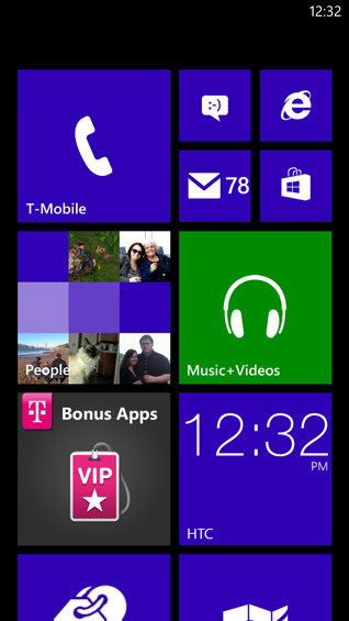
If you're unfamiliar with it, Windows Phone 8's interface involves two basic screens: the start page which features live tiles, and an application list. For WP8, Microsoft has gone from having two live tile sizes to three, and while I feel like it clutters the interface, it's ultimately much more productive. The tiles both launch applications and, depending on which applications they link to, can also provide useful information, essentially combining desktop widgets with shortcuts into a single useful "button." The tiles also tend to blend together in a much neater and more orderly fashion than widgets and icons do in iOS or Android, and they're very easy to rearrange and resize. Microsoft won't let you personalize your background (only your lock screen), but you can get a lot of mileage out of customizing the start page exactly.
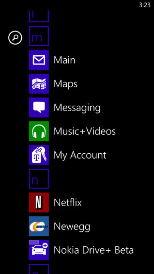
Meanwhile, the application list has amusingly been the standout feature of Windows Phone every time I've shown it to anyone: it's just that sensible. If you swipe left from the start menu, the application list is exactly what it sounds like: a vertical list of the apps installed on the phone, alphabetized. Icon on the left, name on the right. Once you reach a critical mass of apps, the letters of the alphabet pop up above each set of apps that start with that letter; you can tap the letter to bring up the alphabet, then tap the first letter of the app you want to find. Or, you can scroll up or down to it. Either way, to me at least, this is a very intuitive way of keeping the phone organized.
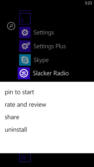
Finally, holding your finger on anything you're interested in brings up a menu that allows you to modify it. Uninstalling apps is as easy as choosing "uninstall app." "Pin to Start Menu" does exactly what it says. On the start menu itself, all of the tiles start floating, allowing you to rearrange them. You can resize them by tapping the arrow on the bottom right corner of the tile.
When you do use applications that employ the Modern UI design language, screens remain exceptionally clean. Since you're restricted to customization between having white text on a black background or black text on a white background and can only choose which accent color you want the tiles and highlights to use, the interface remains crisp and easy to understand.
Ultimately, between Windows Phone 7.5 and Windows Phone 8, the only immediately visible major interface change is the addition of the quarter-sized live tile on the start menu. You can add additional notifications to the lock screen and choose a single application to get a full text readout, but I felt like the one notification type seriously missing from the WP7.5 lock screen was a toast notification for whatever games I was playing with friends (i.e. WordFeud). Despite being able to assign a "games" icon to the lock screen, there's still no toast notification for any of the games I play. On the flipside, pinning the games I play regularly to the start menu allows the live tiles to indicate to me whenever it's my turn, so at least there's some way to know.


117 Comments
View All Comments
yankeeDDL - Monday, January 28, 2013 - link
Wow. This is the first time in ... what, 7? 8 years? ... since I read AnandTech, that I am disappointed about a review.I mean, what is this? Really? "A bit more editorial?" Is this a polite way to say that "objectivity" stays out of the door?
Come on: the whole idea of a smartphone is to be able to use whatever app will increase its usefulness, productivity, or fun.
If you need a phone to make phone calls and update Facebook you don't need a "smart"phone, or at least not one that sets you back $450!
Yes, the lackluster app store is a chicken and egg problem: if you don't buy a phone devs won't have incentives to develop apps and it'll never work.
But has anyone looked at the Windows Phone store? Top photo app "Photofunia"? Seriously?
Top free game: "Ragdoll run"?
Come on, I have tons of fun free games from my kids on my Android to keep them entertained when we travel. I have several books to read on the go (I prefer a larger phone than having to bring a phone and a tablet ... but that's just me).
Personally, I would love to see some key benefit of using Windows' platform (screen expansion, live VNC, remote execution, ...), but rather than leveraging on existing Windows desktop ecosystem, Microsoft has created a the Windows Phone platform from scratch, and what's worse, is that it is showing it down the desktop as well, killing what it had already going.
JPDVM2014 - Monday, January 28, 2013 - link
So, you are saying that since the top free apps in two categories are something you don't think are fun or worthwhile, that this review is disappointing? Also, I believe that "editorial" does mean a certain amount of objectivity goes away. It is a personal opinion after all. I use a WP, and have tons of free games, and books to read on the go, so it must be just as good as android, right?yankeeDDL - Tuesday, January 29, 2013 - link
No, I am not. I didn't want to bother listing all the top free apps on every single category, but I mentioned two that go a long way in Android and iOS in terms of popularity (Instagram? CameraZoon? PaperPhoto?).Instagram is a (was a?) booming social app for crying out loud.
But again, I only wanted to say that the apps market is a deserted land, IMHO.
That doesn't mean that someone can't find what is looking for but still, that does not change the fact that the offer/quality is abysmal compared to Andoid and iOS.
For me this is an enormous deal.
The article didn't even mention that Google went as far as negating WP support for most of his Apps, at least for now.
I don't know you but I normally buy a phone planning to use it for 3~4 years or more: the thought of being locked into a sub-par apps market when there are two glaring alternatives seems a no brainer to me.
Which goes back to my comment: I am sure there are plenty of people that prefer to use their smartphone more like a "dumb phone". Snap shome photo, call people and that's about it. Then I really don't see WP8 having any real limitations, but would it be worth the price? I say no, and that's my opinion.
DukeN - Monday, January 28, 2013 - link
I probably use Gmail and Google Maps the most out of just about any set of apps.How is the experience on WP8?
(assuming the standard apps like ScoreMobile, Netflix, Kijiji, are available..)
s44 - Monday, January 28, 2013 - link
Not so great, mostly because Google isn't interested in boosting WP8.El Goog is cutting off the Exchange connector for new devices of non-paying Gmail users this week, so you won't get push until/unless MS implements IMAP idle (probably in another OS release that requires entirely new phones)...
As for Maps, there's no official app, and mobile IE doesn't play terribly well with the mobile site (Microsoft proprietary vs. Webkit).
zilexa - Monday, January 28, 2013 - link
Thanks for this article, very nice and pleasant to read.I fell in love with the Lumia 920. But its rocky release was bad.. and availability was worse. Now it's finally in stores and I tested one in the store. Way too big. I don't mind the weight, optical stabilization is actually an outcome for me so the extra weight is the price you pay.
But overall it's huge.
if there was a smaller version with the same high end features, would be a big hit.
Not like the 820, it's just lacks the good looks (I even think its ugly) and has a bad resolution: screen too big for such a resolution, definitely for a 2013 phone, which it is!
prdola0 - Monday, January 28, 2013 - link
I have to say it again - why does Apple very time get shiny nice photos of their products and EVERYONE else is getting these terrible, crappy pictures like the one in the articles overview and in the article? This phone looks really nice in reality. Even small tech websites have better and higher quality pictures without all that dirt and fingerprints. Why not you?I've been trying to be polite, but never got an answer before. But now I have to say it straight - Anandtech is BIASED.
Dustin Sklavos - Monday, January 28, 2013 - link
Actually, it's a much more mundane and probably disappointing answer for you.Anand has the space and the equipment to take stellar photos, and he's the one that usually reviews the Apple products. I don't (though I do need to buy a new backdrop, admittedly).
prdola0 - Tuesday, January 29, 2013 - link
Well then it is biased. Since one vendor gets in fact better treatment, it's quite unfair for the others, even if unintended. Why not send the gear to Anand for taking pictures after you're done with the review?crispbp04 - Monday, January 28, 2013 - link
I'm confused on the part talking about not supporting multiple calendars. I have multiple calendars working just fine. Facebook, Live, Exchange, and Outlook.com all integrate fine and I can pick and choose my calendars. Maybe it's a limitation of google calendars? It could be due to a 3rd party and not the fault of msft.