Samsung Galaxy Note 2 Review (T-Mobile) - The Phablet Returns
by Brian Klug on October 24, 2012 9:00 AM ESTSo up until now I’ve felt like the Galaxy Note 2 is really just a larger Galaxy S 3 with an active digitizer. But the 1280x720 HD SAMOLED display at 5.5 inches diagonal is where the Note 2 begins to strongly diverge from that trend. First off, it’s bigger than the Note’s HD SAMOLED which was 5.3" and 1280x800.

Galaxy Note 2 (left), Galaxy Note (right)
When I heard that Samsung was going to be doing a Note 2, I originally suspected that they would use the original Note’s display in conjunction with the hardware platform I outlined earlier. Instead, Samsung has gone with an entirely new revision of HD SAMOLED yet again for the Note 2, one that represents an interesting middle ground between a traditional RGB stripe like you’d see on an LCD and the RG BG Nouvoyance PenTile tech that we’ve seen countless times and iterated through a few different geometries to date.
With Galaxy Note 2, Samsung has gone with an entirely new subpixel rendering matrix, which I’ve heard was going to be called S Stripe. Instead of the previous PenTile tech which used two subpixels per logical pixel (either RG or BG), this new subpixel geometry uses 3 subpixels per pixel (RGB) but with a green subpixel above the red subpixel and a long vertical blue subpixel.
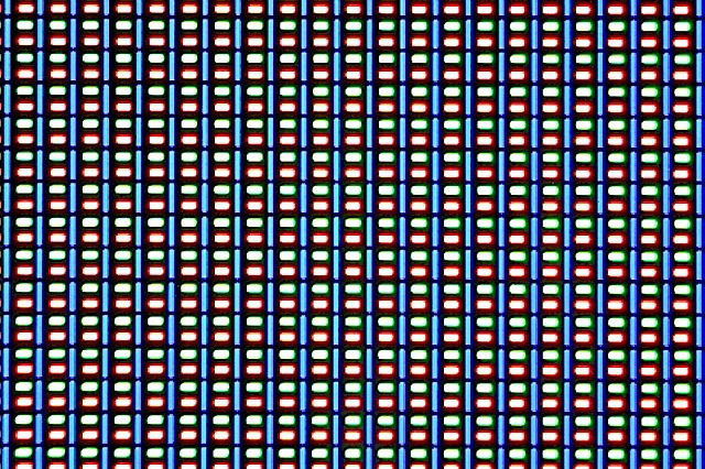
The reason for this change in geometry has always been an interesting one. The blue material has a lower luminous efficiency than the other colors, and thus requires either a larger area or higher drive power to match the equivalent green and red luminance. This is why you hear people saying the blue subpixel ages faster — sure, at the same size it ends up burning out faster due to this lower efficacy.
The mitigation is thus to craft a matrix that allows for a nonuniform geometry, and this one brilliantly does it without the tradeoff in longevity or loss of spatial resolution from going to two subpixels per pixel. The tradeoff that does get made is that subpixel smoothing only really gets two pixels to turn off - the blue, or the red and green unit. In the past the display driver could handle the RGBG unit cell and do font smoothing, from what I’ve seen the above is how the new one works as well.
I’m not complaining, this is a great tradeoff and makes sense for the resolution and size that Samsung has selected for the Note 2. Going with a PenTile RGBG layout at this size would not be desirable, instead the “S Stripe” layout runs with subpixels small enough that I can’t see them. It’s tempting to look at the 1280x800 of the Note and the 1280x720 of the Note 2 and assume it’s lower resolution, when in fact the Note 2 has more subpixels (2.05 MP vs 2.76 MP) and in spite of the size increase stays around the magical 1 arcminute subtense (1.073 arcminutes on Note 2).
The Note 2’s brightness unfortunately isn’t that high, but like always Samsung makes up for it with huge contrast from the black subpixels being almost entirely dark. I have a feeling this is still being very conservative for the panel for battery life concerns and to minimize both aging effects and burn-in.
Next up is color accuracy and calibration, where Samsung AMOLED has traditionally been very oversaturated — which looks vibrant and draws customers in at stores — but results in inaccurate rendering. We’re using Chris’ new suite here which is in CalMAN 5, I touched on the details in the iPhone 5 review.
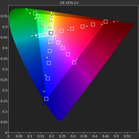
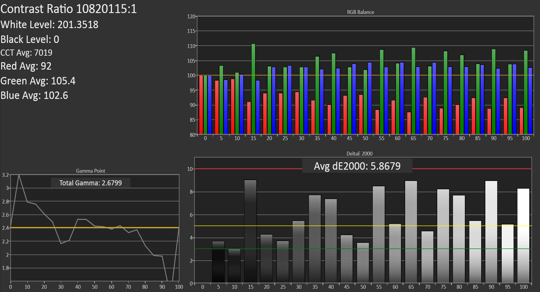
Our target is sRGB, as Android doesn’t have a CMS, and the Galaxy Note 2 doesn’t stop the trend of SAMOLED having a gamut much larger than sRGB. At the same time however things could be much worse. I also measured the Galaxy Note 2 display at maximum brightness with Francois who said much the same thing - it isn’t alltogether bad among SAMOLED displays.
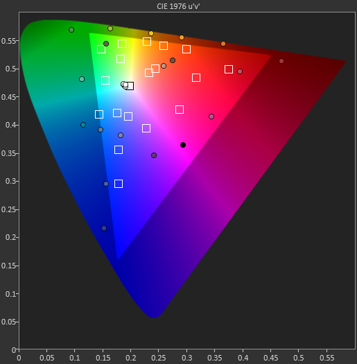
Color temperature at 200 nits is around 7000K but as the blue subpixel wears it will warm up and get closer and closer to 6500K. Overall the Galaxy Note 2 display makes some tradeoffs but ends up being quite appealing. There’s still something to be said for how contrasty AMOLED is even if it still is oversaturated compared to sRGB.
| CalMAN Display Comparison | ||||||||
| Metric | iPhone 5 | iPhone 4S | HTC One X | Samsung Galaxy S 3 | Samsung Galaxy Note 2 | |||
| Grayscale 200nits Avg dE2000 | 3.564 | 6.162 | 6.609 | 4.578 | 5.867 | |||
| CCT Avg (K) | 6925 | 7171 | 5944 | 6809 | 7109 | |||
| Saturation Sweep Avg dE2000 | 3.591 | 8.787 | 5.066 | 5.460 | 7.986 | |||
| GMB ColorChecker Avg dE2000 | 4.747 | 6.328 | 6.963 | 7.322 | 8.185 | |||


131 Comments
View All Comments
sharath.naik - Wednesday, October 24, 2012 - link
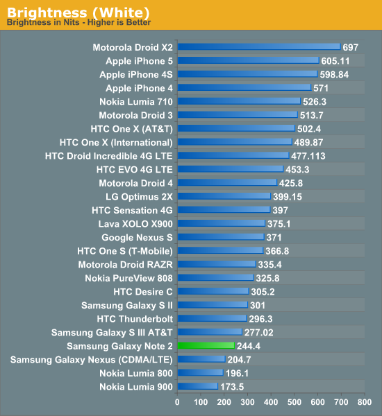
I expected the battery life to be much better that what the test shows. Specifically the WiFi browsing time of 6 hrs, when I Phone gets 10. I did not see the brightness level set during this test in the article (or did I miss it), given how much of a effect OLED screen brightness has on battery life, I would have liked know the brightness level set.Mugur - Thursday, October 25, 2012 - link
They said the brightness was at 200 nits. In my opinion that is somehow misleading, because this is almost max for Note 2 or other OLED screens and 1/3 for LCD ones like iPhone 5. Why not doing a test on max brightness?Spunjji - Thursday, October 25, 2012 - link
It's meant to be a standard level to make the numbers directly comparable. Furthermore, it would be unfair to penalise a phone with an exceptionally high brightness by running it at such a level during a test when you'd be unlikely to use that mode all the time in reality.However, in this instance it does hamper the phone's performance - I run it around the 50% level most of the time and it looks nice and clear that way. However, I wouldn't say it necessarily does so *unfairly*. Just something to bear in mind... additional figures would be nice but time-consuming to obtain.
Seggybop - Wednesday, October 24, 2012 - link
"I know there are big cultural differences associated with the appeal of this chrome ring"where can I find this mythical culture that appreciates gaudy chrome trim? as far as I can tell, it's a universally reviled element that does nothing but make a device look cheap.
CeriseCogburn - Friday, February 1, 2013 - link
Both you ladies should take some more cultural arts classes and brush up on your laughable snobbery.Seggybop - Wednesday, October 24, 2012 - link
"I know there are big cultural differences associated with the appeal of this chrome ring"where can I find this mythical culture that appreciates gaudy chrome trim? as far as I can tell, it's a universally reviled element that does nothing but make a device look cheap.
Impulses - Thursday, October 25, 2012 - link
Korea or Asia in general possibly...Seggybop - Wednesday, October 24, 2012 - link
"I know there are big cultural differences associated with the appeal of this chrome ring"where can I find this mythical culture that appreciates gaudy chrome trim? as far as I can tell, it's a universally reviled element that does nothing but make a device look cheap.
barry spock - Thursday, October 25, 2012 - link
The longer I spend think about my own subjective limitations, the more I realise that the products from anyone but apple aren't getting a fair go.And this one's an interesting product to attempt to not pigeonhole. I'd think of it more as a media device than a phone. And so does the rest of south korea, as I watch them using these things on the subway -- they watch tv on them. They make calls using earbuds -- not holding a thing this size to their heads. And they rarely put it in their pockets -- it goes in a handbag (or a manbag)
The bit about it not fitting in the F-150's "big Gulp" plastic cup holder speaks volumes about the culture it was written in.
Different cultures will use these devices differently. I imagine Samsung won't fret if this isn't taken up in droves in the US, because after all, there's always china.
Also, Anand, et al. *please* give us the ability to mod-down thoughtless comments such as the first one attached to this article.
CeriseCogburn - Friday, February 1, 2013 - link
That's all we need is you bland one mind fits all nazi book burners to demand the ability to wipe out the 1st amendment when you see fit.If you don't like a comment move on, instead of demanding personal power over others.
I didn't like certain things in your comment above, I'd like to wipe it out, we'd all be better for it.