The next-gen MacBook Pro with Retina Display Review
by Anand Lal Shimpi on June 23, 2012 4:14 AM EST- Posted in
- Mac
- Apple
- MacBook Pro
- Laptops
- Notebooks
The King of All Notebook Displays
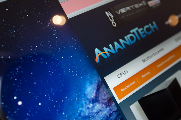
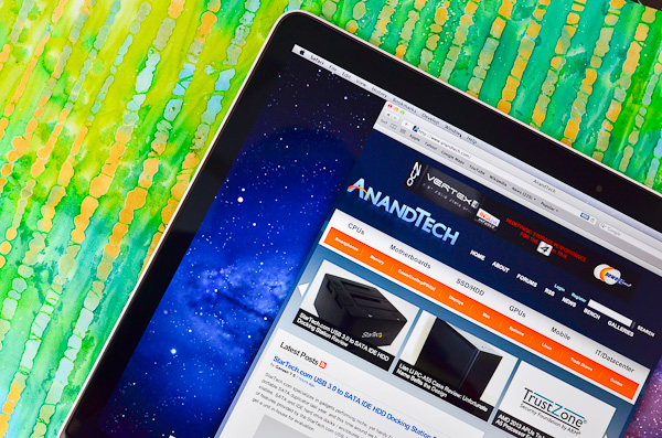
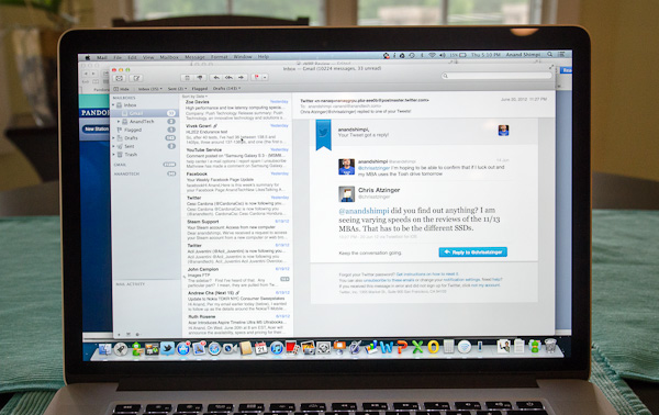
For years Apple has been shipping some of the best displays in consumer notebooks, but the MacBook Pro’s Retina Display is in a league of its own. While I never liked the phrase “painted on” in reference to the iPad and iPhone Retina Displays, that’s the best way I can describe the effect the MacBook Pro’s Retina Display has on me. Text really does look painted on. The effect is really the result of two things.
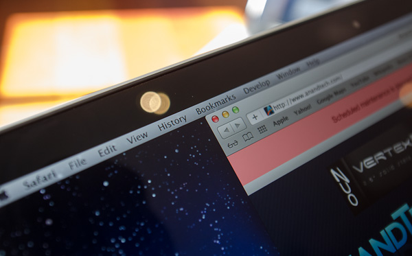
The first is Apple’s removal of its cover glass. LCD panels aren’t particularly attractive, they are ugly squares composed of two pieces of glass and a number of filters/polarizers. To hide the ugly edges, display makers wrap bezels around the display. Most people aren’t fond of bezels so next came a ton of effort to minimize bezel size. An alternative is to simply place a third piece of glass over the entire LCD assembly and make it look as if the bezel and LCD panel are integrated. This outermost layer is known as a cover glass and is what Apple uses on all of its glossy displays. If you’ve ever taken apart a Cinema/Thunderbolt Display or a newer iMac you’ll know that the cover glass is literally just a piece of glass that you have to remove with some suction cups.
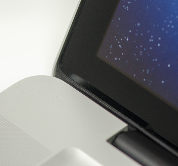
Non-Retina MacBook Pro, notice the gap between the outermost LCD glass and the cover glass
The MacBook Pro’s Retina Display does away with the cover glass and instead uses a fairly unique LCD assembly. There are still two pieces of glass but the outermost glass is actually a different size and shape - it integrates a bezel. By integrating the bezel into the outermost glass in the LCD stack you get the same effect as a cover glass but without the added reflections it introduces.
You also limit the possibility of dust getting trapped between the cover glass and the LCD. The danger is that you no longer have a protective piece of glass in front of your expensive new LCD. If you scratch the display you're scratching the LCD itself. While this has been true for conventional matte displays for a while, it's worth mentioning if you're used to Apple's glossy displays where you did have that added security layer.
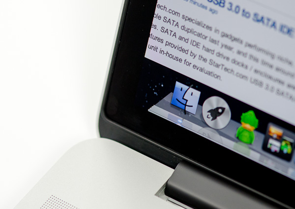
The MacBook Pro with Retina Display, no gap, no cover glass
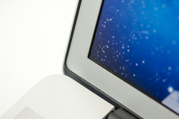
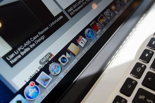
The 2011 MacBook Pro with High-Res Matte display option, no cover glass, top bezel
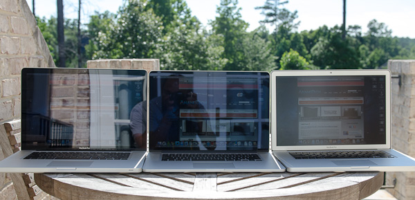
From left to right: 2010 High Res Glossy MBP, 2012 rMBP, 2011 High Res Matte MBP
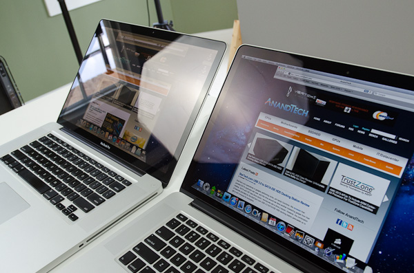
Glare handling indoors - 2011 High Res, Glossy MBP (left) vs 2012 rMBP (right)
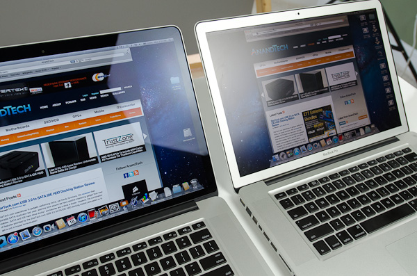
Glare handling indoors - 2012 rMBP (left) vs. 2011 High Res, Matte MBP (right)
The Retina Display is also obviously an extremely high resolution panel at 2880 x 1800. Note that this is 44.6% more pixels than Apple’s 27-inch Thunderbolt Display, and 26.6% more pixels than the 30-inch panels that we’ve loved for so long - all in a 15.4-inch notebook display.
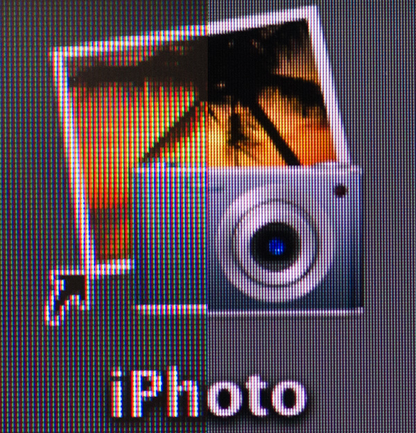
An iPhoto shortcut, High Res 2011 MBP (left) vs. Retina Display MBP (right)
At 220 pixels per inch it’s easily the highest density consumer notebook panel shipping today. At normal viewing distances and even with my face closer than I’m comfortable putting it I simply cannot discern individual pixels.
It’s the combination of these two elements, the removal of the cover glass and the insanely high pixel density that makes everything from text to UI elements just look painted on the new Retina Display. And the effect is gorgeous. I’ve never seen a prettier panel and it’s actually ruined me for pretty much all other displays, notebook and desktop.
While I can appreciate the iPad’s Retina Display, the impact from the MacBook Pro’s display is even more significant. Perhaps it’s because I still spend so much time working on a standard, non-tablet display, but I’m far more excited about this display than anything else Apple has delivered under the Retina moniker.
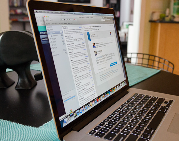
It’s not just pixel density that Apple has to offer here. Similar to its Retina Displays in the iPhone and iPad, the MacBook Pro’s Retina panel ditches TN in favor of IPS technology. The result is an incredible improvement in viewing angles. On a notebook I don’t spend a lot of time viewing it from far left/right angles, although I see the benefit when I’ve got others huddled around my display. Here the panel performs admirably - you lose brightness at far left/right angles but there’s no perceivable color shift. In fact, the painted on effect is even more impressive at these far left/right viewing angles.
For a single user however the more impressive characteristic is just how good the display looks at vertically off-center angles. I wrote much of the initial parts of this review while on an airplane in coach, which with a 15-inch notebook on my lap means I’m going to be looking at the display at a weird angle to begin with. The thinner rMBP doesn’t do enough to make the airplane usage model any better if the person in front of you decides to recline, but the IPS panel does make the display perfectly usable at the off-center angle you’ll inevitably have to deal with.
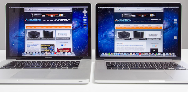
2010 High Res, Glossy MBP (left) vs. 2012 rMBP (right)
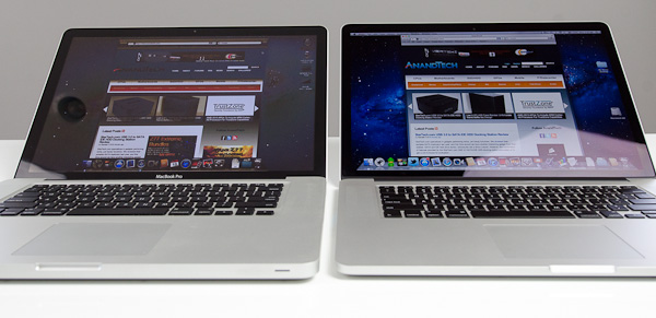
Hello colorshift!
2010 High Res, Glossy MBP (left) vs. 2012 rMBP (right)




471 Comments
View All Comments
OCedHrt - Sunday, June 24, 2012 - link
1) That's probably Canada. It is $1599 base in US for a while now and I got mine for $1100 after tax.2) Another Canada thing. But I agree, Sony is too inflexible.
3) That is by design. There is a video online with an interview where they explain it. This means you can grab your laptop by the screen and not risk damaging the hinges / screen. If you grabbed your MBP Retina by the display I'd be wary of breaking it.
ThreeDee912 - Saturday, June 23, 2012 - link
There's more to a computer than its hardware spec sheet.You can rattle off a laptop spec sheet with a good CPU, GPU, SSD, screen, etc., but if they're not integrated very well with everything else, or have mediocre software support, you can't always take advantage of those specs without some tacky workarounds.
gstrickler - Sunday, June 24, 2012 - link
^^^ I'll second that. Also, the right balance of specs matters more than "this spec is greater than that spec".If the keyboard, trackpad, or display sucks, you'll hate the computer no mater what the specs say. If it's too fragile, or heavy, or cumbersome, you won't want to carry it. If the software is slow and bloated, it won't matter that you've got 8GB RAM and a quad core i7, it can still feel sluggish.
The satisfaction with a computer is far more than just it's specs, or individual components, or even it's operating system. It's having the right combination of everything.
OCedHrt - Sunday, June 24, 2012 - link
1) This is dependent on user. i don't care about the 1" vertical, it's really the # of pixels that matter.2) The previous Z had discrete built in. The purpose of making it external is to achieve the 2.5 lb form factor. Sony once had a 11" 1.6 lb netbook. That is literally the holy grail in terms of weight for a portable laptop. The move to external discrete is really a step in that direction.
3) You can output more than 1920x1080 on HDMI.
4) 15" is too big for me, even at 2.5 lbs. Not everyone wants a huge screen on their lap - that's why I have a monitor on the desk.
5) Yes, at 2.5 lbs and 13", there's limited space for heat dispersion.
maratus - Sunday, June 24, 2012 - link
Unfortunately, Z tops at 1920x1200 through HDMI or single link DVI on the dock station. It was a dealbraker. Now rMBP ability to drive 2x 2560x1600 and 1x 1920x1200 is simply overkill for me, I'm still confused why did Sony stuck with HDMI only and didn't even bother to provide DP, mDP or 2L DVI as a second port.OCedHrt - Monday, June 25, 2012 - link
That's typical Sony (Japanese) stupidity.Chava - Friday, June 29, 2012 - link
That's typical Japanese stupidity...Yeah for some reason you thought that was acceptable.
Solandri - Saturday, June 23, 2012 - link
The chassis isn't thinner than the 13" 2010 MBP (it tapers from 1.0-1.3" vs the MBP's 0.95"). Its other two dimensions are smaller though (12.4" x 8.3" vs 12.8" x 8.9"), and it's lighter (lighter than the 2010 Macbook Air in fact) at 2.9 lbs (some models were 3.04 lbs, never figured out why). Sony managed this by using a lot of carbon fiber and a really thin screen. So it's not as stiff as the solid block of aluminum that the MBP used. But the keyboard bezel is solid aluminum making it very stiff.http://asia.cnet.com/sony-vaio-z-sports-worlds-fir...
http://www.pcpro.co.uk/reviews/laptops/355384/sony...
Here's the only marketing brochure I could find for the model being discussed (in French):
http://www.mgmi.fr/docs/pdfprod/VPC-Z11Z9E-B.pdf
OCedHrt - Sunday, June 24, 2012 - link
That's the 2008 Z. 2008. The 2011 Z is a non tapered design:13.0" x 0.66" x 8.27" (WxHxD)
330mm x 16.8mm x 210mm
The MBP is 50% thicker than the Z. It's understandable given that it is 15" instead of 13".
Freakie - Sunday, June 24, 2012 - link
http://www.tomshardware.com/news/sony-vaio-z-quad-...Here you go. THIS is true innovation. Sony did amazing work with this version of the Z to get all the functionality of a bigger laptop into a tiny package. It is even more impressive when you think about how old, hot, and power hungry the CPU/GPU was back then. Sony has innovated much more in the laptop industry than Apple has, in my opinion. Though I still wouldn't want a Sony like this just like I wouldn't want an Apple like the rMBP (user upgradability and repairability is virtually non-existant, which is an instant deal breaker for me, it was hard enough buying a laptop with a 540M integrated onto the mobo, could never buy a laptop that didn't even let you upgrade storage)
Here's a more detailed teardown: http://translate.google.com/translate?js=y&pre...