Samsung Galaxy S III Review - AT&T and T-Mobile USA Variants
by Brian Klug on June 20, 2012 12:01 AM ESTSamsung didn’t emphasize camera performance very much during its launch event, which surprised me since HTC and Apple have both made steady improvements on the camera experience this generation. That said, the SGS3 does make some iterative improvements of its own in the camera department.
First off, the 8 MP rear facing camera sits behind F/2.6 optics with a relatively wide focal length of 3.7 mm. If you compare to the SGS2’s F/2.7 optics with 4.0 mm focal length, the SGS3 is a fair amount wider, and it’s noticeable when out and about shooting photos. From my digging, I’ve found that both my T-Mobile and AT&T SGS3s contain a S5C73M3 rear camera module - that looks like a Samsung CMOS name to me, but usually Samsung CMOSes start with S5K3 in the 8MP category. This is the same as the International version I’ve seen, though there’s still considerable debate about whether this is a Sony CMOS, but initial reports are that it isn’t the IMX145 from the iPhone 4S. I’ve also seen references to “CML0801” but that doesn’t mean anything to me immediately. Either way, the CMOS is 8 MP with 1.4µm pixels and BSI, images at full resolution are 3264 x 2448.
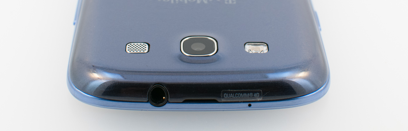
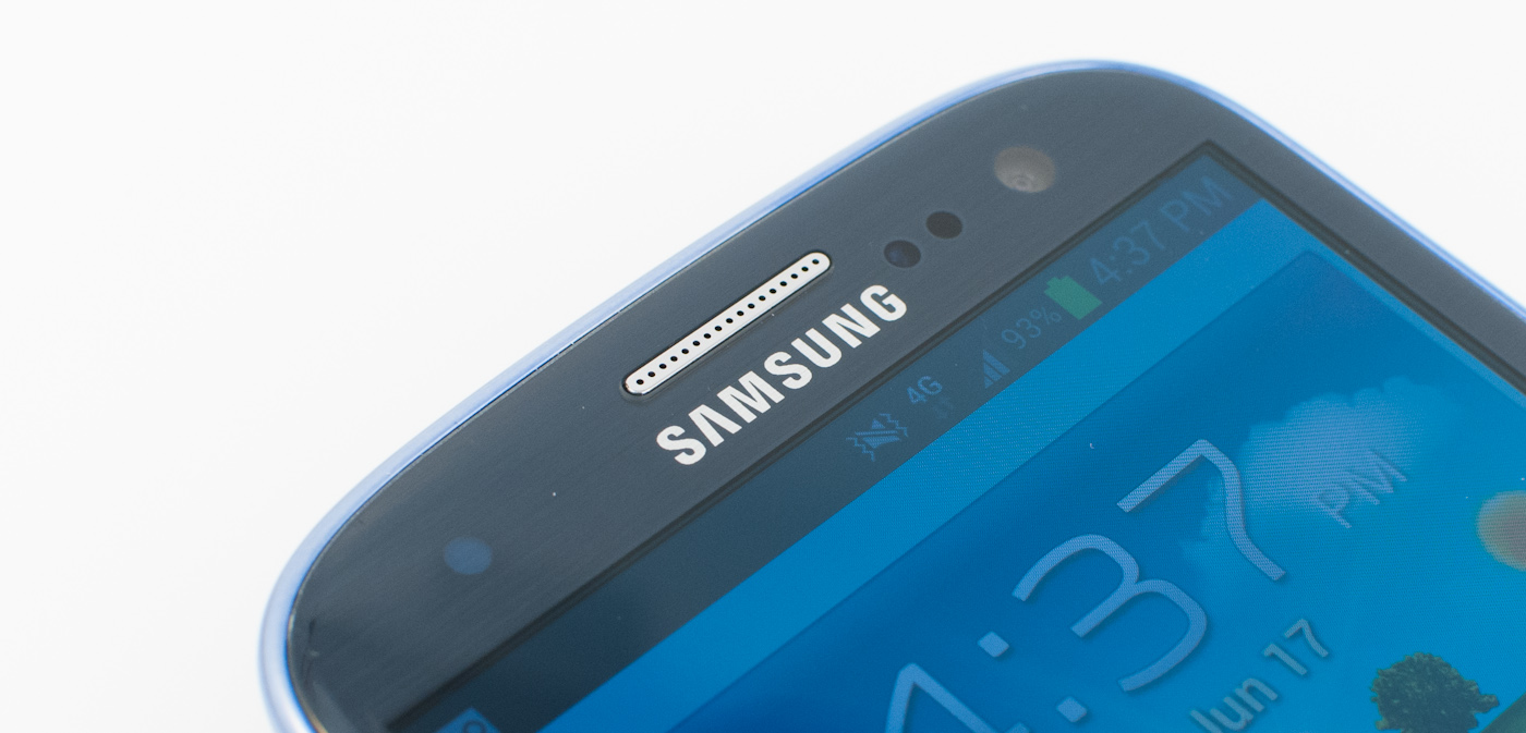
The front facing camera is a Samsung S5K6A3 CMOS which hasn’t been announced or made formal yet, and as a result I’m not sure about its pixel pitch or format. It is 1.9 MP and square - 1392x1392, which is relatively unique. I wager most users will just use 1280x960 and not know that the 1.9 MP option exists, though it is exposed in the camera UI.
Samsung has made some improvements to the camera UI, and though they’re subtle, they’re nonetheless worth talking about. The camera application does launch speedily, which was one of Samsung’s major points. As I mentioned, the shortcut from home screen (if you enable it) is handy if you don’t want to use up one of the application shortcut spaces.
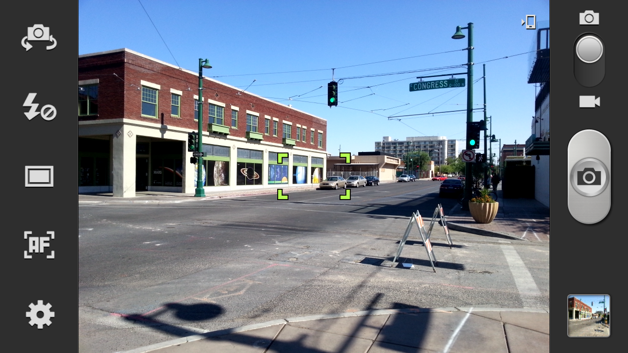
For SGS2 users, the whole application should be familiar, settings is in the bottom left, and all the icons on the left pane can be changed or customized by long pressing. Tap to focus and expose is still here, and capture speed is nearly instantaneous, just like on the One series.


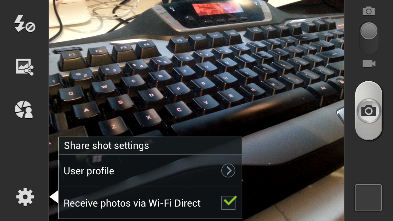
Shooting modes can be changed from single to burst shot, HDR, and a few other options. HDR combines three exposures like we’ve seen on other platforms, paints a progress bar while it computes (which happens impressively fast) and saves the resulting exposure. Probably one of the cooler shooting modes is share shot, which uses WiFi direct to share photos captured from linked SGS3s to each other. Tapping this brings up the WiFi direct pair prompt, and successive photos get put in a received folder on other devices.
To evaluate still image quality we turn to our usual set of tests, which means the lightbox scene with the lights on and off, and our bench photo locations (numbers 3 - 7 remain). I couldn’t get the test charts and lighting setup due to me moving houses while working on this review (everything is boxed up), but will update when that’s settled. For now we have a decent picture of the SGS3 camera performance, but something I would like to investigate more once I can setup my test charts. Consider the following more of a first impression than really my end thoughts on the SGS3 camera’s performance.


Immediately, you can tell that Samsung has tweaked their camera ISP and disabled the sharpening kernel which used to leave halos around contrasty spatial detail. There’s some loss of high frequency detail to noise reduction which is particularly evident in the lightbox camera’s focus rings and markings, but nothing too inordinate. White balance gives the scene a somewhat purple cast. I have to say that the One X image is sharper, but not by much.
With the lights off, the SGS3 does a great job exposing, and focuses with the scene lit up so it doesn’t miss focus entirely. This is still something I see so many other smartphone cameras not doing, and instead just capturing at infinity focus and hoping for the best. Kudos to Samsung for still doing it the right way.
At the bench location photos, I’m kind of left feeling the same way about the SGS3 camera at first glance. There’s nothing really wrong with it, and it seems to have less distortion (the test chart will tell the objective truth) but it just isn’t as sharp as some of the other cameras I’ve seen. Having a wider field of view is definitely something different, and it’s noticeable over the SGS2.


107 Comments
View All Comments
antef - Wednesday, June 20, 2012 - link
I don't believe "context menu" is the right term here. We're not discussing context menus - that would be something related to your *exact* context, such as long-pressing a row in a list and getting some options. What we're discussing is the app's "primary" menu that holds whatever could not fit on the main UI surface. In that sense, both the legacy menu and the action bar "overflow" are going to hold similar things, so what they contain is not really an item of debate. The main problem with the fixed Menu key, as Impulses said, is that it's "hidden" - since it's always present, there is really no indication that an app needs it or not, and it's also off-screen and thus doesn't feel cohesively tied to the rest of the app's UI. Action overflow, meanwhile, only appears when needed and right alongside other related functions.HTC switched to the new layout but unfortunately their use of physical buttons necessitates the nasty "full row menu button" for legacy apps. And I bet you that Samsung only stuck with the Menu key because they were too lazy to rethink parts of TouchWiz's UI - it clearly is a carryover from Gingerbread and they've shown before they don't put a lot of polish into their software. In that sense, this device is just stuck with that button because Samsung did not try to design a better user experience, not because they genuinely think this is the better way to go.
themossie - Thursday, June 21, 2012 - link
I understand what you mean, and "primary" menu is definitely a better term! However, the "action overflow" on-screen button which Google wants to replace the older "primary" menu (menu button) is not an improvement."Action Overflow" is not intended to be an actual settings menu. With "Action Overflow", Google basically says "Hey guys, you don't need 'settings' any more - just 'buttons you won't press that often." They then allow developers to put the action bar in 3 different places (http://developer.android.com/design/patterns/actio... so there's no longer consistent button placement.
The biggest problem with the menu button (for new users) was the lack of contextual cues. ICS ironically manages to fix this even as it deprecates the menu.
At this point, I'm way outside the scope of a phone review's comment sections, so I'll leave some food for though (discussion, not favoring a particular approach)
http://www.reddit.com/r/Android/comments/uda99/dea...
http://stackoverflow.com/questions/9286822/how-to-...
antef - Thursday, June 21, 2012 - link
Action Overflow is not intended to be an actual settings menu, but neither is legacy menu! it was never intended as a "settings" or "options" menu...literally just a menu to put anything you want. In this sense Action Overflow is exactly the same, only commonly used items don't have to be in the menu and instead can be directly on the action bar. It completely fixes the discoverability issue since the 3-dots are right there next to other icons you're already using. It leads you to it and it appears part of the app's UI.Thanks for the links. :)
synaesthetic - Wednesday, June 20, 2012 - link
Google was smoking crack when they got rid of the menu button. I installed a custom ROM onto my Nexus to make the menu button come back.I have never used a real serious app that didn't have a contextual menu. Never. And the "ICS friendly" apps that use the dotdotdot in-app menu like to put them in really obnoxious places... like the TOP OF THE SCREEN.
Holy carp Google, this phone is already huge, you want me to drop it trying to hit that menu key with my thumb?
The SGS3 having a menu button makes me want it EVEN MORE.
antef - Thursday, June 21, 2012 - link
I do have to tilt my Nexus forward a bit to reach up there with my thumb, but this is no different than having to reach up there for anything else, including the main action icons which are going to be up there no matter what.It is true that most apps used legacy menu, but still, nothing has to. That makes the very idea of an always present button silly. The nav bar should stick to system-wide navigation as it does on the Nexus and leave things pertaining to an app to be on the app's UI surface. The OP of the Stack Overflow link said it best:
"This [the overflow button] seems much more intuitive for users than throwing them into a separate menu list that requires the user to jump from a touch(screen) interaction to a button based interaction simply because the layout of the ActionBar can't fit them on the bar."
What he's saying is the on-screen controls and off-screen controls are different UI "sections" that shouldn't intermingle during the course of using an app. An app's controls should all be available within the app's UI. It's more cohesive and straightforward. In practice, it only ever really appears in the top right or bottom right, and most of the time the top right. It's not jumping all over from app to app like some people like to suggest.
8er - Friday, June 22, 2012 - link
Menu button is good.Physical home button, even better. It is huge selling point for me.
Side bar. I do not comprehend how anyone can say 'insert button name here' is bad. It looks like a search button and it searches or a menu buttons bring up menus, or a home buttons brings you home, and someone is confused?
If the above is true then that person is helpless. I will not apologize for sounding crass, but that person gets left behind. You are not left starving on an island kind of crass. If you do not understand what selecting an icon might do then a smart phone is too much for you.
robinthakur - Friday, June 22, 2012 - link
Yes, this totallyl! Coming from an iPhone, the long press to access multitasking is really slow and rubbish, I wasn't sure whether this is the same across all Android handsets. It doesn't help that on iOS, the commands are flipped and long press is Siri with double tap or four finger upwards swipe being multitask! The use of the Menu button seems haphazard as it isn't obvious which apps use it (or even which parts of the apps) and which ones don't.THX - Wednesday, June 20, 2012 - link
Folks on Head Fi are worried that the S4 chipset will strip out the Wolfson DAC. Any word what sound chip is inside the US Galaxy S3?Impulses - Wednesday, June 20, 2012 - link
Does the international version still have a Wolfson DAC? I know the SGS2 and many Tegra 2 devices did, haven't really kept up with that aspect of phones but I know a lot of people really liked that DAC because of the untapped potential in it (and the Voodoo app that it). Have they found anything particularly alarming about the One X's DAC or sound tho? (gimmicky Beats EQ aside) HF to ride their FOtM choices pretty hard and in the process anything else is deemed simply incomparable.Impulses - Wednesday, June 20, 2012 - link
that should've read "HF tends to ride"