Samsung Galaxy S III Review - AT&T and T-Mobile USA Variants
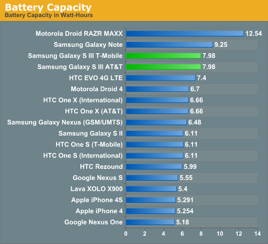
by Brian Klug on June 20, 2012 12:01 AM ESTBattery life is hugely important, and in the case of the SGS3 USA variants the question is just how long you can go with the combination of even beefier air interfaces like LTE and DC-HSPA+, an even larger 4.8" display, and dual core 28nm MSM8960. The SGS3 includes a very large 7.98 watt-hour battery with a higher 3.8V nominal chemistry (2100 mAh * 3.8 V = 7.98 watt hours).
I spent a big part of my limited time with the SGS3s battery life testing, and turned to our Smartphone 2011 suite of battery life tests which I’ve described in detail before. The web browsing tests consist of a few dozen pages which are loaded every 10 seconds with the display set at precisely 200 nits (using a meter) until the phone dies - this is done over WiFi and cellular data. The tethering test consists of a single client notebook attached to the device using its onboard WiFi hotspot function, and four tabs of our page load test alongside a 128 kbps streaming MP3 station are loaded on that notebook until the phone dies.
I was supplied the AT&T and T-Mobile SGS3s, which differ in air interface and band support. The T-Mobile version is on the carrier’s DC-HSPA+ network for testing, and the AT&T version supports both HSPA+ (single carrier) and LTE. Unfortunately AT&T LTE is not lit up in my Tucson, AZ market yet (which would make my life so much easier), so I could only run the 3G WCDMA result. 4G LTE results from that particular device will come shortly and I’ll update appropriately.
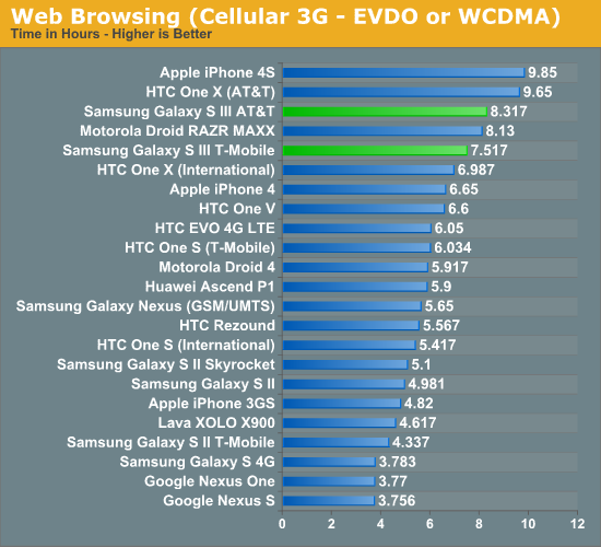
Immediately we can see that the combination of MSM8960 and Samsung’s big battery really pay off for the SGS3. Both the T-Mobile and AT&T versions (on DC-HSPA+ 42.2 and HSPA+ 14.4, respectively) post impressive numbers around 8 hours. This is with the display set at 200 nits in the browser, which is one tick short of all the way to maximum on the SGS3. Samsung has included a ton of battery saving display analysis features in the SGS3 browser, which were turned off for this test. Obviously if you turn those on (I would) you’ll be able to push battery life even further. It is shocking how close we come to the previously untouchable iPhone 4S.
As soon as I get the AT&T LTE numbers (I have to travel to an AT&T LTE market and carry out the test there) I’ll update with that graph here.
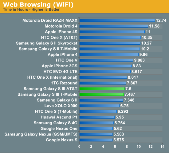
Next up is the WiFi battery life test, which posts numbers right around where the 3G cellular test was. You might be wondering why this is since the SGS3 includes an even lower power WiFi stack (BCM4334 even in the Krait-based USA variants). The result indicates to me that we’re almost entirely dominated by display power draw here. If we ran with a lower brightness, I expect you’d see WiFi longevity pull in front of cellular like you’d expect.
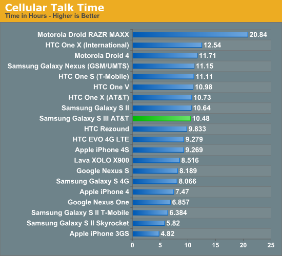
Cellular talk time is starting to get so long that it’s hard to test - I essentially lost an entire day of playing with the AT&T SGS3 to running a call time battery life test. This is a good problem to have, though I’m surprised it didn’t go just a bit longer and match or beat the One X AT&T result.
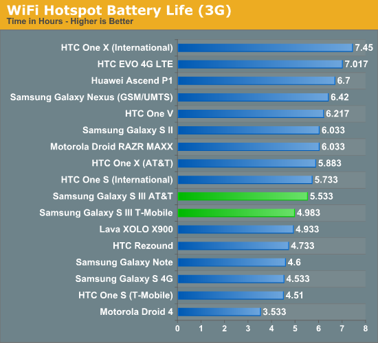
The 3G hotspot test really tells what things are like with the display turned off. Quite honestly I’m surprised the SGS3 doesn’t do much better here – it’s possible there’s room for further optimization of the WiFi hotspot mode on SGS3. Likewise, I’ll update with 4G LTE numbers for the AT&T model as soon as I’m in an area where it’s lit up and I can burn a few hours testing.
Overall, in my time with the SGS3 I would subjectively describe battery life as above average. With AMOLED, 200 nits is actually pretty bright, and you see Samsung and other OEMs clamping display brightness well below the physical limits to both save power and prevent burn-in.
Obviously the other interesting question is how the SGS3 fares on its battery saving mode with the CPU clock capped at 1.0 GHz. That’s also next in line for testing.


107 Comments
View All Comments
antef - Wednesday, June 20, 2012 - link
I don't believe "context menu" is the right term here. We're not discussing context menus - that would be something related to your *exact* context, such as long-pressing a row in a list and getting some options. What we're discussing is the app's "primary" menu that holds whatever could not fit on the main UI surface. In that sense, both the legacy menu and the action bar "overflow" are going to hold similar things, so what they contain is not really an item of debate. The main problem with the fixed Menu key, as Impulses said, is that it's "hidden" - since it's always present, there is really no indication that an app needs it or not, and it's also off-screen and thus doesn't feel cohesively tied to the rest of the app's UI. Action overflow, meanwhile, only appears when needed and right alongside other related functions.HTC switched to the new layout but unfortunately their use of physical buttons necessitates the nasty "full row menu button" for legacy apps. And I bet you that Samsung only stuck with the Menu key because they were too lazy to rethink parts of TouchWiz's UI - it clearly is a carryover from Gingerbread and they've shown before they don't put a lot of polish into their software. In that sense, this device is just stuck with that button because Samsung did not try to design a better user experience, not because they genuinely think this is the better way to go.
themossie - Thursday, June 21, 2012 - link
I understand what you mean, and "primary" menu is definitely a better term! However, the "action overflow" on-screen button which Google wants to replace the older "primary" menu (menu button) is not an improvement."Action Overflow" is not intended to be an actual settings menu. With "Action Overflow", Google basically says "Hey guys, you don't need 'settings' any more - just 'buttons you won't press that often." They then allow developers to put the action bar in 3 different places (http://developer.android.com/design/patterns/actio... so there's no longer consistent button placement.
The biggest problem with the menu button (for new users) was the lack of contextual cues. ICS ironically manages to fix this even as it deprecates the menu.
At this point, I'm way outside the scope of a phone review's comment sections, so I'll leave some food for though (discussion, not favoring a particular approach)
http://www.reddit.com/r/Android/comments/uda99/dea...
http://stackoverflow.com/questions/9286822/how-to-...
antef - Thursday, June 21, 2012 - link
Action Overflow is not intended to be an actual settings menu, but neither is legacy menu! it was never intended as a "settings" or "options" menu...literally just a menu to put anything you want. In this sense Action Overflow is exactly the same, only commonly used items don't have to be in the menu and instead can be directly on the action bar. It completely fixes the discoverability issue since the 3-dots are right there next to other icons you're already using. It leads you to it and it appears part of the app's UI.Thanks for the links. :)
synaesthetic - Wednesday, June 20, 2012 - link
Google was smoking crack when they got rid of the menu button. I installed a custom ROM onto my Nexus to make the menu button come back.I have never used a real serious app that didn't have a contextual menu. Never. And the "ICS friendly" apps that use the dotdotdot in-app menu like to put them in really obnoxious places... like the TOP OF THE SCREEN.
Holy carp Google, this phone is already huge, you want me to drop it trying to hit that menu key with my thumb?
The SGS3 having a menu button makes me want it EVEN MORE.
antef - Thursday, June 21, 2012 - link
I do have to tilt my Nexus forward a bit to reach up there with my thumb, but this is no different than having to reach up there for anything else, including the main action icons which are going to be up there no matter what.It is true that most apps used legacy menu, but still, nothing has to. That makes the very idea of an always present button silly. The nav bar should stick to system-wide navigation as it does on the Nexus and leave things pertaining to an app to be on the app's UI surface. The OP of the Stack Overflow link said it best:
"This [the overflow button] seems much more intuitive for users than throwing them into a separate menu list that requires the user to jump from a touch(screen) interaction to a button based interaction simply because the layout of the ActionBar can't fit them on the bar."
What he's saying is the on-screen controls and off-screen controls are different UI "sections" that shouldn't intermingle during the course of using an app. An app's controls should all be available within the app's UI. It's more cohesive and straightforward. In practice, it only ever really appears in the top right or bottom right, and most of the time the top right. It's not jumping all over from app to app like some people like to suggest.
8er - Friday, June 22, 2012 - link
Menu button is good.Physical home button, even better. It is huge selling point for me.
Side bar. I do not comprehend how anyone can say 'insert button name here' is bad. It looks like a search button and it searches or a menu buttons bring up menus, or a home buttons brings you home, and someone is confused?
If the above is true then that person is helpless. I will not apologize for sounding crass, but that person gets left behind. You are not left starving on an island kind of crass. If you do not understand what selecting an icon might do then a smart phone is too much for you.
robinthakur - Friday, June 22, 2012 - link
Yes, this totallyl! Coming from an iPhone, the long press to access multitasking is really slow and rubbish, I wasn't sure whether this is the same across all Android handsets. It doesn't help that on iOS, the commands are flipped and long press is Siri with double tap or four finger upwards swipe being multitask! The use of the Menu button seems haphazard as it isn't obvious which apps use it (or even which parts of the apps) and which ones don't.THX - Wednesday, June 20, 2012 - link
Folks on Head Fi are worried that the S4 chipset will strip out the Wolfson DAC. Any word what sound chip is inside the US Galaxy S3?Impulses - Wednesday, June 20, 2012 - link
Does the international version still have a Wolfson DAC? I know the SGS2 and many Tegra 2 devices did, haven't really kept up with that aspect of phones but I know a lot of people really liked that DAC because of the untapped potential in it (and the Voodoo app that it). Have they found anything particularly alarming about the One X's DAC or sound tho? (gimmicky Beats EQ aside) HF to ride their FOtM choices pretty hard and in the process anything else is deemed simply incomparable.Impulses - Wednesday, June 20, 2012 - link
that should've read "HF tends to ride"