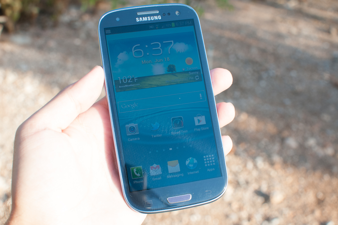
Samsung Galaxy S III Review - AT&T and T-Mobile USA Variants
by Brian Klug on June 20, 2012 12:01 AM ESTOne of the standout features on the SGS3 is the 4.8" HD SAMOLED display, which has an effective resolution of 1280x720. Like other Samsung devices, the name tells you almost everything you need to know: HD connotes 720p, S for Super means the stack is optically bonded with fewer air gaps (and thus fewer fresnel 4% back reflections), and the lack of Plus means it’s an RGBG PenTIle subpixel matrix.

First off, it’s clear to me that the SGS3 display is a substantial improvement on the Galaxy Nexus display, which was 4.65" diagonal and also 720p HD SAMOLED. The problems that I talked about in the Galaxy Nexus display are basically completely absent in the SGS3. There’s no longer any mura (luminance variance which looks like noise) or a weird purple cast in the greys, two things that are still present on the Galaxy Nexus. I suspect that moving to a larger display with the same resolution (and thus larger subpixels) might have helped mitigate some of the mura, and in addition this appears to be a completely new revision of the process with none of those problems.
Outdoor viewing angles are pretty darn good
I think it’s also worth discussing PenTile once more - specifically in the context of whether or not you can see the pixels. At this point, I don’t think we need to go over what it is in much detail, but that it uses two sets of two subpixel units to achieve higher effective resolution than an RGB stripe. There are two variants - RG, BW which I’ve seen in a few Motorola LCD displays (that are Samsung), and RG, BG, which is the more common variant that is in all the AMOLED panels without the “plus” suffix.
The implementations that I complained loudest about were really the Nexus One and Nexus S / Galaxy S, where AMOLED was still somewhat in its infancy, and RG, BG was both a way to increase subpixel lifetime before fading took place (according to Samsung), and achieve a higher logical resolution with fewer subpixels than an RGB stripe would require. For that reason, you can’t really just evaluate a display with some boolean is garbage / not garbage based on the presence of PenTile alone. In theory, if the logical two-pixel cell is itself smaller than human visual acuity, then you shouldn’t be able to see it, and seeing the pixels is what drove me crazy about those two phones.
I present the following graph, which has the angular subtense in arcminutes along the stripe (when a device is held portrait, this is the x direction) of one logical pixel. That is to say, two subpixels if we’re talking about an RGBG PenTIle display, or three for an RGB display. For reference, human visual acuity is most often cited as being around 1 arcminute for the human vision system corrected to 20/20, which isn’t perfect vision (20/15 or slightly better is). Anything below that should be indistinguishable at a distance of 12 inches (standard viewing distance).
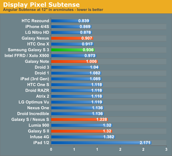
This is what I’m talking about when I say that in implementations such as the SGS3, even though PenTile is present, the logical pixel is still smaller than visual acuity, and the subpixels are half that. There’s still a case to be made for whether you can see fringing on black text on a white background to some extent, but personally I cannot see it.
So how is the display in other terms, such as brightness, color rendering, and viewing angles? For this I turned to the combination of my display colorimeter (still an i1D2), ColorHCFR, and Francois’s excellent Voodoo Screen Test Patterns.
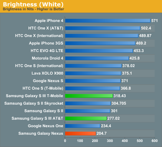
When it comes to brightness, I found that oddly enough the T-Mobile and AT&T devices differed by a measurable and repeatable margin. Possibly these are from completely different batches, possibly there is some optimization done for the display brightness dynamic range to conserve battery - I’m not sure. Either way, it’s there, but the SGS3 is thankfully brighter than the Galaxy Nexus, though it still seems to be clamped to a fairly conservative number.
I measured blacks a few times and tried to see if I could get a reading on whether the SGS3 also has a slight DC bias (not fully off), but still couldn’t get anything. If it’s there, I haven’t noticed it yet.


In the Color HCFR testing, we can see that gamma looks very weird and nonlinear across the greys, going from around 2.4 down to 1.2, I have no idea what’s going on here. Color temp is thankfully a bit more controlled, at just under 7000K, and relatively flat.
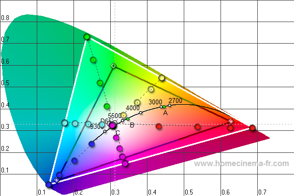
I measured both devices after seeing that there was variance, and uploaded the color.chc files for both the AT&T and T-Mobile model for people with HCFR installed to check out. I’ve also made two galleries for the respective panels. I’ve heard really good things about the International SGS3 from Francois (supercurio), but haven’t measured it yet. I guess these initial numbers make me suspect that like SGS2 the USA variants have differences in the display rendering. I will say that over a range of brightnesses the SGS3 seems to have much less of the color shift compared to other AMOLEDs I’ve seen in the past.


107 Comments
View All Comments
OCedHrt - Wednesday, June 20, 2012 - link
I wish we would get AWS on AT&T's S3 for WCDMA in addition to LTE.richworks - Wednesday, June 20, 2012 - link
Why isn't the International version of SGS3 not included in the benchmark tests? Am I to understand you haven't reviewed it yet?minhajmsd - Wednesday, June 20, 2012 - link
He did mention in the article that his unit hasn't arrived yet.richworks - Wednesday, June 20, 2012 - link
Ah.. thank you. I might have overlooked that part. I apologize for that :)antef - Wednesday, June 20, 2012 - link
Brian, you mention that by Samsung including a menu button that they don't have to include the full-row on-screen menu button that HTC does, but what you didn't mention is how this is still not ideal because it breaks Google's design goals for ICS completely. Google very plainly stated that the Menu key with its hidden functionalities (and sometimes no functionality) was not good design and encourages all developers to move away from it. Yet Samsung decides to include it on a new device built for ICS (probably because TouchWiz is carried over from Gingerbread).This means a few things. First, some app devs might not move to ICS design standards because they think they don't have to with new devices still coming out with Menu keys. Second, even if an app does use the new standards/action bar, the 3-dot overflow button will be HIDDEN because a Menu button is present. This is confusing and hides functionality that should be grouped with the other actions at the top. Finally, it necessitates a long-press of Home for task switching, which is slow and cumbersome compared to a dedicated button.
All around a bad decision on Samsung's part. The full-row menu key necessary for legacy apps on the One X is not ideal either, which is why on-screen buttons like on the Galaxy Nexus are the way to go.
Impulses - Wednesday, June 20, 2012 - link
I agree with you (and Google) on the menu button overall, it needs to go... I was never particularly bothered by it but it was a pretty sloppy design crutch and it confused new users of the platform... I agree that Samsung's implementation now only makes it worse by encouraging devs to continue using it and by messing with the way current ICS UI layouts are presented.I'm not sure I necessarily agree on screen buttons are better tho... IF you can make the device smaller by using them I'd say you have a case, but the Galaxy Nexus is no smaller than the One X so the latter ends up with more screen real estate the majority of the time (only sacrificing space to menu for legacy apps, which seems to be your main argument for on screen buttons).
I really hope Moto doesn't follow Samsung's lead, cause I believe LG has, and this is worse than the old game of musical chairs that manufacturers played with the four classic buttons. I think we've already had some leaks that showed them going with on screen buttons tho, fortunately.
It's gonna definitely gonna take longer than Google would like to deprecate menu...
hat being said, I've always liked Samsung's side power buttons (much easier to reach) so much do that I mod my HTC phones to wake on volume press... And I also kinda dig the physical home button (even tho it's ugly and another point of failure) because it makes it much easier to wake the phone while it's laying flat.
Most of that is subjective tho, Google moving away from menu is not... Not only was it a design crutch, multi tasking feels so much quicker without long press. I know realistically it's not that much slower to long press home, but subjectively it feels slow. I think Duartesaid in an interview that was one of the reasons they were moving away from long presses and towards the use of more swipes etc.
antef - Wednesday, June 20, 2012 - link
I definitely agree with you about Menu being a design crutch and long-pressing Home feeling slow. People might think Menu is no big deal, but they have to consider the broader audience. Why do people think an iPhone is so much easier to use for most people - because everything is right there and easy to explain. Try explaining Menu and long-press to a new user: "You press this button to show more actions - sometimes it will show things, sometimes it won't, you just have to press it and see. And there's no indication of whether an app uses it or not, you just have to remember it's there. And then you press and hold this to switch apps...no, you didn't press it long enough, try again." versus "Press this button to switch apps. Here at the top of the screen are icons for things you can do. If you there are more things you can do you can access them by pressing the 3-dot button right next to it." It's a night and day difference, and like you said this will stall Google's efforts to deprecate it, now a whole new generation of Android users will get accustomed to a Menu key on the SGS III.You are correct that the Galaxy Nexus loses some screen real estate with the on-screen buttons, but I don't see that being much of an issue when you have a 1280x720 resolution screen. The thing is, with 3 physical buttons, you are going to have one of these problems either way, and the on-screen button eliminates that. In addition I think the on-screen buttons are just preferable anyway. They are bold, easy to see, give you feedback when you press them, and appear coherently part of the UI. It looks like a complete package. Versus the off-screen, backlight-lit keys, which appear "separate" from the UI and are typically smaller. I never realized this from pictures, but after actually using a Galaxy Nexus, I much prefer the look and feel of the on-screen buttons.
Definitely also like the side power button, it's practically necessary for large devices like these.
themossie - Wednesday, June 20, 2012 - link
Yes, it does ignore Google's design goals. It also makes most applications far more usable. Why are contextual menus bad? (I understand the inconsistency problem where the menu button on ICS will not pop up on screen depending on the phone, but still...)Seems like many phone manufacturers agree with me here.
Since I'm complaining anyway... :-)
Does anyone else find ICS task switching far less useful than 2.x's "Recent Apps"? With "Recent Apps", I never had to scroll to find the app I wanted - and never had to worry about closing applications to keep the Task Switcher bar reasonably short.
(For reference, I have a Gingerbread phone and a ICS tablet)
Impulses - Wednesday, June 20, 2012 - link
Contextual menus aren't bad per se, forcing people to guess when they exist at all is. Very few applications are better off with a hidden menu than ICS' action bar + overflow menu plainly visible on screen. Many manufacturers = 2 out 5 or so major Android OEMs? Sony, HTC, and Motor have conformed to the new button scheme.Not sure why you're complaining about scrolling on ICS, are you using a 7" tablet? On my 10" the recent app menu shows 9 apps in portrait and 5 in landscape. Previous versions of Android showed either 6 or 8 icons depending on manufafturer, and had no preview of the app.
You couldn't kick apps out of the recent apps pop up either... ICS multi tasking seems like an improvement in every possible way except maybe landscape use or smaller lower res phones, and even then tap + swipe + tap is no slower than long press + tap.
themossie - Wednesday, June 20, 2012 - link
Re: Contextual menus - I do agree that it's bad to force people to guess when they exist. (That wasn't a problem before ICS, when you could safely assume a program has one!) I don't find the ICS icon to be a useful contextual clue to new users - 3 dots does not a menu suggest.Now, for scrolling: (forgive the rant)
That said, from memory:
* CM9 on HP Touchpad (1024x768) - shows 1 app in landscape.
* ICS on Galaxy Nexus - shows only 3 apps in portrait. (images.google "task switcher galaxy nexus")
* ICS on HTC Evo 4G - shows only 1 app in landscape. This may be a Sense issue, experienced other landscape issues.
You have to scroll to do anything!
Compare this with Gingerbread on my Droid 2 (the not-Motoblur), where "Recent Apps" shows 18 apps. With 18 apps in Recent Apps, I no longer need the homescreen to load applications.
I'd still find the stock "Recent Apps" (I believe it's 8 in Froyo, 10 in Gingerbread?) more usable than ICS.