Samsung Galaxy S III Review - AT&T and T-Mobile USA Variants
by Brian Klug on June 20, 2012 12:01 AM ESTThe SGS3s all ship running Android 4.0.4 (IMM76D), which is just a few builds short of the current latest version of Android. Atop that is the latest version of Samsung’s controversial TouchWiz theme. Like almost all skins, that means a different lock screen, tweaked notifications shade, main launcher, and settings pane.
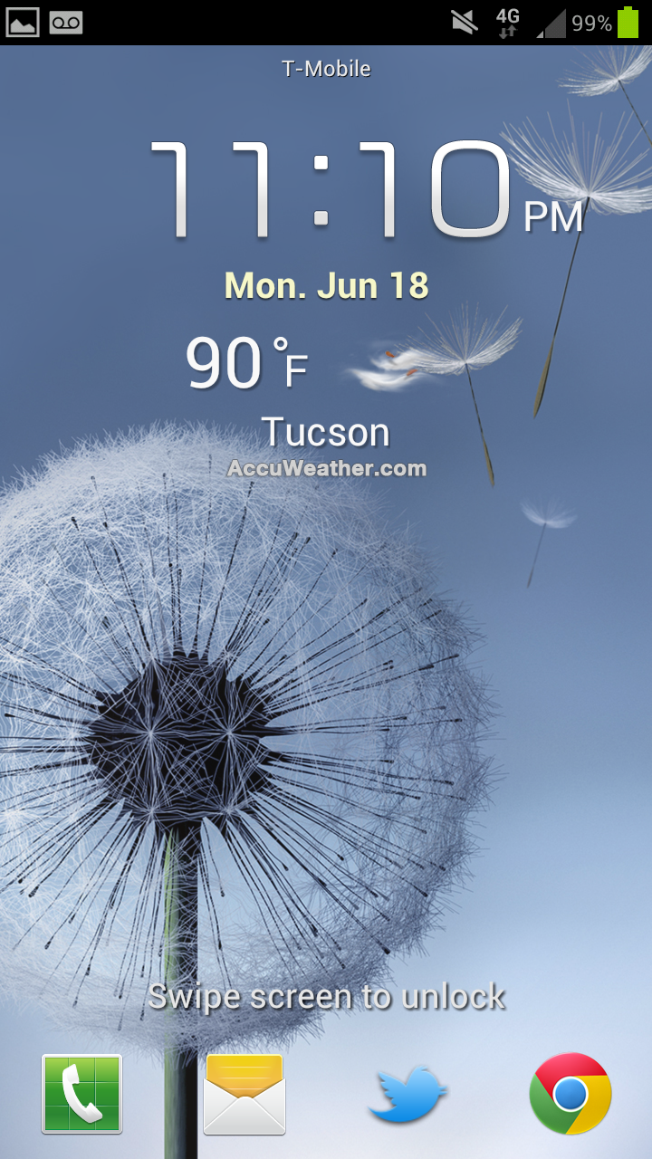
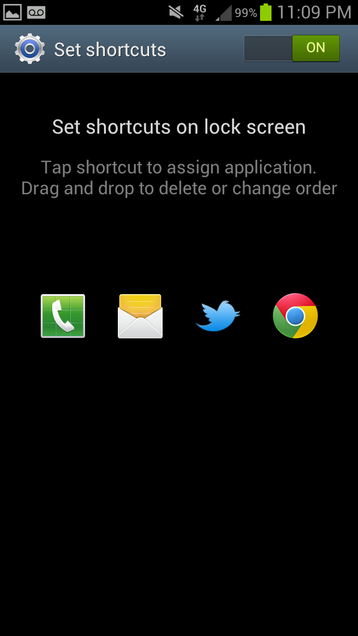
On the lock screen, there are application shortcuts which can be customized, along with a few other options. Weather, stock tickers, and an optional gestural camera shortcut are all TouchWiz enhancements. Like SGS2, missed calls or SMSes can also be directly addressed by swiping on their respective icons.
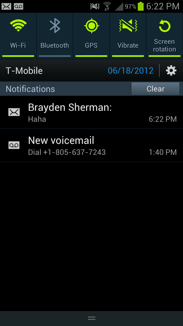

In the notifications shade, Samsung has added more power toggles. The bar slides right or left to expose those additional toggles. There’s also the date now printed alongside carrier, just left of the shortcut into the settings app which is standard in ICS. Speaking of the top status bar, TouchWiz also adds an optional battery percentage report - it blows my mind that this has been something you’ve needed to use a custom ROM to get for so long.
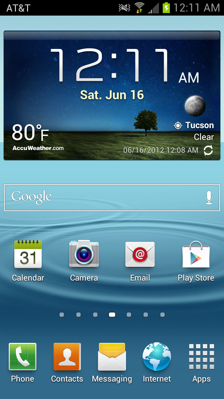
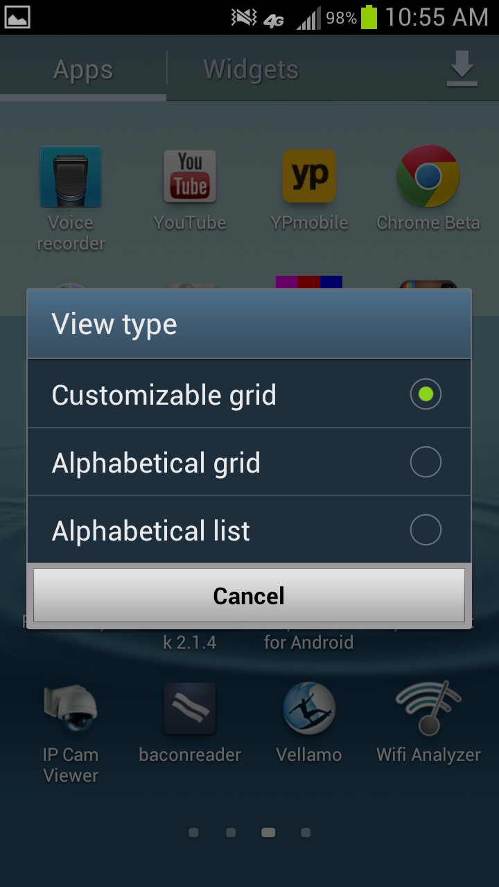
Samsung’s TouchWiz home screen goes with a 3D box left/right transition rather than the ICS stock planar swipe. For the most part however, the flow isn’t really changed from ICS. Widgets are added from a separate tab in the applications launcher, and Samsung hasn’t overwhelmed with way too many custom ones. The launcher is likewise a horizontally paginated application grid just like ICS. This can be sorted alphabetically or in a customized arrangement where newly downloaded apps get placed at the end of the list.
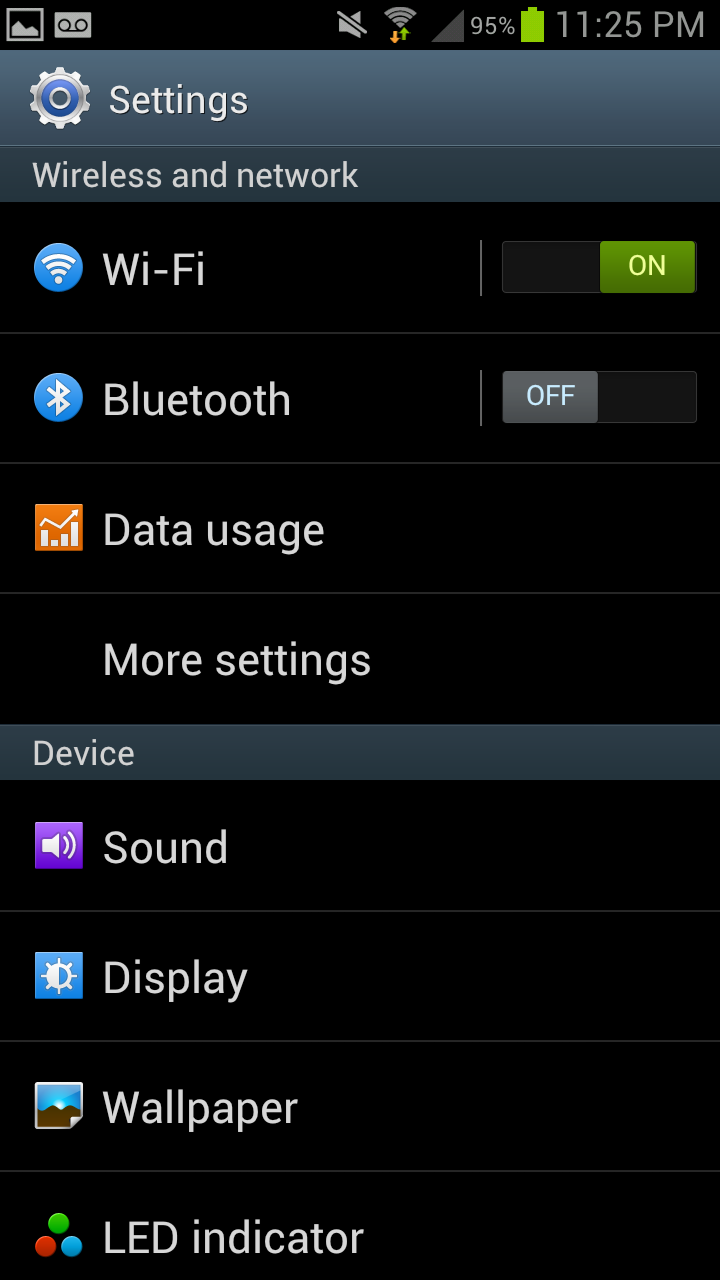
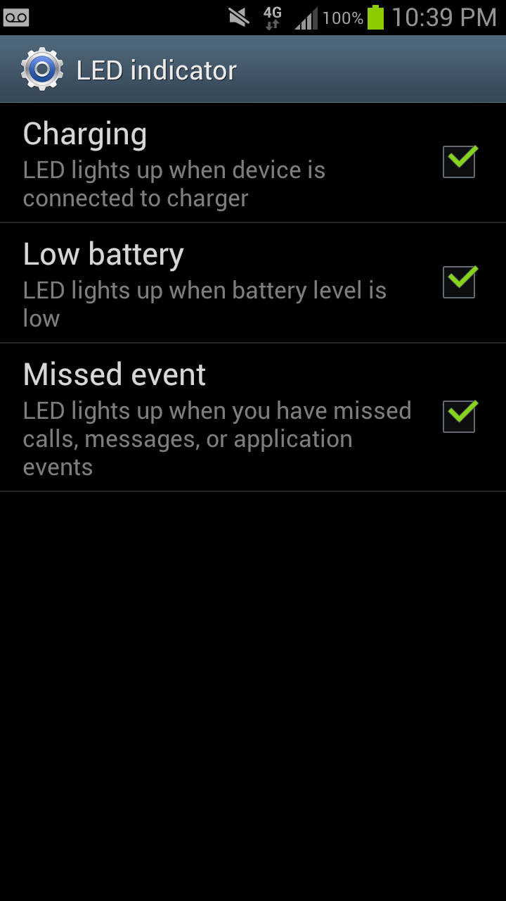
Settings gets a few new options that I think are worth going over. First is the obvious visual change which includes colorful icons that seem a bit corny but aren’t surprising. First is an option to customize the notification LED, but is pretty basic and probably will be supplanted with Lightflow for power users. Under Display is the option to enable “smart stay” which uses the front facing camera and keeps the display on when you’re looking at it, beyond the timeout length. I found that this does indeed work well, as long as there’s sufficient illumination for the front facing camera to see your face.
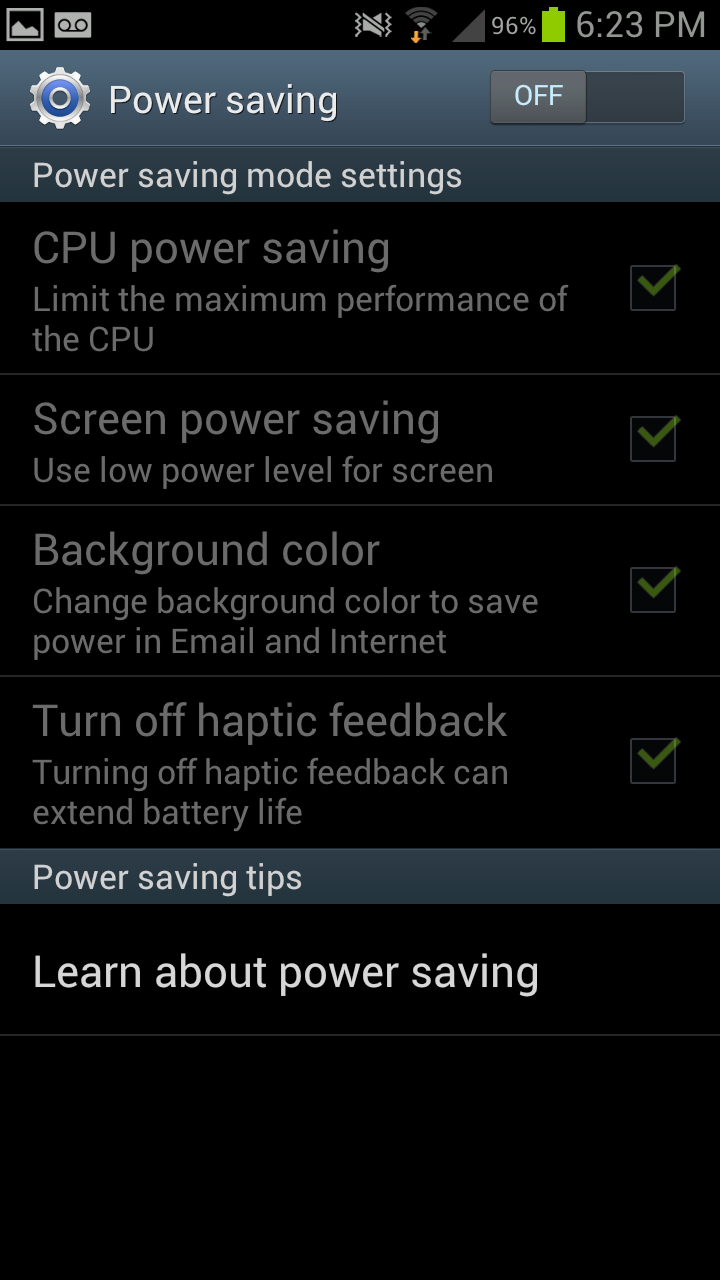
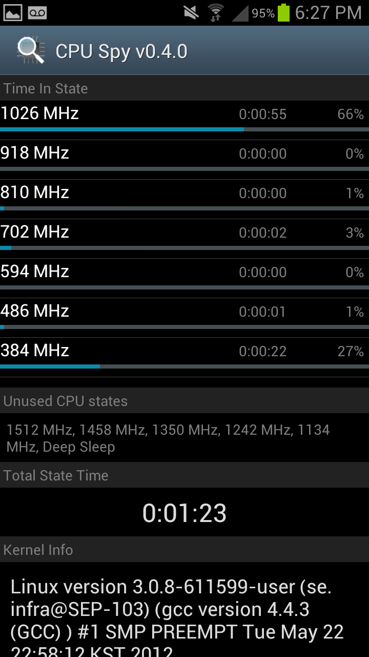
Right - CPU Spy with Power Save "CPU Power Saving" ticked
The next is more interesting - Power Saving. Under here is an option which enables you to change the SoC governor. Tick “CPU power saving” and the maximum MSM8960 CPU clock gets changed to 1.0 GHz instead of 1.5 GHz, giving you a nice savings if you’re willing to sacrifice some performance in turn for running with lower active power draw. I believe GPU clock also gets clamped as well, but can’t pull those directly. Outside of rooting and messing with the governor yourself, and a governor option pane on some ASUS products, this is the first time I’ve seen direct user access to CPU frequency since PocketPC days.
Also present are motion gestures, a lot of which I’ve seen before but never really fully utilized. Under security is that options pane I was talking about earlier for customizing the shortcuts on the lock screen, and enabling that camera launch gesture. Samsung also goes with its own browser customizations for Android 4.0.4’s stock browser, but it doesn’t deviate too much beyond just UI changes from what I can tell. Just like previous Samsung devices, I find the browser super smooth - gone are the days where browsing using the stock browser was a shuddery mess, though I still prefer Chrome Beta.
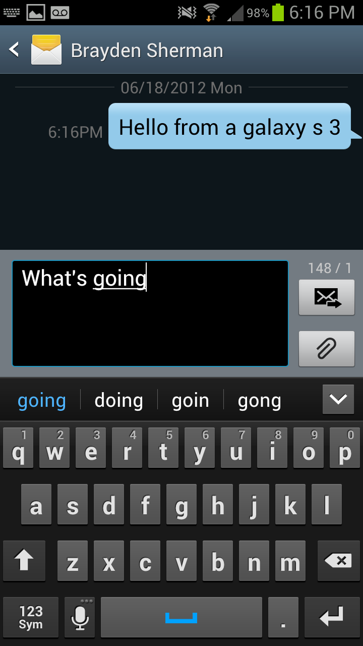
Messaging also looks very similar to how I recall it looking on the SGS2. Dialer also gets a change up and still includes a smart dial functionality.
Other than software preloads, which will differ between each carrier device, is Dropbox. Both Verizon and AT&T have opted out of the 50 GB for 2 years promotion, however the other carriers continue to enable this. I was told that the carriers who have opted out have done so because they view Dropbox as a competitor to services they’re backing or selling. I’m now up to 131.2 GB on my personal Dropbox account between free quests, the One series promotion, and SGS3 promotion.
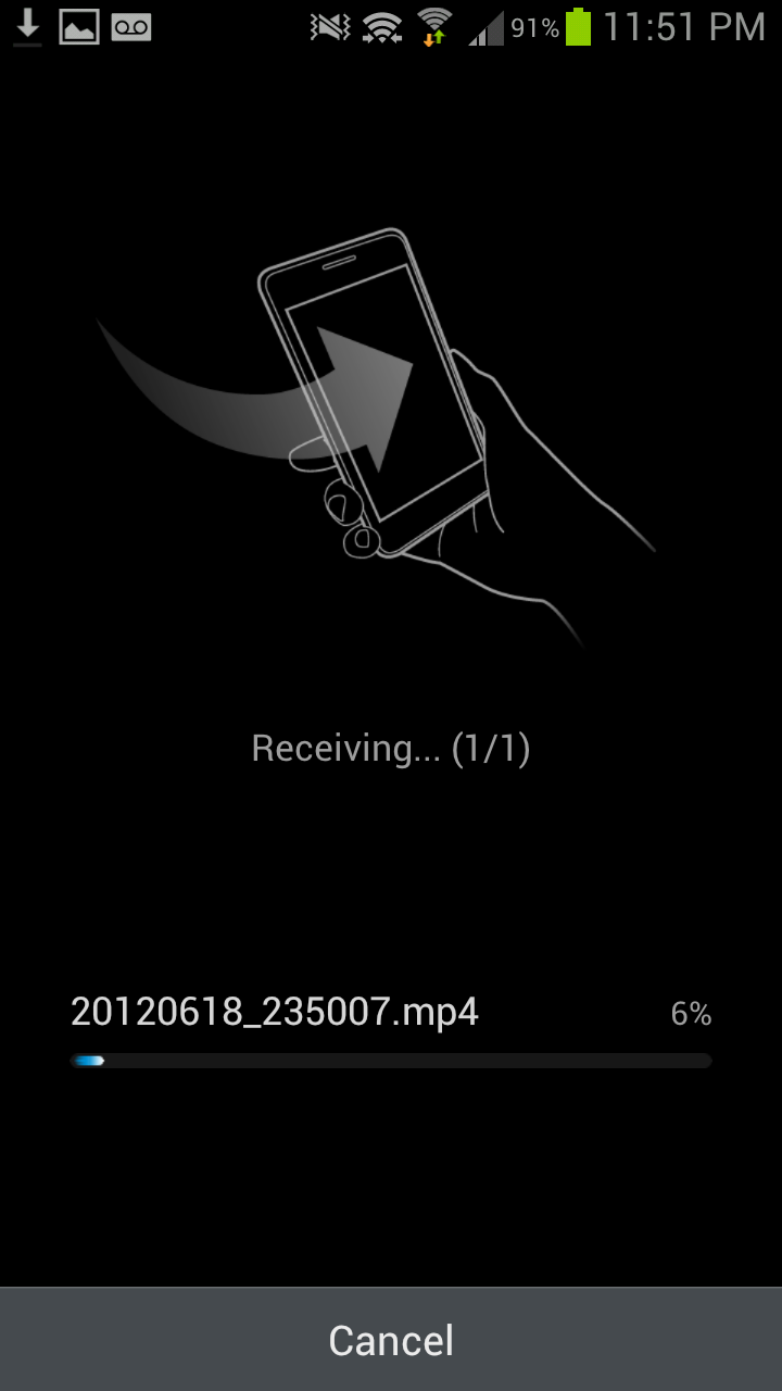
The last part are two S - features. S Beam, and S Voice. S Beam is essentially a WiFi Direct augmented version of Android Beam to enable sharing more content than just what can be sent over NFC’s limited bandwidth. The gist of it is that you can send photos or files (even large video files) using S Beam over the WiFi direct link which gets setup using NFC. For example, from gallery, one can open a video, then put two phones together, tap and hold on the prompt, and NFC takes care of both setting up the WiFi direct connection and file transfer. In practice it works surprisingly well, even for large video files. I played around and saw a rate around 40 Mbps for transfers, which is pretty close to Samsung’s cited “1 GB in 3 minutes” (45 Mbps) speed.

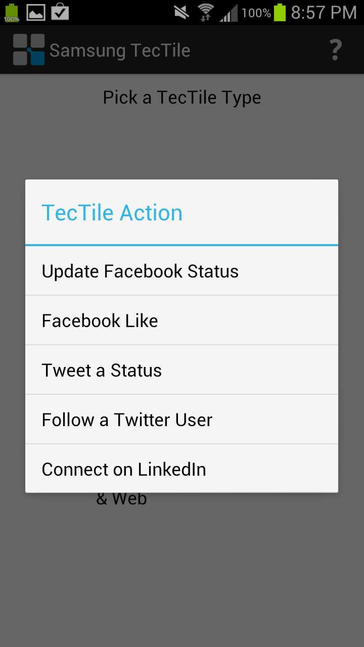
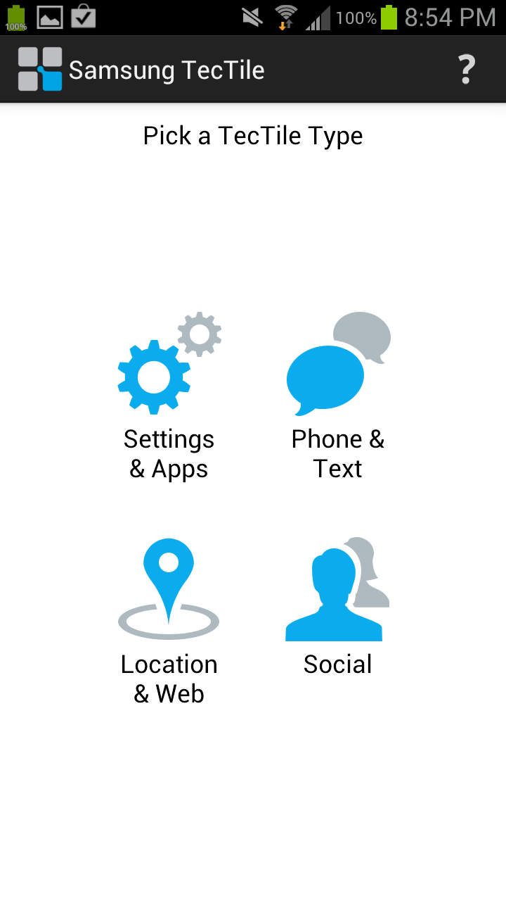
Part of S Beam is the TecTiles initiative, which is a combination of the TecTiles programmer application, and Samsung branded programmable 1KB MIFARE tags available in a set of 5 from carrier stores and online. Even though there are other NFC tags available for cheaper, and similar applications on the market, getting this in a prepackaged format into customers hands will go a long way to driving NFC adoption, which until now has been glacially slow. I programmed both my contact data and my WiFi network (hooray, no longer will I type my 20+ character PSK into new phones, at least those with NFC) into tags.
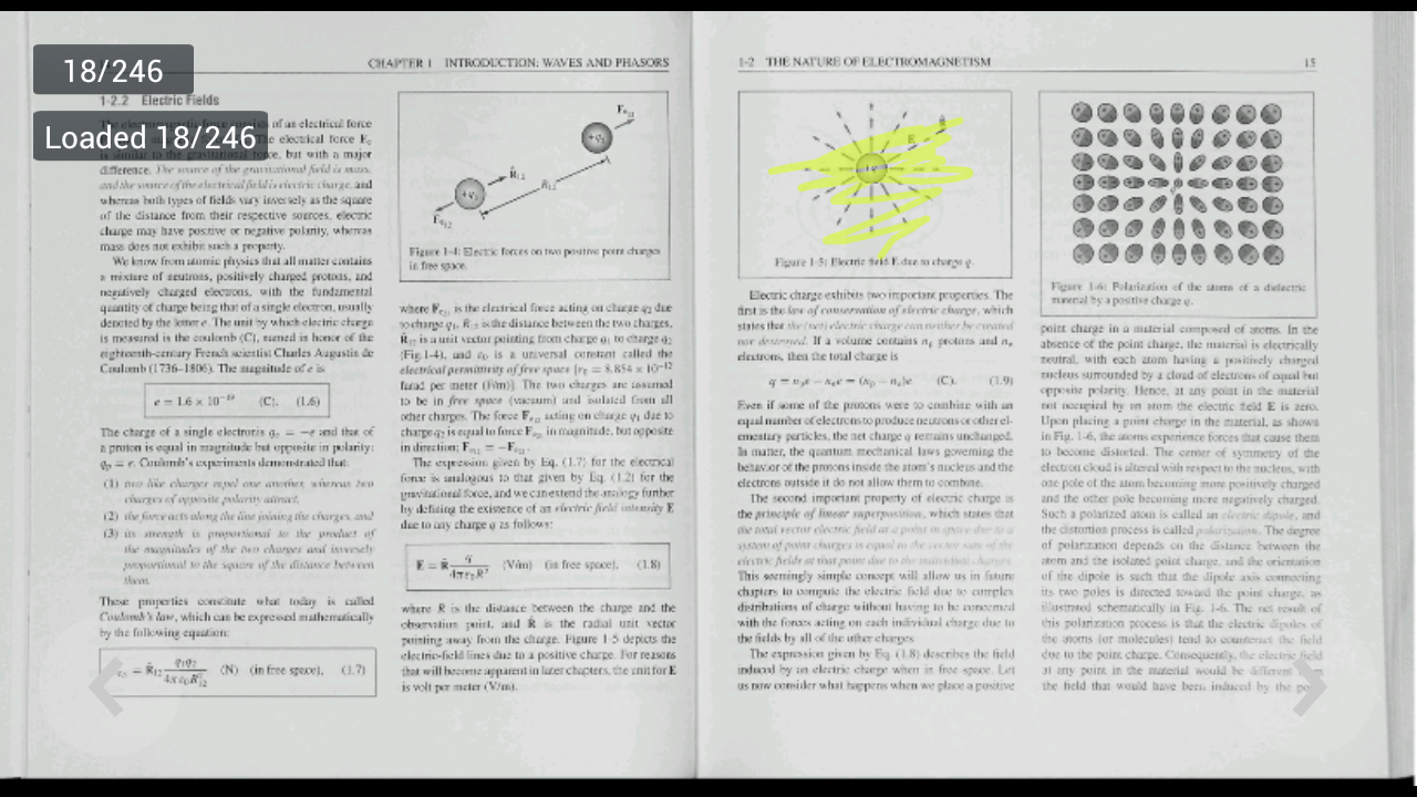
There’s also AllShare Play, which allows you to broadcast either a document, files, or photos to up to 6 devices on the same WiFi network. Trying out sharing features was partially why Samsung sampled two SGS3s, so I gave AllShare a shot with my 100+ MB electromagnetics textbook PDF scan from my ECE381 days. Sure enough, it was possible to jointly browse slides and annotate on the two SGS3s - each member of the AllShare session gets their own colored pen for annotating. I could see this being useful if you managed to round up a number of friends with SGS3s. I wish that the resolution was higher, but if I had paginated this book to be single pages instead of spreads it likely would be sufficient to read the body copy and equations.
Last but not least is S Voice. There’s no putting this lightly - S Voice is definitely a Samsung approximation of Apple’s Siri. The promise is a similar level of conversational interaction with S Voice going off and fetching data from appropriate pre-programmed sources and reporting back. A double tap on the home button fires up S Voice, and a familiar tappable microphone interface guides you through voice prompts.
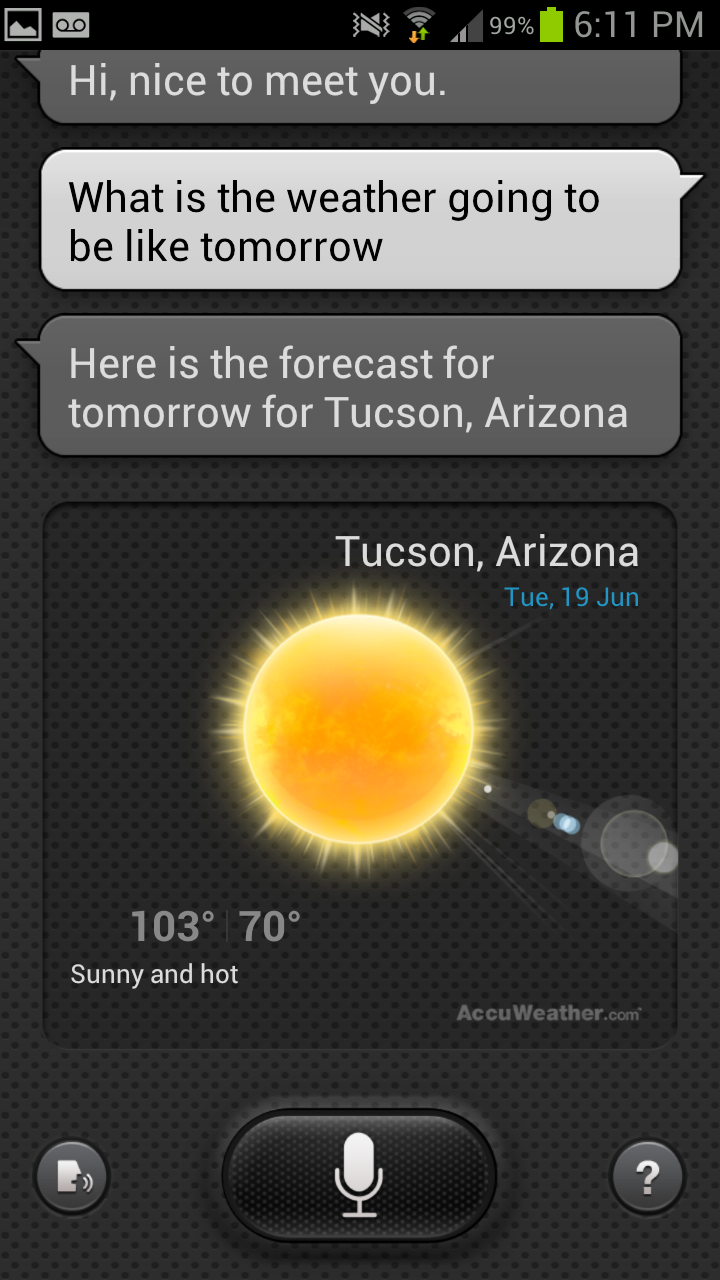
You can do a similar list of things with S Voice as you can with Siri, including asking for the weather, calling people, adding tasks, and setting alarms. A few S Voice features that were previously above and beyond Siri (such as launching apps) are now part of iOS 6, but in theory the level of functionality is pretty close. I’m actually fairly surprised about how much the functionality matches, and wonder if this is the new thing that Apple will attack aggressively with litigation. In practice, I found S Voice a lot less conversational than Siri. I still think voice navigation is kind of a trendy feature that ultimately is slower than just using my hands, unless you’re driving and can’t use the phone.


107 Comments
View All Comments
OCedHrt - Wednesday, June 20, 2012 - link
I wish we would get AWS on AT&T's S3 for WCDMA in addition to LTE.richworks - Wednesday, June 20, 2012 - link
Why isn't the International version of SGS3 not included in the benchmark tests? Am I to understand you haven't reviewed it yet?minhajmsd - Wednesday, June 20, 2012 - link
He did mention in the article that his unit hasn't arrived yet.richworks - Wednesday, June 20, 2012 - link
Ah.. thank you. I might have overlooked that part. I apologize for that :)antef - Wednesday, June 20, 2012 - link
Brian, you mention that by Samsung including a menu button that they don't have to include the full-row on-screen menu button that HTC does, but what you didn't mention is how this is still not ideal because it breaks Google's design goals for ICS completely. Google very plainly stated that the Menu key with its hidden functionalities (and sometimes no functionality) was not good design and encourages all developers to move away from it. Yet Samsung decides to include it on a new device built for ICS (probably because TouchWiz is carried over from Gingerbread).This means a few things. First, some app devs might not move to ICS design standards because they think they don't have to with new devices still coming out with Menu keys. Second, even if an app does use the new standards/action bar, the 3-dot overflow button will be HIDDEN because a Menu button is present. This is confusing and hides functionality that should be grouped with the other actions at the top. Finally, it necessitates a long-press of Home for task switching, which is slow and cumbersome compared to a dedicated button.
All around a bad decision on Samsung's part. The full-row menu key necessary for legacy apps on the One X is not ideal either, which is why on-screen buttons like on the Galaxy Nexus are the way to go.
Impulses - Wednesday, June 20, 2012 - link
I agree with you (and Google) on the menu button overall, it needs to go... I was never particularly bothered by it but it was a pretty sloppy design crutch and it confused new users of the platform... I agree that Samsung's implementation now only makes it worse by encouraging devs to continue using it and by messing with the way current ICS UI layouts are presented.I'm not sure I necessarily agree on screen buttons are better tho... IF you can make the device smaller by using them I'd say you have a case, but the Galaxy Nexus is no smaller than the One X so the latter ends up with more screen real estate the majority of the time (only sacrificing space to menu for legacy apps, which seems to be your main argument for on screen buttons).
I really hope Moto doesn't follow Samsung's lead, cause I believe LG has, and this is worse than the old game of musical chairs that manufacturers played with the four classic buttons. I think we've already had some leaks that showed them going with on screen buttons tho, fortunately.
It's gonna definitely gonna take longer than Google would like to deprecate menu...
hat being said, I've always liked Samsung's side power buttons (much easier to reach) so much do that I mod my HTC phones to wake on volume press... And I also kinda dig the physical home button (even tho it's ugly and another point of failure) because it makes it much easier to wake the phone while it's laying flat.
Most of that is subjective tho, Google moving away from menu is not... Not only was it a design crutch, multi tasking feels so much quicker without long press. I know realistically it's not that much slower to long press home, but subjectively it feels slow. I think Duartesaid in an interview that was one of the reasons they were moving away from long presses and towards the use of more swipes etc.
antef - Wednesday, June 20, 2012 - link
I definitely agree with you about Menu being a design crutch and long-pressing Home feeling slow. People might think Menu is no big deal, but they have to consider the broader audience. Why do people think an iPhone is so much easier to use for most people - because everything is right there and easy to explain. Try explaining Menu and long-press to a new user: "You press this button to show more actions - sometimes it will show things, sometimes it won't, you just have to press it and see. And there's no indication of whether an app uses it or not, you just have to remember it's there. And then you press and hold this to switch apps...no, you didn't press it long enough, try again." versus "Press this button to switch apps. Here at the top of the screen are icons for things you can do. If you there are more things you can do you can access them by pressing the 3-dot button right next to it." It's a night and day difference, and like you said this will stall Google's efforts to deprecate it, now a whole new generation of Android users will get accustomed to a Menu key on the SGS III.You are correct that the Galaxy Nexus loses some screen real estate with the on-screen buttons, but I don't see that being much of an issue when you have a 1280x720 resolution screen. The thing is, with 3 physical buttons, you are going to have one of these problems either way, and the on-screen button eliminates that. In addition I think the on-screen buttons are just preferable anyway. They are bold, easy to see, give you feedback when you press them, and appear coherently part of the UI. It looks like a complete package. Versus the off-screen, backlight-lit keys, which appear "separate" from the UI and are typically smaller. I never realized this from pictures, but after actually using a Galaxy Nexus, I much prefer the look and feel of the on-screen buttons.
Definitely also like the side power button, it's practically necessary for large devices like these.
themossie - Wednesday, June 20, 2012 - link
Yes, it does ignore Google's design goals. It also makes most applications far more usable. Why are contextual menus bad? (I understand the inconsistency problem where the menu button on ICS will not pop up on screen depending on the phone, but still...)Seems like many phone manufacturers agree with me here.
Since I'm complaining anyway... :-)
Does anyone else find ICS task switching far less useful than 2.x's "Recent Apps"? With "Recent Apps", I never had to scroll to find the app I wanted - and never had to worry about closing applications to keep the Task Switcher bar reasonably short.
(For reference, I have a Gingerbread phone and a ICS tablet)
Impulses - Wednesday, June 20, 2012 - link
Contextual menus aren't bad per se, forcing people to guess when they exist at all is. Very few applications are better off with a hidden menu than ICS' action bar + overflow menu plainly visible on screen. Many manufacturers = 2 out 5 or so major Android OEMs? Sony, HTC, and Motor have conformed to the new button scheme.Not sure why you're complaining about scrolling on ICS, are you using a 7" tablet? On my 10" the recent app menu shows 9 apps in portrait and 5 in landscape. Previous versions of Android showed either 6 or 8 icons depending on manufafturer, and had no preview of the app.
You couldn't kick apps out of the recent apps pop up either... ICS multi tasking seems like an improvement in every possible way except maybe landscape use or smaller lower res phones, and even then tap + swipe + tap is no slower than long press + tap.
themossie - Wednesday, June 20, 2012 - link
Re: Contextual menus - I do agree that it's bad to force people to guess when they exist. (That wasn't a problem before ICS, when you could safely assume a program has one!) I don't find the ICS icon to be a useful contextual clue to new users - 3 dots does not a menu suggest.Now, for scrolling: (forgive the rant)
That said, from memory:
* CM9 on HP Touchpad (1024x768) - shows 1 app in landscape.
* ICS on Galaxy Nexus - shows only 3 apps in portrait. (images.google "task switcher galaxy nexus")
* ICS on HTC Evo 4G - shows only 1 app in landscape. This may be a Sense issue, experienced other landscape issues.
You have to scroll to do anything!
Compare this with Gingerbread on my Droid 2 (the not-Motoblur), where "Recent Apps" shows 18 apps. With 18 apps in Recent Apps, I no longer need the homescreen to load applications.
I'd still find the stock "Recent Apps" (I believe it's 8 in Froyo, 10 in Gingerbread?) more usable than ICS.