The HTC One X for AT&T Review
by Brian Klug on May 1, 2012 6:00 PM EST- Posted in
- Smartphones
- Snapdragon
- HTC
- Qualcomm
- MSM8960
- Krait
- Mobile
- Tegra 3
- HTC One
- NVIDIA
The next major thing to talk about it HTC’s Sense 4. First off, all of the HTC Ones run Android 4.0.3 as of this writing, which was the first ICS build pushed to the android open source project. It isn’t 4.0.4, but that’s forgivable considering the timeframe involved. Anyhow, Sense is one of those things that traditionally has been a major point of contention for power users. The problem for an OEM crafting a theme or skin is to strike a balance between the native appearance and feel of the underlying base OS, and whatever unique customizations they’re adding.
For probably the first time, I can honestly say I think HTC has has nailed that balance with Sense 4. The platform still feels and looks ICSey, and I think that’s what made previous iterations of Sense somewhat awkward - you couldn’t adequately grasp the theme or feeling of the underlying OS. HTC has changed things like overscrolling behavior throughout the OS, as elements now spread apart like an accordion. Toggle switches and buttons also get a new theme, but it isn’t an altogether huge departure from ICS, and (as required) Holo is still lurking underneath for applications that leverage it.
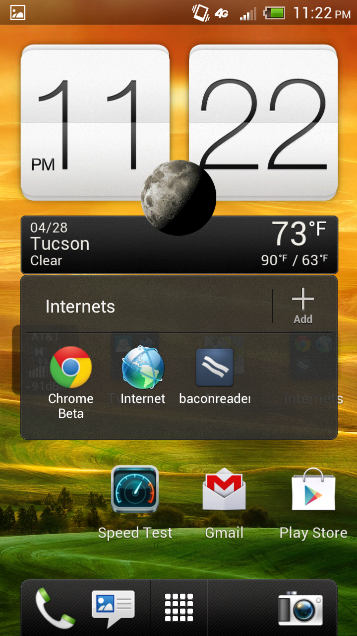
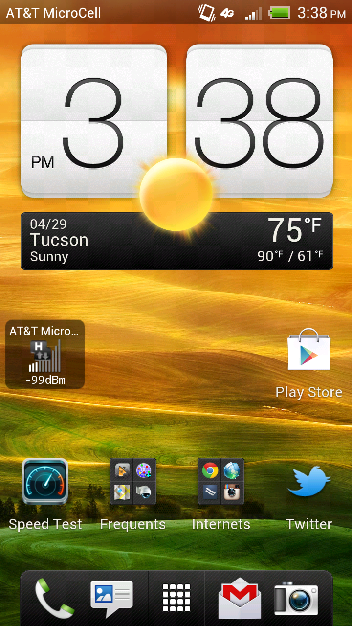
Like previous iterations, Sense 4 includes a number of lock screen customizations, including the ability to launch applications or SMSes by dragging their shortcuts into the ring. Unlike the previous version, you don’t get the ability to change the lock screen shortcuts directly, instead they’re inherited from the bottom dock-like row of applications on the launcher. The launcher now includes ICS features like folders on the homescreen for organizing shortcuts, and a new widget, app, and shortcut management view.
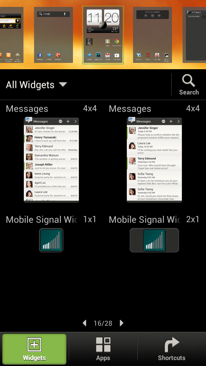
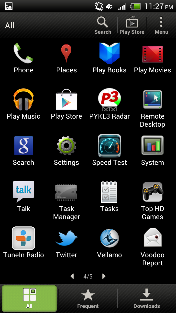
The main launcher gives you a paginated 5x4 grid of application tiles. HTC has done similar things in the past with the bottom three tabs - all, frequent (sorted by number of launches), and new downloaded applications. There’s not much to say here other than it’s interesting how most stock launchers have returned to paginated structure instead of just a big scrollable list view. Both the launcher and main homescreens are very very smooth, thanks to the combination of ICS’s OpenGL ES 2.0 2D acceleration and MSM8960.
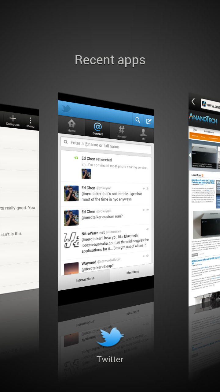
The other main Sense customizations include both messaging, keyboard, and the task switcher. HTC has opted to change the task switcher entirely; instead of ICS’s transparent column of recently launched applications, the HTC Sense 4 launcher is a row of full screen previews. Applications can be closed by swiping them up (hello WebOS cards…) or switched between by tapping on them.
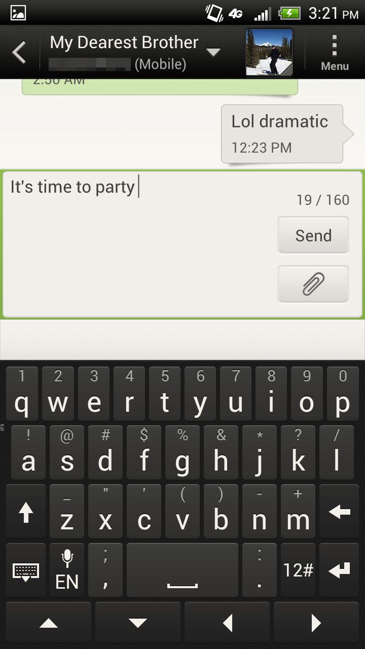
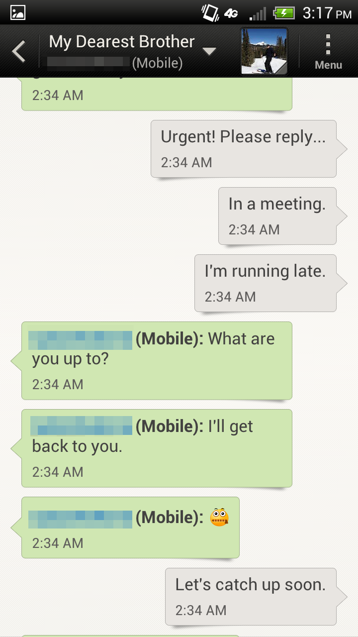
Messaging has changed subtly since the previous version of Sense, and feels snappier. One of my complaints with Android in general has been how messaging seems to always slow down after a few weeks worth of SMSes accumulate, and so far I haven’t run into that wall. I still do think the compose box is too big and covers too much of the conversation, and the default font seems gigantic, but thankfully one can change that. The Sense 4 keyboard also feels improved, and I can type at full speed without issue. That said, I’ll never understand why OEMs continue to remove the stock keyboard entirely.
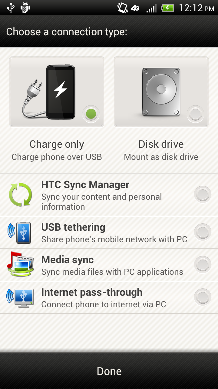
Another major design decision HTC has made is to go with the traditional USB disk drive mount option instead of MTP. I think we’ll see OEMs also go this route as the MTP connector on some platforms still leaves a lot to be desired. Sense 4 also leaves the notification shade virtually untouched - there aren’t any quick power settings or tabs, just the settings pane shortcut like stock ICS. All in all I feel like this is the new Sense 4 design language - minimalist and simple, not the self-justifying customization of every last window and view just for the sake of doing so.
Storage on the AT&T One X is 16 GB of integrated NAND. Like basically all Android phones, this is divided between an /sdcard mount point, and /data. Note that this architecture is basically required if you’re going to implement USB mass storage instead of using MTP.
shell@android:/ $ dfFilesystem Size Used Free Blksize/dev 335M 136K 335M 4096/system 1007M 895M 112M 4096/data 2G 696M 1G 4096/cache 251M 4M 247M 4096/devlog 19M 16M 3M 4096/mnt/asec 335M 0K 335M 4096/mnt/obb 335M 0K 335M 4096/firmware_radio 199M 33M 166M 4096/firmware_q6 199M 5M 193M 4096/firmware_wcnss 4M 1M 3M 2048/data/secure/data 335M 0K 335M 4096/data/DxDrm/fuse: Permission denied/mnt/sdcard 9G 1G 8G 32768
So you get 9 GB of storage for media and photos, and 2 GB for applications, which is pretty much the normal storage split I see. Like we discussed in our initial ICS piece, you can either get unified storage with MTP, or the less cumbersome mass storage mount method.
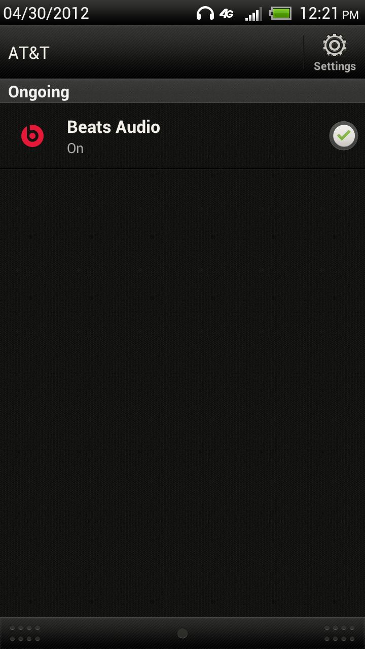
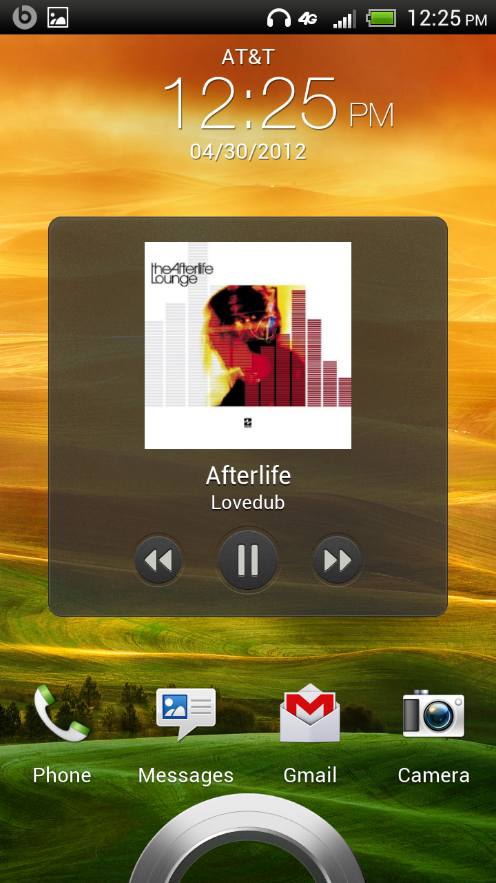
The last note is Beats Audio. HTC includes the Beats branding almost everywhere - it’s on the box, on the back of the device, on the boot splash images, and inside the OS. There’s no longer any Beats earbuds in the box, but a corresponding change in the way Beats works. The new change is that Beats now works for any headphones that you attach, instead of just Beats branded ones like previously. At some point I’m going to investigate Beats Audio integration in newer HTC devices more thoroughly, for now just know that new HTC devices give you the Beats DSP on any attached headphones. I will note that it sounds to me just like the Beats audio from the HP TouchPad, which is to say boosted bass and some dynamic range compression. I honestly prefer it off, but overall sound quality with it off is subjectively good - no background hiss or whine audible.
The rest of Sense is hardware related and involves another important consolidation - camera, which we’ll get into in the respective section.


137 Comments
View All Comments
Tryad - Tuesday, May 1, 2012 - link
The Sprint version has a larger battery and some other hardware changes, I was wondering if Anand is planning on reviewing it so we can see how much the battery changes add and other stuff like Bloatware compares to this one.Impulses - Wednesday, May 2, 2012 - link
Slightly larger battery, kickstand, camera button, microSD slot, and a completely different casing made mostly out of aluminum (and some glossy plastic). Aesthetics aside, I don't see how it can be anything but an improvement, unless the CDMA stack gets bungled and it somehow wrecks battery life.Sprint has been pretty good about bloatware lately too, they were one of the first carriers to let you uninstall/hide some of their bloat even before ICS allowed it (most of my EVO 3D's built in apps could be removed/hidden, not all tho).
Their network is another story but since there's no VZW in Puerto Rico and AT&T treated me like crap I'll stick with Sprint for now, the EVO LTE helped their cause a bit too.
NeoteriX - Wednesday, May 2, 2012 - link
It wouldn't be the first time a Sprint CDMA version of a phone suffered worse battery life than the GSM version...Impulses - Tuesday, May 1, 2012 - link
Thanks so much for putting out this review this quickly, I know carriers often have a hand in what phones you get to review etc (this one in particular being pre release) but AT reviews continue to be a cut above anything else on the web.I seriously don't understand how you can be the only site out there that has a standardized method for battery life testing... Even beyond that tho, AT's reviews are simply the most informative, detailed, and less subjective phone reviews out there, bar none.
Impulses - Tuesday, May 1, 2012 - link
Oh and I'm looking forward to the One S and international variant reviews... I'm not even getting any of these phones but I still appreciate the work a lot. Any clue if you'll eventually get an EVO 4G LTE in for review? :pantef - Wednesday, May 2, 2012 - link
How did you remove the "AT&T" in the upper-left corner of the display in the status bar? Engadget had it displaying there in all of their pics. I would like to be able to remove that as well if I bought this since I don't need a reminder that I'm on AT&T's network.Impulses - Wednesday, May 2, 2012 - link
It's kinda curious AT&T is the only carrier doing that, and rather annoying since it's wasted notification space. Kinda redundant too considering they also silk screen it on the phone itself and it's also displayed within the notification pane and/or the lock screen (what everybody else does).1ceTr0n - Wednesday, May 2, 2012 - link
Simple, its marketing, like it or not. Likely will need to root phone and load different ROM to get rid of itantef - Wednesday, May 2, 2012 - link
I see it in some of the author's pics and not others. What's the deal?Impulses - Wednesday, May 2, 2012 - link
Apparently AT&T tag disappears when you actually have notifications, so at least they did that right.