The new iPad: Retina Display Analysis
by Anand Lal Shimpi on March 19, 2012 5:49 PM ESTQuantifying Display Performance: Big Gamut Gains
Pixel density may have improved, but what about the rest of the display characteristics? We'll start with the usual suspects - brightness, black levels and contrast ratio:
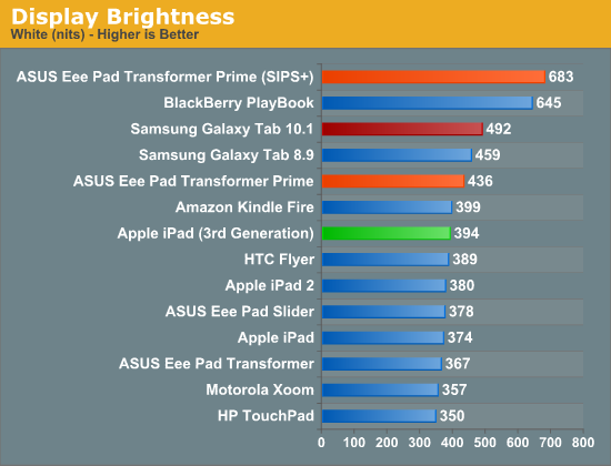
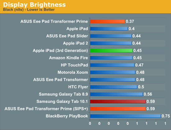
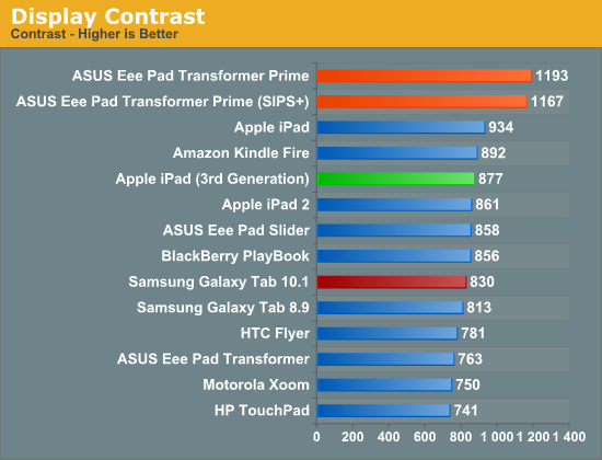
Despite a tremendous increase in pixel count and density, the new iPad delivers roughly the same brightness and contrast ratio as its predecessor. White point remains unchanged as well at ~6700K.
At the introduction of the new iPad, Apple briefly mentioned a 44% increase in color saturation from the new panel. Although the old display definitely looked good, the new one does actually look better. My eyes aren't normally the best judge of gamut, but we have some tools to help quantify exactly what I was seeing:
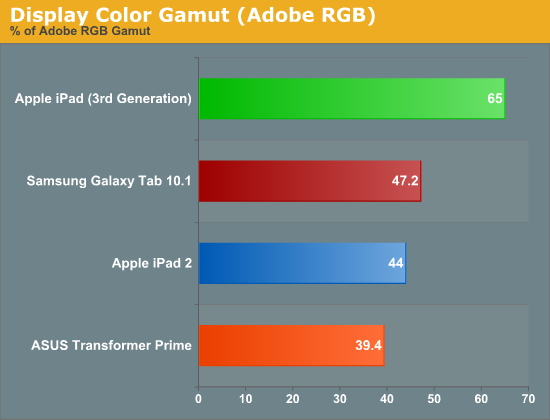
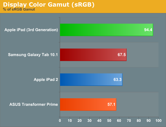
Color gamut has definitely improved. While the iPad 2 and TF Prime both were able to represent ~40% of the Adobe RGB color gamut, the new iPad jumps by nearly 50% to representing 65% of the Adobe RGB gamut. More impressive are the gains you see if you look at the color gamut of the new panel compared to the sRGB space:
Here the panel is able to deliver nearly full coverage of the sRGB color gamut. Below is the CIE diagram for the new panel with an sRGB reference plotted on the same chart so you can visualize the data another way (the white triangle is the new iPad, the gray outer triangle is the sRGB reference):
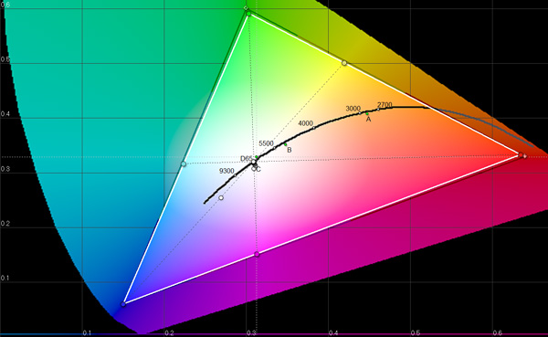
Near perfect coverage. The new iPad's display is a huge step forward in both pixel density and being able to represent a wider color gamut. While it's still no where near the quality of high-end PC displays, this is real progress for tablets. The bar has been raised.


172 Comments
View All Comments
Original Idea - Wednesday, March 21, 2012 - link
Can you share the formula used to calculate the PPI used in your graph. It seems that while the raw PPI is off by ~25% if using H*W/Size.Thanks for sharing.
valnar - Wednesday, March 21, 2012 - link
Thank you Apple for keeping the aspect ratio at 4:3. It makes it usable in both directions.