The new iPad: Retina Display Analysis
by Anand Lal Shimpi on March 19, 2012 5:49 PM ESTWe're hard at work on our review on the new iPad but with a fair bit of display analysis under our belts I thought a quick post might be in order. One of the major features of the new iPad is its 2048 x 1536 Retina Display. Apple kept the dimensions of the display the same as the previous two iPad models, but doubled the horizontal and vertical resolution resulting in a 4x increase in pixels. As display size remained unchanged, pixel density went through the roof:
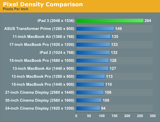
Although the iPad 2 has a fairly high pixel density compared to most of Apple's Mac/display lineup, you're more likely to hold a tablet closer to your eyes which made the low resolution/pixel density problematic. The new iPad addresses this issue as you can see from the chart above. I can't focus closely enough to the panel to actually make out pixels on the new iPad, much less at a normal viewing distance. With the aid of a macro lens we can definitely identify individual pixels. The improvement over the iPad 2 display is striking:

To the left we have the original 1024 x 768 panel, and to the right we have the new Retina Display. At this distance you can still identify individual pixels, an ability that quickly vanishes at normal viewing distances. The Music app icon is an even better example of what you gain from the newer display as it has more high contrast edges that appear more aliased on the 1024 x 768 panel:

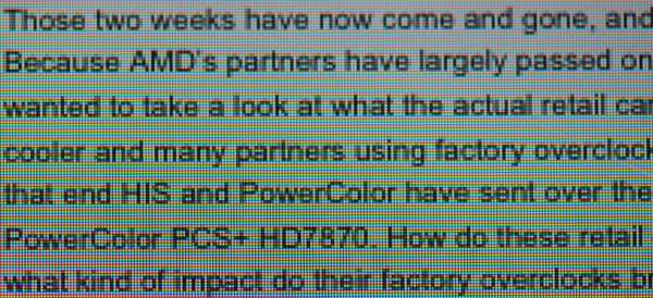
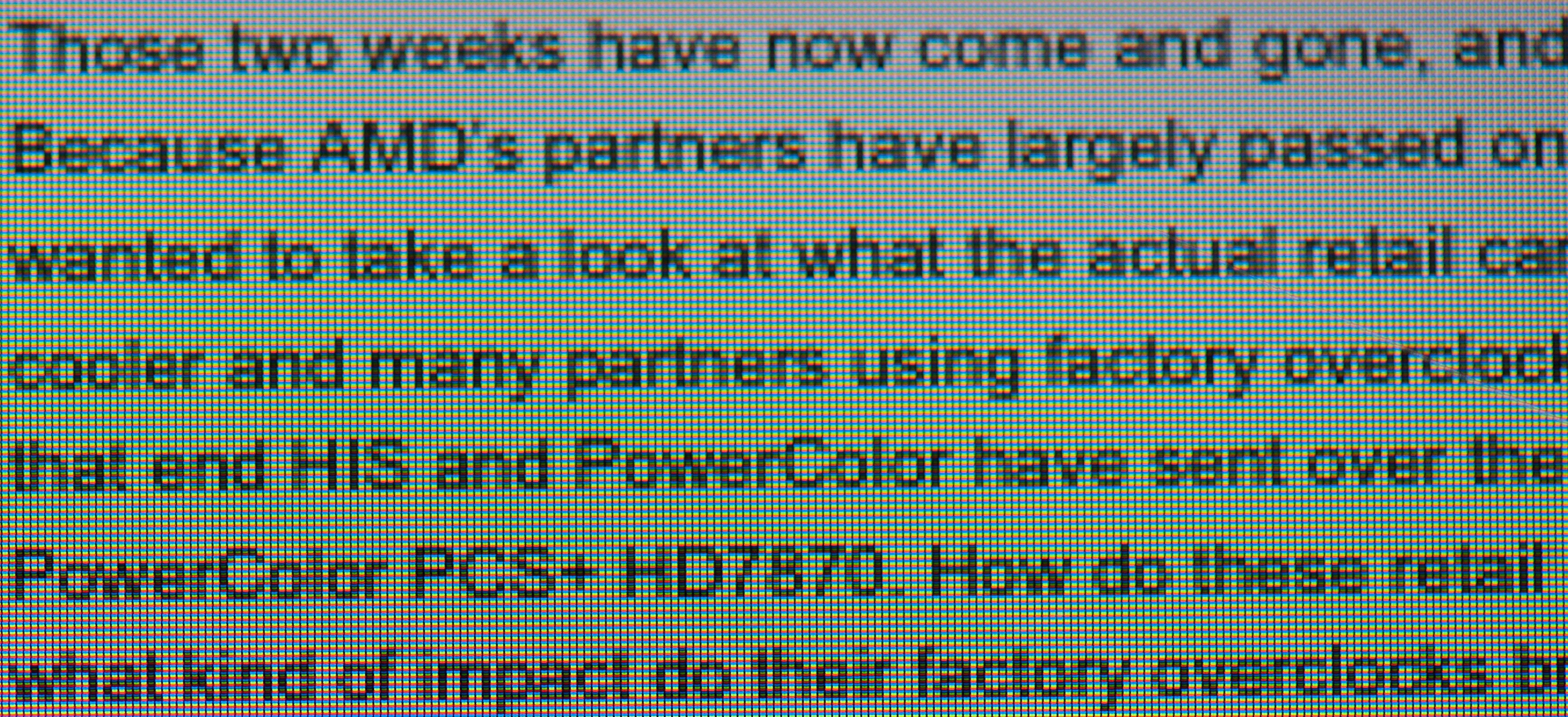
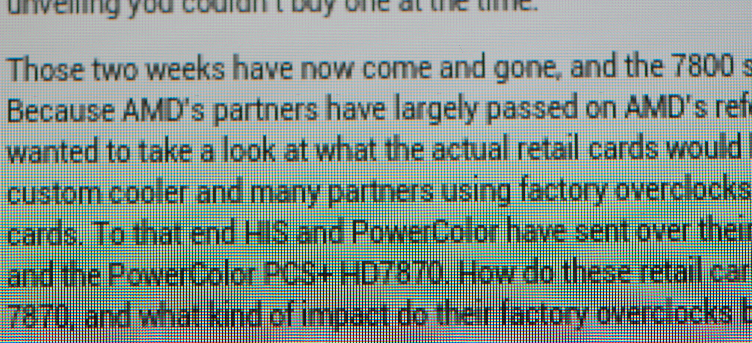
The old iPad's 1024 x 768 resolution was fairly bothersome when it came to reading text on web pages or books. Most Android tablets standardizing on 1280 x 800 offered an advantage in that respect, albeit not delivering significantly higher pixel density. The new iPad completely resolves this issue. Hover over the links below to see roughly the same paragraph of text from our retail Radeon HD 7870 review on the iPad 2, new iPad and ASUS Transformer Prime:
| Apple iPad 2 | Apple iPad (3rd gen) | ASUS TF Prime |
| original | original | original |
While it's still obvious that you're looking at a screen and not an e-ink display, the pixels perform a good disappearing act on the new iPad.


172 Comments
View All Comments
AnnihilatorX - Tuesday, March 20, 2012 - link
You shouldn't really say that. The jump from 40% to 65% is 20%, not 50%
Don't mix percentile with relative ratios.
doobydoo - Tuesday, March 20, 2012 - link
When you start out at 40%, of anything, if you see a 20% improvement compared to that 40% starting point, you end up at 48%.Using percentages is correct, you just have to know what is a percentage of what, which admittedly should have been made clearer.
It would have been more incorrect to say the iPad had improved by 20% when that would imply it hasn't made as much of an improvement as it has.
doobydoo - Tuesday, March 20, 2012 - link
(To be clear, a percentage is a relative ratio. % = / 100 )Origin32 - Tuesday, March 20, 2012 - link
I hate it when people don't distinguish between percents and percent points. /petpeeve3rd alinea 3rd page I'm glad you asked
guidryp - Tuesday, March 20, 2012 - link
"While it's still no where near the quality of high-end PC displays"In what way? I have an NEC 2490 high end PC display (> $1000).
In most ways the new ipad display equals or betters it.
I hope Anand hasn't fallen into the trap thinking that Wider gamut = better.
There really is only one gamut standard in wide use and that is sRGB. Any deviation falling short(as old iPad did), or going beyond sRGB will produce less accurate color in most situations.
This display is as close to sRGB as I have seen in any monitor. Since that is actually the proper target to aim for (not simply wider = better), they have done an exemplary job.
medi01 - Tuesday, March 20, 2012 - link
On other tablets, Samsung's Galaxy in particular? (only 3 were shown in chart)medi01 - Tuesday, March 20, 2012 - link
I guess I know why it isn't shown:Gamut of Adobe RGB 1998
iPad 2 - 49.9%
iPad 3 - 66%
Galaxy Tab 10.1 - 62.8%
Transformer Prime (SuperIPS Off) - 40.2%
So older Galaxy Tab has much better color gamut than iPad2 and is very close to iPad3.
http://www.tomshardware.com/reviews/ipad-3-benchma...
midori - Tuesday, March 20, 2012 - link
@anand:I think we all saw enough of photos from microscopes and magnifying glass.
I don't really see a reason in posting comparison photos that are so "close" and zoomed in.
That just isn't real world scenario. We all get get that the screen has 4X pixel count but post comparison photos from normal usage distance. That way I can really see if I can benefit from all those extra pixels or not.
Graag - Tuesday, March 20, 2012 - link
The problem with normal size comparison photos is that they will generally be viewed on monitors with less than the iPad's resolution. Making it difficult to really tell the difference. Sort of how it would be hard to evaluate color TVs by looking at them on a B&W TV.uhuznaa - Tuesday, March 20, 2012 - link
One thing that would be really useful would be full-size screenshots of an iPad 2 and an iPad 3 displaying the same book-sized PDF.Especially PDFs are terrible on the older iPad. I mean, there're lots of really good apps for working with them, but the need to constantly zoom around is just maddening. The new display should really help here a lot.