ViewSonic V3D231 3D Display - The Passive Approach
by Chris Heinonen on December 30, 2011 12:00 AM ESTThe V3D231 is a conventional TN display, which means the viewing angles are not fantastic. In day to day use they didn’t bother me, but as soon as you start to move off axis too much you get very large contrast and color shifts. This might be why they only provided the single set of 3D glasses, as when I was testing I found I needed to be in the exact right spot or my viewing experience would vary dramatically.


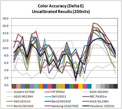
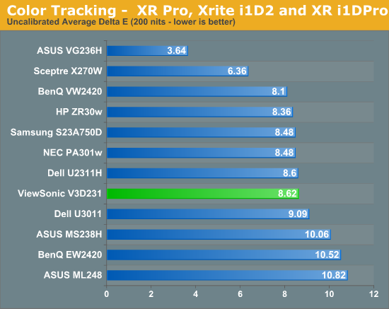
Uncalibrated, the V3D231 performs no better or worse than most displays I have seen. The best thing about its results is that it offers a much more linear grayscale than most non-professional displays, with the peak dE error being around 12 instead of the 14-16 that I commonly see. This is still very poor performance, but in comparison to many consumer displays it is slightly better. I did my testing uncalibrated in the sRGB mode, which was the most accurate but also will not let you adjust the brightness or contrast when selected. Since the sRGB standard has a target of 120 nits and not the 200 nits we usually use, this will look darker than what you might like. If you don’t have access to any calibration equipment and want the most accurate picture out of the box, it is the mode that I would choose.
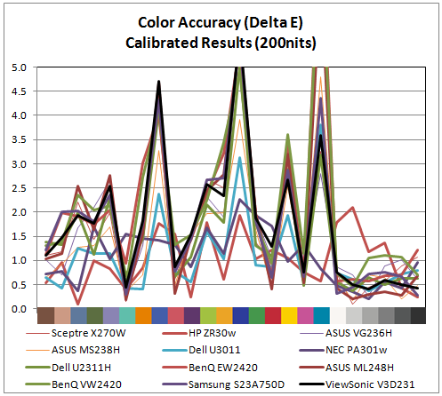
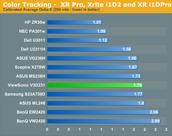
Using ColorEyes Pro and an i1Display2 colorimeter, I then calibrated the ViewSonic to our target values: 200 nits of light output, a D65 white point, 2.2 gamma, and minimum black level. This resulted in an average dE less than 2 with a fairly linear grayscale. The ViewSonic did not do well with shades of blue, and the error there was some of the highest from all of the displays we have reviewed. Here again we have decent performance, but nothing outstanding.
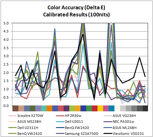
To test how the ViewSonic would perform for print work, I once again used ColorEyes and the i1Display2, only this time I chose a target of 100 nits instead of 200 nits, which is closer to the level of light output you would get reflected off the printed page. Once again we have an average dE of under 2.0, but if you look at the chart you will see that the grayscale is far worse than any other display we have tested recently. Apparently the V3D231 has issues with calibration down to 100 nits, perhaps caused by the use of the patterned retarder on the screen for 3D. Regardless of what causes this issue, the ViewSonic is not a monitor I would consider using for print work as any other monitor we have reviewed does a much better job with grayscale quality.


42 Comments
View All Comments
MobiusStrip - Monday, January 9, 2012 - link
"as most monitors will be used with web pages, word processors, and spreadsheets, there are a lot of white backgrounds that will accentuate it."Yep, because of the continued use of failed inverse-video color schemes from the "desktop publishing" fad, during which vendors wanted to draw an analogy between the screen and a sheet of paper. That analogy fails because a sheet of paper doesn't EMIT light, the way a screen going full-blast in your face does.
At least with most OSes you can set up a color scheme that makes sense, with a dark background and light text. Mac users are SOL, since the vaunted Mac UI still doesn't have user-definable color schemes (which Windows has had for 20 years).
RPsen - Sunday, January 28, 2018 - link
I love premium sound of ViewSonic V3D231, because it has SRS for high quality sound.Admin: http://projectoreviews.com