Amazon Kindle Fire Review
by Anand Lal Shimpi & Vivek Gowri on November 29, 2011 3:31 AM EST- Posted in
- Tablets
- Mobile
- Amazon
- Kindle Fire
- Kindle
The Operating System
There are three reasons why the Kindle Fire is one of the most important tablet releases of the year: software, services, and shopping. The hardware, while nice, plays a definite secondary role here. The user experience, with tight-knit integration with Amazon's full suite of digital media services (Kindle, Appstore for Android, MP3 Cloud Player, and Prime Instant Video), is what makes the Kindle Fire the most formidable threat.
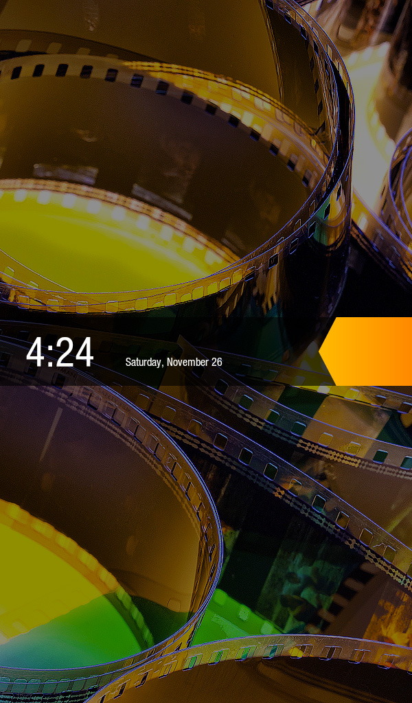
Amazon and Lab 126 have taken the same route as Barnes and Noble here and built the Kindle Fire operating system on top of Android 2.3. This is basically a skinned version of Gingerbread just as you'd find on an HTC Flyer or the old Galaxy Tab 7", but instead of augmenting the stock Android experience, the goal here is to hide it entirely. When you press the (stupidly located) lock button, you're treated to a simple lock screen, featuring a high resolution image of Amazon's choosing and an orange lock slider with the day, date, and time. Note that you cannot change the lockscreen image without rooting the device.
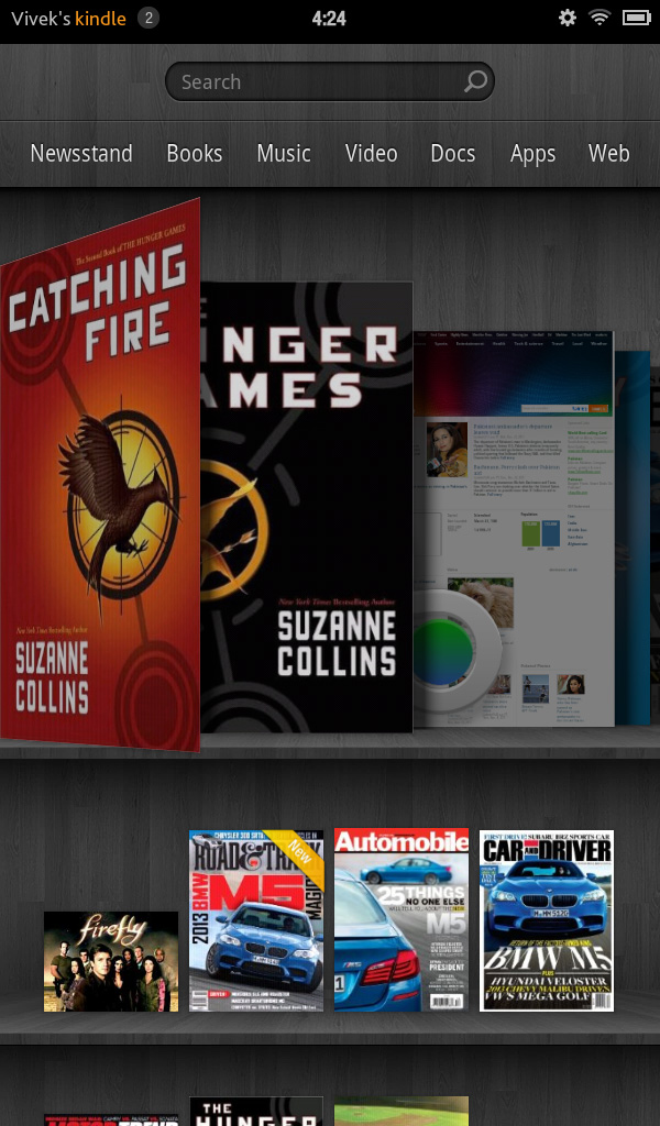
Slide the bar over to get to the homescreen, and you find yourself looking at a virtual bookshelf of apps. The top shelf is called the Carousel. It's a rotating, Cover Flow-style list of recently used files and applications that you can swipe through. It's nice, in that you can switch between your recent windows, but there's too many app windows that are stored. This leads to two problems: there can be some choppiness in the animation if you try to scroll through the entire list quickly, and overall it's a bit visually chaotic and disorganized. It's good, but it'd be better if they shortened the list to just the last 8-10 items. The shelves underneath are made up of items you deem "favorites". You can pin almost any content to the mainscreen - applications, magazines, newspapers, books, albums, playlists, videos, documents, websites; just hold down the icon/cover to add to favorites, then it'll show up on your homescreen. 4 icons per shelf, and the size of your bookshelf grows downwards as you add more content to it. However, as you add more content, scrolling through the bookshelf tends to get a bit choppy.
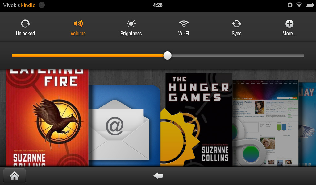
The notification bar from Android 2.x is still there, but the notification drawer is a push-button affair instead of a slide-down windowshade. The left side of the notification bar contains the battery and WiFi indicators as well as a small gear. Press it to bring down the quick setting options, and select "More..." to get to the full settings menu. The quick settings options are the rotation lock, volume and brightness controls, wireless settings, and a manual sync button. The main menu settings are relatively limited compared to normal Android, mostly account and security options, along with the standard device settings: sounds, display timeout, keyboard, network, date/time, and application permissions. The notification tone catalogue is basically lifted from Honeycomb, as are the keyboard touch sounds. The sounds are basically the only personalization options you've got. There's no real wallpaper to speak of other than the dark gray bookshelf, and as mentioned before, you can't touch the lockscreen images.
There are no hardware buttons, so the standard Android navigation buttons show up on a bottom navigation bar. The Home button and back button are always present, joined by the menu button and search when relevant. The menu bar disappears when you're viewing print or video content, necessitating a touch of the screen to bring up the navigation bar.


Above the Carousel is a list of the different content areas. You can access the web or one of the content libraries by hitting the corresponding name: Newsstand, Books, Music, Video, Docs, Apps, Web. Web takes you to the browser, Apps takes you to the main application launcher, and the rest of the content areas are mostly self-explanatory. It's the only way to access the browser, the launcher, and the music player, so you'll use those buttons often. Above the content libraries is a search box that searches through your books, magazines, documents, movies, music, and apps. We'll cover all of these systematically, starting with the browser, which Amazon says is "cloud-accelerated" using the computing back-end of Amazon Web Services. It's called Silk.


70 Comments
View All Comments
Reflex - Tuesday, November 29, 2011 - link
No, part of the reason Amazon forked Android was to eliminate Google services and analytics. No Google account required, nothing is shared with Google unless you choose to install their apps and services. Amazon also has very strict privacy policies and does not share user information with anyone(even internally from what I understand).stationstops - Tuesday, November 29, 2011 - link
As a commuter, I am on my iPad2 3 hours a day. I would love to try the Kindle Fire as a less cumbersome replacement (for me, it either fits in the pocket of the sport coat or it doesn't), but without 3G, there is absolutely no productivity for me here at all.Its kind of amazing how little importance 3G is given in the press when discussing Android tablets. They commonly get released with no 3G version at all, and when the 3G versions do come out, they have contracts and pricing which simply can't compete with iPad's liberal Verizon and AT&T month-to-month plans.
Keep in mind that this great 2011 tablet computer has worse connectivity then a Gen 1 Kindle.
melgross - Tuesday, November 29, 2011 - link
It's interesting that most reviews from Anand pick apart even the smallest problems, but this review seems to gloss over them. Is it really possible that Anand and Vivek didn't have the problems that other reviewers had?Problems mentioned in other reviews include, turning off the tablet when watching movies, browsing, or doing any activity because of the poor placement and implementation of the
Owner button.
The need to often tap several times to get the screen to respond, or to find that the tablet did, after a lag, detect a tap, but now moves you to something else because you tapped too often.
The lack not only of a microphone, but a rear and front camera, so no Skype possible.
Also no gyro. Amazon doesn't allow apps in their store if it uses any of these features.
Many side loaded apps either don't work, or have problems if they do. And sideloading apps isn't for the average user anyway, so most are stuck with what Amazon approves, which isn't much.
Many tap points are small (and as mentioned, not always responsive), and so people with vision problems or motor control problems will have difficulty with this.
Overall, this isn't such a great product. I'm surprised that Anand didn't go more deeply into this. There's no excuse that it's just $200. For that we should get something that lacks features, but it should still work well for what it does.
Wizzdo - Tuesday, November 29, 2011 - link
I agree. I feel this review isn't up to the usual high standards. The points melgross states are quite salient. Anand mentions that the Kindle Fire is no iPad 2 but this is for many more reasons than size and graphics horsepower alone.cat12 - Tuesday, November 29, 2011 - link
I have own a older molder kindle (purchased 6 months ago) I was very pleased with it and still am. Well I had to try the fire. I did not like the back light at all. When you work on computers all day you eyes fatigue. With the older kindle seems like you are reading a book and is much easier on the eyes.As far as the internet web browsing it was redundant since I have laptop etc... The film quaility of the movies on the fire was excellent but again redundant.
Also I could view my external mail account but could not open the messages, so it was useless as a business tool. The fire seems to be much heavier, and do not think for a moment that you can use your old protective cover for the fire. You will have to lay out cash for a new one to fit the fire.
I returned the fire after a couple of days and am awaiting my refund from amazon. I will continue to enjoy my older kindle for the "book" reading experience, after all that is why I wanted a kindle in the first place.
NCM - Tuesday, November 29, 2011 - link
"Amazon refused to skimp in two areas: compute and the display.""this is more general purpose compute..."
Please: "compute" is a verb, not a noun.
bludragon - Tuesday, November 29, 2011 - link
This is my single biggest gripe with the browser, especially in landscape, most of the screen is wasted on the buttons and status bar. Unless I'm being really dumb and missed the option to get rid?Aside from Netflix, nothing I searched for in the app store was there. I don't think I'm asking a lot...
1. Zinio
2. Google maps
3. Yelp
4. Firefox, opera or some other web browser to get around the browser irks and the few buggy web sites (typically where pop up ads prevent you from seeing the page, or you can't select things on pop up menus)
Bazili - Tuesday, November 29, 2011 - link
It's time to create a device with both displays and a simple smart cover that shifts the device from one mode to another.Isn't it possible, is it?
VivekGowri - Wednesday, November 30, 2011 - link
The NotionInk Adam is a similar idea to what you're talking about.geniekid - Tuesday, November 29, 2011 - link
A lot of people say they don't understand the comparison between the Fire and an iPad, but I think there's value to such a comparison.Yes, I KNOW the iPad is obviously a superior piece of hardware to the Fire and it was designed to meet different needs. I need to know EXACTLY what those different needs are. What does that extra $400 dollars buy me? I would guess at least half the people reading reviews about the Fire want to know how it compares to the iPad, EVEN IF THEY ALREADY UNDERSTAND that the two are targeting different demographics.