Microsoft BUILD: Windows 8, A Pre-Beta Preview
by Brian Klug & Ryan Smith on September 13, 2011 12:05 PM EST- Posted in
- BUILD
- Windows
- Microsoft
- Windows 8
- Trade Shows
The Metro UI
The best way to describe Windows 8 is a cross between the Metro UI from Window Phone 7 and the desktop architecture of Windows 7. In fact, virtually everything but the desktop gets a Metro treatment in Windows 8.
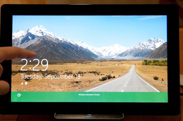
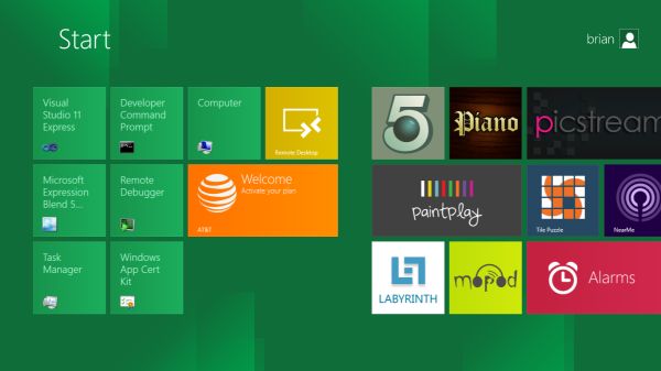
The Windows home screen starts initially hidden behind a lock screen virtually identical to WP7’s - slide up on a large edge-to-edge background to unlock. Inside is the Metro start screen, which is comprised of a grid of live application tiles that behave almost identically to those in Windows Phone 7. Two sizes of tiles serve as both application launch shortcuts and notification areas that can be populated with notifications, graphics, and other status indicators.
The tiles populate a horizontal strip that can be scrolled back and forth, and tiles can be rearranged accordingly. There are a few new gestures here over what we’ve seen before in WP7, including a swipe up to select a tile, and multitouch scrolling plus tile repositioning. Swipe up on tiles, and you can select them to convert size, uninstall, or unpin from the home screen.
The new start menu is more than a user experience oriented at tablets, it’s also the design language Microsoft has adopted for the entire new Windows 8 experience.
The thing to realize is that this modality isn’t so much a view as it is a combination of both new start menu, new interface for making Windows usable from a mobile perspective, and a completely new interaction paradigm. The interface is designed to perform and behave in the same way across multitouch, active digitizer, and keyboard+mouse combinations.
There’s another set of gestures and features as well which make use of the four edges of the display. The top and bottom are reserved for application-specific functions, the left and right are reserved for two Windows 8 specific tasks.
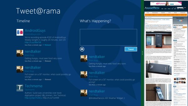
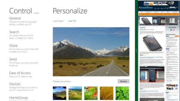
Sliding one’s finger from the left edge onto the display allows for both fast application changes, and the multiple-window snap functionality that’s been demoed already. The split is roughly 1:4 and divides horizontal real-estate between two applications views at once. The narrower of the two requires some additional development support, but the aim is to create a workable touch interface without sacrificing multitasking.
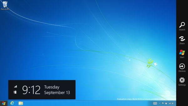
Swiping a finger from the right edge of the display towards the center brings up what Microsoft calls charms. This is a view that includes status indicators, and functionality like search, share, start, devices, and settings.
These respective shortcuts then bring up panes that occupy the same area on the right, and do what you’d expect. Settings for example is a place each application to build out a preferences area, so that each application has a common place users will go to control things.
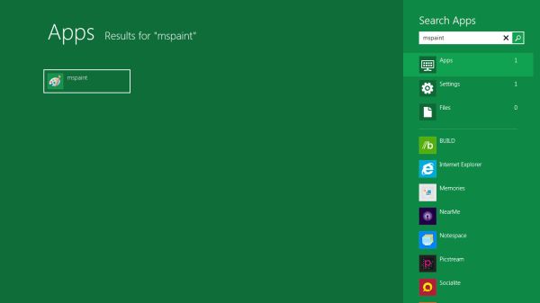
Likewise, share acts like an intelligent copy paste, sharing working elements between applications. Finally search can either look through files and applications or dive into strings surfaced by other third-party applications.
These left and right based gestures exist across not just the Metro-infused start screen, but the entirety of Windows.
Moving around and getting back to the home screen is accomplished by pressing the Windows button, which on the tablet we were loaned is its own physical button analogous to iOS’ home button. Pressing the keyboard windows button performs the exact same action and summons the start menu.
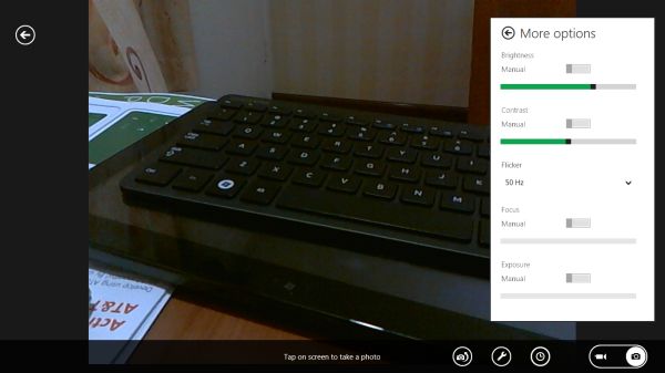
The current set of first-party applications is pretty spartan. There’s no maps, mail, or camera application, though Microsoft has already bundled a set of its own internally-created applications. These are entirely Metro themed as well. I mention camera because the sample hardware includes a front facing and rear facing camera, and at present the only way to access them is through the change user tile picture function, which can capture a photo from the front or back webcam.
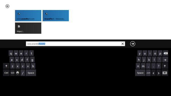
Throughout the entire OS is a very WP7-like virtual keyboard, which supports a full size and thumb keyboard mode. There’s also a handwriting recognition mode which has two lines of handwriting input and is styled similarly to Windows 7’s tablet input keyboard.
The keyboard can be docked to the bottom of the display or detached and dragged around as well. I find that the split keyboard accommodates typing with thumbs and holding the device midair quite well.





235 Comments
View All Comments
Booster - Thursday, September 15, 2011 - link
It's the ribbon again, but infinitely worse. Metro is just outright stupid, that is.I remember watching a presentation by Julie Larson-Green where she pitched the ribbon back in 2006. IIRC she said that they listened to the users and created the ribbon according to their usage scenarios. So according to her the ribbon was next best thing since sliced bread.
Who were they listening to? The ribbon looks better give or take, but it's less useful in the workflow, it's less effective, it's just plain worse than the old concept. That division of MS doesn't listen to users, it's like a dictatorship in which we have to use our PCs the way that madam wants us to. But she doesn't do any actual work on the PC like me for example. Hell, you can't even preview a page or print without setting up the ribbon, where's the usability? Why do I have to scroll between all those damn tiles?
This Windows 8 fiasco is where MS finally needs to realize the situation and finally take the matters well in hand.
archer75 - Thursday, September 15, 2011 - link
You do realize you don't have to use the metro tile UI right? You can boot right in to a traditional desktop like you are used to.Plenty of updates here for the desktop user.
Really this new metro UI just provides a better layer for tablets but the OS is still there which i'm really pumped about. I don't know how often i've been using my ipad and wishing I could access a real OS on it.
Moricon - Friday, September 16, 2011 - link
"Overall Windows 8 is extremely jarring right now from a desktop user perspective. Metro is the Windows shell, no ifs ands or butts. Metro applications can only be accessed through the Metro shell (i.e. the Start Screen), and the Metro shell is always what the tablet will boot up into. Explorer as we know it is the Metro shell – if you kill it, you kill Metro shell with it – so at this time it’s not possible to boot up into the traditional Windows desktop. Even if you could, the Start Menu is gone, replaced with Metro charms."Metro IS the windows Shell--- METRO IS EXPLORER!!!!
Have you loaded the build, I have, played with it. IT SUCKS bigtime!
Microsoft will go back on this, the pressure will be to great from the desktop user!
There are improvements, better memory management, faster boot process, safer recovery options, faster work-flow (yes ribbon is actually better for non-power users, who use keyboard shortcuts.)
Why can they not just bring those improvements to th Win desktop version and leave metro to Tablets, Netbooks and ARM anyway.
My days of PC Gaming are coming to a close, most Games are crap! Looks seriously like Mint will become my main Work OS and I will keep a copy of WIN7 for my back catalog of games!
MrBungle123 - Friday, September 16, 2011 - link
How is this Metro crap going to work for those of us that make a living with a mouse and keyboard?I work in IT, I have to do everything from assisting users to writing programs. Its not uncommon for me to have Visual Studio, Outlook, IE, 2 databases, and 5 or 6 Remote Desktop connections going on at the same time.
There is no way in hell I'm putting this garbage on my work computer, nor am i going to install it on any of the desktops/servers connected to my network. This is a user training nightmare, the resistance to migrating to Vista from XP is nothing compared to what the resistance of migrating from Win7 to Win8 will be if the final product is anything like this.
talk2dfox - Friday, September 16, 2011 - link
Does anyone else think Windows 8 seems to have no coherent strategy?For users:
1) two different types of applications, which can't run side by side: what do you do if you are a business user who needs to switch efficiently between one application which is Metro-based and another which is not?
2) switch to the desktop and click on the start button and you're back at the Metro UI? huh? Are the only desktop applications I can start directly from the desktop UI the ones which have links on the desktop?
3) some settings are in the metro control panel, others in the old windows control panel
4) too many gestures which will be impossible to remember because they bear no relation to anything you've used before. The whole reason why the touch experience of iPhone et al has caught on (and why even small children catch on to it quickly) is that it is familiar. Want to move what's currently on the screen up? put your finger on it and move it up as if it were a physical object. Want to zoom? use two fingers to "stretch" or "shrink" the image. So, what's the comparable analogy in Metro for swiping up to select a button? There isn't any. Not that Microsoft had much choice - they're trying to graft a touch experience onto an existing Windows UI which has too many different functions without physical analogies, so some of them are bound to be mapped to something weird. But that's the point - trying to graft a touch experience onto the existing Windows UI is never going to produce something coherent and intuitive.
For developers:
5) yet another API, but all the old APIs (.net and win32) still supported (but only on x86, not ARM).
6) If you are starting to develop an application today, what should you use?
Will an app built for Windows Phone 7 today be portable to Metro (and sellable via the Windows 8 store)? If not, will it run at all on an ARM-based metro phone or tablet? What about an x86 based tablet or desktop?
What if you want to write an application to be used on Win 8 on all form factors? The only thing which will run on Win 8 on ARM will be Metro, but the development tools for Metro don't exist yet. Think about how far WP7 is behind iPhone and Android today, and then consider what the situation will be like for Win 8 which is just now reaching the point where Microsoft can demo the UI and talk about development.
Contrast this situation with iOS/OS X: With a single language (objective C), a single development environment (xcode), and two variants of essentially the same framework (Cocoa), you can target iPhone/iPad and Mac.