Motorola Droid 3 Review - Third Time's a Charm
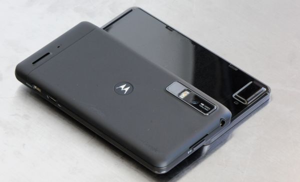
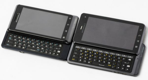
by Brian Klug on July 30, 2011 12:01 AM ESTJust like the other Droids, this model’s slider lacks any spring assistance, instead it slides out along a friction-guided two-rail track. It’s pretty obvious where that friction happens and where the slider locks into the display part, given the two small notches at the top, and likewise where the tracks are at the extreme left and right. Initially I found the Droid 3 slider a bit resistive and not super smooth, however after a few days of use it settled into a much better and smoother groove.
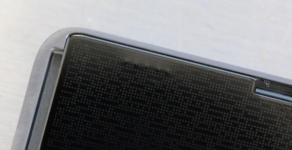
It still isn’t quite as fluid as HTC’s latest designs, but again gets the job done with an impressive thickness (or lack thereof). The back of the display is topped with a reflective, patterned surface which also unfortunately collects fingerprints.
So how is the keyboard that the slider makes possible? In a word - amazing. Yes, it quite literally is the closest to perfect I’ve seen in a very long time. Each iteration of Motorola Droid keyboards has gotten slightly better, starting with the almost unusable Droid 1’s concave keys which had minimal feedback, to the mid-cycle refresh which changed key domes to convex, followed up by the Droid 2 which removed the D-pad and improved communication, and now the Droid 3.
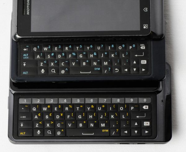
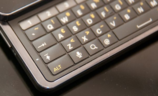
The Droid 3 adds a fifth keyboard row, this time dedicated exclusively to the arabic numerals. I originally thought having numerics wouldn’t make much sense, but after entering my 20-character WPA PSK for probably the hundredth time followed by the usual assortment of passwords for email and google accounts, it finally made sense. Having a row dedicated to numerics just makes so much sense in retrospect, both for entering phone numbers in messaging, passwords, and so many other situations.
The numerical row also does double duty by acting as a buffer between the top row of the latin characters and the top display slider. My only major complaint with the Droid 2 and before was that there was very little space between this top row and the display slider - if you had any fingernails at all or even just large fingers, they’d likely collide with that slider when typing on the top row. Now, having one more (even half height) row makes that a solved problem.
The keys on the Droid 2 previously had little space between them, it was primarily one large piece without a discrete gap between characters. The Droid 3 now includes a shiny plastic layer between keys, which will no doubt show lots of grime in due time, but it does make each key independently clicky.
The only rearrangements to speak of are the removal of alt-lock and the back keys, and repositioning of the tab key. The bottom row also is slightly shifted to the left. Material and tactile feel on these new domes are excellent. Again, the keys are convex, topped in a soft matte texture, and communicatively clicky. Motorola takes a nod from Apple with a caps-lock indicator that nicely disappears into the lip on the left next to the shift key - it’s a nice touch which makes the caps lock indicator visible even with a finger on the button.
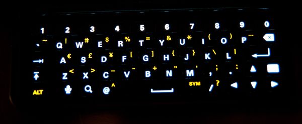
Backlighting on the Droid 3 keyboard is nice and even. There aren’t any controls in settings for controlling when the backlight comes on or how long until it turns off. Backlighting seems to turn on and remain on when ambient brightness is under a certain level. Alongside the Droid 2, the Droid 3 seems very conservative with its keyboard backlighting, as it seems to enable it at a notably lower ambient light level than its predecessor.
The capacitive buttons are likewise backlit the same way they have been on previous Motorola Droids, and thankfully the order of these respective Android keys are unchanged from the Droid 2 to 3. There’s a bit of capacitive button backlight bleed at the bottom of the display where the glass ends and meets plastic, but it isn’t too distracting.
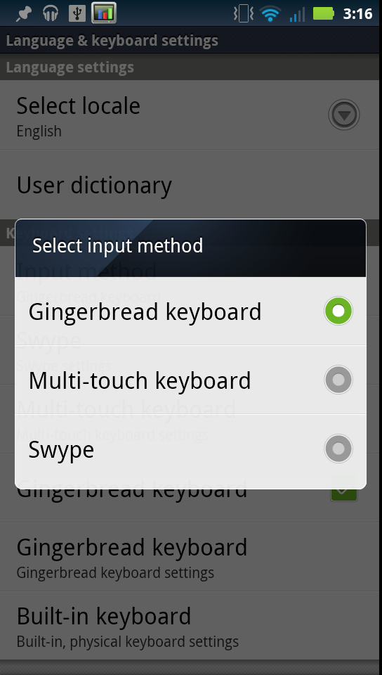
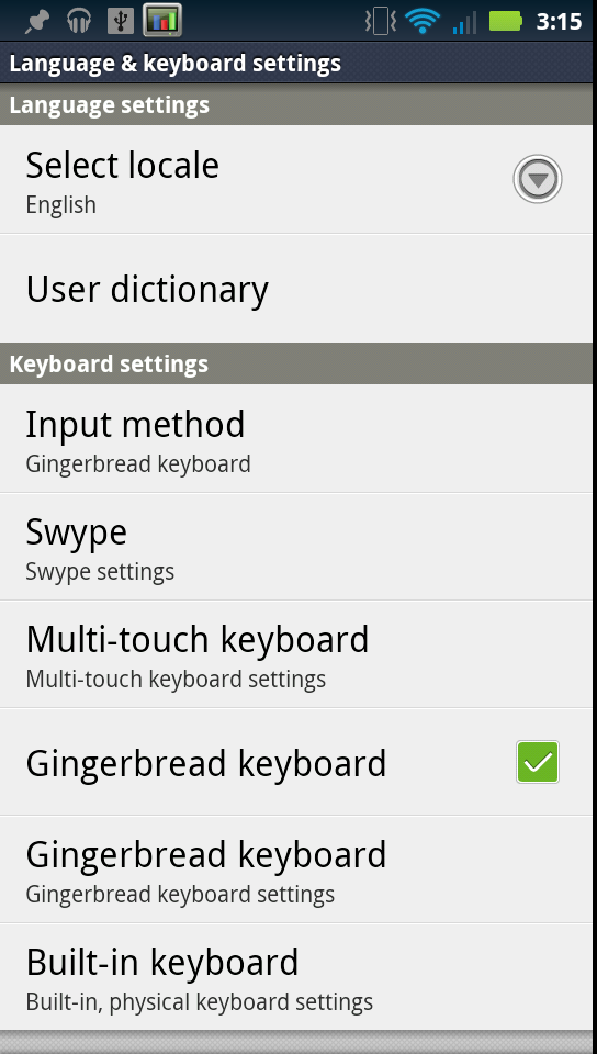
Since we’ve been talking about the keyboard, I think it’s worth mentioning that the Droid 3 continues the Motorola legacy of including a host of software keyboard options for portrait view. Swype, the default Motorola multi-touch keyboard, and the Android 2.3 stock gingerbread keyboard are all preinstalled an available as options. I’m glad the Droid 3 doesn’t do away with the gingerbread keyboard, like I’ve seen other Android 2.3.x handsets do. Swype is themed to look like Motoblur, and the multi-touch keyboard is as good as it always has been on other Motorola Android devices.
The last part is that there’s another pane in the input and keyboards settings page for the hardware keyboard with a few options. What feels neglected is how anemic the hardware keyboard auto-replace engine is. Compared with the gingerbread and even Motorola multi-touch keyboards, the hardware keyboard has an almost non-existant auto-replace engine for fixing misspelled words. In practice, it does little more than correct things like “im” to “I’m,” and so forth. It’d be nice to see the hardware keyboard get a bit more love.




84 Comments
View All Comments
Lucian Armasu - Sunday, July 31, 2011 - link
I completely agree with you on this. Either raise the resolution for a normal LCD/AMOLED screen (RGB) or don't raise it at all if you're going to use Pentile. It makes the display worse overall.It's like you're trying to increase sharpness of the display by increasing resolution by 30%, and then you use Pentile which *drops* sharpness by 60%. The end result is negative on the sharpness of the display.
YoPete525 - Sunday, July 31, 2011 - link
Have you guys actually looked at the Droid 3 in person? Most elements on the screen still appear sharper than say on the Incredible 2, which has a relatively comparable 4-inch screen with the 800x480 resolution. You also have to realize that a higher resolution means more viewable content, such as more settings options on the same screen, or more emails in the same view. The increased detail is very noticeable on, for example, home screen icons, looking at the Droid 3 and then a phone with the traditional 800x480 makes icons on the smaller resolution screen appear comically large.Solid colors, especially the green (which is in the battery icon), do look fuzzy, as well as a combination of lines on certain backgrounds, and colored text. But at least give the screen a chance in person before you write it off. In terms of overall screen sharpness, you're right in that the RGBW Pentile matrix isn't ideal, but it isn't as bad as you make it out to be.
snowblind64 - Sunday, July 31, 2011 - link
Let's not forget there are benefits to a RGBW pentile screen. Battery drain is consistently well under 10% on my Droid 3 thanks to that extra white sub-pixel.themossie - Sunday, July 31, 2011 - link
For some, it really is that bad.I used it in person, spent a couple off hours in the shop playing with it. Compared to the Droid 1, on the Droid 3 I have to read text at a greater font display size / zoom level (the characters have to be bigger on screen) and as a result can fit less content on the screen than on the Droid 1.
Best comparison I can make: it feels like you are running an LCD screen at a very uncomplimentary non-native resolution. Try running a 1080p screen at 900p, it's painful to most any power user - you can still read and do work, but everything is fuzzy and hurts the eyes. Some people aren't bothered by this, others get headaches.
For UI elements, the screen is acceptable; for reading this becomes a problem.
I'm glad (and jealous) the Droid 3 screen works for you :-) I want a new slider that beats my OG Droid!
RavnosCC - Monday, August 1, 2011 - link
Agreed! I played w/the phone side by side with my D1 on all my favorite sites, reading the same content... trying to find a comparable zoom level on the D3 that didn't make the text look horrible was near impossible on most of the sites I frequent. I think Moto needs to seriously rethink the idea that increasing specs while effectively lowering quality will become the future :( The trade-offs aren't worth it, imho.relativityboy - Thursday, August 4, 2011 - link
As a posessor of the D3 I can say my D1's screen looks much better.Brian Klug - Sunday, July 31, 2011 - link
So you have to keep in mind that the photo actually is a 100% crop that I supplied to just show the differences in the subpixel matrix between RGBW and RGB.I've been pretty critical of PenTile RGBG in the past, and admittedly RGBW still isn't as desirable as straight up RGB, but it definitely is a way to emulate higher equivalent resolution. The other RGBW advantage is of course the reduction in power (just keep the W subpixel in the on position when displaying white) and thus requiring a less powerful backlight.
Again, I'd definitely prefer a true qHD 960x540 display like what HTC has on the Sensation/EVO 3D, but this isn't too bad compared to how RGBG looked on the previous generation of AMOLED displays, if nothing else because the vast majority of webpages render with sharp black edges properly.
-Brian
Lucian Armasu - Sunday, July 31, 2011 - link
It's because of the Pentile Matrix. It makes the screen fuzzier. I wish manufacturers would stop using it. It's not a trade-off I'm willing to make over whatever benefits Pentile brings.hwarrior - Saturday, July 30, 2011 - link
Too bad Droid 3 is Verizon linked.http://www.engadget.com/2011/07/18/motorola-xt860-...
jjj - Saturday, July 30, 2011 - link
Motorola will be using 2 LTE chips in it's 5 LTE devices planned to be released this year (Xoom, Bionic,1 more phone and 2 more tablets).One of the chips is developed by Motorola and the other one ... no clue really but Motorola might not want to kill battery life by using Qualcomm so maybe ST-E or Icera.