Back to the Mac: OS X 10.7 Lion Review
by Andrew Cunningham, Kristian Vättö & Anand Lal Shimpi on July 20, 2011 8:30 AM ESTAll OS X versions, even the “no new features” Snow Leopard release, have made some changes to the way things look without much affecting how they act, and Lion is no exception to this.
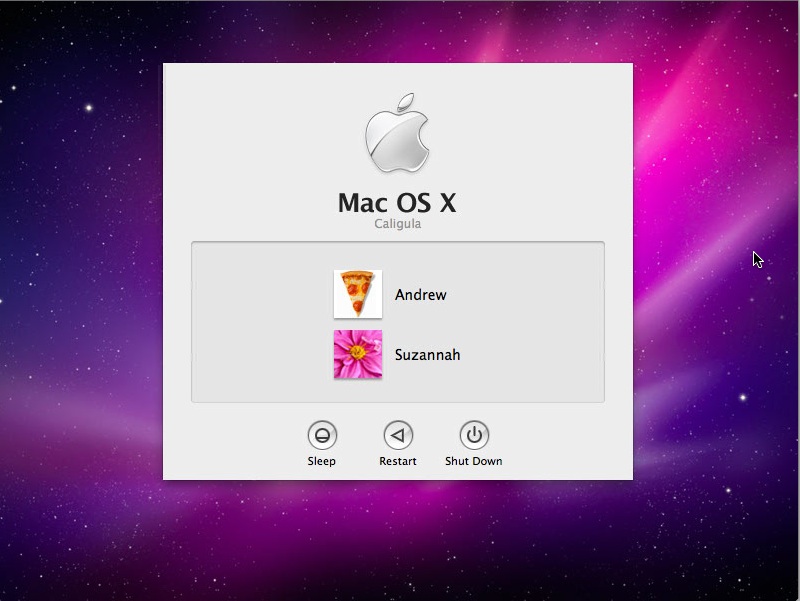
The first (and perhaps most obvious) change is to the login screen itself. In all previous OS X versions, this has taken the form of a white box with the OS’s default wallpaper as a backdrop, with either a vertically-aligned list of users or a pair of fields where you enter your username and password (depending on the number of users on your Mac and the way you’ve configured your login screen to work).
In Lion, this has been exchanged for a simpler-looking horizontally-aligned list of users against an iOS-like textured background (again, depending on your login screen’s setup).
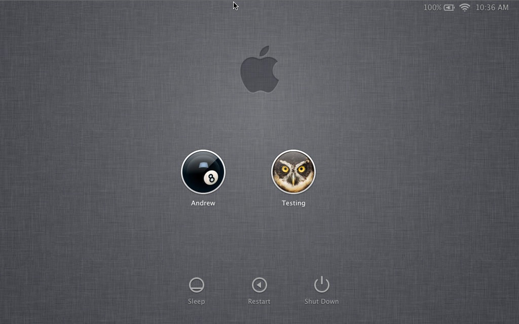
The login screen is marginally more useful in Lion, since you can see your computer’s wireless status, battery life, and clock in the upper-right hand corner without logging in.
This information is also shown on the lock screen, which has also been changed – it’s easier to show than to tell, as you’ll see below – and this makes it that much easier to check your Mac’s battery status without having to authenticate.
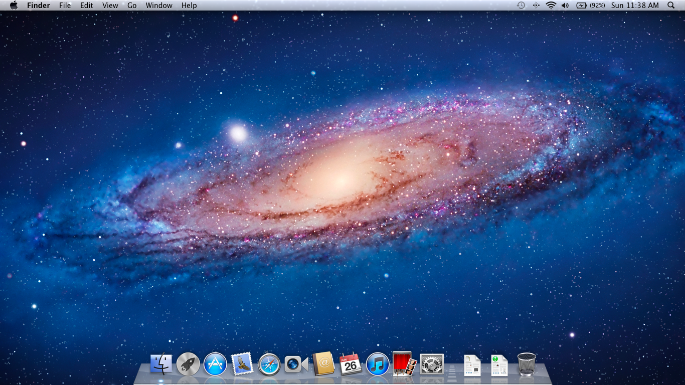
Login, and your desktop now fades into view in an iOS-esque way. In fact, Lion has a good bit more fading and zooming than Snow Leopard - most notification messages now employ some graphical razzle-dazzle and jump out at you instead of just appearing, which you’ll either think looks slick or frivolous, depending on the kind of user you are.
Fading, sliding, and zooming aside, the desktop looks pretty much identical to Snow Leopard’s, with the exception of yet another space-themed default wallpaper - The Dock and the taskbar look and act the same way as they did in the previous OS X version. One behavioral difference: windows throughout the OS can now be resized by clicking and dragging any corner of the window - this is one of those oh-wow-is-this-seriously-only-happening-now features that should have been in the OS ages ago, but that makes it no less welcome now that it’s finally here.
Apple continues its quest to get stuff off of your desktop by default – inserted discs and external drives no longer show up on the desktop by default (mounted network drives stopped showing up on the desktop by default in 10.5, and the computer’s internal hard drive stopped showing up by default in 10.6). You can switch all of this back on in the Finder’s preferences, just as before, but it’s another baby step away from an easily visible file system.
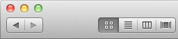
Lion also continues Apple’s slow shuffle away from the Aqua styling that defined the OS when it was originally released. For starters, the subtler, more staid icons that have been creeping in since Leopard have replaced the colorful icons in the left-hand sidebar.
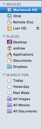
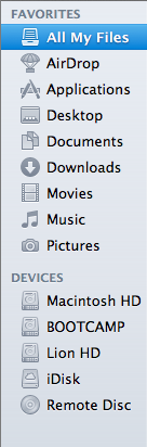
Snow Leopard sidebar (left) vs. Lion sidebar (right)
The scrollbars have also been changed, depending on what you’re using for input. If you’re using a multitouch-enabled device like the Magic Trackpad (or the large glass trackpads on most MacBooks from late 2008 onward), you’ll see scrollbars only as you actually scroll – they appear and disappear as they do in iOS. However, using an older-model trackpad or traditional keyboard and mouse will cause more standard, always-present scrollbars to appear.
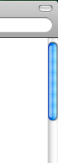
Snow Leopard scrollbar (left) vs. Lion scrollbar (right). Lion's scrollbar will disappear if you're using a multitouch-enabled mouse or trackpad.
Next, turn your eyes to the upper left-hand corner of your window, where you’ll notice that the close-minimize-resize buttons have been reduced in size.
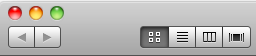
Snow Leopard's buttons (left) vs. Lion's smaller buttons (right).
If you then look at the rest of the window, you may notice that the color has been lightened slightly compared to Snow Leopard – this lighter color scheme occasionally threw me off, since it’s somewhat similar to a deselected window in Snow Leopard – I occasionally thought that my clicks weren’t registering because the colors weren’t quite right.
The subtle color scheme changes also extend to buttons and progress bars in the Lion, which have shed their bright Aqua-blue in favor of a less-shiny and slightly darker blue. Notice that button shapes have also moved away from the shiny, round Aqua-style to a more traditional rounded rectangle.
Snow Leopard progress bar (top) vs. Lion progress bar (bottom)
Snow Leopard buttons (top) vs. Lion buttons (bottom)
Last, let's talk branding: The AirPort status indicator in the menu bar is now labeled Wi-Fi instead of AirPort, a small but welcome step away from a sometimes-confusing moniker. Apple's wireless hardware is still called AirPort in the System Profiler, and Apple's just-refreshed routers are still called AirPort Extreme, so it's likely that the branding will stick around - it's just not as readily evident in the OS.
None of these changes are going to have much, if any, effect on how you use the OS, but they’re there and you should know about them. OS X has been shedding the old, colorful Aqua in favor of a more reserved (if a bit less distinct) Aqua UI for awhile now, and Lion continues in that direction.


106 Comments
View All Comments