The HTC Flyer Review
by Anand Lal Shimpi on June 21, 2011 4:05 AM EST- Posted in
- Tablets
- HTC
- Android 2.3
- Mobile
- Flyer
The Hardware
Compared to early Android tablets the Flyer doesn't look very different. It's a 7-inch almost 16:10 tablet with a 1024 x 600 resolution. In the grand scheme of things however, this is a pretty different form factor - particularly for a tablet released in 2011. Apple set the tone for at least the first generation of tablets with the iPad: nearly 10-inches, and at least a 1024 x 768 display. Steve brought forth the iPad and it was good. The only problem with this approach is that tablets, like notebooks, aren't one-size fits all. People are different sizes (tiny vs. large hands) and usage models vary (couch surfing vs. portable computing device). While the iPad has clearly done very well, it's clearly not the only answer.
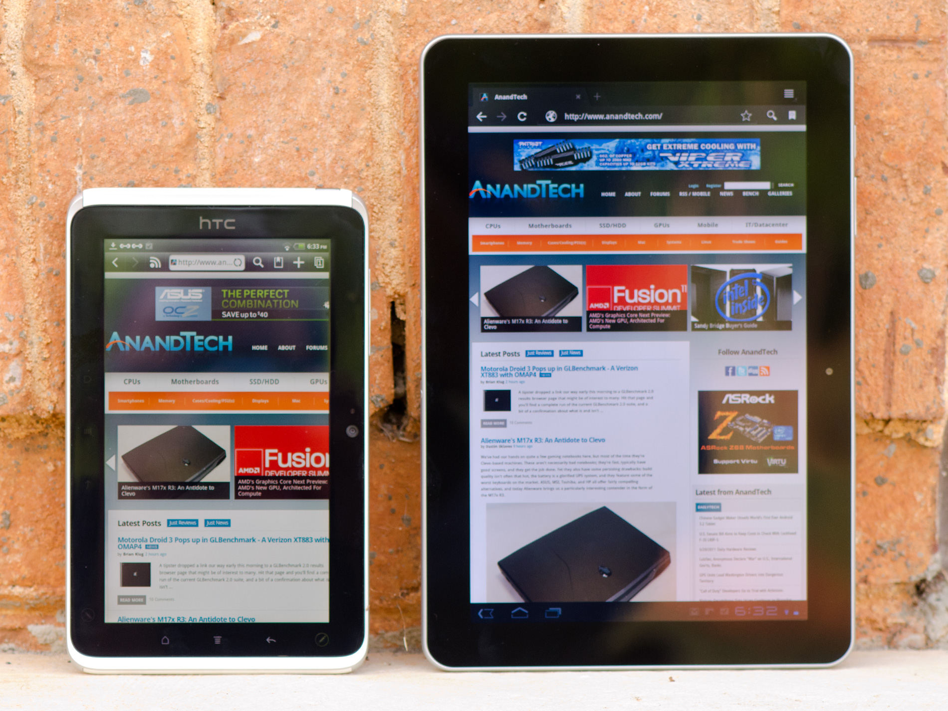
HTC Flyer (left) vs. Samsung Galaxy Tab 10.1 (right)
Viewed through iPad colored glasses, the Flyer starts out very different. In fact, it takes a page from RIM's playbook (giggle) and aims for portability rather than the comfort of a large screen size. I'll say the same things I said about the PlayBook about the Flyer: it's far more comfortable to carry around with me, but at home it's not as enjoyable to surf the web on. I think that's ultimately what separates the 7-inch tablets from the 10-inch models, portability vs. ease of use at home. It remains to be seen if Samsung's forthcoming 8.9-inch Galaxy Tab can really provide the best of both worlds.
I don't have particularly large or small hands but I can actually hold the Flyer with a reasonable level of comfort in the palm of one hand with my fingers gripping the outer edges.

Samsung Galaxy Tab 10.1 (left) vs. HTC Flyer (right)
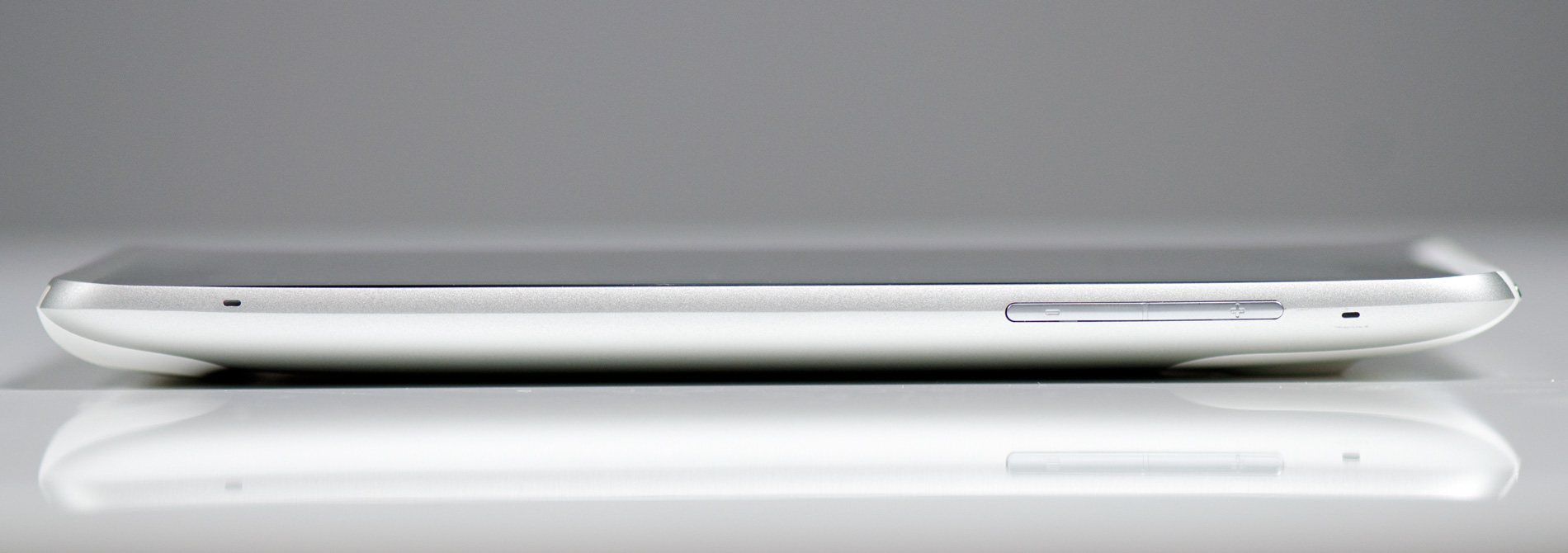
The Flyer isn't thin. At its thickest point it's 13.2mm, that's around half an inch. Even the original iPad is thinner. The back however curves out to that point and because there's not a lot of surface area it actually doesn't feel overly thick. I'd go as far as to say that the Flyer feels like it has a good grip to it.
The device is light by tablet standards at only 420 grams. Even the Galaxy Tab looks porky on paper by comparison. Again, in a smaller package the Flyer ends up feeling more dense despite its light weight. You can definitely hold the Flyer in a single hand without much fatigue, but I personally got the feeling that HTC's first tablet was about 10 - 20% over weight for its size. It's not bad, but not perfect. Don't feel too bad though HTC, in my opinion no one else has really gotten the whole form factor thing perfect either.
The HTC logo on the front panel implies that the Flyer is designed to be held in portrait mode, although obviously rotation is supported. In landscape mode there's a 1.3MP front facing camera in the center of the top bezel. Around back there's a 5MP rear facing camera as well.
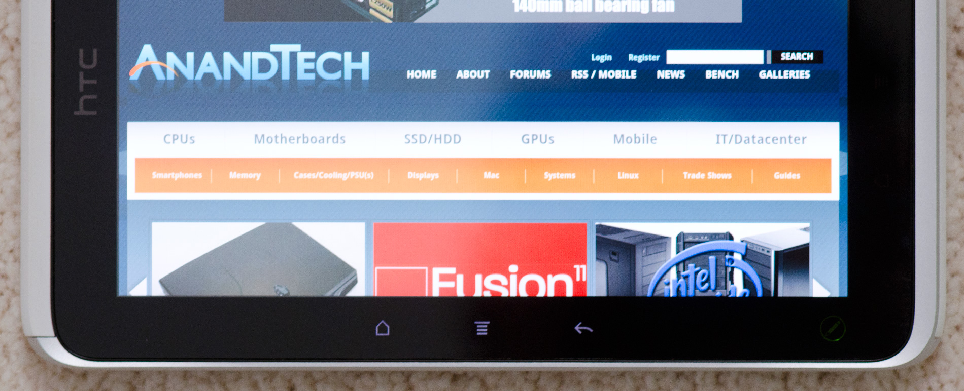
You can't rotate the Flyer in all directions however. Either the HTC logo or the front facing camera have to be at the top of the tablet. Holding the Flyer the other two ways won't rotate the screen. HTC does this because it actually has two sets of backlit capacitive buttons in the bezel around the screen - one set are illuminated in landscape mode, the other set in portrait mode:
It's a nice addition but one that forces HTC to limit the rotational freedom of the device. It's not a huge tradeoff, but one that doesn't exist on Honeycomb tablets since they integrate the standard Android buttons into the OS itself.
HTC only includes three standard capacitive buttons on the Flyer. From left to right there's home, menu and back. The search button is gone but not missed. Honeycomb also only includes three buttons (home, back and recently used apps), but it's just as quick to get a listing of recently used apps on the Flyer by holding down the home button. Some might argue that it's a quicker way of switching tasks than Honeycomb offers.
There's a fourth button on the Flyer, but this one is only accessible via the optional HTC Scribe - a battery powered digital pen accessory. I'll get to that bit in a moment.
Up top there's a power/lock button with integrated status LED. The LED blinks green for notifications (e.g. new email) or glows orange when charging. If you don't do your homework it turns red. Next to the power/lock button is a tapered 1/8" stereo headset jack. The Flyer doesn't come with any earbuds, you'll have to supply your own.
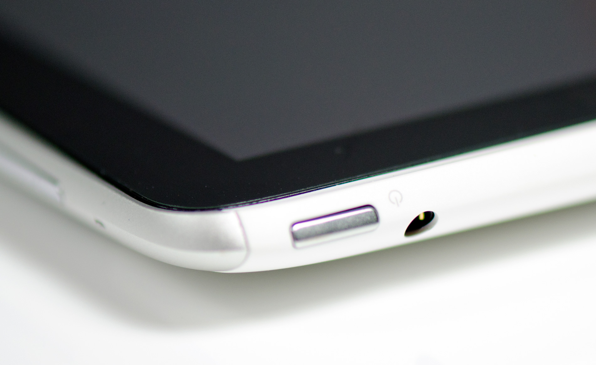
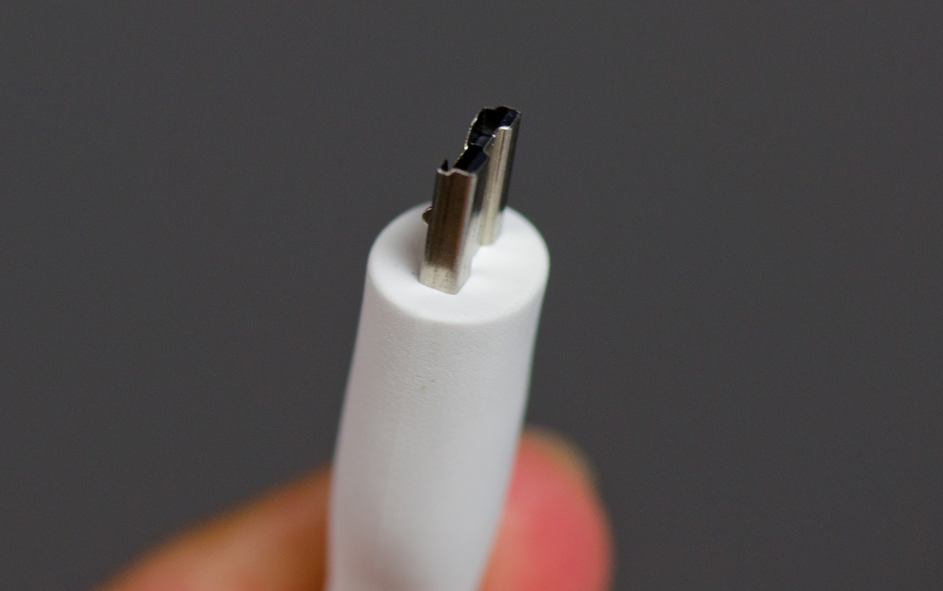
The left side of the device is barren and the right is home to volume up/down buttons as well as two microphones. Along the bottom of the Flyer is HTC's proprietary dock connector that's used for getting content onto the device as well as charging it.
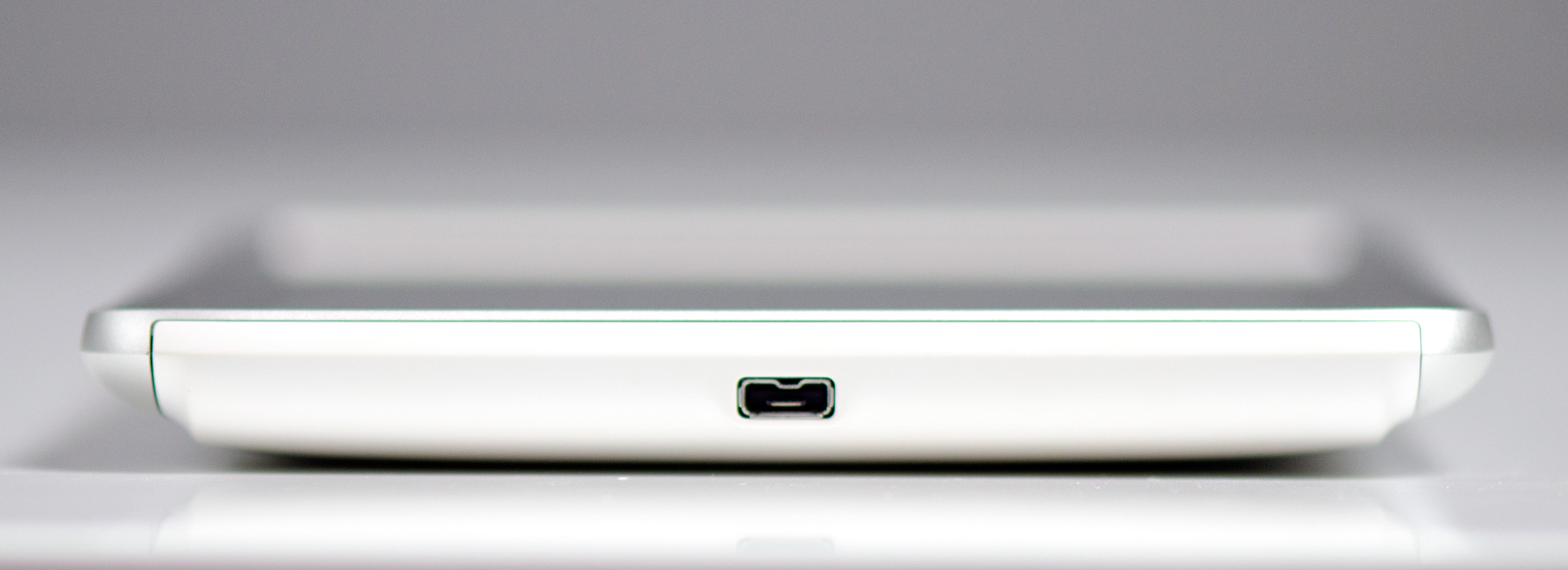
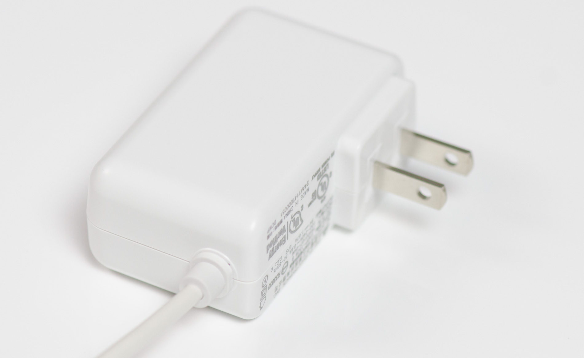
The Flyer comes with a power brick as well as a dock to USB cable. Unlike larger tablets the Flyer can charge (very slowly) off of a standard USB port while running.
The back of the Flyer is all aluminum save for two plastic inserts. The bottom insert is immovable and feels equally stuck in place.
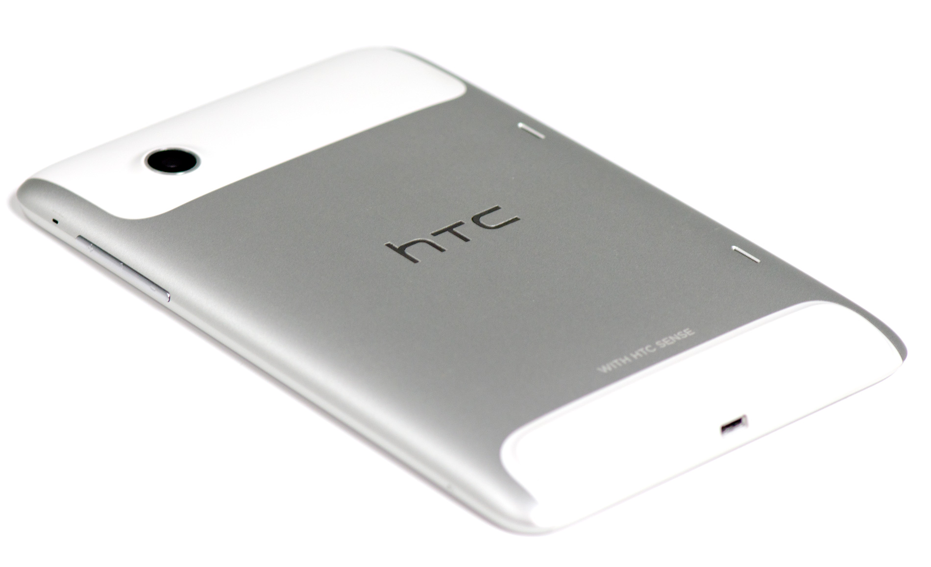
The top insert is a removable cover that hides the Flyer's microSD slot. I'm not a fan of hiding microSD slots behind large removable covers - it seems silly to have to remove something so big to access something so small. With the Flyer the removable plastic cover seems to somewhat ruin the point of the device's aluminum back. The removable cover definitely flexes under your grip and just doesn't feel as solid as the rest of the device.
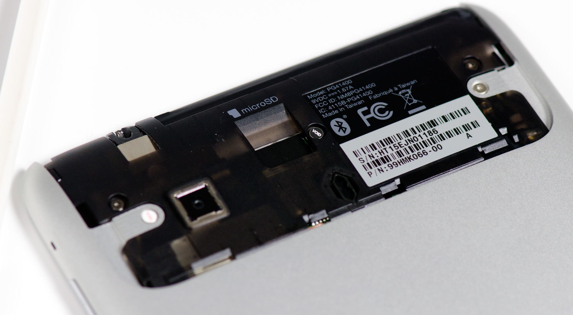
There are two tiny speaker grills on the back as well for stereo sound. Sound quality isn't anything to write home about, the speakers get loud but harsh at the same time.


26 Comments
View All Comments
wintermute000 - Tuesday, June 21, 2011 - link
unfortunately with ipad parity pricing its a fail. no 3G option either, what's the point of 7" portability if its not always on. If it had 3G for 500USD you're at least in the ballpark.I say this as a happy original SG tab owner (here in Oz, they dropped the full 3G toting version to 300USD briefly, sold like hotcakes, guess why). It really made me appreciate the 7" form factor in combination with always on internet (gingerbread surprisingly isn't too bad as a tablet OS, aside from some apps that were never meant for the bigger res). But its too expensive.
wonder if the bootloader is locked. If not the 3G version could be a nice value 2nd hand pickup in 6-9 months
Shadowmaster625 - Tuesday, June 21, 2011 - link
What point is there in racing to get a $500 tablet on the market. The only people who are going to buy these things are the really dumb suckers. The same people who are most likely to be wiped out by the market changes coming over the next few years. $500 is way way wayyyy too much to be spending on what is little more than a toy. I hope all these companies fail, because the entire $500 tablet market is a malinvestment.bhima - Tuesday, June 21, 2011 - link
I can't believe they don't include the pen for that money though. It has to be hard to decide to purchase any android tab thats over the asking price of the asus transformer.ripBear - Tuesday, June 21, 2011 - link
SenseUI was created to solve shortcommings of Windows Mobile. HTC ported it to Android in order to create a unique offer in this platform based on the positive reviews it got from WinMo implementation.RandomUsername3245 - Tuesday, June 21, 2011 - link
Advertizing with audio that is enabled by a simple mouse-over means Anandtech.com has been removed from my Flashblock Whitelist.Anand Lal Shimpi - Tuesday, June 21, 2011 - link
None of our direct ads have mouse-over audio (it's a policy of ours), this must've been a network ad. Do you have any details on the ad you saw? A screenshot, description, linked URL, etc... If you can email me anything you have (anand AT anandtech DOT com) I'll send it on to our ad partner that can hopefully get it scrubbed from the site entirely.Take care,
Anand
LostPassword - Tuesday, June 21, 2011 - link
if this thing can't even come out with honeycomb out the box, good luck getting updates.taltamir - Tuesday, June 21, 2011 - link
Puns are awesome, but you really shouldn't inform the readers every time you make one. Yes, we get it. And if we don't then that's ok too. Putting a (hey look I made a pun) after every one just detracts from the writing.Impulses - Tuesday, June 21, 2011 - link
I didn't mind this... Although they felt like the comments editors sometimes introduce into their writer's articles, except here I think it was just Anand commenting upon himself. :pNihility - Tuesday, June 21, 2011 - link
It was tasteful. No problems with it here.