Motorola Xoom Review: The First Honeycomb Tablet Arrives
by Anand Lal Shimpi on February 23, 2011 11:57 PM ESTWelcome to Honeycomb
The first Android tablets were laughable. Without changes to the UI Android doesn’t scale well to a larger screen, not to mention the lack of tablet specific apps Oh but what’s this? Android’s all grown up:
It doesn’t look like iOS but it surely doesn’t look like any version of Android we’ve seen before. Honeycomb is Google stating plainly that it can tear up blueprints and reinvent itself with the best of them.
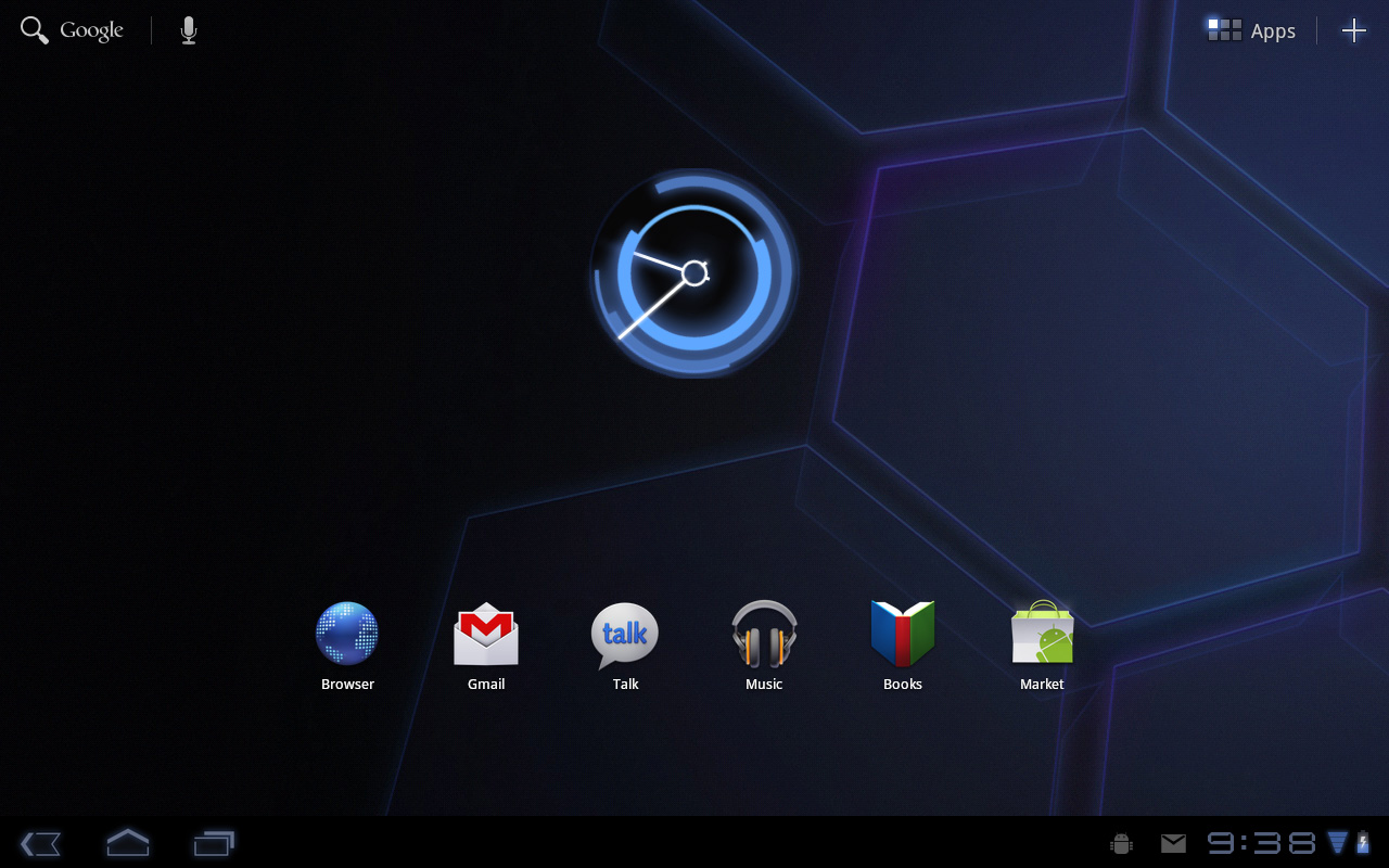
Pick up any Android phone and you’ll see four buttons, either capacitive touch or physical switch, along the bottom of the front face: Home, Menu, Back and Search. The order was up to manufacturer interpretation but all four had to be present. Honeycomb nixes two (Search and Menu) and adds one (Tasks). Google also moved the buttons from the screen bezel to on the screen itself - the buttons aren’t just capacitive, they are a part of the OS.
![]()
Back, Home, Tasks
The order is fixed: Back, Home and Tasks. As of now there’s no customizing the Honeycomb UI - say goodbye to Motoblur, Sense and TouchWiz. The location is also fixed: bottom left. My biggest complaint here are the icons themselves, they are unnecessarily ambiguous at first sight and do take some getting used to for Android and iOS users alike.
The entire UI motif is Tron meets Robocop. Swipe between home screens and you’ll get a thin blue outline of the previous/next screens as you move. The fonts used for links at the top of the page are more expected, while everything along the bottom of the screen is a bit more 80s sci-fi. I don’t personally believe this is ultimately what Google will settle on for tablet UIs, but it shows a willingness to try something new and different, which is the quickest way to ensure that Android will remain relevant as this market evolves.
I suspect the ideal tablet UI is probably not too far off what modern desktop OSes have become. While a smartphone’s UI must be dramatically different due to the lack of screen real estate, a tablet UI just needs to be more efficient than its desktop counterpart - not necessarily very different.
I believe Google is beginning to realize this as Honeycomb has some very desktop-like elements in its design. What was once a pull down shade at the top of the UI is now a notification bar in the lower right of the screen, eerily reminiscent of the Windows system tray - just not as frustratingly cluttered.
![]()
Notifications
There are also clock, WiFi and battery status indicators down there, but I’ll stop drawing parallels. The point is that this works well and I expect that we’ll continue to see a lot of convergence between the desktop and tablet OS UIs (and eventually the OSes themselves, isn’t evolution fun?).
Overall the UI is amazingly clean and very well done. It's not perfect, but I'm pleasantly surprised - all this time I thought Android was just super functional, who knew it could look great as well?


112 Comments
View All Comments
Impulses - Friday, February 25, 2011 - link
Yeah, heh, I use ADW and every single one of my widgets is a scrolling widget (save for the weather widget). This is where I think a lot of people reviewing Android devices miss the mark... They're too focused on the stock software experience, yet one of Android's strengths is how customizable that experience is. You don't have to hack your device or be a geek to install an alternate launcher and a couple of widgets...On my home screen I have a 2x2 SCROLLING widget with my to-do list and immediate appointments, flanked on the right by a 2x2 music player widget w/album art, some shortcuts on the bottom and weather up top. On a different screen I've got a 2x4 SCROLLING widget w/my facebook/email feed (super customizable), elsewhere another 2x4 SCROLLING widget w/a grid calendar, and finally a 3x4 SCROLLING widget w/my news feed.
Those widgets even employ some basic pop-up windows when you interact with them... Hell, they're so well coded they scroll smoother than almost anything else on my phone (though they don't update instantaneously to reflect changes, fast enough tho). Stuff like this is very real and very widely used on Android, but nigh impossible on any other mobile OS, and it's just not taken into account during almost any reviews.
Slap LauncherPro or ADW on many of these phones and half the experience changes dramatically... To review Android devices as if these things don't exist is kind of weird imo.
strikeback03 - Friday, February 25, 2011 - link
While I agree that an article covering some of the customizations available (without rooting) would be useful, I think the bulk of the reviews has to carried out on primarily stock software. A lot of general consumers just want to use the device as is, not be configuring everything.Jinded - Friday, February 25, 2011 - link
This is true to an extent, but if one of the often-quoted advantages of iOS, for example, is the plethora of downloadable apps, then the advantages of Android, such as widgets, especially scrollable and interactive ones, should be pointed out as well.rwei - Thursday, February 24, 2011 - link
Embargoes, not so much3DoubleD - Thursday, February 24, 2011 - link
The third image on the Google Video Chat page says it all... (I like how you squeezed that in there Anand)@ $799, who would buy this?!? The Motorola Execs were smoking some strong stuff to come into the market a year late AND priced above the dominant player, Apple. If everything was perfectly executed on this device and it put the upcoming iPad2 to shame, the price would be justified. This isn't the case though as the lackluster screen, annoying charger, and (current) general instability leaves Apple ample room to upset Motorola's "attempted" market position. Upon release of the iPad2, the Xoom price must fall.
$499 for the Wifi and 3G (with contract) would make more sense. There is simply no room in today's market for a company to compete with Apple on who can sell the highest margin products! On the other hand, perhaps Motorola expects their sales to eat their production capacity whether they are competitive with the iPad2 or not.
Chudilo - Thursday, February 24, 2011 - link
Shame on MOTO for disabling Misro-USB charging. If they wanted to provide a faster charge option, fine. I should still be able to charge it via a standard plug. If it takes 10hrs to charge over microUSB , so be it. It's still better then lugging an extra power adapter around (I just want the option) . If it's an open OS , you've gotta follow through with the hardware. This just made this thing a lot less portable. You can not carry it as a magazine anymore(you can't do it with an iPad either, but again, you shouldn't be trying to match them, you should be trying to beat them).Ideally leaving it plugged in overnight would give it enough juice to run for a decent amount of time. Since this isn't a productivity centered device, it will most likely be plugged in through the night, then be used for a few minuted in the morning to check latest news/weather/music, then be plugged in again for the rest of the day until evening. If you forgot to plug it in then you can always use the fast charger to charge it while you're using it.
I'm going to have wait to see what the docking options will be.
RLMb - Thursday, February 24, 2011 - link
Great review. Very objective and detailed.It's funny how the dynamics of blogs playout. Sites like Engadget, Techcrunch, etc. have their writers write shallow, opinionated, many times with plain false statements. These articles draw hordes of commenters, half calling on the article, the other half defending the article because it "proves" the point they want to make. Other than that they tend to be Apple biased.
I am going to buy the Xoom, the subsidized version with 3G.
I am not a big fan of 2y contracts in general, but I think this one is worth it. The total cost over 2 years is 600 + 480 = 1080 and That gives me 3g access, albeit limited.
If I could buy the same $20/1GB plan for the Ipad, that would cost me $730+480 = 1210 If I used 3g every month. This is $130 more than the Xoom price, so even if I did not use the contract for 6.5 months on the ipad (say vacation, etc.) the Xoom would still be cheaper.
Of course, if you do not plan to use the 3G you should but the Wifi only version.
Impulses - Friday, February 25, 2011 - link
Buying any of these under contract is inane if you're already paying for a smartphone ('cept maybe if you're on AT&T and shackled w/a 2GB data cap)... Just tether them to your phone and use the data connection you're already paying for. If you're gonna be using it for hours on end chances are you're near WiFi anyway (or you can find an outlet to charge your phone and offset the power usage tethering incurs).darckhart - Thursday, February 24, 2011 - link
Pricing on these tablets is all out of wack. I don't argue the functionality and convenience, but the price puts it in the tier of low to mid notebook. How is what amounts to smartphone processing capability, form factor, and touch equal to a notebook? It just isn't. Unfortunately, the ipad set the bar for pricing and people were willing to pay, thus ushering in another sorely mispriced gadget. With the current specs of tablets, they should have debuted in the 250-450$ range.strikeback03 - Thursday, February 24, 2011 - link
Remember, unsubsidized prices on high-end smartphones are generally in the $450-700 range as well. Add a bigger screen and battery and you end up with the unsubsidized prices we are seeing.Devices which try to pack lots of power in smaller spaces have always cost a premium relative to the amount of silicon inside.
That said I think the Xoom would make a lot more sense with a $100-150 price drop in both subsidized and unsubsidized form.