Motorola Xoom Review: The First Honeycomb Tablet Arrives
by Anand Lal Shimpi on February 23, 2011 11:57 PM ESTA PC-like Tablet Browser
When I reviewed the iPad I wrote that web browsing was the killer app for the device. Today, with a healthy number of pretty impressive apps I don’t believe the iPad has to exclusively rely on web browsing to sell itself but it remains an important part of the tablet experience.
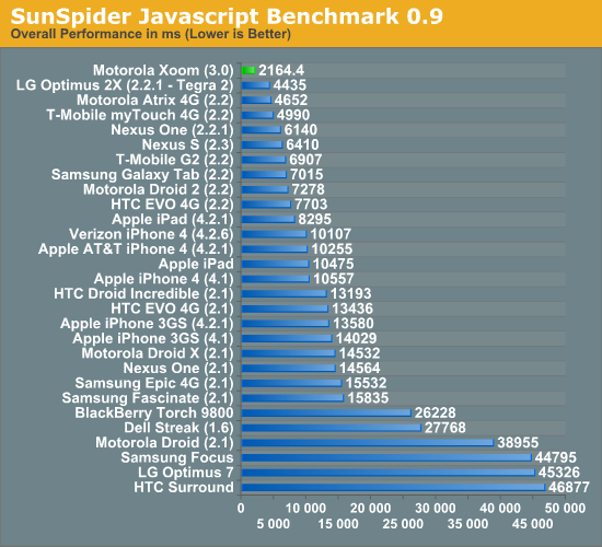
As such, Google focused very heavily on the browsing experience on Honeycomb and I can honestly say it’s better than what you get with the iPad today. There’s the performance first and foremost, the Honeycomb browser is unbelievably fast and it’s running on the fastest SoC shipping today: NVIDIA’s Tegra 2 (T20).
We’ve put together a new suite of web page loading tests that I’d like to debut in this article. The pages are served from a machine on the local network (the device never has to talk to the public internet) and thus this is a best case scenario for web page loading performance. The pages are automatically timed as they load. The browser cache is cleared before the first load and then each page is loaded another 7 times. I repeat the process on a total of 6 web pages and present an average of all of the times. The web pages tested are the front pages of AnandTech, Amazon, CNN, Engadget, Reddit and NY Times.
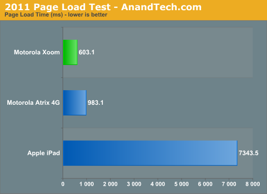
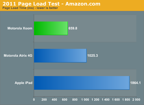
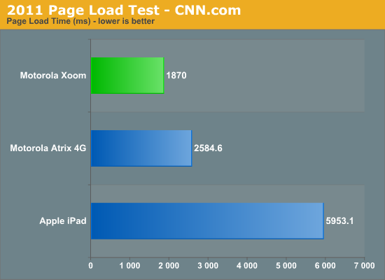
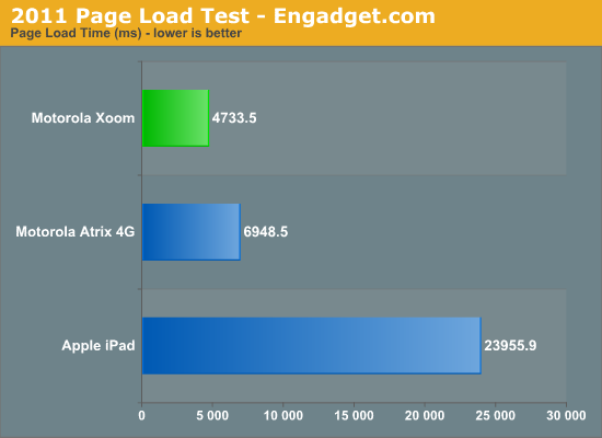
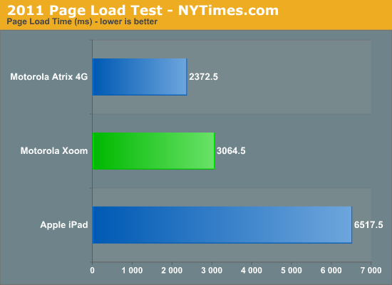
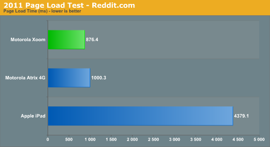
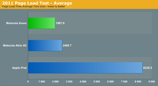
Simply put: the Xoom puts the iPad to shame. The combination of an ultra fast javascript engine with a pair of 1GHz Cortex A9s makes the Xoom feel less like a tablet and more like a PC when browsing the web. Particularly over WiFi the web browsing experience is just awesome. It’s like using a netbook, which in this case isn’t meant as a knock but rather a compliment.
It’s not all about performance though, functionally the Honeycomb Browser is a huge improvement over anything else out there: it supports tabbed browsing. I can’t stress how much better this makes browsing on a tablet. Switching between tabs is just as easy as it is on your PC or Mac, you just use your finger instead of a mouse or keyboard combination.
Google also allows an optional experimental UI that does away with the conventional controls altogether and gives you a popup dial that only appears when you swipe your thumb in either the left or right margins of the screen.
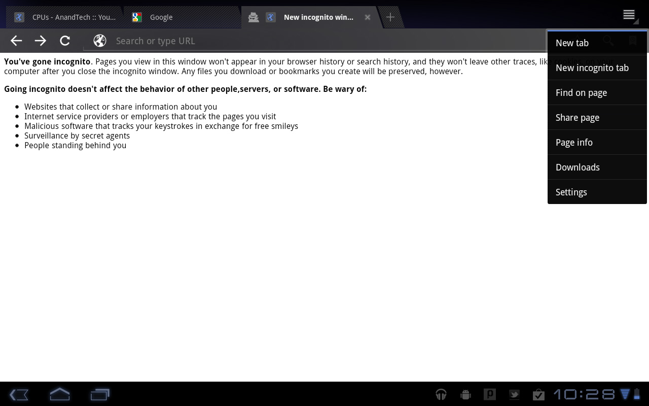
There’s full support for incognito mode and Find on Page, just like you’d find in Chrome on the desktop.
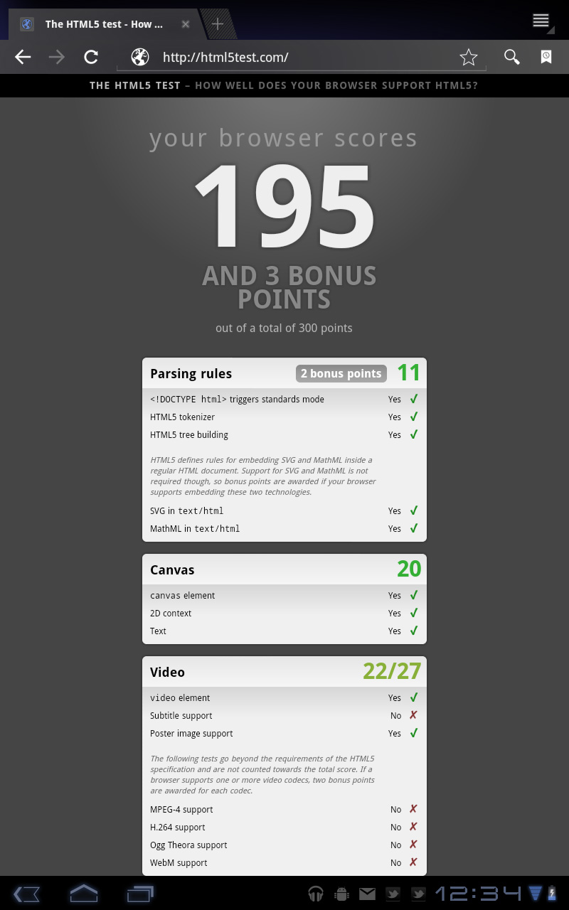
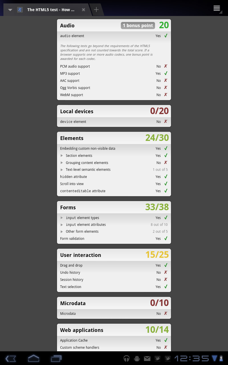
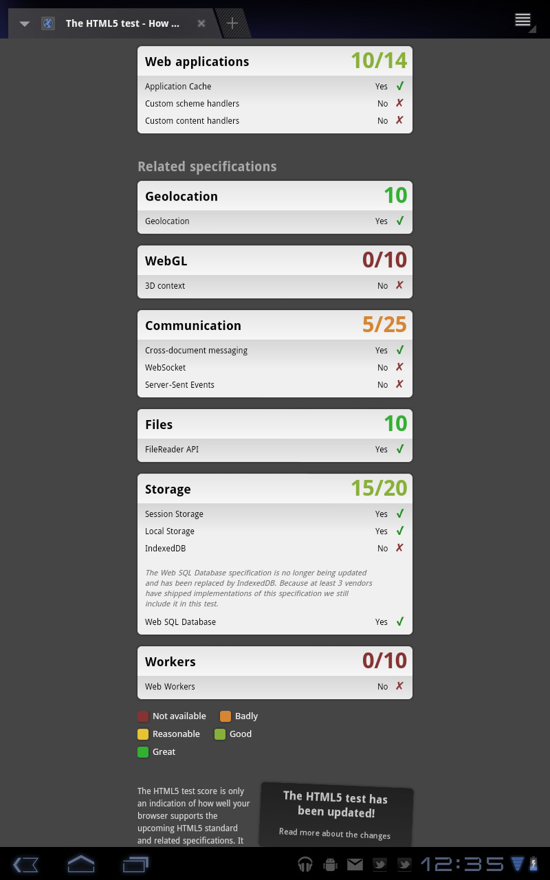
In terms of standards compliance, the Honeycomb Browser passes the Acid3 test but only manages a score of 195 (+3 bonus points) in the HTML5 test.

 |
 |
 |
This is the future of tablet apps. As tablet hardware becomes more powerful we’ll end up running full desktop applications on these devices. This is only the beginning and Google clearly gets where it’s headed.


112 Comments
View All Comments
softdrinkviking - Thursday, February 24, 2011 - link
anand writes... "I suspect the ideal tablet UI is probably not too far off what modern desktop OSes have become. While a smartphone’s UI must be dramatically different due to the lack of screen real estate, a tablet UI just needs to be more efficient than its desktop counterpart - not necessarily very different."this is an interesting thought, and I am wondering if you are considering the, potentially, drastically different usage models that tablets need to be built for.
not only will people be using these things on the run, but the ways I see people using them now are really different from desktops.
tablets really lend themselves to task integration, where you have a specific reason to use it over and over.
for example, I have seen the subway/train information officers using them here in Japan to give people directions, and I see store clerks using them to implement inventory management software.
that kind of usage demands quick access to a limited number of functions and a low level of file maintenance.
If anything, I would have guessed it the other-way around, where tablets will need to be closer to a smartphone OS, but adjusted for the larger screen real estate.
mlambert890 - Thursday, February 24, 2011 - link
100% spot on. This is where the enthusiast niche that follows forums, and the reviewers and bloggers that server them, can't seem to "get it"For tech geeks, a slightly tweaked desktop metaphor is what they want from a tablet (for the ones that even want one at all). For the vast majority of the target audience, this absolutely misses the mark which is why iOS on iPad, despite all of the nerd rage towards it, has done so well.
I'm as geek as geek gets with 20+ years in this industry, but these days as an old guy, I am also a mobile professional. On the road, which is all the time, for work, i need exactly what you describe. Quick, efficient, task focused access.
I'm not geeking out at a Starbucks or doing proofs of concept (WoW on emu on Android on Xoom!!!) for YouTube. I'm doing email, note taking, Webex and reading/presenting on the go.
If google inches towards a tweaked desktop UX paradigm they will be making the same mistake MSFT did (and continues to) with their tablet efforts.
The hardcore tech crowd might be happy, but they are a micro percentage of this market.
bplewis24 - Thursday, February 24, 2011 - link
Did you miss the part of the review where Honeycomb was better in all of those areas? Or did you just focus on a quote taken out of context which compares this OS to a desktop OS?Never mind, I already know the answer.
Brandon
ccrobopid - Thursday, February 24, 2011 - link
I was waiting for your review of the Xoom. Goog job on your part, but I must say I'm a little disappointed with the hardware. On a tablet the screen quality sure is one of the most important elements, and at this price point I don't think I'll buy it. I also don't get the 16:10 aspect. Widescreen had sense in BIG screens because we have more degrees of vision sidewards, but at this screen size I prefer a 4:3 format because I feel it's more useful for web browsing, reading and apps in general.ccrobopid - Thursday, February 24, 2011 - link
Complementing my post, if it wasn't for the too boxed experience, I still feel like iPad is the device to have. Let's see if iPad2 launches and throws away some of that "boxeness" :Dmacs - Thursday, February 24, 2011 - link
Honeycomb needs:- an update to solve the youth problems
- great screen (at least as good as iPad)
- 16gb and wifi only for 499$
Apple needs:
- to catch up Honeycomb on software side (multitasking,browser,... I don't think that an iPad 2 still running iOS 4.x would be enough...)
- faster SoC (A5 dual core)
- Facetime Camera
- Video Out
Shadowmaster625 - Thursday, February 24, 2011 - link
I have a great idea. Let's all go spend $800 (+ $50 in tax) to have a tablet that crashes constantly and cant be viewed outside. Crackhead.Mr Alpha - Thursday, February 24, 2011 - link
I would really like to see minimum brightness numbers. The ability to turn the back-light way down is important in order to avoid a headache when reading something in a low light situation. The iPad for example has a too high minimum brightness.josephandrews222 - Thursday, February 24, 2011 - link
...you wrote this:"Things like this combined with the instability I mentioned earlier makes me feel like Honeycomb was a bit rushed, perhaps to hit the streets before one other major tablet announcement coming this year?"
...you referring to the iPad2 or HP's 'Pad'?
I really enjoyed this review. A lot. Thanks.
Jinded - Thursday, February 24, 2011 - link
On the Multitasking page, you mention the following about widgets:"In Gingerbread and prior version of Android, widgets were fairly constrained and two dimensional. You could display information within the widget but there was no depth and no concept of scrolling."
I don't think this is quite true, as several launchers (like LauncherPro) support vertically scrolling widgets. I myself use Agenda Widget as a scrollable 1x4 calendar widget. The Samsung TouchWiz interface (and I'm sure others as well) also comes with several widgets set up rolodex-style, displaying maybe the last 10 or so notifications/pictures/events that can be scrolled using up/down buttons. Not quite the same thing as a scrollable widget, but I think it counts as having depth.