Motorola Xoom Review: The First Honeycomb Tablet Arrives
by Anand Lal Shimpi on February 23, 2011 11:57 PM ESTWelcome to Honeycomb
The first Android tablets were laughable. Without changes to the UI Android doesn’t scale well to a larger screen, not to mention the lack of tablet specific apps Oh but what’s this? Android’s all grown up:
It doesn’t look like iOS but it surely doesn’t look like any version of Android we’ve seen before. Honeycomb is Google stating plainly that it can tear up blueprints and reinvent itself with the best of them.
Pick up any Android phone and you’ll see four buttons, either capacitive touch or physical switch, along the bottom of the front face: Home, Menu, Back and Search. The order was up to manufacturer interpretation but all four had to be present. Honeycomb nixes two (Search and Menu) and adds one (Tasks). Google also moved the buttons from the screen bezel to on the screen itself - the buttons aren’t just capacitive, they are a part of the OS.
![]()
Back, Home, Tasks
The order is fixed: Back, Home and Tasks. As of now there’s no customizing the Honeycomb UI - say goodbye to Motoblur, Sense and TouchWiz. The location is also fixed: bottom left. My biggest complaint here are the icons themselves, they are unnecessarily ambiguous at first sight and do take some getting used to for Android and iOS users alike.
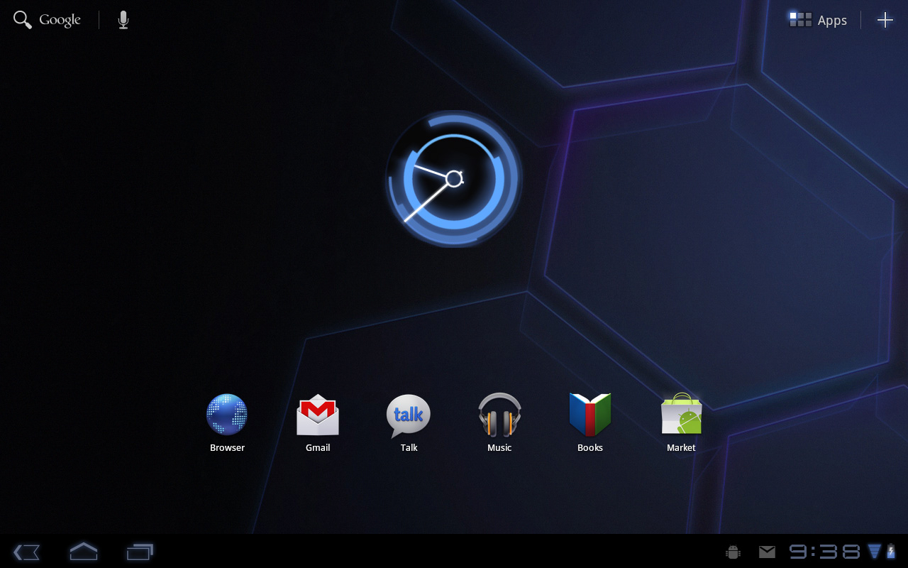
The entire UI motif is Tron meets Robocop. Swipe between home screens and you’ll get a thin blue outline of the previous/next screens as you move. The fonts used for links at the top of the page are more expected, while everything along the bottom of the screen is a bit more 80s sci-fi. I don’t personally believe this is ultimately what Google will settle on for tablet UIs, but it shows a willingness to try something new and different, which is the quickest way to ensure that Android will remain relevant as this market evolves.
I suspect the ideal tablet UI is probably not too far off what modern desktop OSes have become. While a smartphone’s UI must be dramatically different due to the lack of screen real estate, a tablet UI just needs to be more efficient than its desktop counterpart - not necessarily very different.
I believe Google is beginning to realize this as Honeycomb has some very desktop-like elements in its design. What was once a pull down shade at the top of the UI is now a notification bar in the lower right of the screen, eerily reminiscent of the Windows system tray - just not as frustratingly cluttered.
![]()
Notifications
There are also clock, WiFi and battery status indicators down there, but I’ll stop drawing parallels. The point is that this works well and I expect that we’ll continue to see a lot of convergence between the desktop and tablet OS UIs (and eventually the OSes themselves, isn’t evolution fun?).
Overall the UI is amazingly clean and very well done. It's not perfect, but I'm pleasantly surprised - all this time I thought Android was just super functional, who knew it could look great as well?


112 Comments
View All Comments
softdrinkviking - Thursday, February 24, 2011 - link
anand writes... "I suspect the ideal tablet UI is probably not too far off what modern desktop OSes have become. While a smartphone’s UI must be dramatically different due to the lack of screen real estate, a tablet UI just needs to be more efficient than its desktop counterpart - not necessarily very different."this is an interesting thought, and I am wondering if you are considering the, potentially, drastically different usage models that tablets need to be built for.
not only will people be using these things on the run, but the ways I see people using them now are really different from desktops.
tablets really lend themselves to task integration, where you have a specific reason to use it over and over.
for example, I have seen the subway/train information officers using them here in Japan to give people directions, and I see store clerks using them to implement inventory management software.
that kind of usage demands quick access to a limited number of functions and a low level of file maintenance.
If anything, I would have guessed it the other-way around, where tablets will need to be closer to a smartphone OS, but adjusted for the larger screen real estate.
mlambert890 - Thursday, February 24, 2011 - link
100% spot on. This is where the enthusiast niche that follows forums, and the reviewers and bloggers that server them, can't seem to "get it"For tech geeks, a slightly tweaked desktop metaphor is what they want from a tablet (for the ones that even want one at all). For the vast majority of the target audience, this absolutely misses the mark which is why iOS on iPad, despite all of the nerd rage towards it, has done so well.
I'm as geek as geek gets with 20+ years in this industry, but these days as an old guy, I am also a mobile professional. On the road, which is all the time, for work, i need exactly what you describe. Quick, efficient, task focused access.
I'm not geeking out at a Starbucks or doing proofs of concept (WoW on emu on Android on Xoom!!!) for YouTube. I'm doing email, note taking, Webex and reading/presenting on the go.
If google inches towards a tweaked desktop UX paradigm they will be making the same mistake MSFT did (and continues to) with their tablet efforts.
The hardcore tech crowd might be happy, but they are a micro percentage of this market.
bplewis24 - Thursday, February 24, 2011 - link
Did you miss the part of the review where Honeycomb was better in all of those areas? Or did you just focus on a quote taken out of context which compares this OS to a desktop OS?Never mind, I already know the answer.
Brandon
ccrobopid - Thursday, February 24, 2011 - link
I was waiting for your review of the Xoom. Goog job on your part, but I must say I'm a little disappointed with the hardware. On a tablet the screen quality sure is one of the most important elements, and at this price point I don't think I'll buy it. I also don't get the 16:10 aspect. Widescreen had sense in BIG screens because we have more degrees of vision sidewards, but at this screen size I prefer a 4:3 format because I feel it's more useful for web browsing, reading and apps in general.ccrobopid - Thursday, February 24, 2011 - link
Complementing my post, if it wasn't for the too boxed experience, I still feel like iPad is the device to have. Let's see if iPad2 launches and throws away some of that "boxeness" :Dmacs - Thursday, February 24, 2011 - link
Honeycomb needs:- an update to solve the youth problems
- great screen (at least as good as iPad)
- 16gb and wifi only for 499$
Apple needs:
- to catch up Honeycomb on software side (multitasking,browser,... I don't think that an iPad 2 still running iOS 4.x would be enough...)
- faster SoC (A5 dual core)
- Facetime Camera
- Video Out
Shadowmaster625 - Thursday, February 24, 2011 - link
I have a great idea. Let's all go spend $800 (+ $50 in tax) to have a tablet that crashes constantly and cant be viewed outside. Crackhead.Mr Alpha - Thursday, February 24, 2011 - link
I would really like to see minimum brightness numbers. The ability to turn the back-light way down is important in order to avoid a headache when reading something in a low light situation. The iPad for example has a too high minimum brightness.josephandrews222 - Thursday, February 24, 2011 - link
...you wrote this:"Things like this combined with the instability I mentioned earlier makes me feel like Honeycomb was a bit rushed, perhaps to hit the streets before one other major tablet announcement coming this year?"
...you referring to the iPad2 or HP's 'Pad'?
I really enjoyed this review. A lot. Thanks.
Jinded - Thursday, February 24, 2011 - link
On the Multitasking page, you mention the following about widgets:"In Gingerbread and prior version of Android, widgets were fairly constrained and two dimensional. You could display information within the widget but there was no depth and no concept of scrolling."
I don't think this is quite true, as several launchers (like LauncherPro) support vertically scrolling widgets. I myself use Agenda Widget as a scrollable 1x4 calendar widget. The Samsung TouchWiz interface (and I'm sure others as well) also comes with several widgets set up rolodex-style, displaying maybe the last 10 or so notifications/pictures/events that can be scrolled using up/down buttons. Not quite the same thing as a scrollable widget, but I think it counts as having depth.