Motorola Xoom Review: The First Honeycomb Tablet Arrives
by Anand Lal Shimpi on February 23, 2011 11:57 PM ESTWelcome to Honeycomb
The first Android tablets were laughable. Without changes to the UI Android doesn’t scale well to a larger screen, not to mention the lack of tablet specific apps Oh but what’s this? Android’s all grown up:
It doesn’t look like iOS but it surely doesn’t look like any version of Android we’ve seen before. Honeycomb is Google stating plainly that it can tear up blueprints and reinvent itself with the best of them.
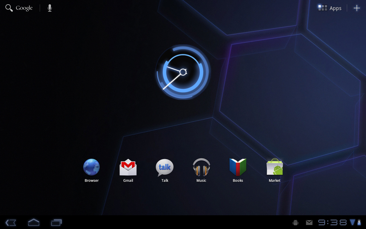
Pick up any Android phone and you’ll see four buttons, either capacitive touch or physical switch, along the bottom of the front face: Home, Menu, Back and Search. The order was up to manufacturer interpretation but all four had to be present. Honeycomb nixes two (Search and Menu) and adds one (Tasks). Google also moved the buttons from the screen bezel to on the screen itself - the buttons aren’t just capacitive, they are a part of the OS.
![]()
Back, Home, Tasks
The order is fixed: Back, Home and Tasks. As of now there’s no customizing the Honeycomb UI - say goodbye to Motoblur, Sense and TouchWiz. The location is also fixed: bottom left. My biggest complaint here are the icons themselves, they are unnecessarily ambiguous at first sight and do take some getting used to for Android and iOS users alike.
The entire UI motif is Tron meets Robocop. Swipe between home screens and you’ll get a thin blue outline of the previous/next screens as you move. The fonts used for links at the top of the page are more expected, while everything along the bottom of the screen is a bit more 80s sci-fi. I don’t personally believe this is ultimately what Google will settle on for tablet UIs, but it shows a willingness to try something new and different, which is the quickest way to ensure that Android will remain relevant as this market evolves.
I suspect the ideal tablet UI is probably not too far off what modern desktop OSes have become. While a smartphone’s UI must be dramatically different due to the lack of screen real estate, a tablet UI just needs to be more efficient than its desktop counterpart - not necessarily very different.
I believe Google is beginning to realize this as Honeycomb has some very desktop-like elements in its design. What was once a pull down shade at the top of the UI is now a notification bar in the lower right of the screen, eerily reminiscent of the Windows system tray - just not as frustratingly cluttered.
![]()
Notifications
There are also clock, WiFi and battery status indicators down there, but I’ll stop drawing parallels. The point is that this works well and I expect that we’ll continue to see a lot of convergence between the desktop and tablet OS UIs (and eventually the OSes themselves, isn’t evolution fun?).
Overall the UI is amazingly clean and very well done. It's not perfect, but I'm pleasantly surprised - all this time I thought Android was just super functional, who knew it could look great as well?


112 Comments
View All Comments
Impulses - Thursday, February 24, 2011 - link
Wow, it loads pages three to eight times faster than the iPad? I didn't realize Tegra 2 was THAT much faster. Did you run that same page load test during the Atrix review? I must've glossed over it.Impulses - Thursday, February 24, 2011 - link
Preview rather.dcollins - Thursday, February 24, 2011 - link
It's a combination of Tegra 2 and Chrome being much faster than Safari. I would assume Chrome for Android 3.0 was optimized even more heavily than Chrome for Windows, which remains the performance leader on the desktop.samirsshah - Thursday, February 24, 2011 - link
make that your SD Card reader SDXC rather than SDHC and just like that utility of Zoom increase twofold because you can store more media. Rumor has it that Apple is going SDXC in their new MacBooks.Impulses - Thursday, February 24, 2011 - link
SDHC should be good for most people's needs, they go up to at least 64GB no? I mean, even 32GB is a lot of music... Judging by MP3 player sales most people don't care to bring their entire collection of music with them, and if you're at home there's plenty of streaming solutions (or even if you aren't).Impulses - Thursday, February 24, 2011 - link
I like the intro... I also feel that at these prices tablets are a little bit too much of a luxury item for anyone that has or needs a laptop. For those of us, the tablet's still a third or fourth device (behind phone, laptop/netbook, and possibly a desktop); and at $800 I simply can't justify it. I'd rather upgrade one of my other devices. For people with just a desktop or a heavy desktop replacement laptop I imagine that tablets hold a higher appel, particularly if the don't need a portable system for work/study.Impulses - Thursday, February 24, 2011 - link
Honeycomb is certainly an impressive release tho, given how quickly after Gingerbread it arrived (had obviously been in the works way earlier)... I'm excited to see where future wifi only models fall. If they sold it at $500 or under with 16gb or even 8gb and no 3g radio they'd fly off the shelves... But just like when the iPad first arrived, I think Moto is well aware they have a superior product so they can charge whatever they want for now.Enormously Hatworthy - Thursday, February 24, 2011 - link
There's a wifi only 16GB version of the Galaxy Tab 10.1 on the way. Pricing for the 16GB 3G version looks to be around €699 so that could come down to €599 without the 3G radio.Plus it'll have Samsung's screen tech and it weighs a quarter of a pound less than the iPad.
Sounds like a winner to me.
Enormously Hatworthy - Thursday, February 24, 2011 - link
Oh and if you have the pleasure of owning one of Samsung's newer wifi enabled TVs, you'll be able to stream live tv to your Tablet.Unfortunately I don't have the pleasure :(
mcnabney - Saturday, February 26, 2011 - link
And by purchasing Samsung, you can forget about getting updated to 3.1 or 3.2.