Google Android 3.0 - Honeycomb Preview
by Saumitra Bhagwat on February 21, 2011 7:07 AM EST- Posted in
- Smartphones
- Honeycomb
- Android
- Mobile
Note to Readers: Saumitra is one of the newest members of our smartphone team. He has contributed to articles in the past but we'd like to formally welcome him to the AnandTech team. Saumitra will be focusing on everything Android and iOS. Welcome Saumitra!
The tablet market today is a far more interesting place than it was just over a year ago. Since the launch of the iPad, there hasn’t been a real competitor to iOS in the tablet space. We’ve seen customized versions of Android for larger devices like the Galaxy Tab, but they’ve all had their fair share of limitations. In fact, Android releases up to Gingerbread were never really designed to be used on larger screens. But Honeycomb has the potential to change all that and it could be just the catalyst manufacturers need to come up with the next iPad-killer.
It’s been public knowledge that Honeycomb (v3.0) was going to be the next major release of Android after Gingerbread (v2.3). It all started when Andy Rubin showed up at the D: Dive Into Mobile event with a mysterious looking tablet that was later revealed to be the Motorola Xoom running Honeycomb. CES gave us a sneak peek at Xoom and a host of other tablets that would run Honeycomb. At the Honeycomb launch event a few weeks back, Google gave us a full-blown preview of the OS. Now, with the Xoom releasing this month, the time has come for Google's official answer to the iPad.
Honeycomb has been designed ground-up for use on tablets. Google also confirmed that Honeycomb is a tablet-only OS for the time being and that some of the new features would eventually transition over to phone versions of the OS. That’s where the next release of Android codenamed Ice Cream comes into picture; more on that later. Honeycomb represents Google’s first effort to be a serious contender in the tablet market. Make no mistake here Honeycomb is an absolutely massive release with a smorgasbord of new user and developer features; some of which are so well implemented that they could give iOS a run for it’s money. Without further ado, let us dive into the juicy bits.
Home Screen
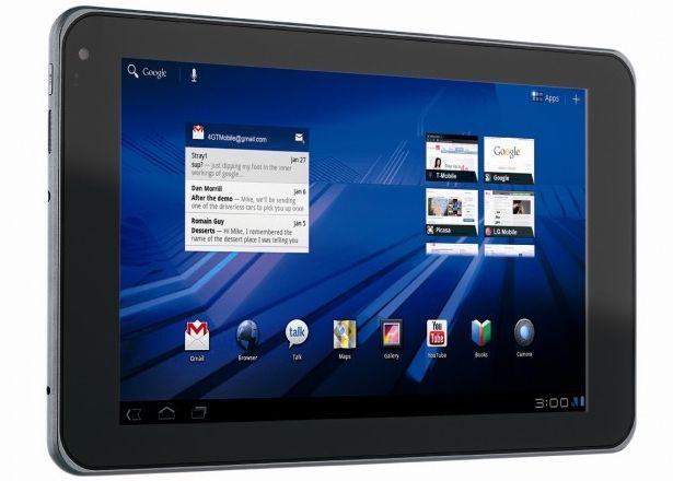
First up, you’re immediately greeted by new home screen. It’s slick, futuristic and predictably neon. Google calls this the holographic UI design based on a content focused interaction model. The new home screen has a very clean layout; there’s the new notifications bar on the bottom right, and three buttons on the left that let you go back, go home and use the new multitasking UI. On the top we have the Google search bar, applications drawer and the add button for adding shortcuts, widgets and other stuff to the home screen.
There are five home screens that you can swipe between; clicking the Add button displays a side-scrollable list of available widgets, applications and wallpapers in the lower half of the screen, and a preview of the five home screens in the upper half. The applications drawer shows a similar preview, but in the bottom half of the screen. Overall, the home screen in Honeycomb is laid out nicely and makes good use of the added real estate offered by tablet-sized screens. Its informative, unobtrusive and yet offers ample space for widgets and other items.
Notification Bar
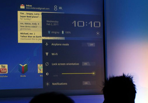
Honeycomb moves the beloved Android notification bar into relative obscurity; tucked away in the bottom right corner of the screen. It displays only the bare essentials; the time, network connections and battery life when not actively in use. Once you click on the notifications bar, it pops out to show you a detailed system status and lets you access things like brightness, screen orientation, notifications and so on; much like the Power Control widget on Android phones. With Honeycomb, Google has overhauled the notification system by leaps and bounds. Notifications are now much more detailed and are very Growl-like. Notifications from apps like the Music Player show album art and let you control music right from the notification. The Google Talk app for example, shows display pictures and message previews. Notifications can therefore leverage the new UI framework in Honeycomb to include images and other elements to offer users more granular control over apps directly from the home screen.
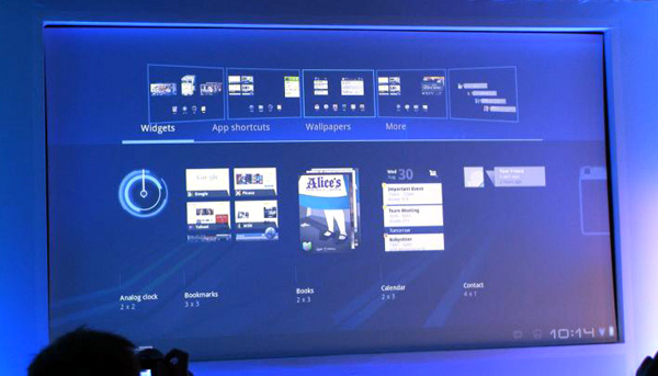
Rich Widgets
Honeycomb adds support for new interactive widgets that display more than just static information. The new widgets UI is completely redesigned to take advantage of larger tablet screens. Apps like Gmail, YouTube or the Music Player can now use new widget forms like stacks, lists and grids and update them with real-time data. For example, the Gmail widget allows users to scroll through their mailbox and the YouTube widget shows previews of videos arranged in a continuously scrollable stack. The new widgets looked stunning with smooth UI animations and transition effects. Of course, that can be partly accredited to the fact that the Xoom runs some pretty solid hardware; lets just hope Google managed to deliver this performance even on lower-end devices.
Action Bar
Google defines the Action Bar as a widget that replaces the title bar at the top of any activity within an app. It displays contextual options and settings depending on the activity being performed in an app. For example, in the Gmail app, if you’ve selected message, the action bar changes to display options like mark as unread, trash, report spam, change labels or mark as starred. The action bar is tightly integrated into the OS for activities like cut-copy-paste; where pressing and holding initiates the “select” feature and options like cut, copy, paste or share can be accessed via the action bar.
For example, in the image below, the action bar shows the app icon and the activity title on the left and useful items from the options menu as icons on the right. Any other options can be accessed via the Overflow Menu on the extreme right.
![]()
Each element that appears in the Action Bar is called an action item and has its own logo. The app icon can be used to navigate home or move up through the activity. The Overflow Menu can also be customized with icons for items not appearing on the Action Bar. The Action Bar also allows moving back and forth through fragments with action tabs. Action tabs, for example, are used extensively in the Mail app and are very useful to navigate directly to specific parts of an app. Action tabs greatly simplify navigation in Honeycomb as compared to iOS, where in most cases, you must sequentially move up the hierarchy of screens to get to the first screen.
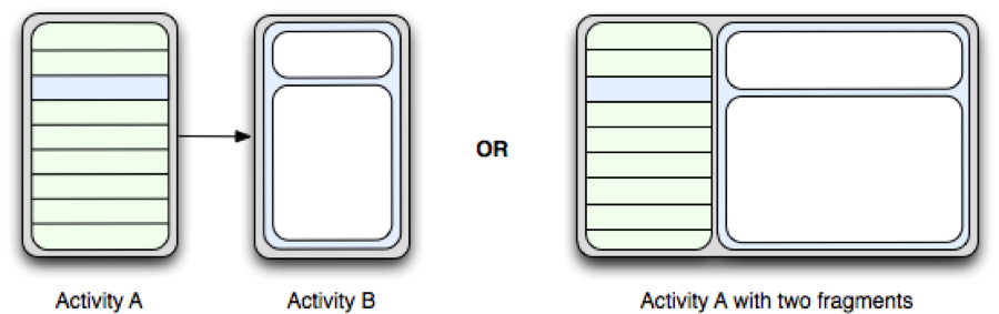
Fragments
Fragments is another addition to Honeycomb’s API to let developers create more flexible UI designs for tablet-sized screens. The larger screens make it easier to combine or interchangeably use UI components. Fragments lets developers decompose an activity into multiple fragments. For example, imagine using the Pulse app on a phone and a tablet. On the phone, owing to the limited screen size, viewing a list of articles is one activity, and reading an article is another activity. With fragments, you can combine this into one activity where one fragment shows the list of articles, and the other fragment shows the selected article. Thereafter, each fragment has its own set of callback methods and user input events. A fragment is basically a modular, reusable component with its own layout and behavior that lets it adapt to different screen sizes. In cases where this is not possible, developers can launch separate activities with independent fragments.
Multitasking
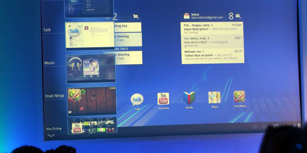
Honeycomb builds on Android’s existing multitasking support with a fresh new UI. The multitasking interface slides in from the left of the screen and populates itself as a list that shows recently used and currently running apps with the app icon and a static image of the app’s last saved state. Again, the UI is extremely clean and should work well on tablets.


65 Comments
View All Comments
vision33r - Tuesday, February 22, 2011 - link
Glad somebody pointed this out because all the fanboys are blinded by hardware performance but fails to see such balant design flaw due to their hardware fragmentation problem.Fast CPU means jack, GPU acceleration is where the UI speed will be felt.
spambonk - Tuesday, February 22, 2011 - link
Actually you are the fanboy here. For one thing there is no "fragmentation", that is how computers are on all platforms - even apple. Secondly its not a design flaw, its how programmers have chosen to do it - if people don't like what the programmers do they should complain to them.Tros - Saturday, February 26, 2011 - link
You're likely wrong objectively, but since you've chosen to subjectify "fragmentation", I doubt any argument would make sense to you.Try setting up a Hackintosh, and it'll become evident just how much PC-vendors vary from BIOS-implementations on the same chipset, not to mention actual hardware variations.
This is purely Android's fault though. Even OS X has Quartz (graphical) acceleration based purely on the CPU, that just seamlessly maps onto a more capable GPU.
Considering all the kernel work that should have gone into Android, I don't see why this hasn't been done. Unless Google has the philosophy that speed and application-freedom will win a market, instead of a steady and refined API. Given the rush to higher power components though, it's not far-fetched.
Dex1701 - Tuesday, February 22, 2011 - link
Again, GPU-accelerated UI effects come along with Android 2.3/2.4 (Gingerbread). Graphics hardware fragmentation is not an issue with a unified graphics driver model and properly-designed APIs for developers to use. Turn the rage knob counter-clockwise and turn the maturity knob clockwise, guy, there's no reason to start running around calling people fanboys. This is just a discussion, not a soap box for platform evangelism.Dex1701 - Tuesday, February 22, 2011 - link
Um...yeah, I believe I mentioned Gingerbread bringing UI speed improvements to the table. It will be in the form of GPU-accelerated UI effects and an improved graphics driver model and API. If it's designed correctly developers will NOT need to accommodate both phones with dedicated GPUs and those without. The same API should degrade gracefully to support CPU-based graphics rendering.chavv - Monday, February 21, 2011 - link
"replete with a smorgasbord of new user and developer features"Maybe not, but then why use so many english words?
tipoo - Monday, February 21, 2011 - link
Was it really that hard to understand?spambonk - Tuesday, February 22, 2011 - link
That is English - get a dictionary.deputc26 - Monday, February 21, 2011 - link
"Offers ample of space" page one just above the "Notification Bar" subtitle.Saumitra - Monday, February 21, 2011 - link
Thanks for the tip, fixed!