The Windows Phone 7 Review
by Anand Lal Shimpi & Brian Klug on October 20, 2010 7:00 PM EST- Posted in
- Smartphones
- Windows Phone 7
- Microsoft
- Mobile
Windows Phone Cloud Integration
One of the redeeming features of the failed KIN was its cloud integration. The entirety of your phone, everything from your contacts to your photos were synced with the cloud. If you ever needed to access a photo you took with your phone all you needed was your Live login and you’re good to go. While the KIN was short lived, its cloud integration features live on in Windows Phone, with some enhancements of course.
The hub for all of your Windows Phone cloud interaction is a website Microsoft put together: windowsphone.live.com. You authenticate using your Live login and once in there’s a lot you can do, all for free.
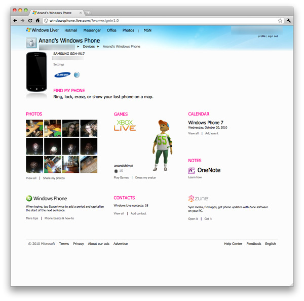
At the top left of your home page is a photo of your phone and your phone number. If you click on the Find My Phone link you’re taken to a page you can use to find your phone on a Bing map, make your phone ring, remotely lock or erase your phone entirely.
The mapping feature works pretty well. Within 30 seconds you’ll get a fairly accurate location of your phone on a map. The site also stores the position of your phone the last time you requested its location. For this feature to work you need to enable it on the phone itself. If you want more instantaneous results you can trade off battery life for location speed, presumably by just leaving the GPS radio on all the time.
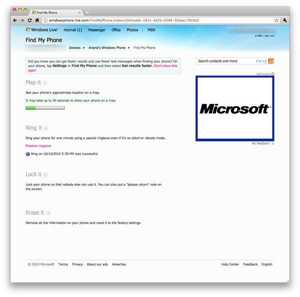
Remotely ringing your phone works as advertised. If you have your ringer off or volume turned all the way down the remote ring will still go through, although the actual ring will be quieter if your volume is turned down to 0.
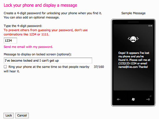
Remote locking works well. You supply a four digit password and optional message to display on the phone. Microsoft won’t let you supply a simple password like 1111 or 1234, you need to be a little more creative than that.
Finally there’s the erase function. The best part of this entire suite of tools is they are all free and they come supported on all Windows Phones.
If you’re not trying to do things remotely to your phone there’s still one very important piece of functionality windowsphone.live.com offers: automatic backup of your photos.
By default any photos you take on your Windows Phone aren’t mirrored in the cloud. However if you’re feeling trusty, you can opt to do just that. There are three levels of sharing options for your photos in the cloud: share with no one, share with friends or share with everyone.
A friend is defined as someone whose information you have in Windows Live either through your address book or Live Messenger. You can also manually add names to your friends list for the purpose of sharing photos.
Microsoft allows Facebook style sharing of photos with not only your friends, but their friends as well. You can even let your friends add their own photos, edit details and delete photos if you’d like.
Photos are uploaded in the background from your phone and they are treated as normal bandwidth usage. That means if you’re on the cellular network and you have a limited data plan, these auto-uploaded bytes count against your monthly limit. AT&T indicated that Windows Phones wouldn’t have any special treatment on the network, so you’ll pay the same rates for data that iPhone users pay.
Uploaded photos reside on your Windows Live SkyDrive account, which is automatically setup for you when you sign up for Windows Live. A single SkyDrive supports up to 25GB of storage for free, presumably you won’t be able to sync photos to the cloud beyond that amount. I say presumably because it’s nearly impossible to test. Windows Phone 7 doesn’t upload full resolution/quality images to your SkyDrive, instead you get a reduced resolution, higher compression version.
All Windows Phones have to sport at least a 5MP sensor, however photos synced to the cloud are stored at 0.3MP - 713 x 539 is what the Samsung Focus’ photos ended up as. File size was always under 90KB. Photos of complex scenes weighed in at around 80KB, while scenes with a lot of easily compressible data (repeated colors, solid backgrounds) were down below 60KB. The resulting image quality is ok but nothing to write home about.
The entire Windows Live web interface desperately needs an overhaul. It’s the one part of the Windows Phone experience that just doesn’t mesh. The functionality is nice but I would like to see higher resolution photos stored online, 0.3MP just isn’t enough. Perhaps when we get more generous data plans from the carriers we’ll see that sort of upgrade on the phone.


125 Comments
View All Comments
bplewis24 - Thursday, October 21, 2010 - link
You call it smooth running and functional, which is fine. That doesn't dissuade me and the OP from feeling it is ugly and off-putting. You even say it doesn't have to be cluttered eye candy, but the review claims it is the most beautiful UI he has ever seen. The thing is big blue blocks. It is exactly what he explained on the first page that Windows typically does with any refresh of their OS: "make it bigger and bluer."It is definitely ugly, but if you only care about how functional and fast it is, then you will love it. I admit that I can't stand iOS cluttered eye-candy style either, so I'm with you on that. Give me functional, customizable and sleek and I'm in heaven. Glad somebody already figured out how to do that.
Brandon
geniekid - Thursday, October 21, 2010 - link
In my opinion, it's quite good looking and better than the default home screen on my HTC Incredible.Like you said, it's all a matter of taste. I will put myself out there and say the guy who thinks the "6 year old crackberry looked better" probably has poor taste.
Smilin - Monday, October 25, 2010 - link
It is the most beautiful UI I've seen. Mind you I've SEEN it. Have you? Screenshots don't do it justice. You have to see it moving and the text shifting in parallax. It's eerily 3D.iPhone and Android are beautiful too....if you're a Windows 3.1 progman.exe fan.
gstrickler - Friday, October 22, 2010 - link
It may be simple and functional, but that doesn't mean it has to be boring and ugly. I'm a huge proponent of simple and functional, but that screen looks like something out of the late 80's or early 90's. The tiles have too little to differentiate them from each other. A little use of color and better contrast would make it a lot clearer and faster to identify the icons, and it would look better.Note to MS, hire a usability consultant and put some of your graphic designers to work (I know you have graphic designers). It shouldn't look like just like Windows 7, but it definitely shouldn't look like it comes from Windows 2.0
inighthawki - Thursday, October 21, 2010 - link
That "ugly" home/start screen interface is one of the main reasons I'm interested in WP7. The other smartphone interfaces I've seen from others like iOS and Android are nothing more than glorified and eye-candy enhanced versions of every other phone out there IMO. And as someone who owns a Zune HD which has a very similar interface, I can tell you that it works really well, and is very nice.bplewis24 - Thursday, October 21, 2010 - link
There is no eye candy in Android. It's basically a blank slate desktop background. And obviously it's no surprise that a Zune HD user would prefer the Windows Phone 7 UI. It's also not a surprise you use subjective and vague justifications for your preference :)inighthawki - Friday, October 22, 2010 - link
I don't see why I have to justify a subjective decision. The bottom line is "I like it" and my entire point was that just because the OP thinks it's the ugliest home screen they've ever seen, there are people like myself that not only like it, but actually dislike the style they do. I am not trying to force my opinion on anyone.Smilin - Monday, October 25, 2010 - link
I agree with you FWIW.cknobman - Thursday, October 21, 2010 - link
I agree 100%Gigantic big colored tiles? Seriously?
What a waste of space and an overly boring-bland appearance!!!
Guspaz - Thursday, October 21, 2010 - link
I agree, the WP7 UI looks horrendous to me. Giant space-wasting bland UI components.My biggest concern is how HUGE the tiles are. Anand complained about iOS/Android cluttering screens with app icons, but it seems to me like WP7 will be incredibly worse.
Reducing the number of tiles on the screen so that you can only view 6 full tiles at a time, as WP7 has done (the bottom two tiles appear cut off in pictures) is a huge limitation. The iPhone displays 20 icons.
If I've got 50 apps, and I'm not using folders, an iPhone will give you three screens to scroll through. Android, I assume is similar. Windows phone 7 seems to require something like 8... And the lack of some sort of folder or grouping support is only going to make this worse.
My prediction is that, if WP7 takes off and starts getting a decent number of apps, they're going to have to rethink the home UI or it'll be unusable.