The Windows Phone 7 Review
by Anand Lal Shimpi & Brian Klug on October 20, 2010 7:00 PM EST- Posted in
- Smartphones
- Windows Phone 7
- Microsoft
- Mobile
The First Phones: LG Optimus 7
We will have full reviews of all of these devices in the coming days, but we didn’t want to leave you with nothing on the hardware at launch so here are some brief thoughts on the three Windows Phones we’ve been playing with.
The LG Optimus 7 isn’t actually destined for US sale, it’ll be available tomorrow in Europe and Asia. The phone sports a 3.8” 480 x 800 TN LCD and unfortunately that’s both its biggest asset and its biggest weakness. The LCD sips power compared to the Super AMOLED in the Samsung Focus, but LG also sacrificed quality. Viewing angles and black levels just aren’t very good. The orange theme looks yellow on the phone when viewed at an angle.
The display is bright but it lacks the integrated design that you get from the iPhone 4 or Samsung’s Focus. There’s a perceivable gap between the touch screen and the LCD beneath it.
The display is the biggest problem, the rest is smooth sailing. The form factor is great, albeit a little thick. LG opted for quality materials including a brushed aluminum battery cover. The device is heavy compared to other WP7 phones but it’s a luxurious sort of heavy, not a brick-like heavy.
The Optimus 7 comes with 16GB of NAND on board with an empty microSD slot for future expansion. Remember the rules though, you need to perform a factory restore on the phone with the microSD installed to use it.
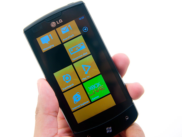
LG preloads the device with three apps: Play to, Panorama shot and ScanSearch.
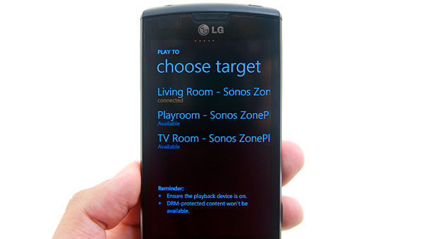
The Play to app is the most interesting as it supports streaming of all of your non-HDCP content to DLNA devices.
The Panoramic photo stitching app is super easy to use and works well in practice. My only complaint is the live view frame rate leaves a lot to be desired.
ScanSearch is a location based augmented reality app for Windows Phone 7. Eventually it'll be able to identify products but today all it can do is point out nearby locations of points of interests using your GPS and WiFi.
Battery life is the best out of the three phones we tested here today. We got over 7 hours in our WiFi browsing test and just over 5 hours on 3G. We’re still running talk time tests.


125 Comments
View All Comments
bplewis24 - Thursday, October 21, 2010 - link
You call it smooth running and functional, which is fine. That doesn't dissuade me and the OP from feeling it is ugly and off-putting. You even say it doesn't have to be cluttered eye candy, but the review claims it is the most beautiful UI he has ever seen. The thing is big blue blocks. It is exactly what he explained on the first page that Windows typically does with any refresh of their OS: "make it bigger and bluer."It is definitely ugly, but if you only care about how functional and fast it is, then you will love it. I admit that I can't stand iOS cluttered eye-candy style either, so I'm with you on that. Give me functional, customizable and sleek and I'm in heaven. Glad somebody already figured out how to do that.
Brandon
geniekid - Thursday, October 21, 2010 - link
In my opinion, it's quite good looking and better than the default home screen on my HTC Incredible.Like you said, it's all a matter of taste. I will put myself out there and say the guy who thinks the "6 year old crackberry looked better" probably has poor taste.
Smilin - Monday, October 25, 2010 - link
It is the most beautiful UI I've seen. Mind you I've SEEN it. Have you? Screenshots don't do it justice. You have to see it moving and the text shifting in parallax. It's eerily 3D.iPhone and Android are beautiful too....if you're a Windows 3.1 progman.exe fan.
gstrickler - Friday, October 22, 2010 - link
It may be simple and functional, but that doesn't mean it has to be boring and ugly. I'm a huge proponent of simple and functional, but that screen looks like something out of the late 80's or early 90's. The tiles have too little to differentiate them from each other. A little use of color and better contrast would make it a lot clearer and faster to identify the icons, and it would look better.Note to MS, hire a usability consultant and put some of your graphic designers to work (I know you have graphic designers). It shouldn't look like just like Windows 7, but it definitely shouldn't look like it comes from Windows 2.0
inighthawki - Thursday, October 21, 2010 - link
That "ugly" home/start screen interface is one of the main reasons I'm interested in WP7. The other smartphone interfaces I've seen from others like iOS and Android are nothing more than glorified and eye-candy enhanced versions of every other phone out there IMO. And as someone who owns a Zune HD which has a very similar interface, I can tell you that it works really well, and is very nice.bplewis24 - Thursday, October 21, 2010 - link
There is no eye candy in Android. It's basically a blank slate desktop background. And obviously it's no surprise that a Zune HD user would prefer the Windows Phone 7 UI. It's also not a surprise you use subjective and vague justifications for your preference :)inighthawki - Friday, October 22, 2010 - link
I don't see why I have to justify a subjective decision. The bottom line is "I like it" and my entire point was that just because the OP thinks it's the ugliest home screen they've ever seen, there are people like myself that not only like it, but actually dislike the style they do. I am not trying to force my opinion on anyone.Smilin - Monday, October 25, 2010 - link
I agree with you FWIW.cknobman - Thursday, October 21, 2010 - link
I agree 100%Gigantic big colored tiles? Seriously?
What a waste of space and an overly boring-bland appearance!!!
Guspaz - Thursday, October 21, 2010 - link
I agree, the WP7 UI looks horrendous to me. Giant space-wasting bland UI components.My biggest concern is how HUGE the tiles are. Anand complained about iOS/Android cluttering screens with app icons, but it seems to me like WP7 will be incredibly worse.
Reducing the number of tiles on the screen so that you can only view 6 full tiles at a time, as WP7 has done (the bottom two tiles appear cut off in pictures) is a huge limitation. The iPhone displays 20 icons.
If I've got 50 apps, and I'm not using folders, an iPhone will give you three screens to scroll through. Android, I assume is similar. Windows phone 7 seems to require something like 8... And the lack of some sort of folder or grouping support is only going to make this worse.
My prediction is that, if WP7 takes off and starts getting a decent number of apps, they're going to have to rethink the home UI or it'll be unusable.