The Windows Phone 7 Review
by Anand Lal Shimpi & Brian Klug on October 20, 2010 7:00 PM EST- Posted in
- Smartphones
- Windows Phone 7
- Microsoft
- Mobile
The Windows Phone 7 Connector for OS X
Every huge company goes through the same motions when a smaller competitor starts making waves. Initially it’s always denial. The competitor doesn’t exist, they have no marketshare, why bother supporting them, etc... Then it’s mild recognition. The competitor exists but who cares, they make stupid products, our next version will assuage all fears. The next stage is depression, and the final stage (if the company survives) is outright competition. Microsoft is at that stage today.
Microsoft recognizes that a sizable portion of the market runs OS X, and it doesn’t want to leave them out of the fun. At launch Microsoft will deliver a beta version of OS X sync software called the Windows Phone 7 Connector.
The connector application doesn’t mimic the functionality of the Zune Sync software for the PC. You don’t get any access to the Zune Marketplace, you can’t download apps, there’s no WiFi syncing support and (today) there’s no system update support. What the Connector is designed to do is get your non-DRM iTunes and iPhoto content from your Mac to your Windows Phone. Nothing more, nothing less.
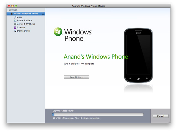
I was supplied with an alpha of the Connector and despite fairly regular crashes (thankfully not while syncing), I’m happy to say it works. You get a very Apple-like interface. Just check the movies, music and photos you want and hit sync and you’re good to go.
The options are minimal. You can’t tell the Connector software to fill all available storage space on the phone with extra music or photos. You have to be very deliberate with what you want to put on the device.
The Connector will insert photos taken on the phone into iPhoto, unfortunately it puts them into albums (roughly one per day it seems) all named after your phone. In my case after a couple of syncs I had a lot of Anand’s Windows Phone albums in iPhoto.
Music downloaded from the Zune Marketplace will also attempt to sync, but it’ll fail miserably. For some reason the Connector tries to put downloaded music in iPhoto, which will of course throw an error:
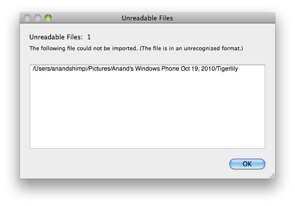
There’s no way around it and unfortunately that means any music you buy in the Zune Marketplace can’t be put on your Mac. Thankfully it seems like a quick fix and we’ve alerted Microsoft to the problem.
There’s also no support for contact or calendar syncing, that’s done through the cloud. You can sync your address book in OS X with Google Contacts and keep your phone synced that way, but you can’t do it over the USB cable.
You can view all of the content on your device but you can’t manage any of it (short of erasing it all). You can’t add/remove email accounts or do any of the things you can do with an iPhone in iTunes. Microsoft’s Windows Phone 7 Connector software is good enough to get the job done, but it’s far from a full fledged OS X client.
The first major update to Windows Phone 7 will come sometime early next year. It’ll bring copy & paste support along with other things. Microsoft plans to have OS update support enabled in the Connector by the time that update rolls around. Assuming all goes according to plan, you should be able to have a pretty decent experience as a Mac user with a Windows Phone. You won’t get the full monty, but you’ll have enough to get by.
Microsoft needs to, as quickly as it can, bring all of the features of the Zune Sync client on the PC to OS X. WiFi syncing, marketplace access - everything. The fact that Microsoft is even providing this option is enough to convince me that it’s serious about being successful here. Windows Phone isn’t just here to offer an alternative, it’s here to take away market share from Apple. To make that happen, Microsoft needs to at least offer feature parity with its sync software for OS X users.


125 Comments
View All Comments
bplewis24 - Thursday, October 21, 2010 - link
You call it smooth running and functional, which is fine. That doesn't dissuade me and the OP from feeling it is ugly and off-putting. You even say it doesn't have to be cluttered eye candy, but the review claims it is the most beautiful UI he has ever seen. The thing is big blue blocks. It is exactly what he explained on the first page that Windows typically does with any refresh of their OS: "make it bigger and bluer."It is definitely ugly, but if you only care about how functional and fast it is, then you will love it. I admit that I can't stand iOS cluttered eye-candy style either, so I'm with you on that. Give me functional, customizable and sleek and I'm in heaven. Glad somebody already figured out how to do that.
Brandon
geniekid - Thursday, October 21, 2010 - link
In my opinion, it's quite good looking and better than the default home screen on my HTC Incredible.Like you said, it's all a matter of taste. I will put myself out there and say the guy who thinks the "6 year old crackberry looked better" probably has poor taste.
Smilin - Monday, October 25, 2010 - link
It is the most beautiful UI I've seen. Mind you I've SEEN it. Have you? Screenshots don't do it justice. You have to see it moving and the text shifting in parallax. It's eerily 3D.iPhone and Android are beautiful too....if you're a Windows 3.1 progman.exe fan.
gstrickler - Friday, October 22, 2010 - link
It may be simple and functional, but that doesn't mean it has to be boring and ugly. I'm a huge proponent of simple and functional, but that screen looks like something out of the late 80's or early 90's. The tiles have too little to differentiate them from each other. A little use of color and better contrast would make it a lot clearer and faster to identify the icons, and it would look better.Note to MS, hire a usability consultant and put some of your graphic designers to work (I know you have graphic designers). It shouldn't look like just like Windows 7, but it definitely shouldn't look like it comes from Windows 2.0
inighthawki - Thursday, October 21, 2010 - link
That "ugly" home/start screen interface is one of the main reasons I'm interested in WP7. The other smartphone interfaces I've seen from others like iOS and Android are nothing more than glorified and eye-candy enhanced versions of every other phone out there IMO. And as someone who owns a Zune HD which has a very similar interface, I can tell you that it works really well, and is very nice.bplewis24 - Thursday, October 21, 2010 - link
There is no eye candy in Android. It's basically a blank slate desktop background. And obviously it's no surprise that a Zune HD user would prefer the Windows Phone 7 UI. It's also not a surprise you use subjective and vague justifications for your preference :)inighthawki - Friday, October 22, 2010 - link
I don't see why I have to justify a subjective decision. The bottom line is "I like it" and my entire point was that just because the OP thinks it's the ugliest home screen they've ever seen, there are people like myself that not only like it, but actually dislike the style they do. I am not trying to force my opinion on anyone.Smilin - Monday, October 25, 2010 - link
I agree with you FWIW.cknobman - Thursday, October 21, 2010 - link
I agree 100%Gigantic big colored tiles? Seriously?
What a waste of space and an overly boring-bland appearance!!!
Guspaz - Thursday, October 21, 2010 - link
I agree, the WP7 UI looks horrendous to me. Giant space-wasting bland UI components.My biggest concern is how HUGE the tiles are. Anand complained about iOS/Android cluttering screens with app icons, but it seems to me like WP7 will be incredibly worse.
Reducing the number of tiles on the screen so that you can only view 6 full tiles at a time, as WP7 has done (the bottom two tiles appear cut off in pictures) is a huge limitation. The iPhone displays 20 icons.
If I've got 50 apps, and I'm not using folders, an iPhone will give you three screens to scroll through. Android, I assume is similar. Windows phone 7 seems to require something like 8... And the lack of some sort of folder or grouping support is only going to make this worse.
My prediction is that, if WP7 takes off and starts getting a decent number of apps, they're going to have to rethink the home UI or it'll be unusable.