The Windows Phone 7 Review
by Anand Lal Shimpi & Brian Klug on October 20, 2010 7:00 PM EST- Posted in
- Smartphones
- Windows Phone 7
- Microsoft
- Mobile
Bing Search and Maps
Bing is tightly integrated into WP7. One needs to look no further than the inclusion of a dedicated (mandatory) button for search just to tell how serious Microsoft is about pushing Bing into the mobile search space with WP7.
I talked earlier about how entering a string into the URL bar in Internet Explorer takes you out of the browser, into search, and then back depending on whether you choose a web result or not. In almost every context (save the marketplace, here search searches the market), pressing the physical search button launches this unified search application.
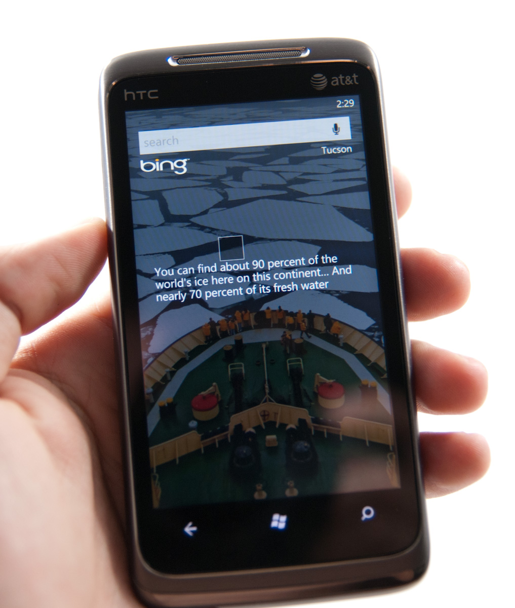
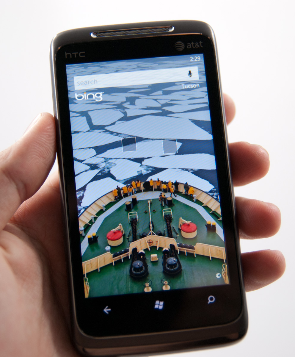
Bing search and maps honestly hasn’t changed much since I saw it at MIX10, and it really didn’t need to as far as basic maps and search go. Hit the button, and you get a Bing homepage like screen with the daily wallpaper and factoid boxes.
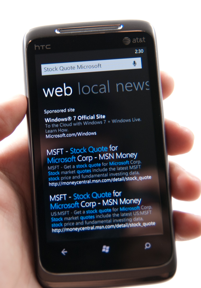
Search terms still pop up differing levels of semantic data - type a company and “stock quote,” and it’ll probably bring that down. Type “pizza in” and a city name, and you’ll get location results. It’s nice to see some intelligence here with searching. You can pivot between web, local, and news. Hit a link on web, and you wind up in the browser. Hit one in local, and you’ll probably wind up in maps. Whether or not you like Bing, the execution here is pretty above average.
What’s lacking is the ability to search local stores like the SMS library or email accounts. It’s sort of ambiguous anymore on every platform what search really does. WebOS has type anywhere, iOS has a mobile spotlight type approach, and Android does a pretty good job searching everything tied to your google account and web.
For whatever reason, WP7 only seems to want to search web facing content most of the time. Hop into messaging, hit search, and you get taken to Bing. Hop into mail, search, and you’ll search email you’ve downloaded - not what’s up on your exchange or IMAP server. Hop into people, hit search, and you’ll search your contacts, but can also search your exchange contacts. The result is that finding stuff is relegated to specific areas rather than one unified place. Whether or not this is right is more of a philosophical argument, it just happens to work that way here.

Another huge omission is the ability to search for things like shipper tracking numbers or unit conversions in Bing. The Bing website allows you to type in a FedEx tracking number or a unit conversion (e.g. 40 pounds in kg), but the search app on Windows Phone won’t give you those results. Given the data already exists on Microsoft’s end, it’s something I’d expect to see down the road.
Microsoft does still have to worry about the bottom line and thus you’ll sometimes see a sponsored search result (similar to what you’d get on a web browser) above your actual results. Microsoft says that the sponsored results will always be limited to one at most.
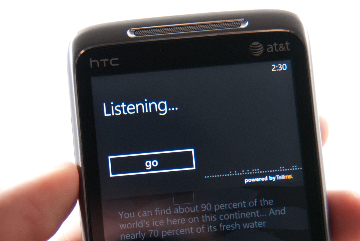
There’s also voice search support from within Bing and the entire platform. You can tap the microphone icon in Bing, or hold down the Windows button for a few seconds anywhere from WP7. It truthfully works very well for calling contacts, searching simple things, but sadly can’t nail down ‘Anandtech.com’ - that results in ‘Manhunt Xbox Com.’
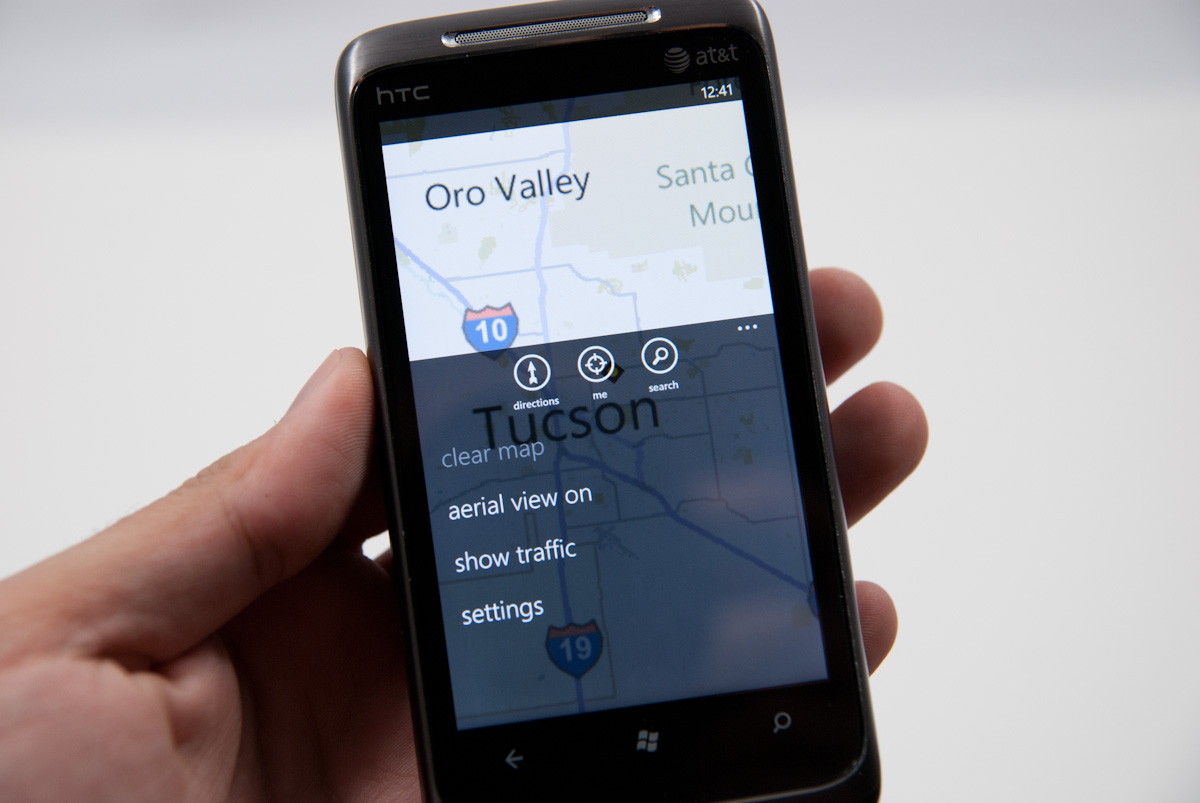
Finally there’s Bing maps. I had a bad experience with Bing maps on Android. It felt slow and clunky, and initially lacked multitouch support entirely. Thankfully Bing maps on WP7 and home turf is completely diffrerent. It’s fluid, packs multitouch support, and loads quickly.
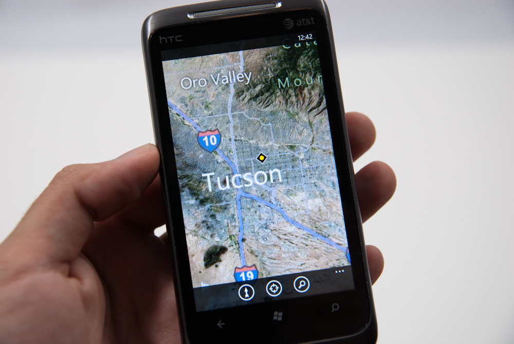
I think WP7 takes a strong nod from iOS here, going the minimalist route with basic directions, locate me, and search support. Expand the options menu, and you can toggle aerial views and traffic, or clear everything from settings.
Directions works well and is a bit unique. There’s support for walking and driving navigation directions, sadly no public transport. There’s a top window that shows the map as you progress and scroll through the directions in the list box below. Finally at the destination you get Bing’s street view perspective of the destination.
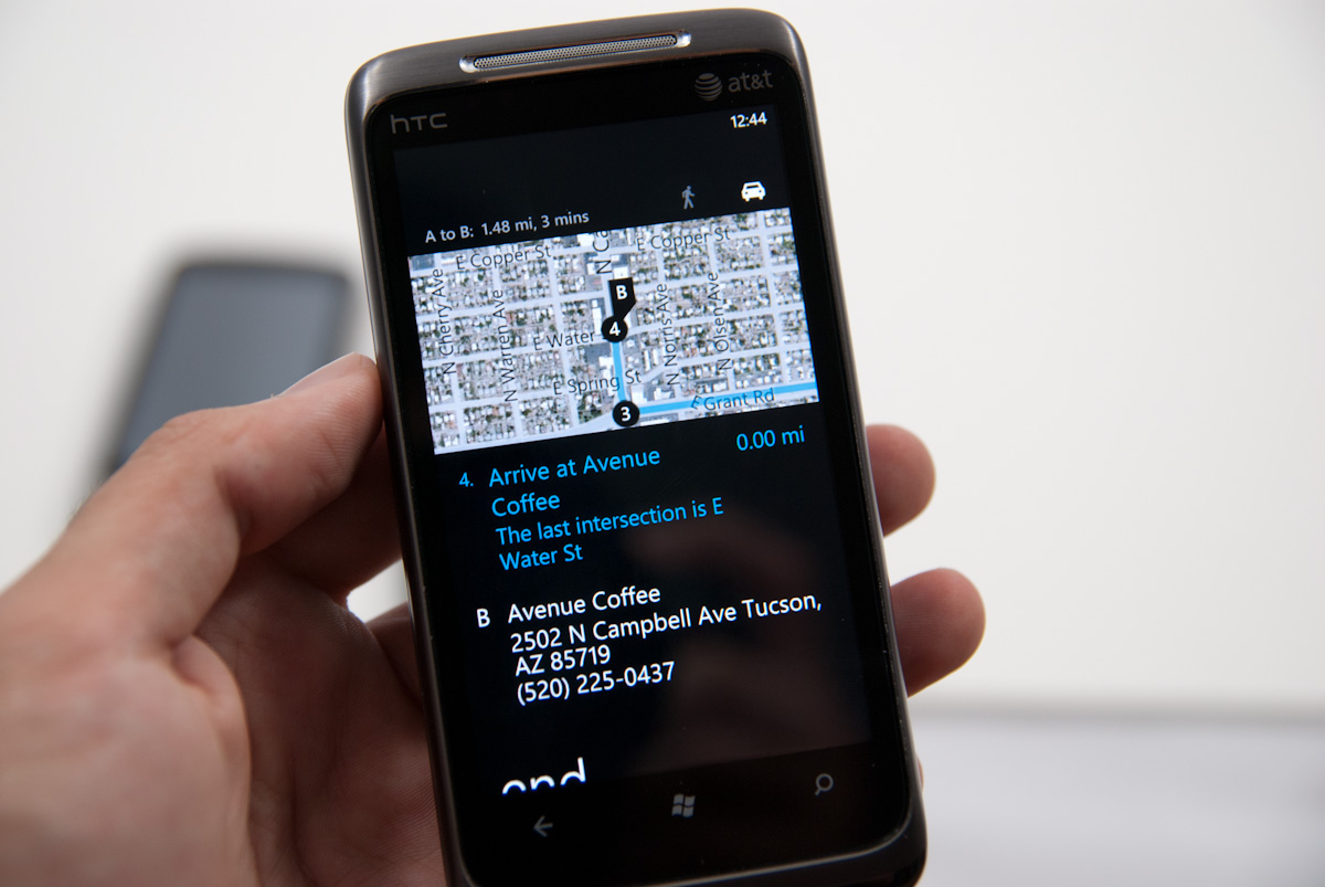
Searching from Bing maps for a location does what you’d expect - flags drop down onto the map. Tapping on these brings up details such as phone, website, and hours if Bing has them. Reviews and nearby and related listings also populate the adjacent pivots.
This is as opportune a time as any to note that the location services on WP7 have continually brought down very speedy location fixes. It’s fast and definitely leverages a location services database like Skyhook or respective databases Apple and Google use. I’m not entirely certain what WP7 is using, or whether Microsoft is rolling its own, but so far I’ve yet to be not be located just as well as I otherwise would be on Android or iOS even inside buildings with no possible way of getting GPS.


125 Comments
View All Comments
bplewis24 - Thursday, October 21, 2010 - link
You call it smooth running and functional, which is fine. That doesn't dissuade me and the OP from feeling it is ugly and off-putting. You even say it doesn't have to be cluttered eye candy, but the review claims it is the most beautiful UI he has ever seen. The thing is big blue blocks. It is exactly what he explained on the first page that Windows typically does with any refresh of their OS: "make it bigger and bluer."It is definitely ugly, but if you only care about how functional and fast it is, then you will love it. I admit that I can't stand iOS cluttered eye-candy style either, so I'm with you on that. Give me functional, customizable and sleek and I'm in heaven. Glad somebody already figured out how to do that.
Brandon
geniekid - Thursday, October 21, 2010 - link
In my opinion, it's quite good looking and better than the default home screen on my HTC Incredible.Like you said, it's all a matter of taste. I will put myself out there and say the guy who thinks the "6 year old crackberry looked better" probably has poor taste.
Smilin - Monday, October 25, 2010 - link
It is the most beautiful UI I've seen. Mind you I've SEEN it. Have you? Screenshots don't do it justice. You have to see it moving and the text shifting in parallax. It's eerily 3D.iPhone and Android are beautiful too....if you're a Windows 3.1 progman.exe fan.
gstrickler - Friday, October 22, 2010 - link
It may be simple and functional, but that doesn't mean it has to be boring and ugly. I'm a huge proponent of simple and functional, but that screen looks like something out of the late 80's or early 90's. The tiles have too little to differentiate them from each other. A little use of color and better contrast would make it a lot clearer and faster to identify the icons, and it would look better.Note to MS, hire a usability consultant and put some of your graphic designers to work (I know you have graphic designers). It shouldn't look like just like Windows 7, but it definitely shouldn't look like it comes from Windows 2.0
inighthawki - Thursday, October 21, 2010 - link
That "ugly" home/start screen interface is one of the main reasons I'm interested in WP7. The other smartphone interfaces I've seen from others like iOS and Android are nothing more than glorified and eye-candy enhanced versions of every other phone out there IMO. And as someone who owns a Zune HD which has a very similar interface, I can tell you that it works really well, and is very nice.bplewis24 - Thursday, October 21, 2010 - link
There is no eye candy in Android. It's basically a blank slate desktop background. And obviously it's no surprise that a Zune HD user would prefer the Windows Phone 7 UI. It's also not a surprise you use subjective and vague justifications for your preference :)inighthawki - Friday, October 22, 2010 - link
I don't see why I have to justify a subjective decision. The bottom line is "I like it" and my entire point was that just because the OP thinks it's the ugliest home screen they've ever seen, there are people like myself that not only like it, but actually dislike the style they do. I am not trying to force my opinion on anyone.Smilin - Monday, October 25, 2010 - link
I agree with you FWIW.cknobman - Thursday, October 21, 2010 - link
I agree 100%Gigantic big colored tiles? Seriously?
What a waste of space and an overly boring-bland appearance!!!
Guspaz - Thursday, October 21, 2010 - link
I agree, the WP7 UI looks horrendous to me. Giant space-wasting bland UI components.My biggest concern is how HUGE the tiles are. Anand complained about iOS/Android cluttering screens with app icons, but it seems to me like WP7 will be incredibly worse.
Reducing the number of tiles on the screen so that you can only view 6 full tiles at a time, as WP7 has done (the bottom two tiles appear cut off in pictures) is a huge limitation. The iPhone displays 20 icons.
If I've got 50 apps, and I'm not using folders, an iPhone will give you three screens to scroll through. Android, I assume is similar. Windows phone 7 seems to require something like 8... And the lack of some sort of folder or grouping support is only going to make this worse.
My prediction is that, if WP7 takes off and starts getting a decent number of apps, they're going to have to rethink the home UI or it'll be unusable.