The Windows Phone 7 Review
by Anand Lal Shimpi & Brian Klug on October 20, 2010 7:00 PM EST- Posted in
- Smartphones
- Windows Phone 7
- Microsoft
- Mobile
Rebuilding a Brand: IE mobile
If there was anything to take away from Windows Mobile, it’s that building a platform with a slow, glitchy browser doesn’t sell. Likewise, if there’s one thing Apple deserves credit for, it’s bringing truly smooth desktop-like browsing to the handheld with Safari. Google and BlackBerry alike can speak to just how important mobile browsers are to platform success, and to woo users from any smartphone platform, WP7 needed to have a fast mobile browser.
When I first heard at MIX10 that WP7’s browser would be built around IE 7 with components from IE 8, I wasn’t sure what to think. That’s right, WP7 is running a mobile port of IE 7’s Trident layout engine - but it isn’t bad. Actually, far from it - it’s quite usable.
First up, Internet Explorer is given its own tile on the home screen. Note that there’s no “mobile” here or insinuation that this is the “pocket” version like it was formerly known by on WinMo, it’s straight up IE. On the first launch, you’re brought to an AT&T captive portal, but ironically enough there’s technically no home page on WP7, future launches bring you to a blank start page.
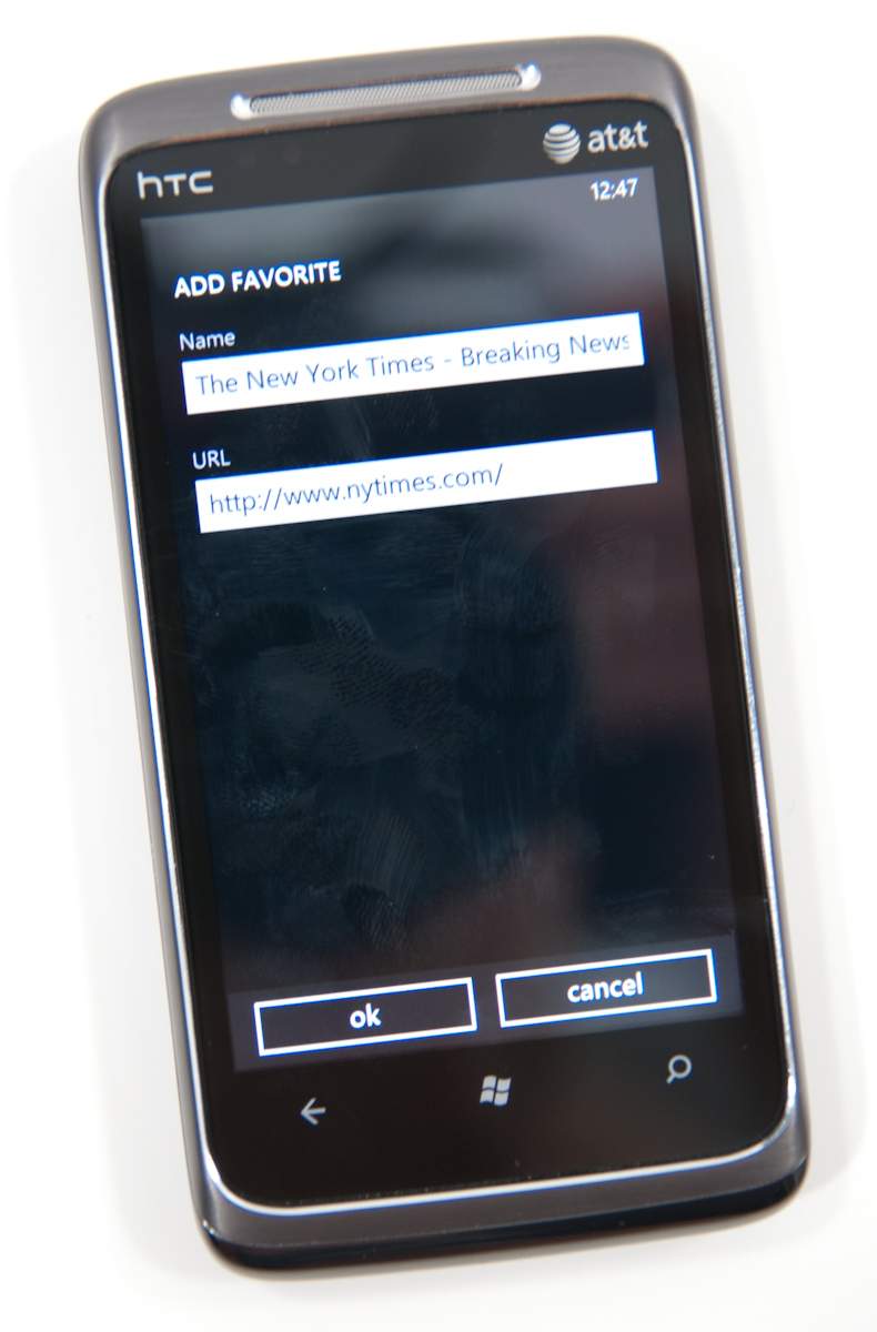
At the bottom are three buttons - add to favorites, favorites, and tabs. Tap the settings ellipsis and you’ll expose more settings - forward ,share page, find on page, pin to start, and settings.
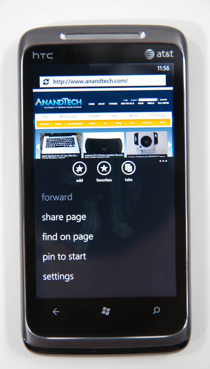
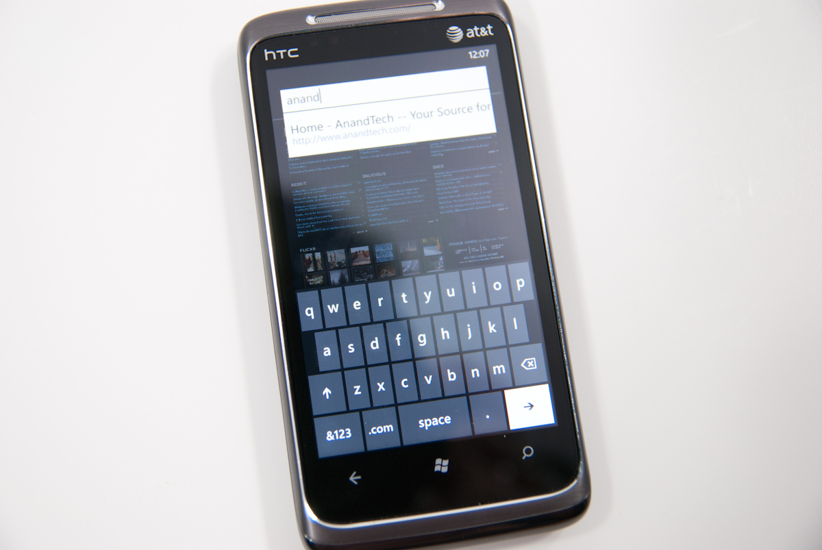
There’s a URL bar up top, but other than that the interface is very minimalist, true to Metro UI standards. Tap on the URL bar and start typing, and all the usual magic bar aides work - addresses from your history are suggested, Bing suggestions below them, and entries from favorites. Hit go, and a narrow progress strip appears just above the URL as the page loads.
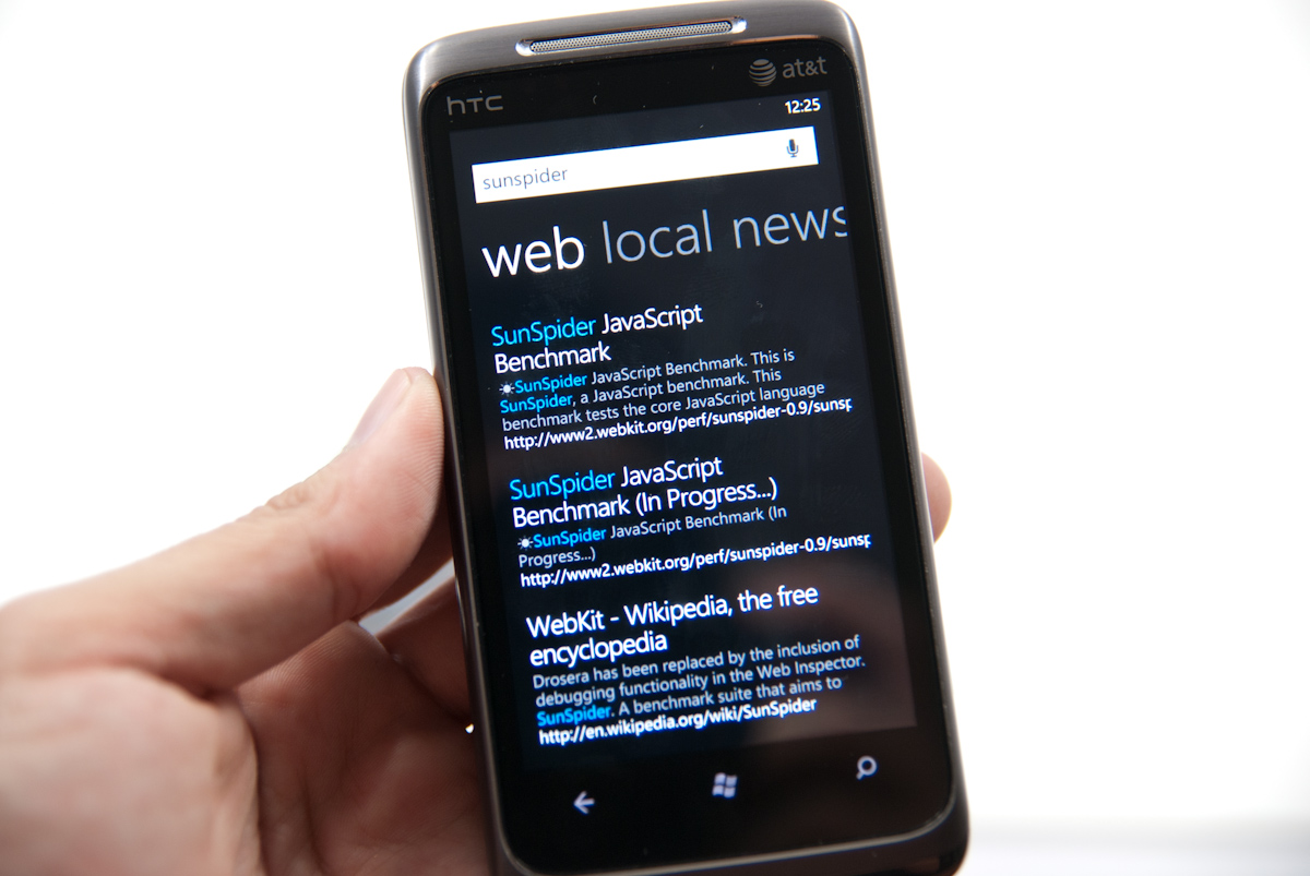
You can enter search terms in the URL bar, but are instantly transported to WP7’s Bing search application for the actual search and results. Clicking on the results brings you back to the browser. It’s a bit jarring to get yanked out of the browser and then transplanted back (and there’s no way to change your search preferences to Google, either), but it does work. More on WP7’s ubiquitous Bing search later.
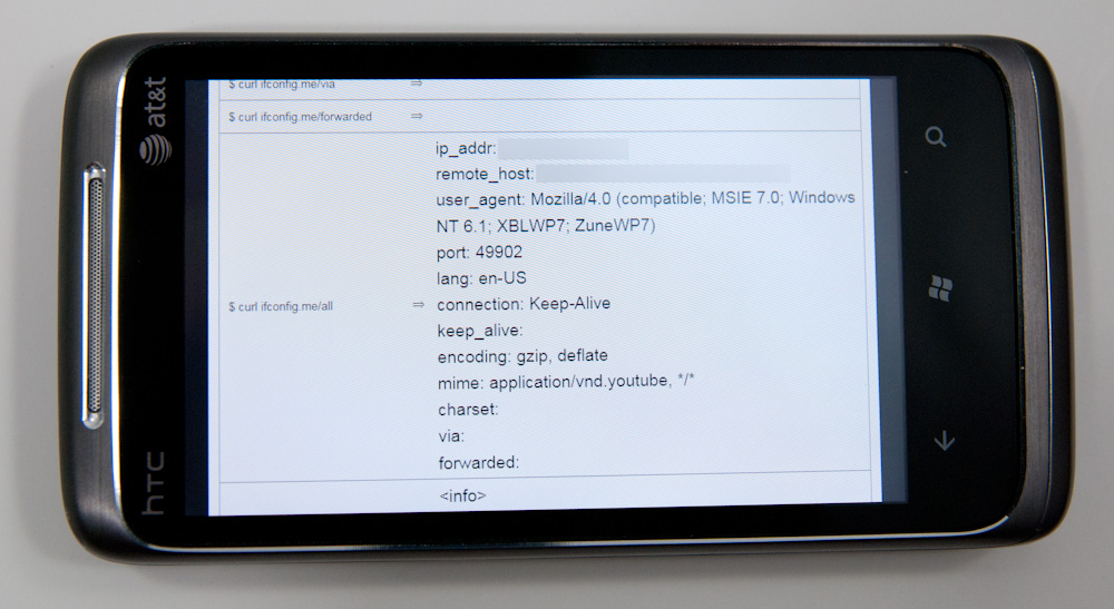
The settings pane for WP7 IE is a bit minimalistic, but gets the job done. There’s a button for clearing all the local data on the phone, but no granularity if you want to just clear history but leave cache intact, or some combination. It’s all or nothing. What’s very useful however is inclusion of a user agent switcher - Mobile version or Desktop version. For sites that support mobile user agent detection and shoot differently formatted content based on that, this is useful.
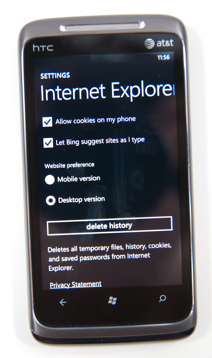
WP7 calls presents its browser user agent as “Mozilla/4.0 (compatible; MSIE 7.0; Windows NT 6.1; XBLWP7; ZuneWP7)” in desktop mode, and “Mozilla/4.0 (compatible; MSIE 7.0; Windows Phone OS 7.0; Trident/3.1; IEMobile/7.0; HTC; T8788)” in mobile mode. While there aren’t many sites right now that identify the phone in mobile view and send appropriately formatted content, that’ll change as detection includes those new WP7 entries. What’s interesting is the inclusion of XBLWP7 and ZuneWP7 in the desktop view - could a browser for Xbox be somewhere on the distant horizon?
Moving on is the tabbed view. IE will let you open a maximum of 6 tabs - the current number of open tabs is displayed atop the logo itself. Though Microsoft calls them “tabs,” they really work in principle a lot more like (and bear more resemblance) to windows. There’s no tabs to be found anywhere. There’s a very smooth 3D animation switching between tabs and opening/closing them. What’s interesting however is that you can open pages in all six tabs in quick succession, and the pages themselves will keep loading and update the tile thumbnail once the page is done:
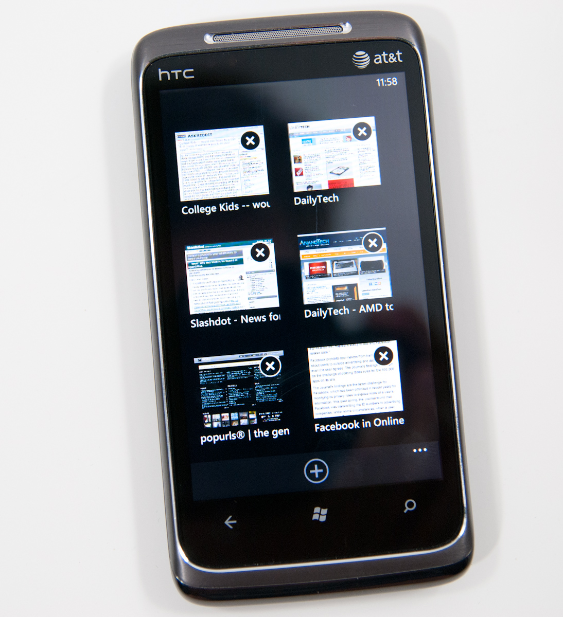
In practice, switching between tabs is very fast, as is closing many windows. It happens all with a very 3D feel and a steady framerate. It’s hard to argue that WP7’s tab switching interface isn’t as good or better than the competition’s. Pages also continue loading if you close the browser and go do something else.
The inclusion of find in IE is a nice addition, something Android has that iOS still lacks in mobile safari. Enter a search term, and you’ll get highlighted matches throughout the browser and next/previous buttons at the bottom that cycle through instances. You don’t get the number of matches like Android provides, but find on page is at least there.

Similarly, you can pin any page to the start screen. Tap that, and a screenshot of the page shows up on the start screen in a tile of its own:

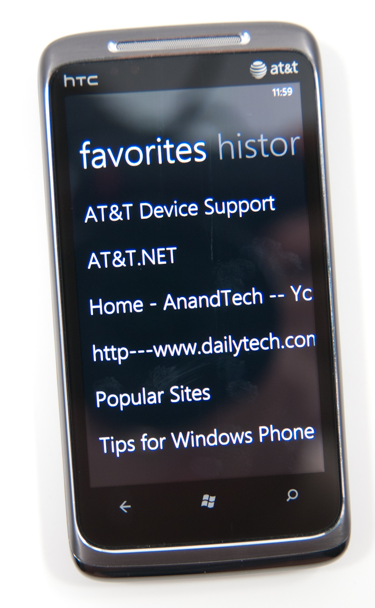
It’d be nice to see the tile reflect a current version of the page rather than the appearance it had when the tile was created - similar to how desktop browsers cache thumbnails of frequently visited pages - but this works. The favorites list is a bit spartan, consisting of a simple list of entries. Long press and you can edit or delete entries, but not change their order. Swipe left or right, and you’re at history.
One of the most common copy and paste workflows I find myself using on other platforms is simply sharing URLs. While there’s no copy paste support on WP7 yet, “share page” from the expanded menu does let you dump the current page’s title and URL into an email or SMS. You’re still somewhat out of luck if you want to share something on Twitter or another application, but copy and paste is coming soon.
There’s landscape support in IE, but you lose all of the UI elements and the browser window fills the entire screen. On one hand, you get the most possible browsing area this way, but sacrifice the URL bar, status bar, and all of the other controls. The downside to this layout is that every time you want to enter a different URL, you’ll have to rotate to portrait, enter it, and then swap back. Same if you want to change tabs or use a favorite. That can get a bit frustrating if you’re used to viewing pages in landscape, but not totally killer. There’s an impressively fluid rotation transition between portrait and landscape, however.

So how is the browser in actual use? Extremely usable and speed up dramatically since last I saw it, but there are definitely a few rough spots. It’s completely usable as it stands.
First off, panning and translating around pages is incredibly fast. It’s iOS level fast if not faster. That includes moving around pages, pinch to zoom, double tap to zoom, and inertial scrolling way down a page. IE does an impressive job keeping up with even extremely fast scrolling up or down a page. No doubt this is due partially to GPU accelerated UI. Android has some serious work to do here, as translating around on pages and multitouch zoom frequently feel choppy.
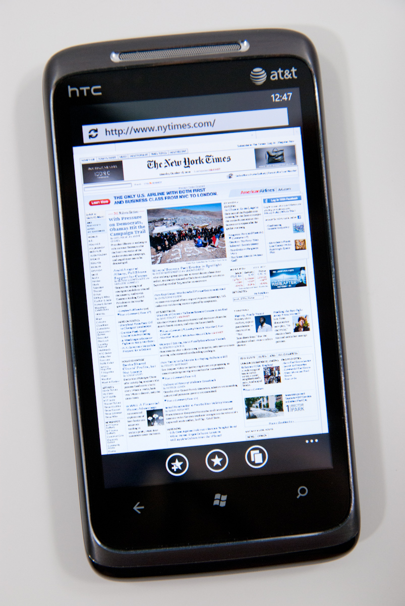
I spent an entire week with WP7’s browser visiting every site I could think of, and have yet to run into a site that doesn’t render properly. Apple showed off the New York Times homepage in some of its earliest iPhone ads, and Microsoft briefly showed off WP7 rendering the NYT homepage at MIX10. Here it is again:
What’s a bit strange is how small fonts are rendered when one is zoomed completely out. Check out the AnandTech homepage, for example:

Click to enlarge
Up close, small text appears aliased and blocky, like a bitmap. The problem isn’t that text isn’t readable zoomed all the way out (it can’t be), it’s that it lacks the antialiasing larger text gets. If you quickly zoom in, that texture is enlarged and there’s a second long pause (or more sometimes) before text is re-rendered smoothly.
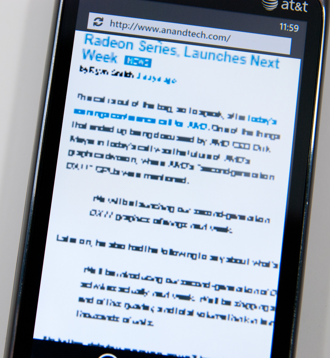
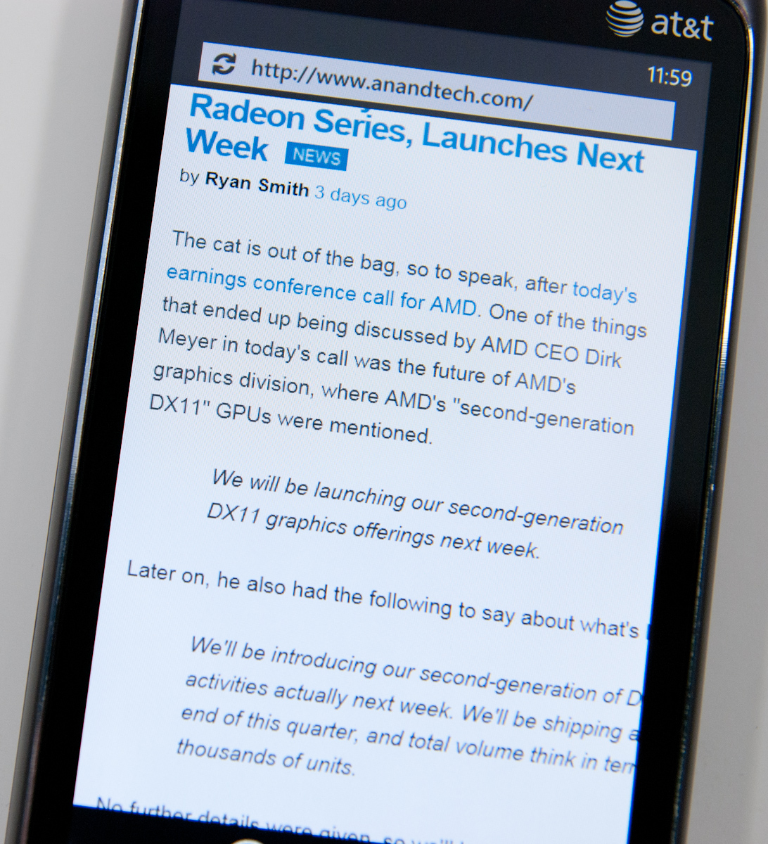
It’s clear that what WP7’s mobile browser is doing is rendering a large texture with the webpage, and then using a translate transform and clip (two inexpensive GPU accelerated operations) to pan the window around so smoothly. The downside is that if you zoom in a lot, you’ll blow that texture up and see the above while the browser re-renders at the new zoom level. What’s strange is that after a certain size, text is nicely anti-aliased - look at the after photograph above and it’s obvious that WP7 is doing subpixel font smoothing just like it should be.
It’s a minor nitpick, but still there. It isn’t quite the level of cheating that Opera mobile does with small text when zoomed out fully (it renders what look like grey boxes after a certain level), but some more font smoothing would be awesome.
There’s also an occasional texture flash when switching between tabs. Change the tab and you’ll go from placeholder image icons to the actual photos after a very brief pause. It’s subtle, but noticeable. Take popurls for example:
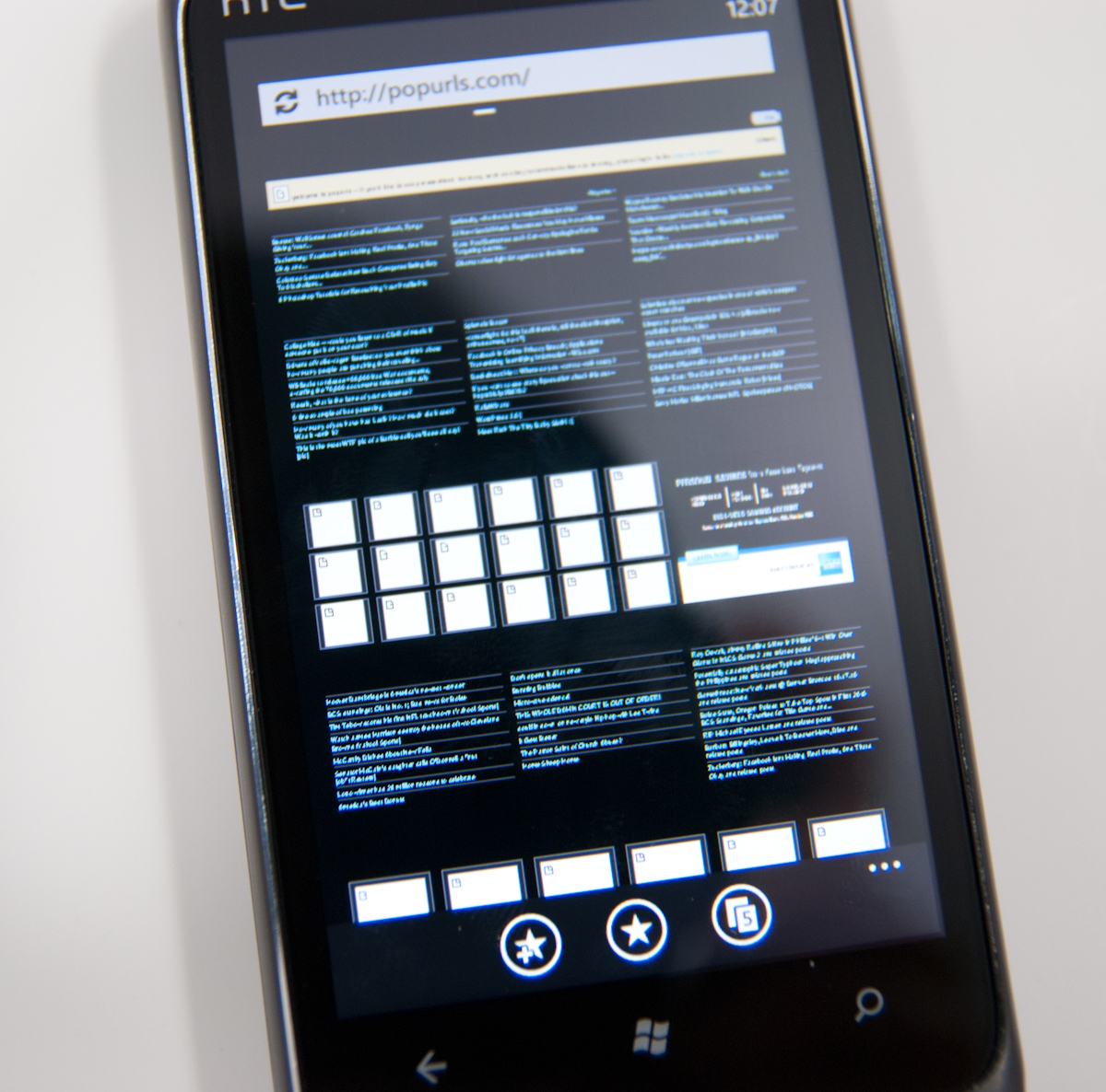

It isn’t quite as bad as how iOS will completely dump a page and completely load then render it again (effectively double loading pages occasionally - which is admittely nice way to increase apparent browser market share), but it is there. This quick texture load happens more often when you’ve got lots of tabs open, but what’s strange is that not all images do the flash - only some. Then the reason occurred to me.
We’ve talked briefly about how WP7 strongly leverages the GPU for rendering the entire UI. Almost every transition and animation is carefully comprised of a few actions which are essentially fast, GPU-accelerated primitives, and there are just a few of them: translate transforms, perspective transforms, opacity, and rectangular clip. Interestingly enough, WP7 also has a few GPU accelerated media decoders, including for stills, but only JPEG gets GPU accelerated rendering, PNG is done entirely in CPU.
The textures that seem to flash most often on the AnandTech homepage at least are PNG in nature. But it still does happen to JPEGs like on the popurls page.
It isn’t that big of a deal, but it does lend some insight into how the browser window can feel so fluid panning around.
It’s really amazing how fast and capable WP7’s browser feels, and having a competent, modern browser is of huge importance for any modern smartphone platform. Microsoft has done a great job making Trident feel snappy, but where it falls short are some of the popular web standards compliance tests.
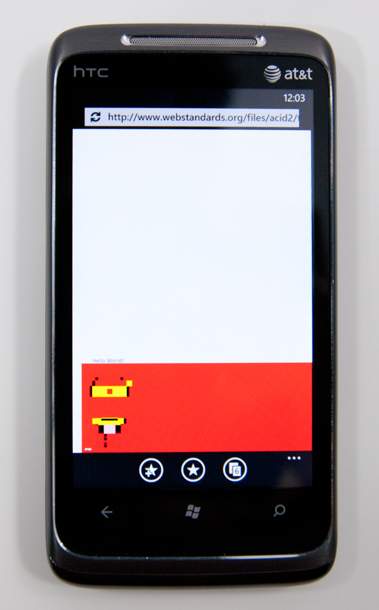
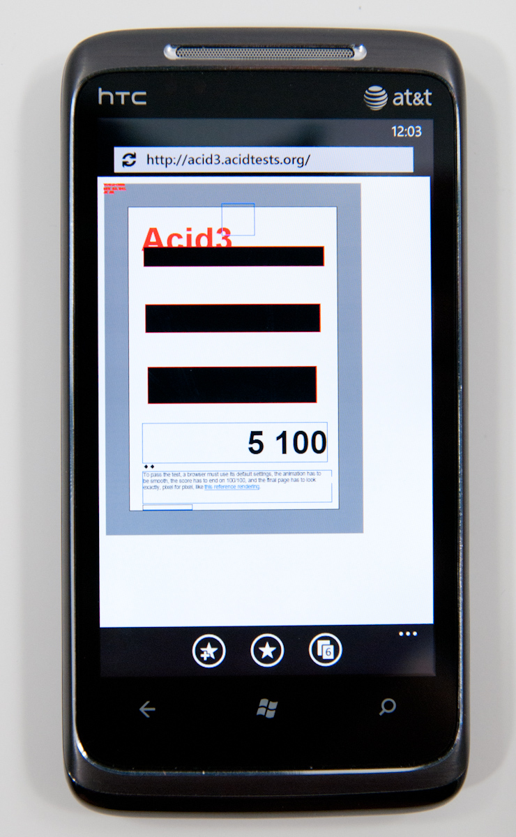
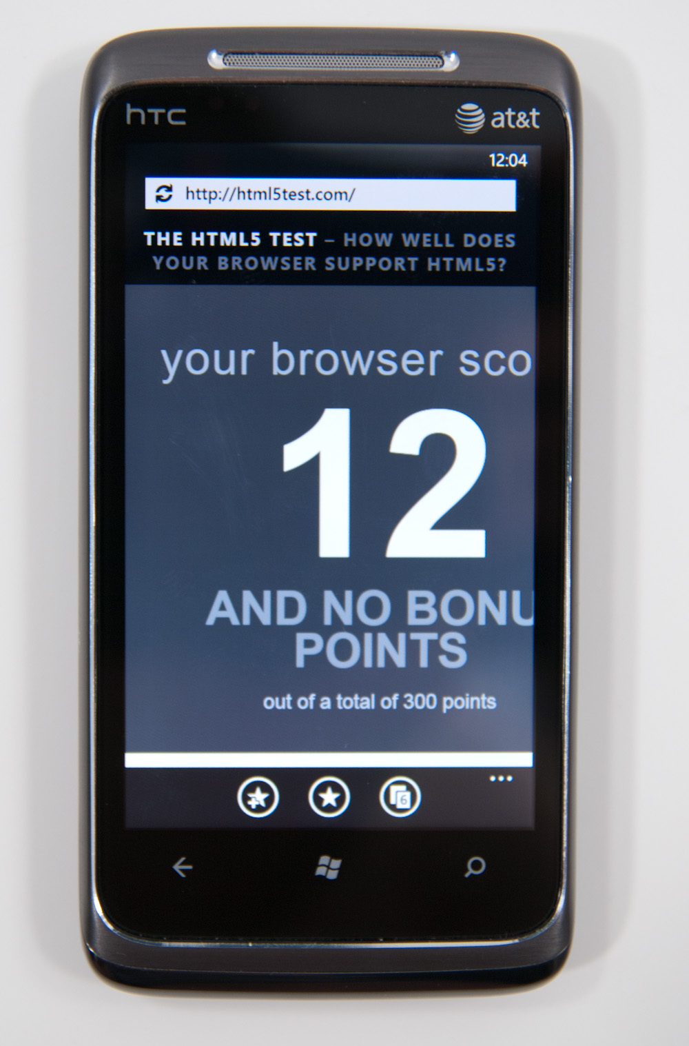
WP7’s browser just doesn’t do very well at Acid 2, Acid 3, or the HTML5 test. The results are pretty self explanatory:
What’s shocking however is that, so far, it hasn’t really mattered. I’ve spent a week using WP7’s browser, testing every page I can think of that I visit on a daily basis, and have yet to encounter anything that doesn’t render properly or crashes the browser. Never once have I been want for more in fact, outside of the font rendering qualms we noted prior.
Obviously, better HTML5 support is the future, but it’s pretty shocking just how usable the browser feels otherwise while still scoring so poorly on these tests.
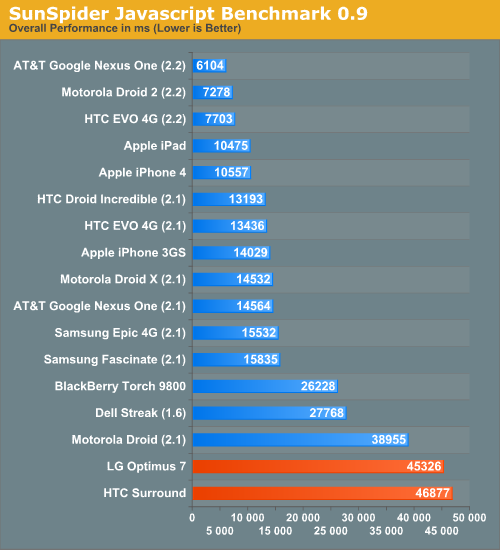
Unfortunately, JavaScript performance isn’t WP7 IE’s high point either, nor is BrowserMark, both of which it scores pretty abysmally in.
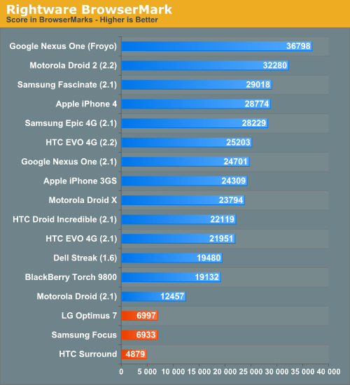
This is one area where Android holds a huge lead, and where Microsoft still needs a faster JavaScript engine. Same for actual page loading times, which are just longer than everyone else’s no matter how you spin it:
What’s surprising is that in spite of all this, the WP7 browser feels fast. It’s amazing just how much extremely fast UI can change one’s perception entirely. Slower page loading times aren’t as big of a deal anyways, since you can leave the browser and go do something else entirely while the page keeps loading. It’s obvious that WP7 makes a WebOS-like tradeoff here, sacrificing snappiness in some places for the ability to go do other things while pages are loading.
There’s no flash support in WP7’s browser right now, but it’s already on Adobe’s radar for the near future. A faster JavaScript engine and faster loading times would definitely be nice, but the browser as it is at launch feels extremely fluid in its current version.
Microsoft has done a lot with Trident and IE8 code in WP7’s browser - they claim that it lies somewhere between IE7 and IE8 in reality, but it’s hard to not argue that still more must be done. WebKit definitely remains the reigning champ in the mobile browser space, now powering essentially every smartphone platform: iOS, Android, BlackBerry 6, WebOS, Symbian, and MeeGo all use it. The irony of the situation of course is that IE9 made its earliest debut at MIX10 the same time WP7 did, and thus the improvement path is obvious. WP7 needs to eventually get IE9 code onboard and deliver much improved HTML5 compliance and JavaScript performance.
My final parting remark about IE on WP7 is that Anand and I both found ourselves occasionally confused by the back button. It sounds simple, right? You can be browsing along, and as long as you don’t leave the browser, back does what you’d expect it to do - take you back. However, if you hit home and leave the browser, then come back in and hit back, you’ll just get taken outside again. The result is that you essentially lose your back history whenever you leave the browser. Not a killer deal, but there should at least be session preservation so that back always works like a browser’s back button should, not like WP7 contextual navigation does.


125 Comments
View All Comments
Kentcomp - Friday, October 22, 2010 - link
I really appreciate you guys so thoroughly reviewing WP7. Your review was like reading a really well illustrated, yet candid owner's manual. Thank you!PS I find the home screen to be kind of boring too but I'll choose functionality over style 99% of the time. After all, the homescreen is just there to get you to where you really want to be.
Riccardo - Friday, October 22, 2010 - link
That's a remarkably in-depth review. Thanks guys!rye222 - Friday, October 22, 2010 - link
amazingly thorough article. i've been eagerly awaiting these phones ever since i bought the Zune HD and thought, "if MS made this into a phone, they would own". thanks Anand, great job as usual on your articles!lewchenko74 - Friday, October 22, 2010 - link
The interface is too minimalistic. Hate the massive two color icons. Just looks ugly.. and really not that functional if you have a lot of these 'icons' to wade through.Then there are the limitations that mean it isnt quite as feature rich as an iphone or Android in certain areas.
There is absolutely nothing compelling to sway me to this phone (at all).
Anyone with an app library (android or iOS) is hardly gonna part with their spent money on a new device and lose that investment... plus it barely has an app library yet.
I wish MS well as competition is important... but it really doesnt give an iOS / Android owner anything new, plus if I was buying fresh... I think that the iOS / Android phones and app-sphere etc are just more compelling.
Nice thorough review though.... just read a little too enthusiastically MS focussed at times, but a good read.
hakime - Friday, October 22, 2010 - link
"The UI is a thing of beauty. Microsoft got the style, customization and performance one hundred percent right on this thing. It makes iOS feel old and utilitarian. It’s funny to think that Microsoft was the one to out-simplify Apple in the UI department."This sentence summarize by itself how not objective and professional this review is. I mean no one on Earth being a little bit rational can think that this Metro interface is beautiful let alone functional or easy to use. I mean how a hell can a text based interface with half displayed text all around and ugly flat colors on top of black background can be called beautiful? This interface just lacks taste, it is different yes, but it is bad, it lacks interaction. You are so Microsft driven that you come to think that a different interface is necessarily easy to use and functional. Nothing is right here, the theme, the colors are ugly with little sense for giving some wish for the user to use the phone, there are too many steps needed to go to what the user wants to do, the tiles are a mess as they can be anything and hubs are an obscure UI concept that serve little interest. You want to browse through your apps, you are presented with only a list view and good luck with that. The calendar and SMS apps are a horrible vision for the users, they are just ugly. The email app looks like it was design by a bunch of students in GUI design with no clue on how to present the information to users. And everything else is just a mess in itself hidden behind a ton of useless animations.
In contrary, iOS just looks easy to use, clean, beautiful. You have your phone and that's it, not extra useless UI concepts and distractions. They are nice for a demo, but for daily usage, they rapidly get useless.
Then you continue with the Zune pass, noting that it is better than iTunes, but in what regard? You are strange enough to like the Zune pass, that does not make it better than the iTunes model. Again non objective argument.
Best integration of Facebook in WP7? Is it a big deal or even a nice feature? The question is if it is really a good thing. Why should I have all my contact and photos all mixed up in an almost uncontrollable mess? Someone objective would surely recognize that such exaggerated integration of Facebook just makes little sense. A well designed app is more than enough to access the Facebook content without having to have all the time friends and non-friends popping up with messages and photos. Distractive and useless like the UI of WP7.
And what about not being more reserved with the major shortcomings of WP7. How many times we have been told about the lack of multitasking in iOS? And now an os comes to a market where all the other mobiles os have multitasking and this is not called a deal breaker! It is a deal breaker, not having multitasking on WP7 is just inexcusable from Microsoft.
Same thing with copy and paste, in 2010 an smart phone should have an efficient copy and past implemented, and WP7 not having it is a total shame. Sure, most implementation out there sucks, and only the iOS has a real efficient and easy to use implementation, but that does not forgive Microsoft for that.
What about also the significant lack of unified mail box in the email app, the lack of robust security features, the lack of tethering, the clumsy Exchange support, the pour performing third party apps, the lack of universal search, the excessive $14.99 for zune pass, the inexcusable lack for support of HTML5 which is even more unacceptable as the os does not support flash either, no YouTube app, weird interface concept when you need to long press to reach some options and in-app menus, etc...
The list is long, WP7 is surely full of animations but it is little functional. And the authors fail to give an objective review of this system which is new but far behind the competition. Having a different UI style does not make this os more functional or even attractive. It just sacrifices too much on real usability for bringing useless UI concepts. The authors wishing so much that their lovely Microsoft brings something to save itself from the mobile market that they have forgotten what objectivity means.
dustcrusher - Friday, October 22, 2010 - link
It's a review. Reviews are inherently subjective. The only parts that aren't are the benchmarks, and even those are arguably not 100% objective. I think at points they were gushing over what worked well but there were other points where they did bring up some valid objections, even if they tinted them a little with rose-colored glasses.Thanks to this review, I learned enough to realize I'm probably better off going to an Android phone when I am able (disclosure: I'm on WinMo 6 right now). Android simply fits my wants and needs better. I don't see WP7 taking giant chunks of market share from Apple or Android, but I think it will do better than WinMo did.
Microsoft is trying to do something different; seems like they are trying to make a smartphone that is as easy to use as a featurephone. It's risky but it could pay off big time. If their sole intention was to cram all of Android and iOS's features into their new OS, it'd be closer to WinMo 6.6 w/HTC's UI shell on top.
A couple of reviewers decided they like the way WP7 does some things. You are clearly happy with your iPhone, so why are you letting it bother you so much? Do you really want to come off as a trollish fanboy?
cjl - Friday, October 22, 2010 - link
Have you read any of Anand's Iphone reviews? If anything, Anand is biased towards the iphone at the expense of pretty much anything else, so the fact that this review is so positive speaks volumes about the phone.Also, to everyone complaining about the interface, you should really try using a Zune HD sometime. It's amazing how natural the interface is.
headrush69 - Sunday, October 24, 2010 - link
There is a big difference between saying an interface is natural to use over saying it is a thing of beauty.Frankly many of the screen shots make elements of the interface look very basic, dated and rushed.
Example: plain square flat buttons on call screen, on/off toggles in setting screen.
Of course these things are pretty trivial to improve and I'm sure they will, but statements like this in the article
"The UI is a thing of beauty. Microsoft got the style, customization and performance one hundred percent right on this thing. It makes iOS feel old and utilitarian."
I just can't agree with and believe exactly the opposite.
Smilin - Monday, October 25, 2010 - link
Have YOU seen the UI? Not screenshot of it. Have you seen it? Used it?Your opinion is worthless.
Smilin - Monday, October 25, 2010 - link
smells like hater in here.Sorry man but this is the most comprehensive and *objective* review I've seen yet. Most of the things you're griping about are IN the article. Did you read it?